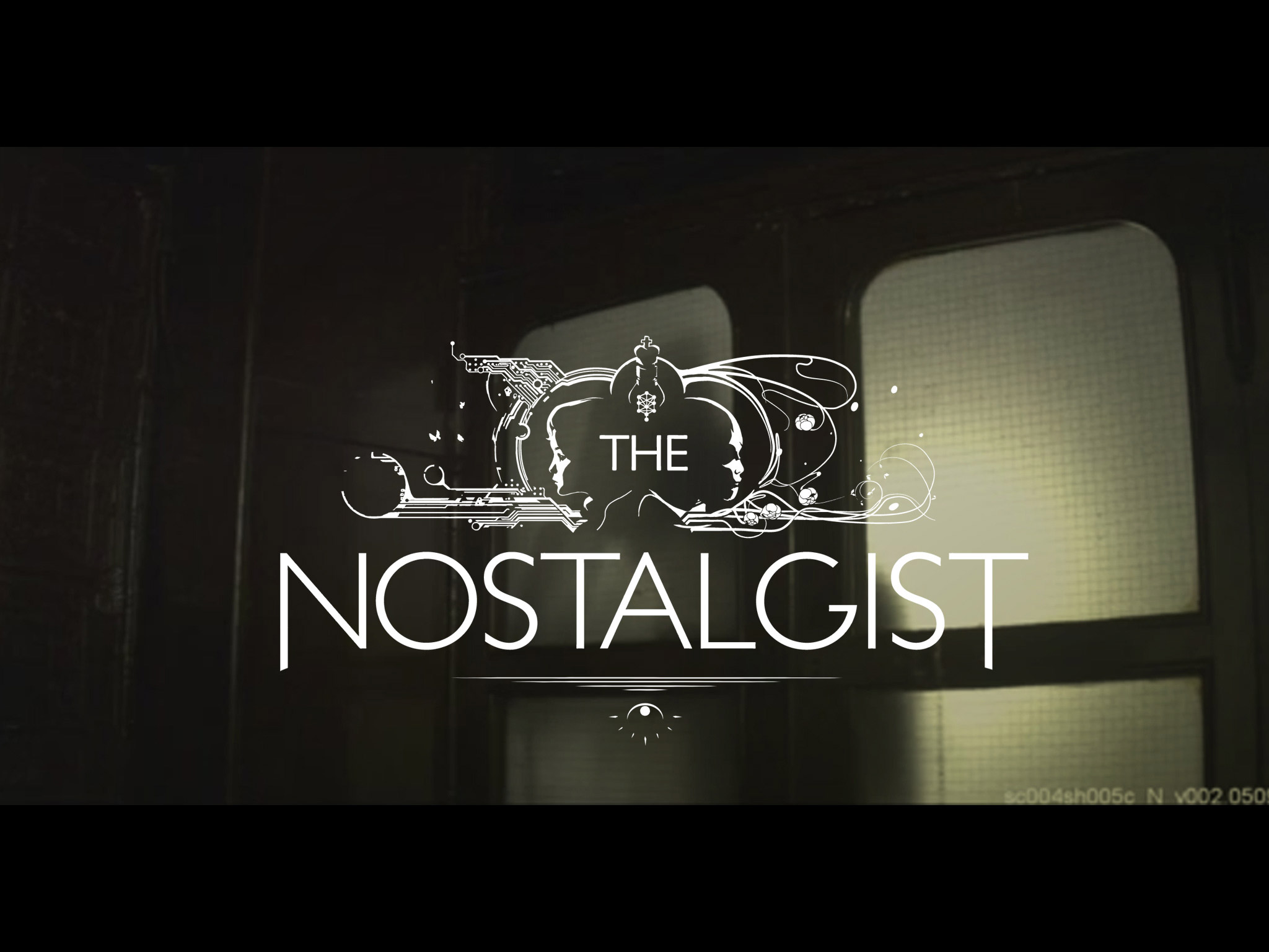
After a couple of years, "The Nostalgist" goes free streaming online, hosted by WIRED VIDEOS.
You can watch it here: http://video.wired.com/watch/the-nostalgist-a-short-film-by-giacomo-cimini
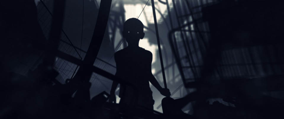
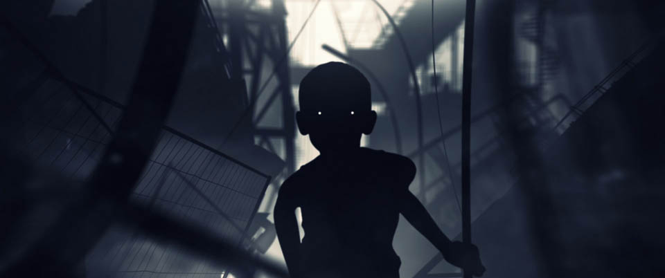
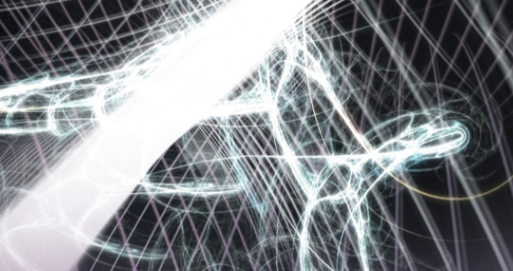
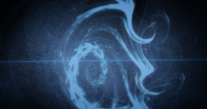
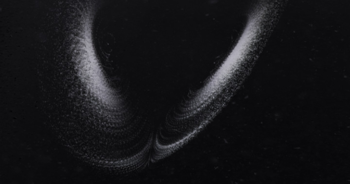
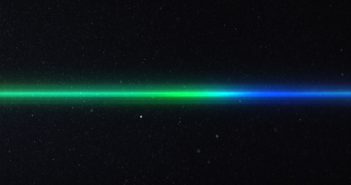
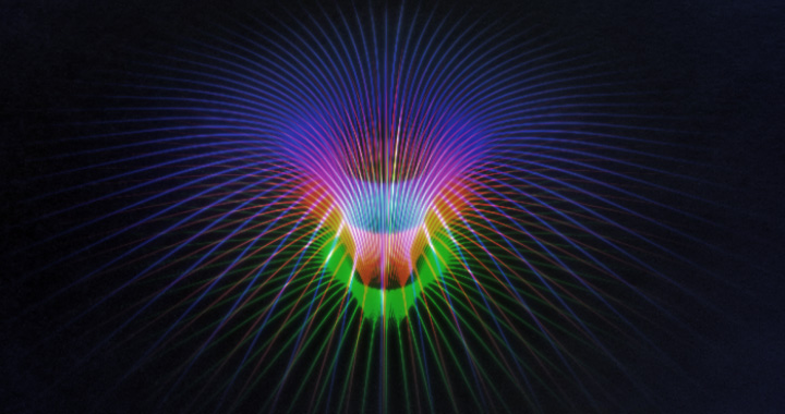
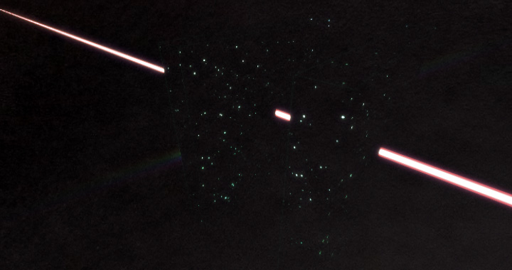
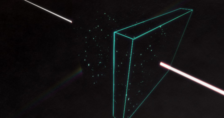
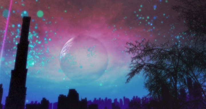
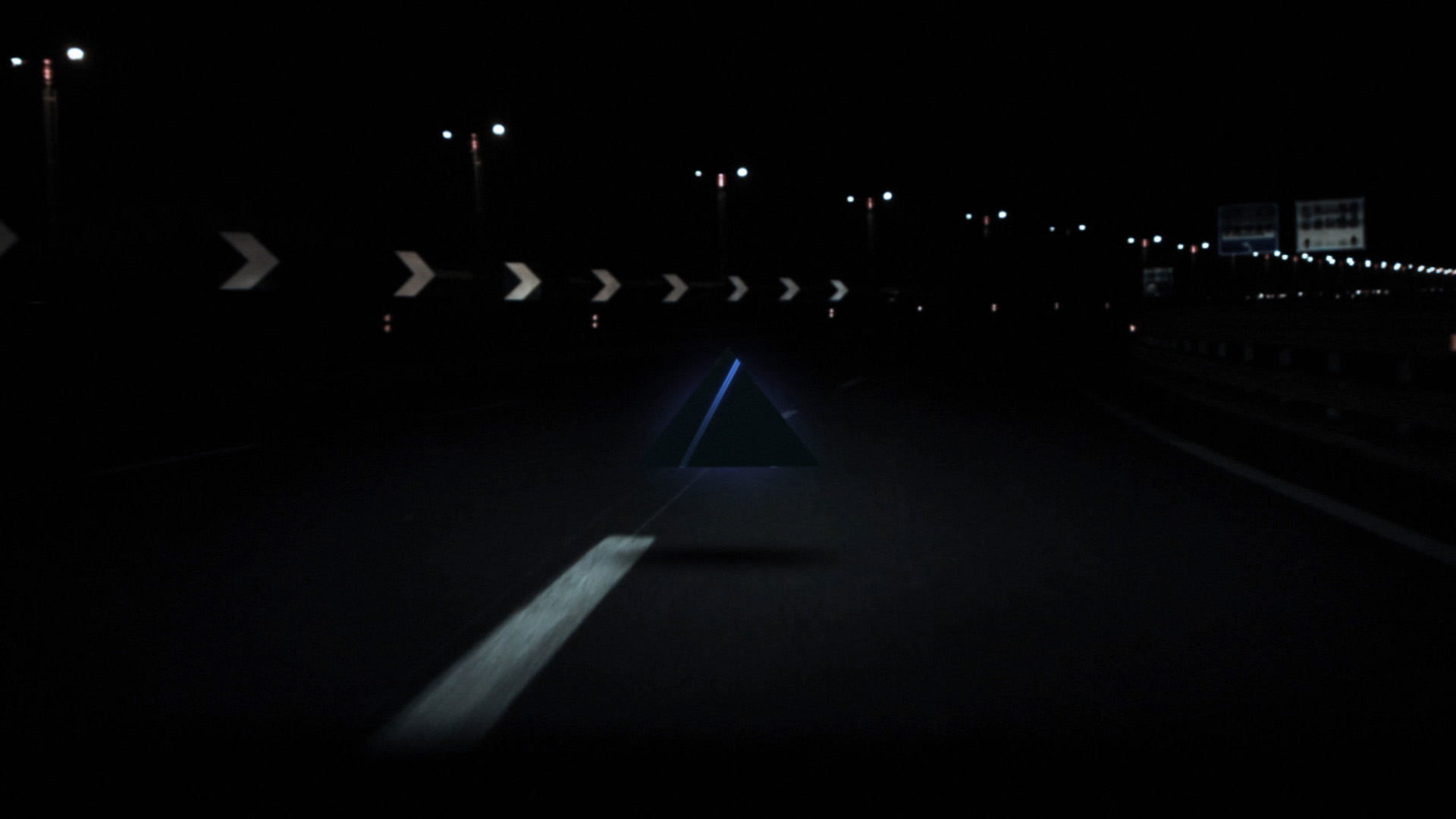
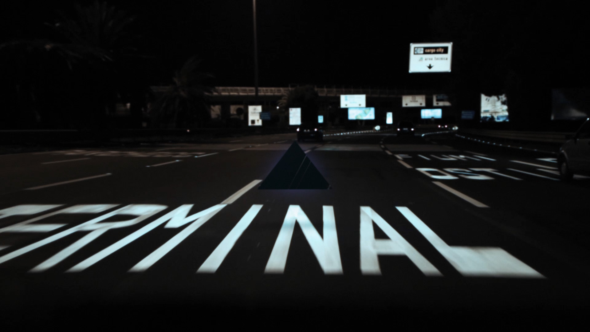
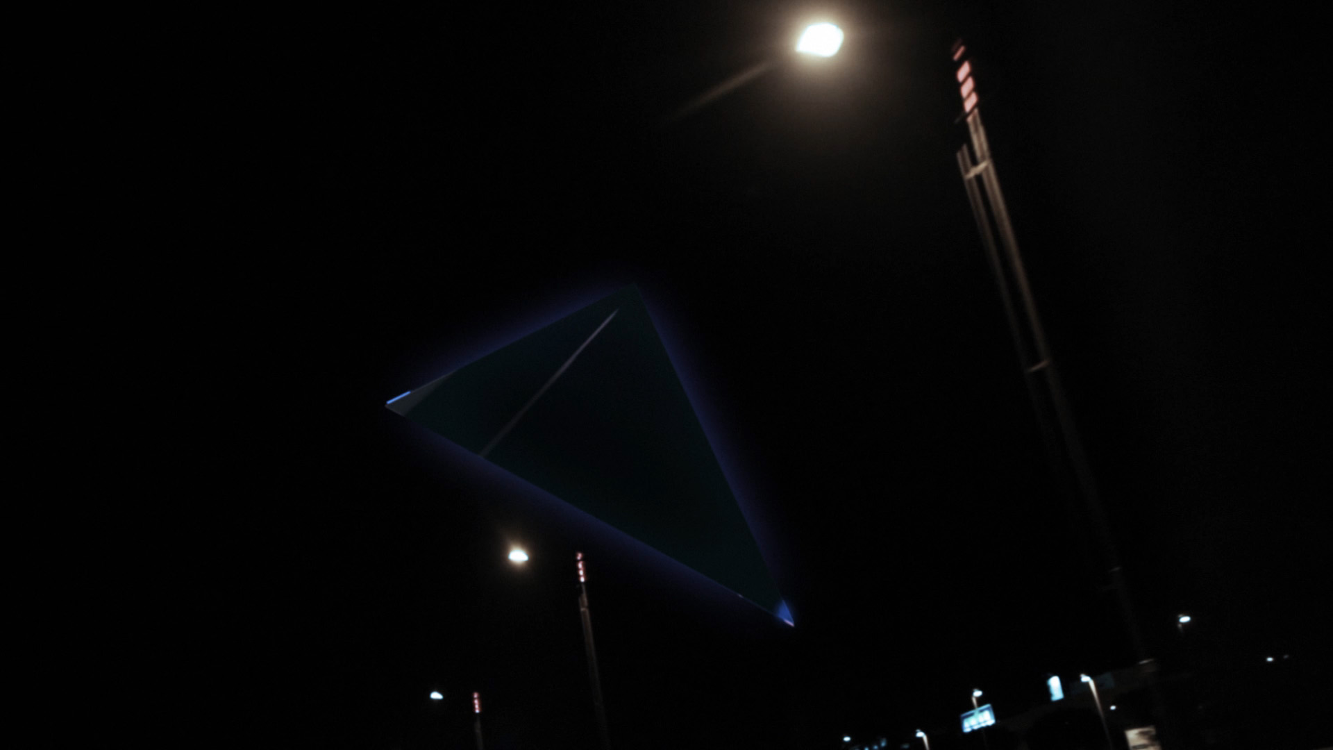
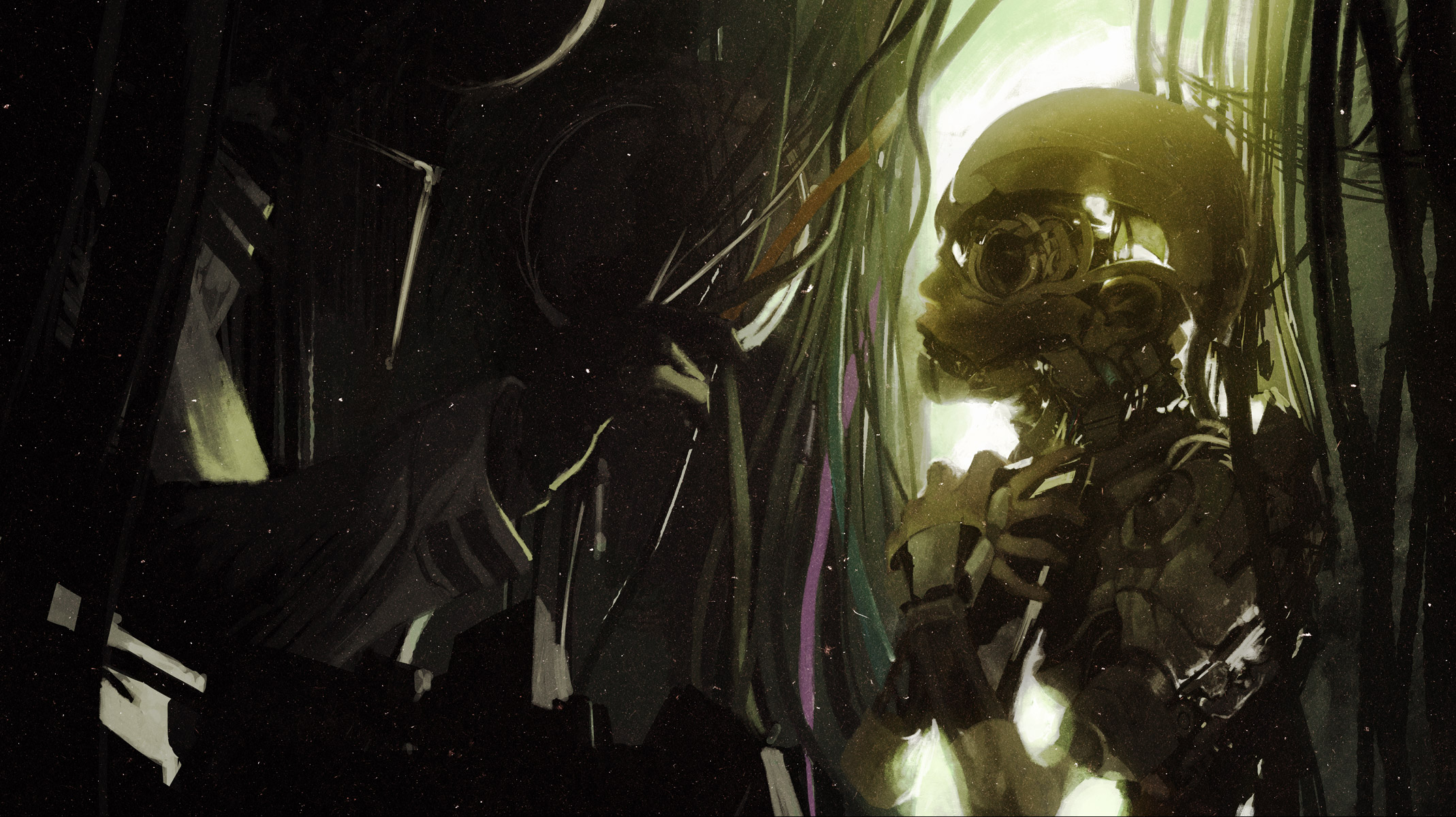
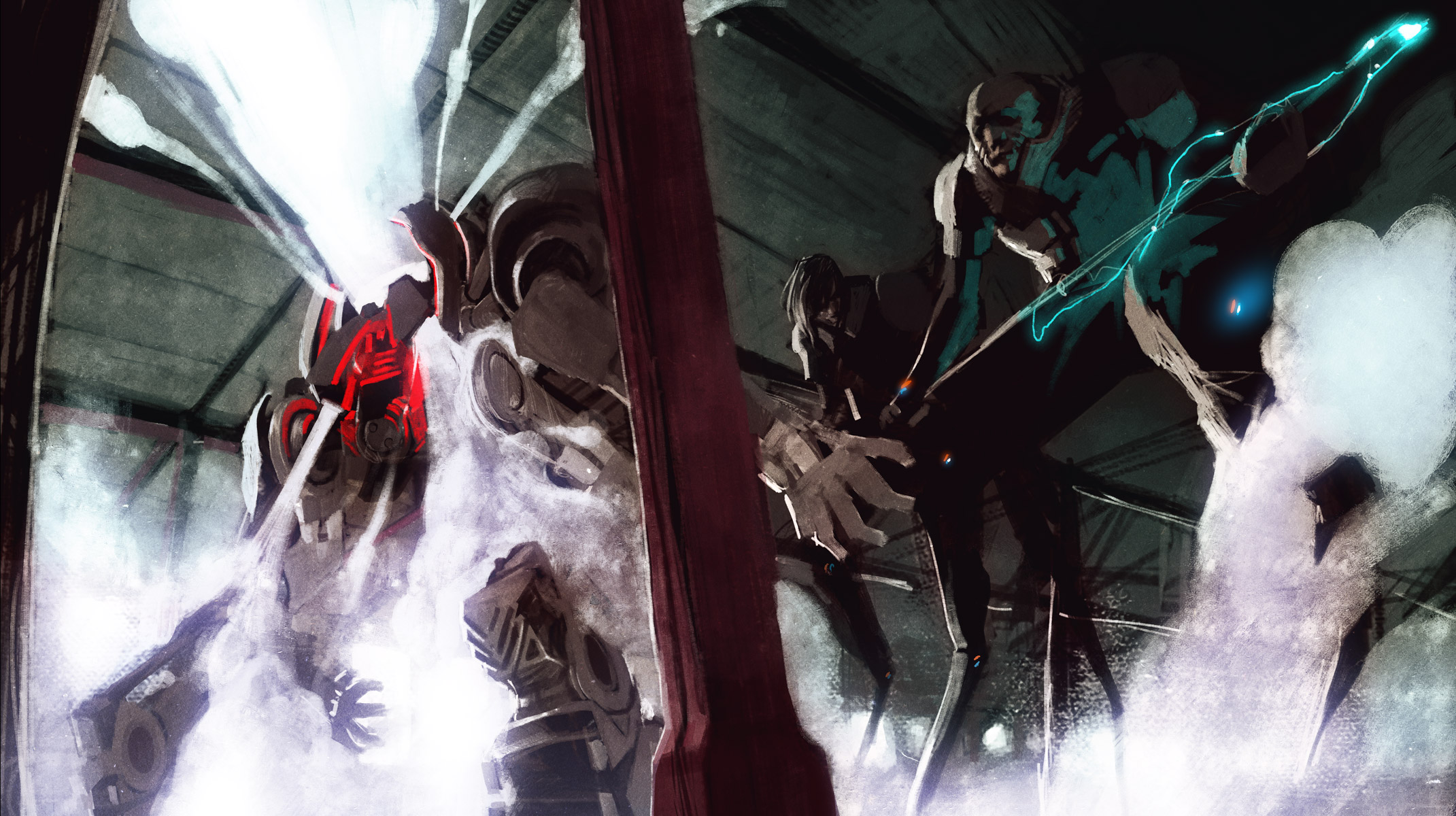
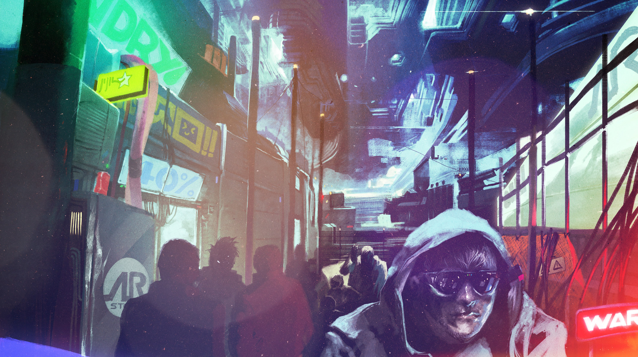
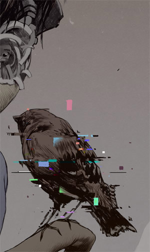
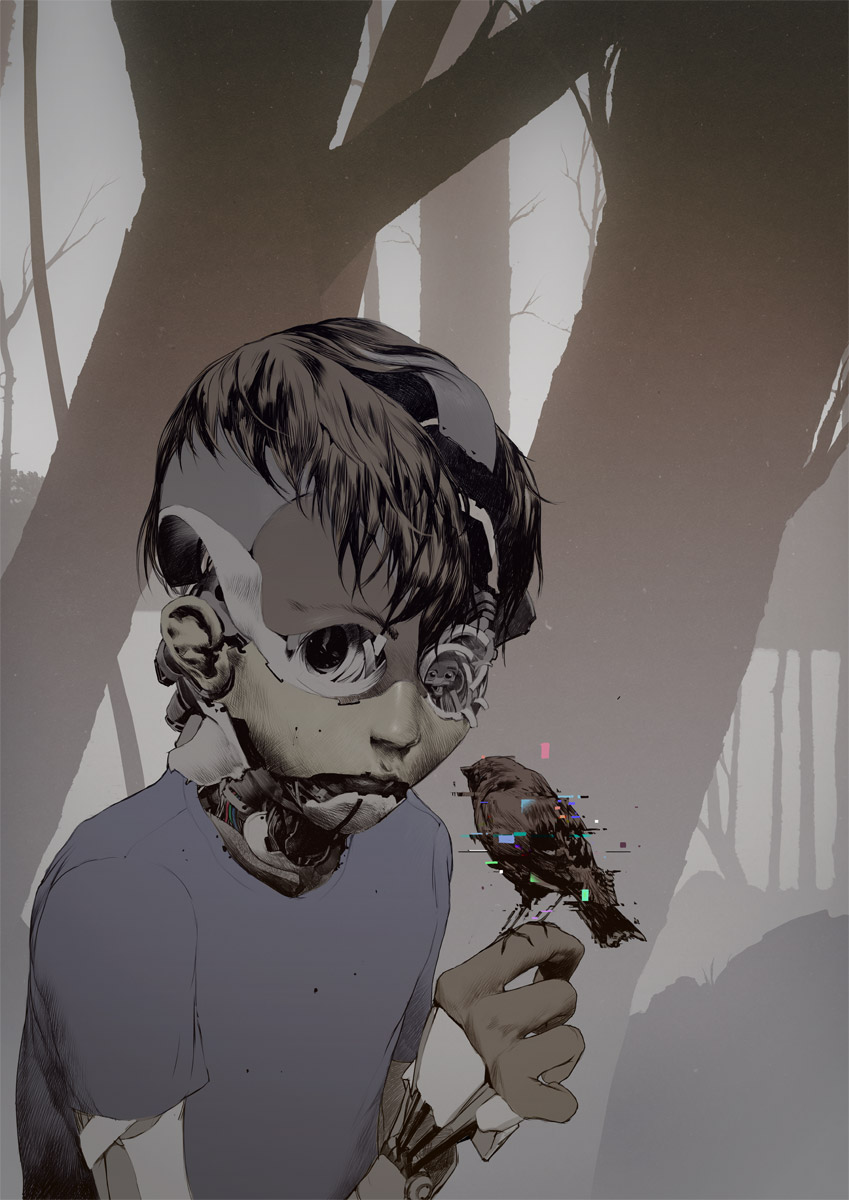
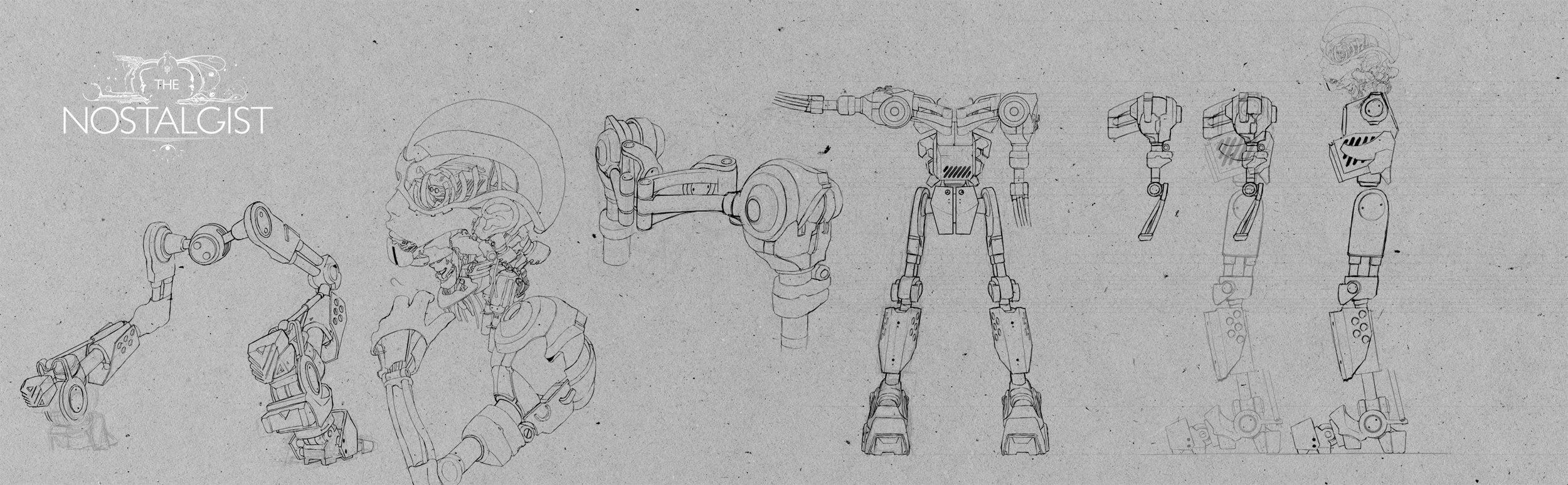
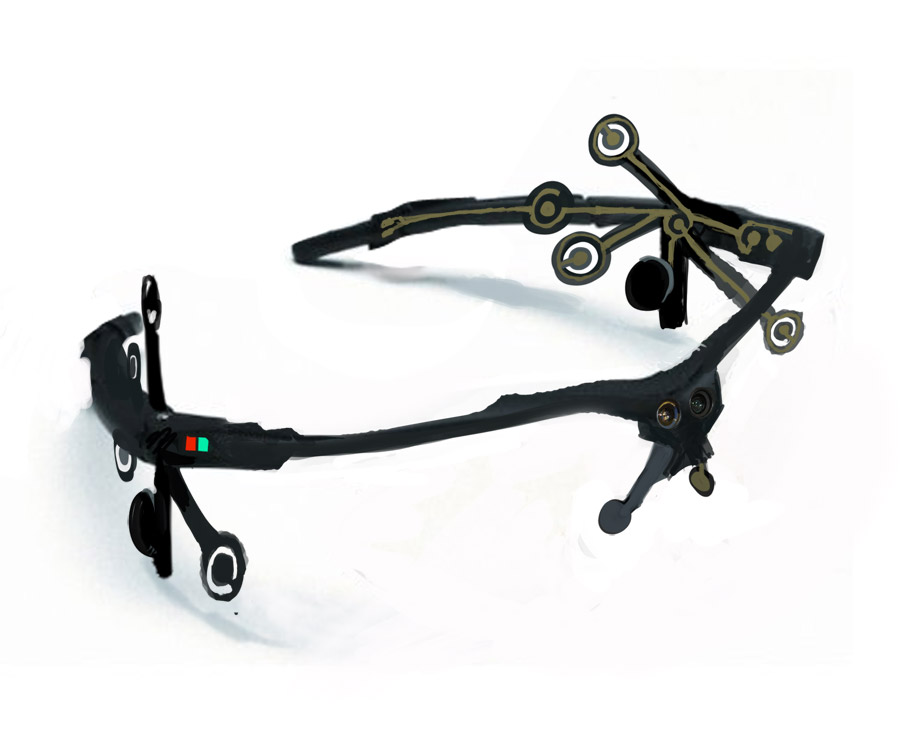
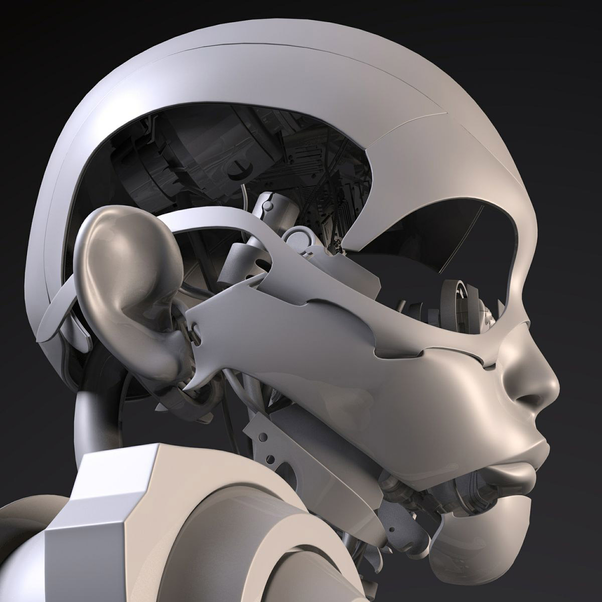
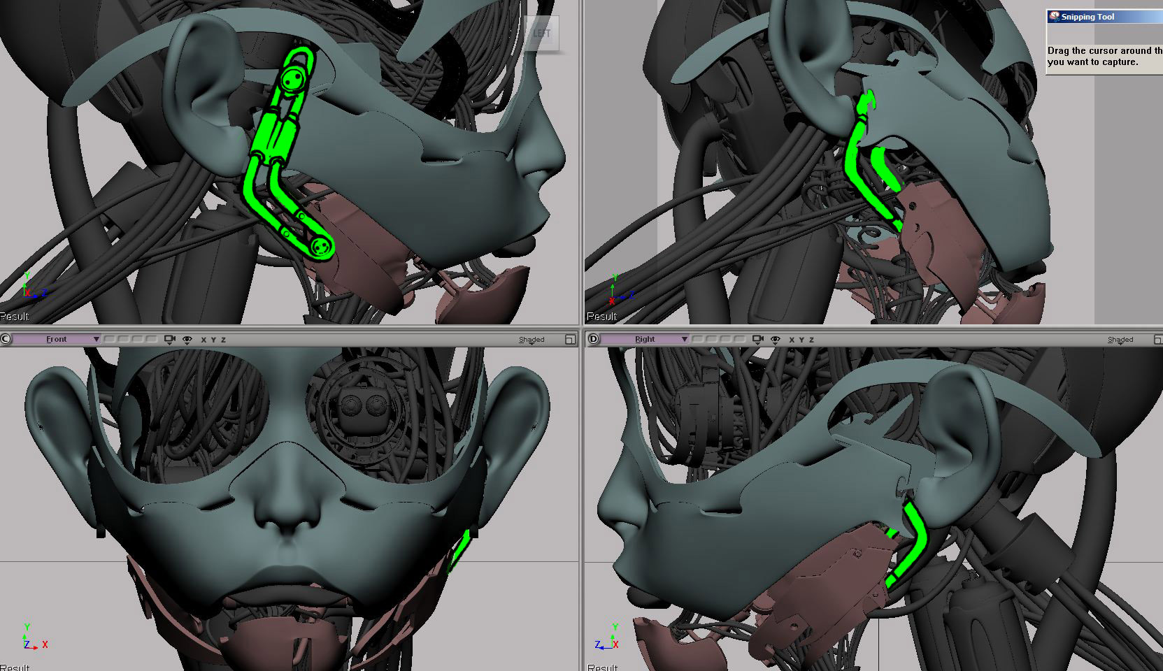
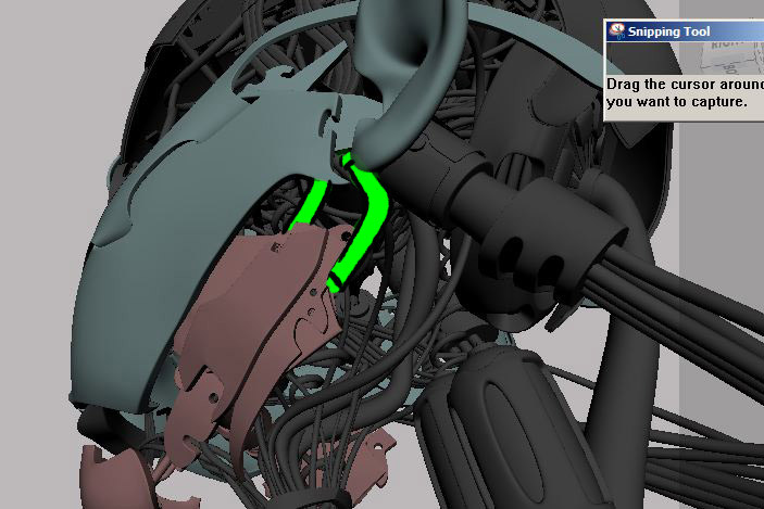
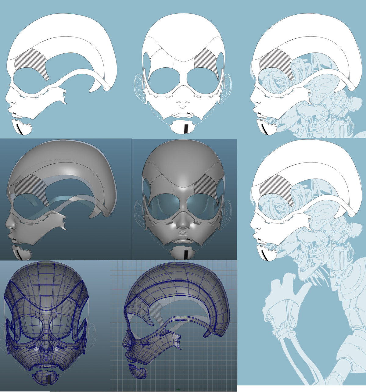
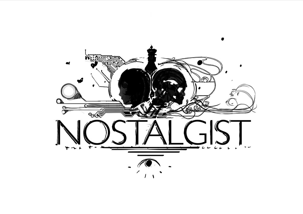
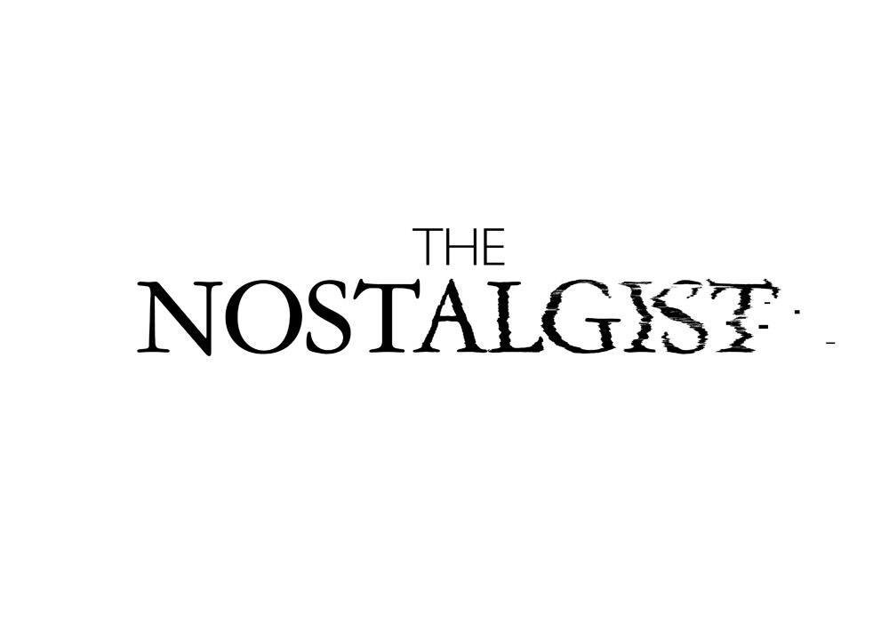
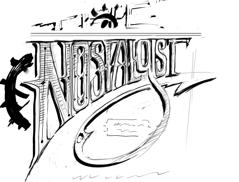
My contribute to this incredible effort by a marvelous crew and their visionary director was the creation of some visual assets in the concept art field: I mainly designed the little robot and visualized the militiamen. Did the movie poster and logo too. It was great taking part to this journey, seeing what a passionate bunch of great people can do. Hope you'll like it!
From "The Nostalgist" Wiki Page:
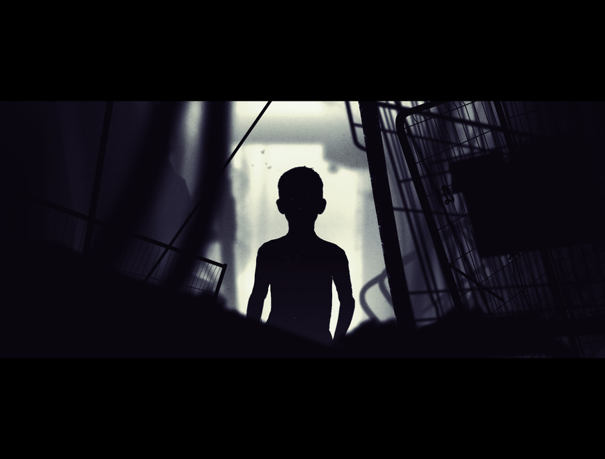
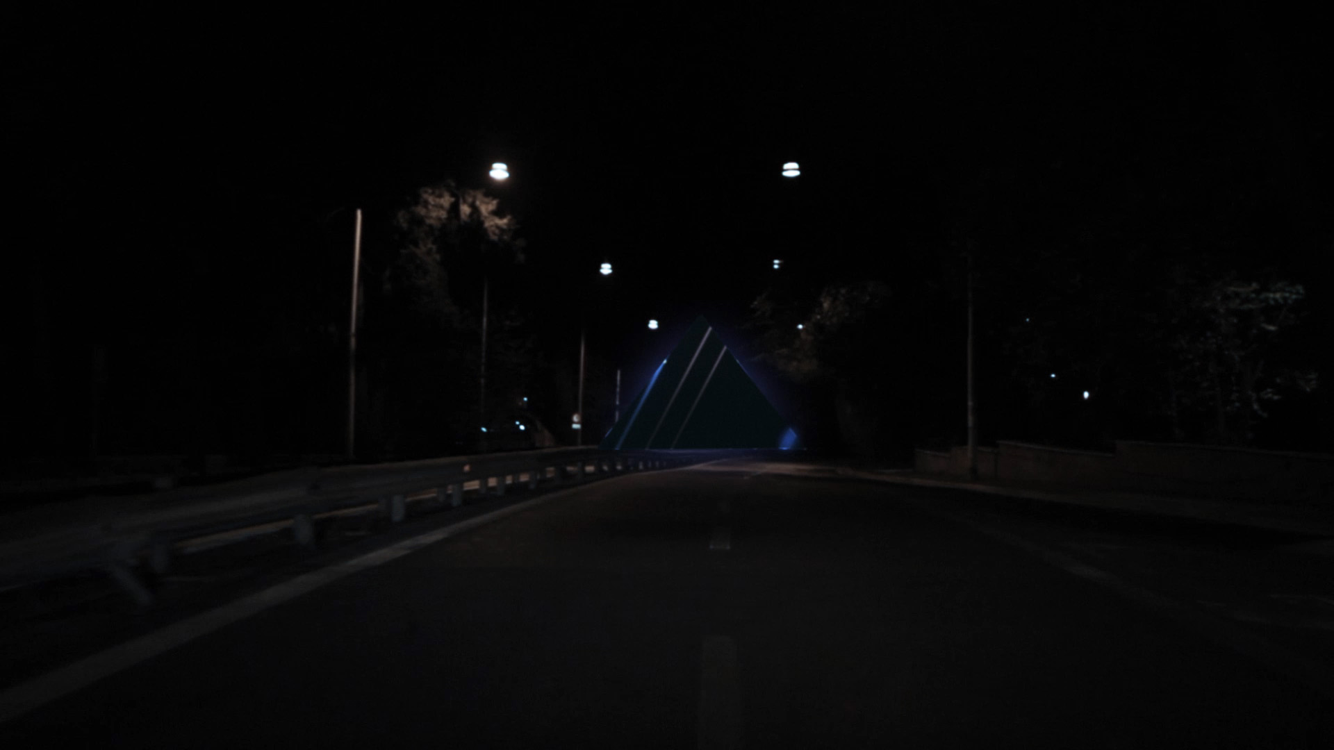
The Nostalgist is a 2014 science fiction short film, written and directed by Giacomo Cimini, based on the short story The Nostalgist by Daniel H. Wilson.It was produced by Giacomo Cimini, Tommaso Colognese and Pietro Greppi for Wonder Room Productions. It stars Lambert Wilson as the father and Samuel Joslin as the son. The short film was filmed in London and explores the themes of loss, nostalgia and robotics. It is noted for its performances and visual effects.
The short film was partially financed through a Kickstarter campaign.
The short film premièred Jun 19, 2014 at the Palm Springs International Festival of Short Films and went on to participate in the Fantastic Fest 2014, the Clermont-Ferrand International Short Film Festival 2015 and the Cleveland Film Festival 2014.
It later had a limited release in the United States and Russia.
It also premièred as video on demand on the We Are Colony on-line platform in October 2014.
The short film was included in the short film programme Cult of the BFI London Film Festival 2014.
In 2014 it won the Méliès d’Argent, the Audience Awards at Trieste Science+Fiction and Utopiales, as well as Best Short Film at the Giffoni Film Festival 2014.
The short film was selected for the Short Takes section of the December 2014 issue of the American Cinematographer.
Awards:
2nd place Best Short Film over 15 minutes - Palm Springs International Festival of Short Films 2014.
Best Short Film (Generator +18) - Giffoni Film Festival 2014.
Prix du Publique - Utopiales, Festival International de Science Fiction 2014.
Méliès d’Argent and Audience Award - Trieste Science + Fiction Festival.
Best Sci-Fi Short film - 28th Leeds International Film Festival.
Best Professional Short Film over 10 minutes - Raw Science Film Festival.
Goon films | Logo animation
Gabriele Mainetti is a director and producer from Rome, owner of GOON Films.
"Lo chiamavano Jeeg Robot" his first feature movie, is out now as I write (february 25th), so he needed a logo animation for his own production company.
He called me to take care of it and so this little piece of animation was born.
The topic, "GOON", was somehow very weird.
1.
Informal. a hired hoodlum or thug.
2.Slang.
a stupid, foolish, or awkward person.
a roughneck.
Goon is a negative term, no doubt about it.
Driven by an idea of violence, stupidity.
Goons are outcasts, violent people.
Movies, however, tell us people's stories, their lives and the reasons behind their personalities.
A story that shows us what brought a man to a blatantly wrong choice rather than a right one It's more interesting for sure, because we firmly think we would never act like him in the first place.
Good movies allow us to see people's soul, they take us away from places where we feel at home, confident.
Good movies show us that people who initially look weird to us are often beautiful, unique people.
Weird people can be dreamers that went too far for our idea of being "good".
I tried, as I have been requested to do, to exalt, or to contradict by contrast, metaphorize, coddle this apparently two-dimensional word.
Behind a weird guy or a "bad" choice doesn't necessarily hide bad story.
As an extra: I didn't go straight for the final version.
I usually start with three different takes on the same thread when a client asks me to develop a corporate ID.
I love to give them the widest spectrum of choice, with VERY different takes.
I developed a STRAIGHT, a HUMOROUS and a OXYMORONIC proposals.
So, I started with a self explanatory, straight version.
A bad on bad take.
The knuckle duster proposal.
Then I went for a more funny, cute one.
The "ugly hero" take.
Then the final one, where GOON word is juxtaposed in the sequence after a young boy spotting us in the dark:
Is he an outcast?
Is he a survivor?
Is he protecting his people or is he all alone?
Is he a scavenger or is he out for a great adventure?
Is it the future or is it the past?
What's the story behind this young boy looking at us?
CREDITS:
The GOON: Stefano Calcaterra
Music: Gabriele Mainetti
Photography: Andrea Camandona
Studio: Talent's
Sound FX: Mirko Perri
Mixing and delivery: In House post Roma
Goon films Logo animation
Gabriele Mainetti is a director and producer from Rome, owner of GOON Films.
"Lo chiamavano Jeeg Robot" his first feature movie, is out now as I write (february 25th), so he needed a logo animation for his own production company.
He called me to take care of it and so this little piece of animation was born.
The topic, "GOON", was somehow very weird.
1.
Informal. a hired hoodlum or thug.
2.Slang.
a stupid, foolish, or awkward person.
a roughneck.
Goon is a negative term, no doubt about it.
Driven by an idea of violence, stupidity.
Goons are outcasts, violent people.
Movies, however, tell us people's stories, their lives and the reasons behind their personalities.
A story that shows us what brought a man to a blatantly wrong choice rather than a right one It's more interesting for sure, because we firmly think we would never act like him in the first place.
Good movies allow us to see people's soul, they take us away from places where we feel at home, confident.
Good movies show us that people who initially look weird to us are often beautiful, unique people.
Weird people can be dreamers that went too far for our idea of being "good".
I tried, as I have been requested to do, to exalt, or to contradict by contrast, metaphorize, coddle this apparently two-dimensional word.
Behind a weird guy or a "bad" choice doesn't necessarily hide bad story.
As an extra: I didn't go straight for the final version.
I usually start with three different takes on the same thread when a client asks me to develop a corporate ID.
I love to give them the widest spectrum of choice, with VERY different takes.
I developed a STRAIGHT, a HUMOROUS and a OXYMORONIC proposals.
So, I started with a self explanatory, straight version.
A bad on bad take.
The knuckle duster proposal.
Then I went for a more funny, cute one.
The "ugly hero" take.
Then the final one, where GOON word is juxtaposed in the sequence after a young boy spotting us in the dark:
Is he an outcast?
Is he a survivor?
Is he protecting his people or is he all alone?
Is he a scavenger or is he out for a great adventure?
Is it the future or is it the past?
What's the story behind this young boy looking at us?
CREDITS:
The GOON: Stefano Calcaterra
Music: Gabriele Mainetti
Photography: Andrea Camandona
Studio: Talent's
Sound FX: Mirko Perri
Mixing and delivery: In House post Roma
ARCHIMEDES, A PLANETARIUM OPERA
Archimedes, a planetarium opera" is a very complex mixed media project by computer music pioneer, performer and composer James Dashow. The opera is about life, works and death of one of the most important and charming personality of physics and mathematics, Archimedes. This project stands out for it's very peculiar form: it's an opera, where music is all computer generated, but with a real choir and actors and computer generated video as a scenography: morevoer video is thought to be projected in a planetarium for a special tridimensional image rendition. The whole opera has several chapters and each of em can have a video track in a very special time/space sync: music has a very complex spatialization process with several audio channels and video sticks to each movement the audio does, creating a very complex multisensorial experience. I was asked by James Dashow to take care of the video for the last part of the opera, the chapter is titled "MATHIII", where archimedes fictionally discovers all of todays explerimental science, like strings, multiverses, black holes and so on. While I was very excited for the project, theme and musics where truly outstanding, I'm not exactly what you could call a science pro so I had to work a lot to get the ideas behind each one of the theories I had to animate. The wholo piece is 16:00 minutes long. Here is a brief Playlist: (00:00) Archimedes starts warming up (1:42) Feynmann diagrams (2:30) Bubble Chamber, Large Hadron Collider (3:25) Chaos, autosimilarity (5:35) Lorentz attractors (6:40) small to micro (7:14) The strings theory (8:31) Penrose tilings (09:29) Big bang, brane theory and parallel universes (11:42) more on parallel universe theory (12:20) Finale, archimedes and the soldier (15:05) Death.
APPROACHING SECTOR X VIDEO
A quick visualization test for an old track of mine. It was the first monomachine + machinedrum only track i've ever made.
QOOB ID3
Doing this work was a real pleasure, as I had the chance to work again with my artistic stepbrother Gianluca Abbate, my colleague and inspiration during the Studio Brutus adventure. Gianluca founded his own Design Firm called ADE Creative Studio along with his old time friend and multitalented music producer Alberto Spezzaferro and worked since day one very closely to QOOB (first known as YOS and FLUX) producing anything they could need for a TV channel. It was a huge work. 2 years passed and they needed a new take on the QOOB identity. Gianluca and Alberto wanted me in for a new twist. I started my creative process trying to stay away from ADE past works for two reasons: it was SO good that I would never do anything better in the same style, change is a change so I tried to break every strong stylistic element ADE did build in two years of work, agreeing with ADE that the old ID grew so rich and without boundaries that it was almost impossible to find a true stylistic guideline.
So I started from the basic writing down a new corporate ID manual for QOOB, slightly altering the logotype structure and extabilishing the rule that changed the game: QOOB logo will not be animated anymore. It will only appear or disappear by unveiling using chromatic additive or negative tricks. I developed then the whole concept behind the typography system: web and TV now could use the same language. Happily used an underline custom version of Helvetica: good typograpy banned underline ornaments from design so it was impossible to have an underline text in a procedural web/video environment. Still I wanted it very badly: underlined linking is very specific of web visual language and being QOOB a user generated TV with a HUGE web based community it was a must to have it coded in their visual DNA.
Then I produced some draft concept videos that ADE presented to Lorenzo Banal (MTV art director) to explain the whole visual idea.
Concept was: from minimal/digital to basic/analog, with a strong back to the broadcast design roots flavour. Gianluca Abbate then did his job, and, as always, delivered the thing of beauty that QOOB ID3 is.
Here I will report directly from ADE Creative Studio webpage:
"At its third identity season refresh the Qoob.tv project, in perennial change, aimed at repositioning its brand so as to become a sort of production factory.
The project was coming of age and was ready to communicate also with an institutional audience, unlike at its first stage when it was mainly addressed to a young audience.
The new identity, created by Ade together with Lorenzo Ceccotti and under the supervision of Mtv and Qoob’s art director Lorenzo Banal, therefore abandoned all modular dissection strategies at the heart of all previous concepts and pointed instead on the solidification of the Qoob brand no longer dissectible nor transformable.
The task of unveiling the brand therefore lay in the additive and subtractive properties of colours with their closed essential geometrical shapes, a concept drawing inspiration from Swiss designer Josef Muller Brockmann’s early works of the 1960s.
As for the fonts, Thermo, planned by Lineto which embodied connotations no longer suitable for the dimensions was put aside in favour of a specially created variation of Helvetica Neue, much more versatile and suitable for the new needs.
Even the sound design shifted towards a softer and more electro-acoustic sound and for the first time a real Sound Logo was produced."
PASSARANI IDENT 2007
Quick Ident.
Yakyuukyou no Uta opening titles + TRON + Furies from The Warriors + Super Street Fighter 2 X.
Music by Marco Passarani.