
First of the year illustration for Agenda Aeterna, an agenda about craziest documented deaths.
Edited by Grrrzetic.

MASTERS OF THE UNIVERSE | ZODAC
I was asked by a super secret client to draw my favourite Masters of the Universe character
Zodac, the walking 2001 monolith. As I child Zodac was the most enigmatic character of the whole series. He wasn't goor evil. He was a god and even He Man was a regular guy compared to him: Zodac used a flying throne to move thru the universe. He is the best.


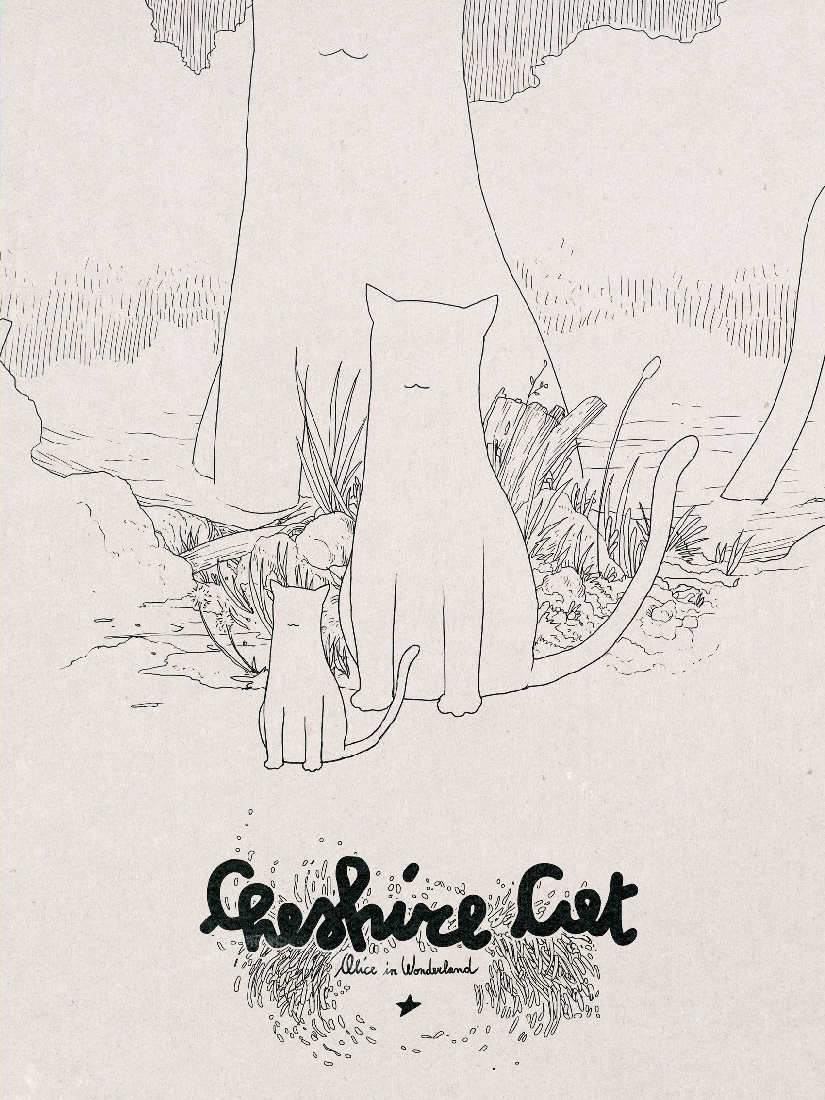

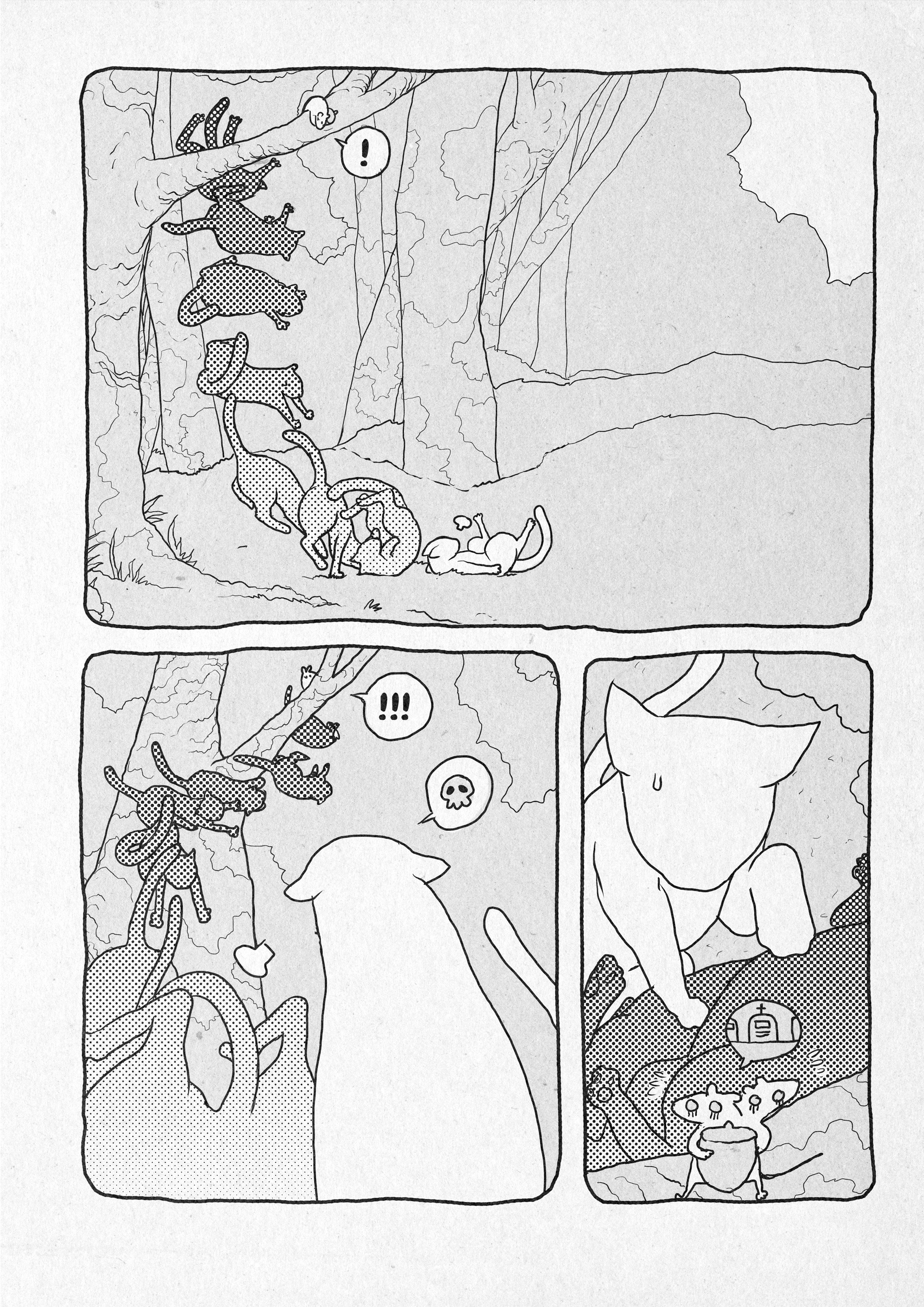
Cheshire Cat
Una storia breve sul gatto del Cheshire pubblicata in “Wonderland, quando Alice se ne andò”, edito da Edizioni NPE.
Dal sito dell’editore:
“Un viaggio nel paese delle meraviglie ma senza la guida disincantata di Alice: un viaggio distorto e schizofrenico attraverso lo specchio, dietro cui ci aspetteranno tutti i personaggi di Wonderland che hanno arricchito l’immaginazione di intere generazioni. Dieci indimenticabili storie in un unico volume firmate da: Lorenzo Bartoli, Alessio Fortunato, Leomacs, Francesca Silveri, Tuono Pettinato, LRNZ, Mauro Uzzeo, Federico Rossi Edrighi, Margherita Tramutoli, Armin Barducci, Sergio Ponchione, Elisabetta Melaranci, Cristina Spanò, Francesco Cattani, Nigraz e Davide Garota.”

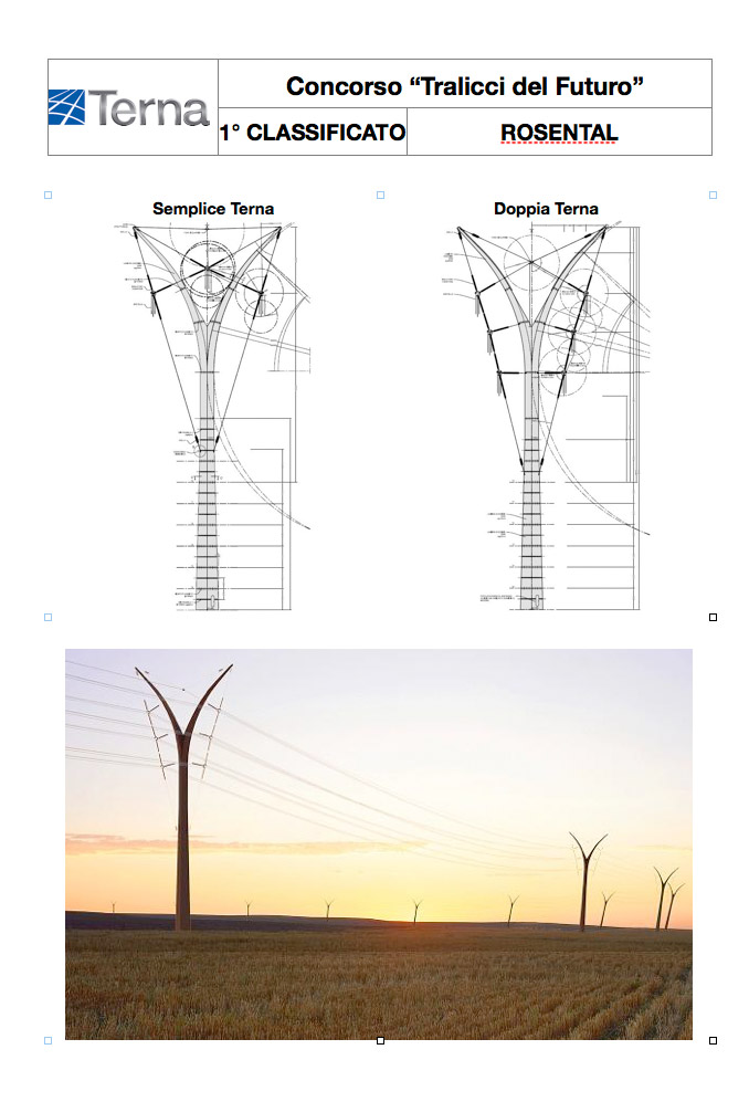
PREMIO TERNA 03


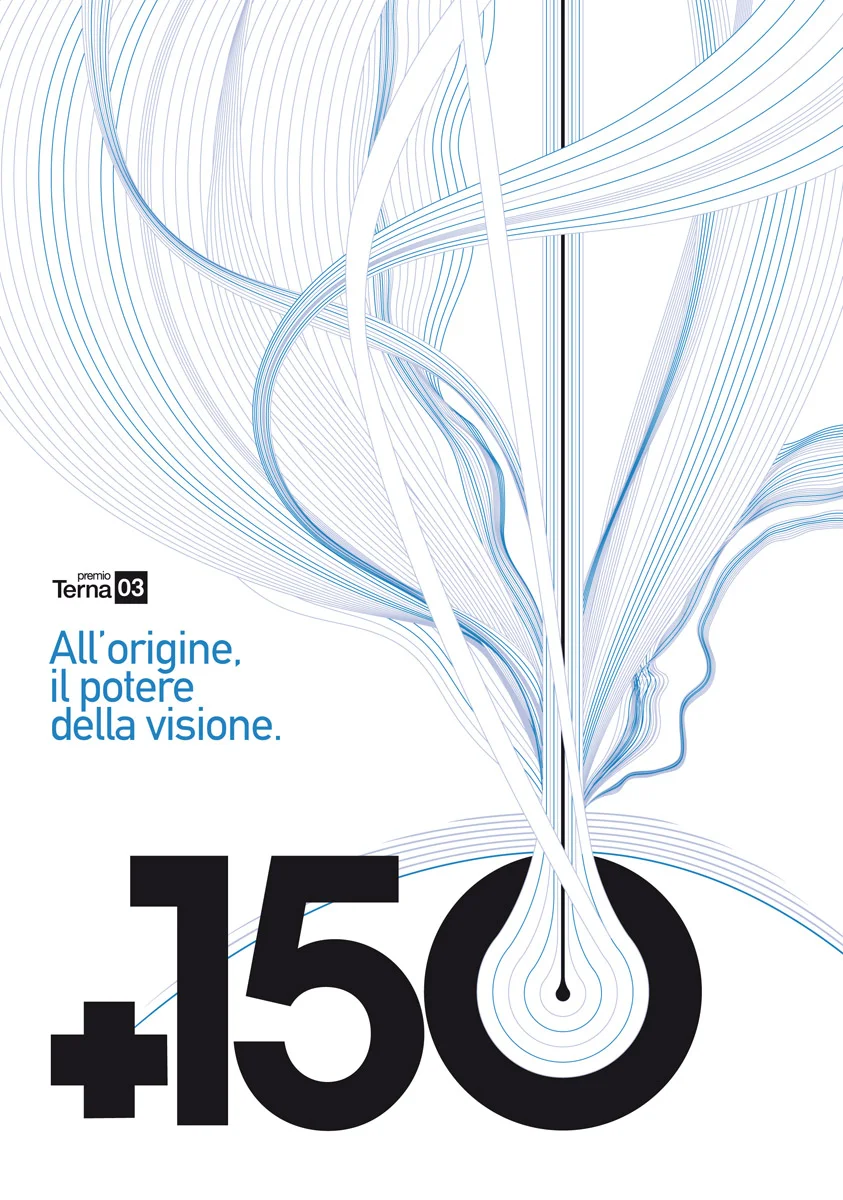


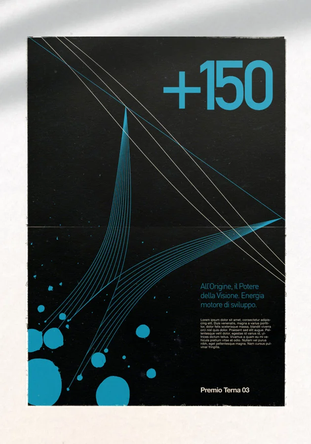
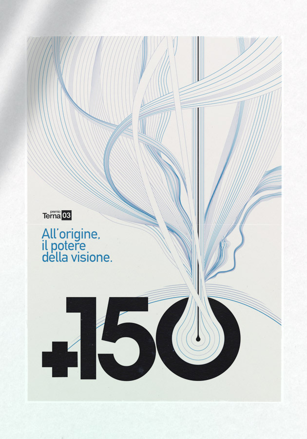


Working for Xister as Creative Director I developed the full identity package for Premio Terna 03. I designed the official image, website, printed and video assets. The official image was set starting from the new terna pylon design (see gallery below). The image has a straight basic look with a very clever use of layout and grid systems. Below you can find the mockups I did to show the client how timeless a functional, basic design can be.
The website was awarded with an IKA award 2011 for the best cultural/educational website of the year.
From the presskit:
"Nasce il portale http://www.premioterna.it/ tutto il mondo dell’arte a portata di click
Il sito del PT si trasforma in una piattaforma multimediale e lancia nuove sezioni e spazi interattivi dove poter mettere in rete le molteplici realtà della art-community
Una galleria d’arte online per gli artisti e una vetrina di opportunità per l’intera comunità del mondo dell’arte contemporanea. E’ il nuovo sito web del Premio Terna, sempre più internazionale nella triplice versione italiana, inglese e cinese, che in occasione della terza edizione del concorso cresce e si arricchisce di contenuti e novità diventando un vero e proprio portale.
NOVITA’. Si arricchisce ulteriormente lo spazio a disposizione dei talenti. La pagina “Profilo d’artista” diventa una vera e propria vetrina personale dove inserire, oltre all’opera iscritta al premio, il proprio curriculum, altri tre lavori e un video rappresentativi del proprio percorso creativo.
La sezione dedicata alle news, inoltre, si trasforma in un vero e proprio contenitore, un magazine consultabile con un click, ilPTMag. Cinque le sezioni attive: AMACI, uno spazio esclusivo dedicato alle iniziative dei 26 musei associati al network, NEWS & EVENTI, le ultimissime dal mondo dell’arte contemporanea, INTERVISTE, un faccia a faccia con i big del settore, artisti affermati e personalità del jet-set, STUDI E INDAGINI, una vera e propria “memoria scientifica” sulla realtà del settore in Italia, SEGNALATI DA VOI, l’area a disposizione di tutti i galleristi, i musei e gli artisti, indipendentemente dalla partecipazione al Premio Terna 03, che intendono proporre mostre ed eventi. In forma gratuita e libera, ognuno potrà suggerire le proprie esposizioni e iniziative di arte contemporanea in Italia e all’estero, accedendo direttamente sul web, previa autenticazione. Basta cliccare sul bottone “Suggerisci Contenuto”, riempire un form, ed ecco tutte le vostre iniziative online sotto gli occhi di un potenziale pubblico di oltre 7milioni di visitatori, tanti gli utenti che hanno navigato sul sito del PT negli ultimi 2 anni.
CONCEPT REVOLUTION. L'impianto di navigazione del materiale redazionale e istituzionale viene ricollocato dallo schedario alla biblioteca, alla mediateca, asciugando e arricchendo al contempo l'esperienza di ricerca con feedback funzionali intuitivi, soluzioni articolate con molta cura nell'interaction design, senza mai abbandonare dove possibile i modelli ergonomici dei media tradizionali. Fra le caratteristiche più peculiari, la possibilità di scegliere il proprio sistema di navigazione preferito, dall'immersivo allo schematico, e la possibilità di analizzare un simbolico DNA dell'opera: infatti ogni lavoro pubblicato sul sito di premio terna viene rappresentato anche da una struttura armonica trifasica che ne illustra le interazioni col pubblico, dando vita ad un vero e proprio organismo indipendente."

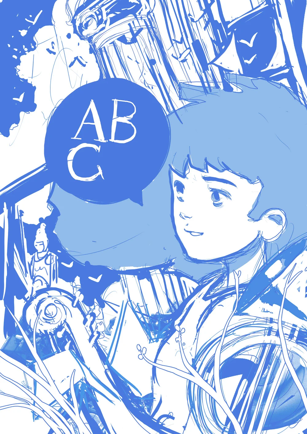
ABC Arte Bellezza Cultura
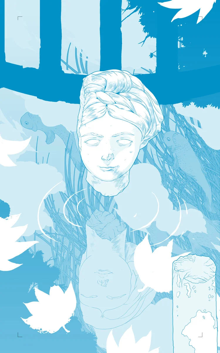
You can buy this work as an A3+ Giclèe Ultrachrome print on Hanemuelhe 310g fine art ultra white rag paper (signed by the author) in the shop section.


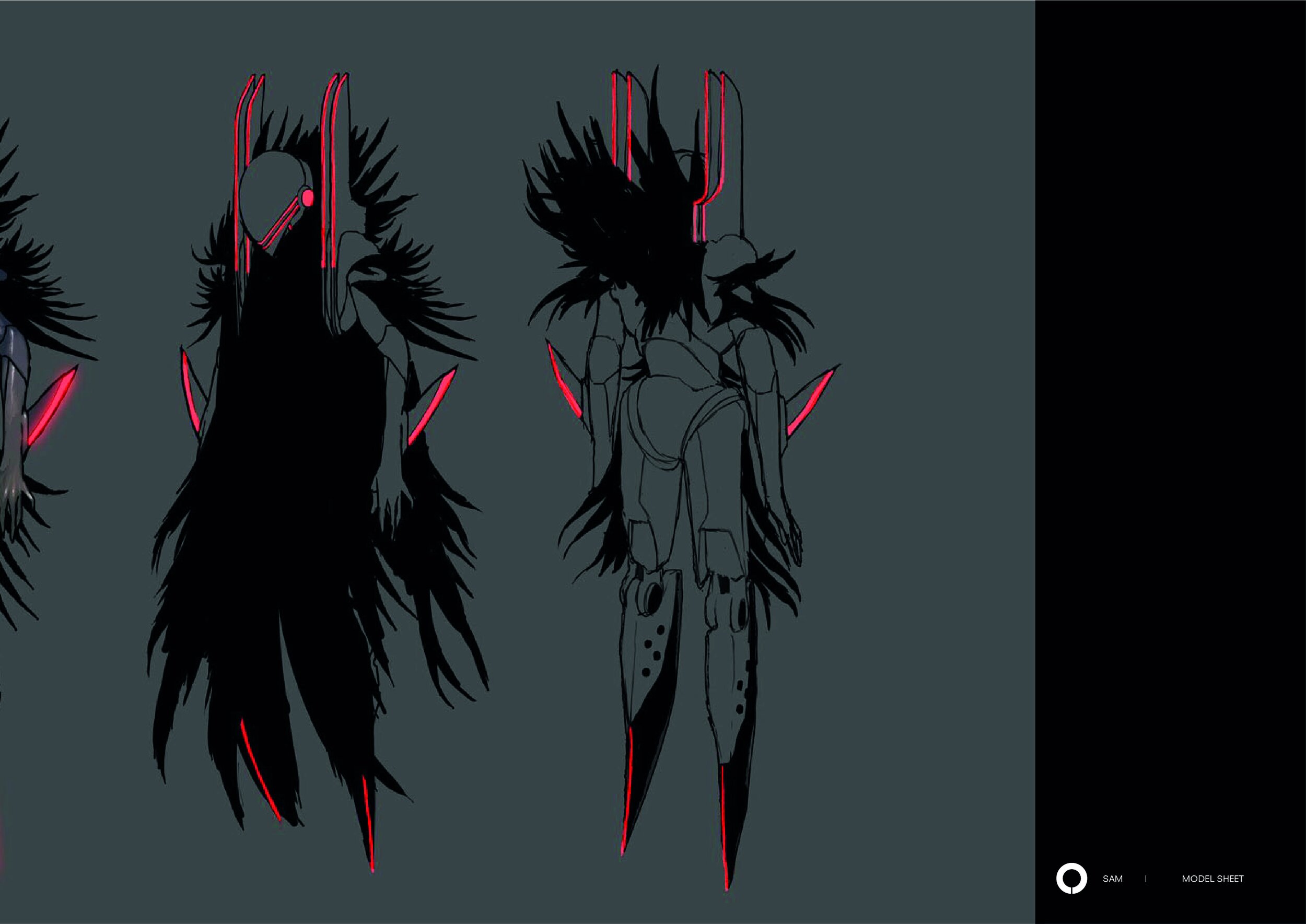
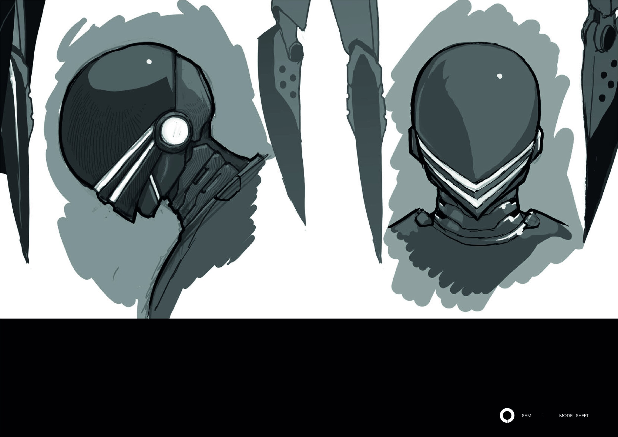

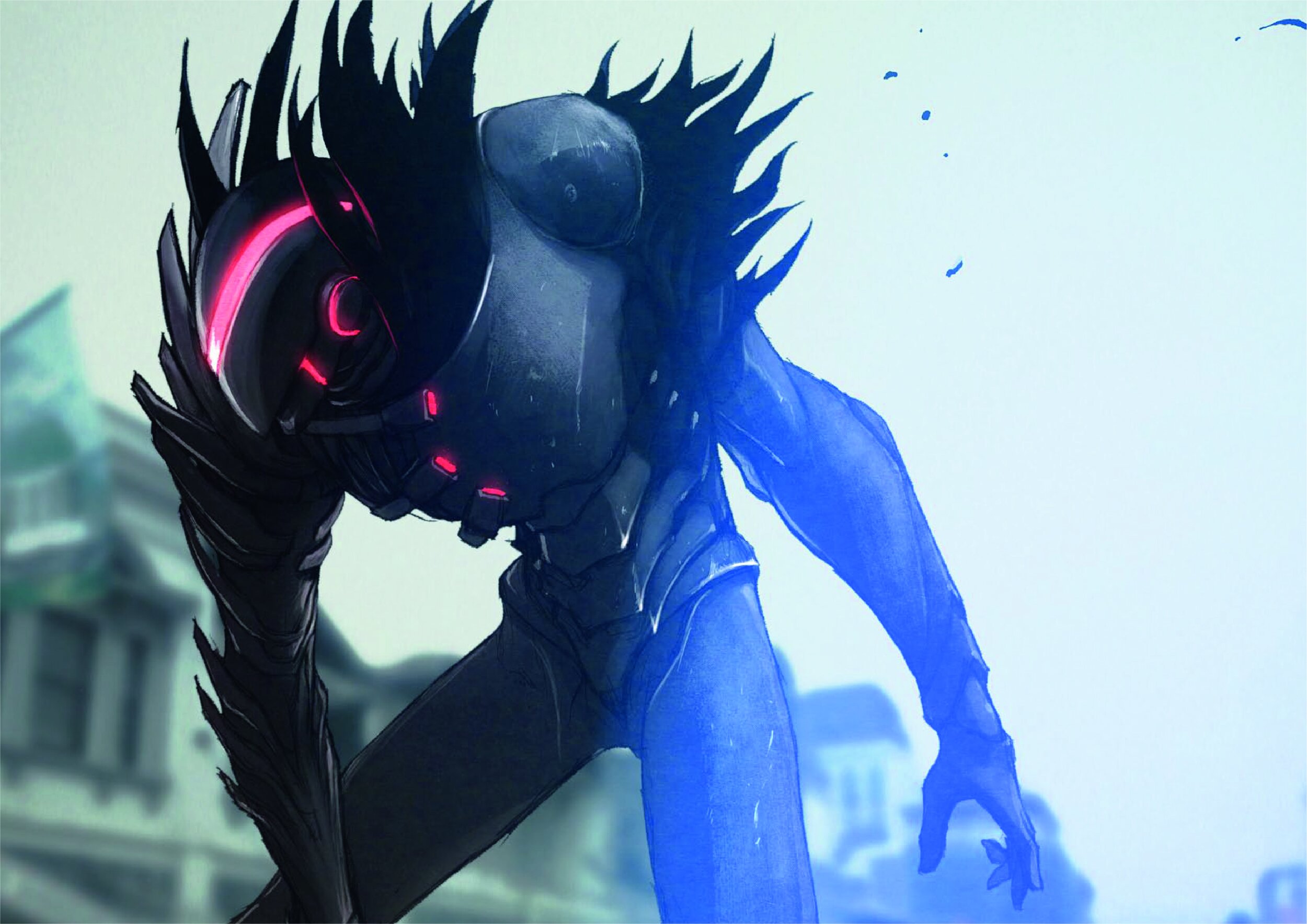
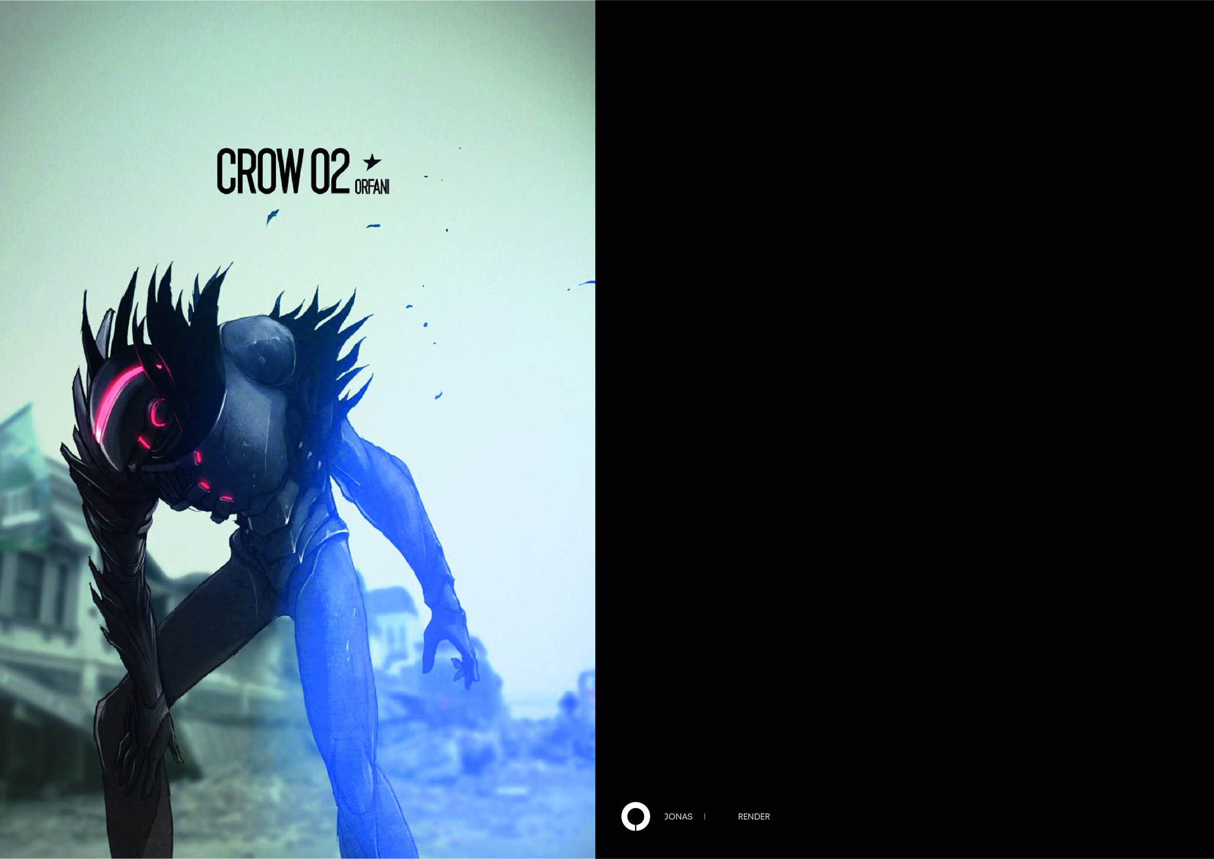

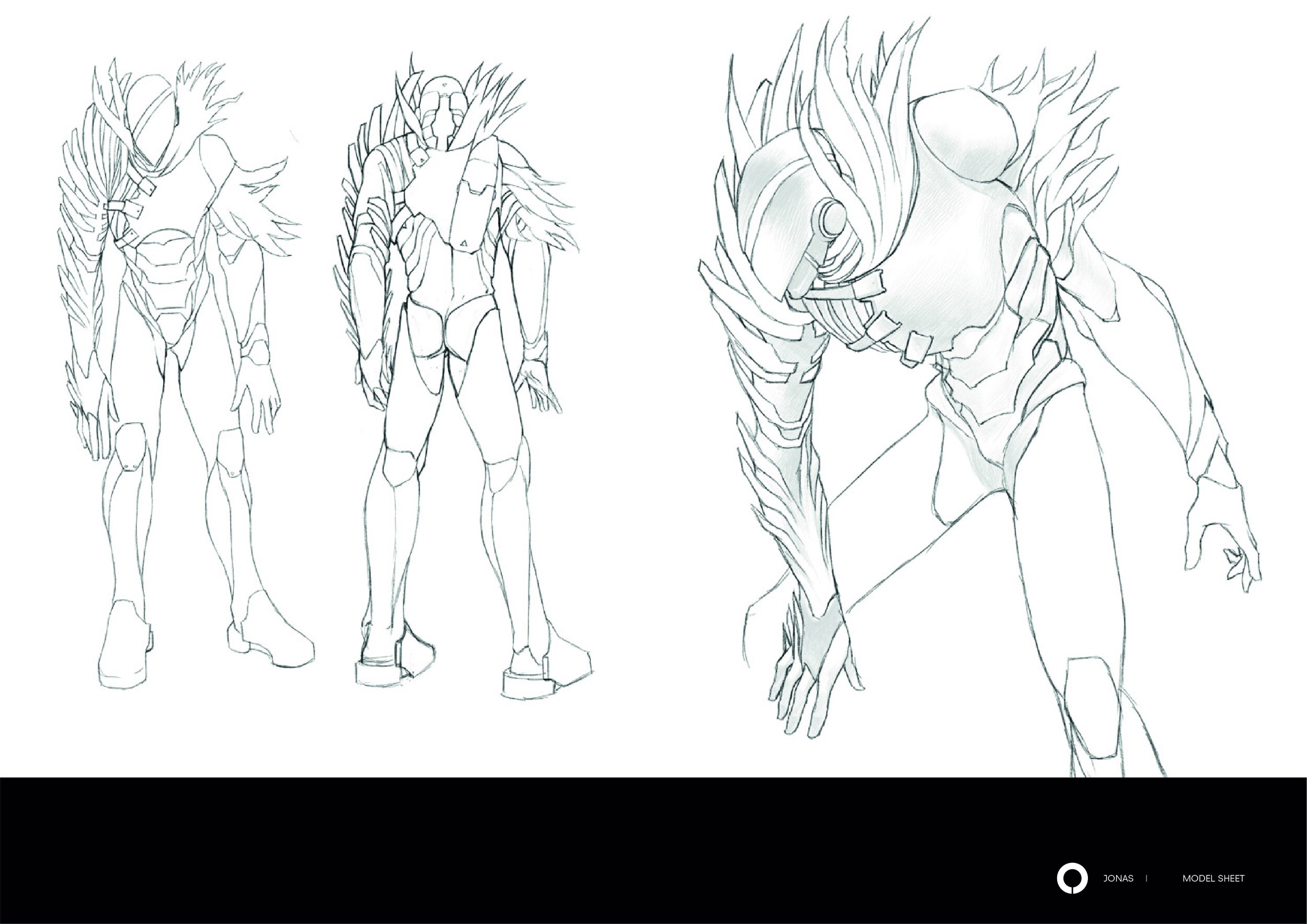
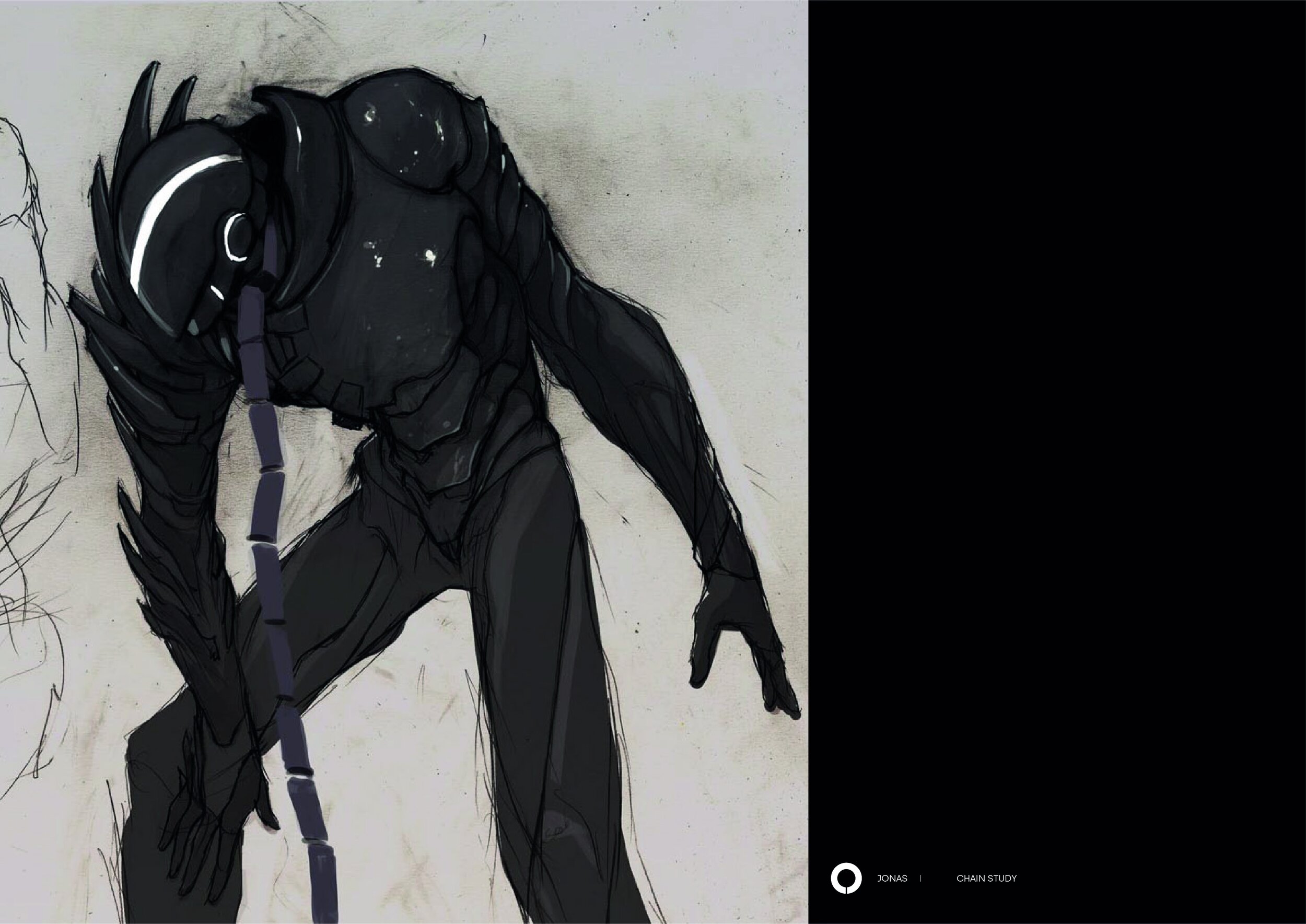
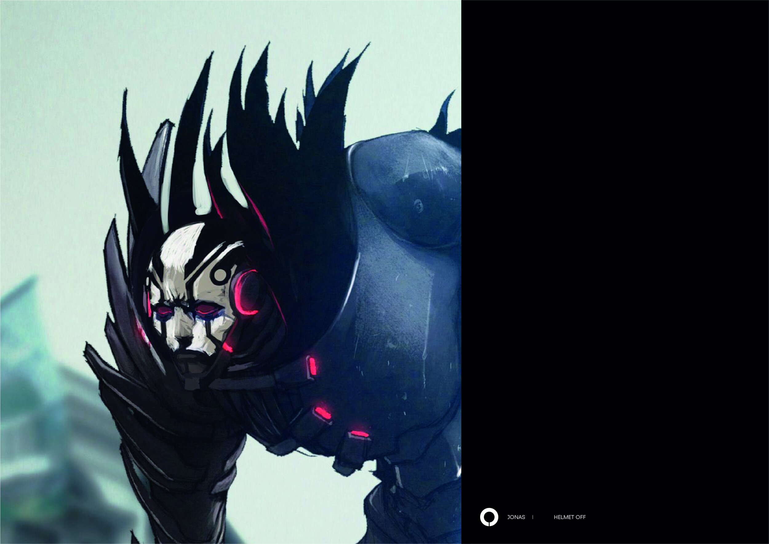

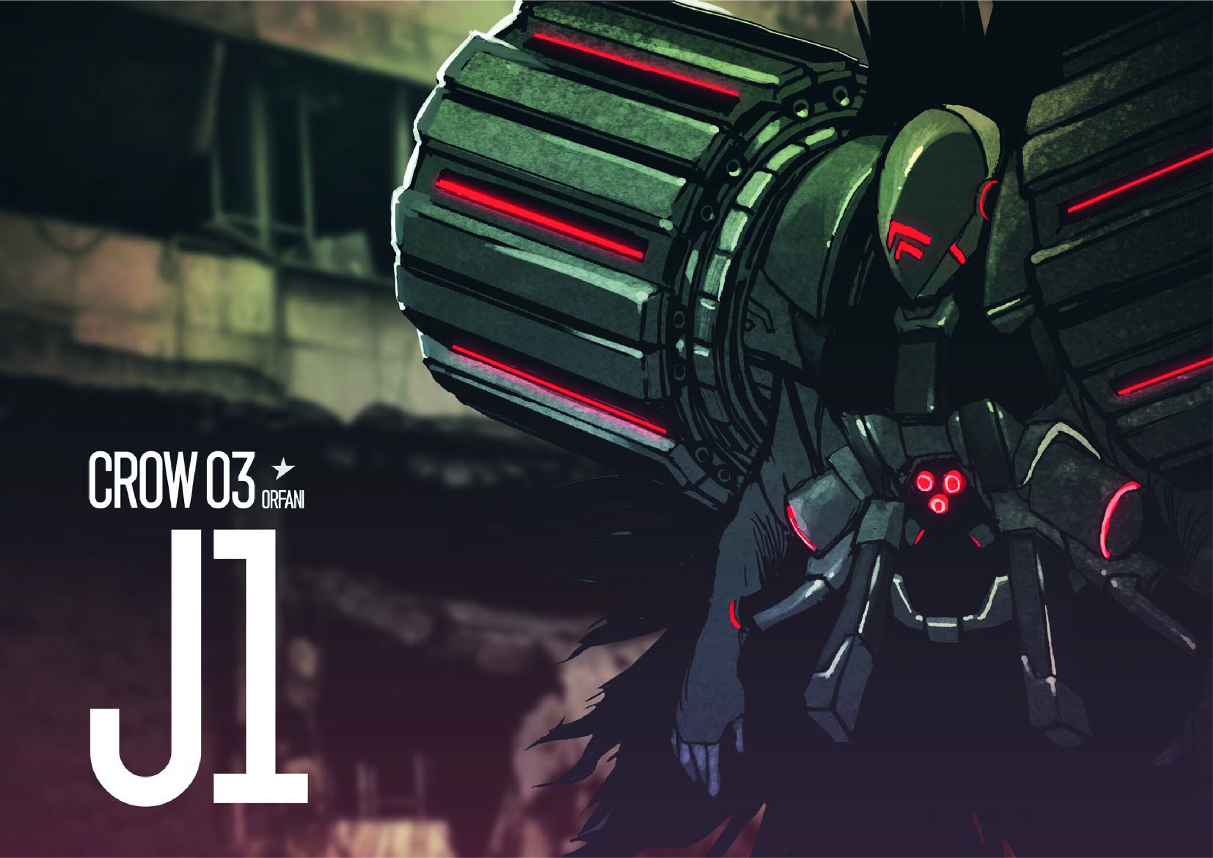
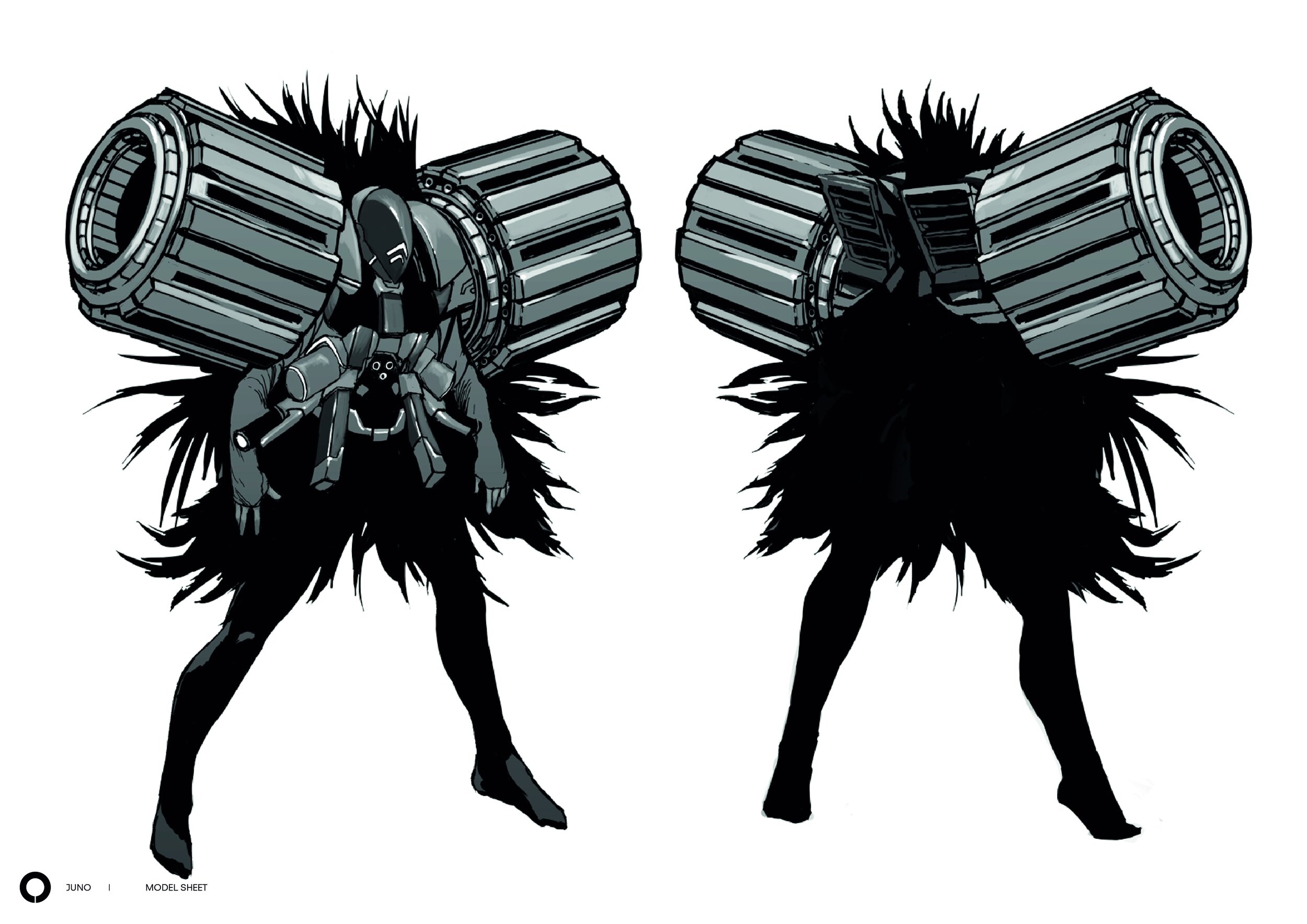
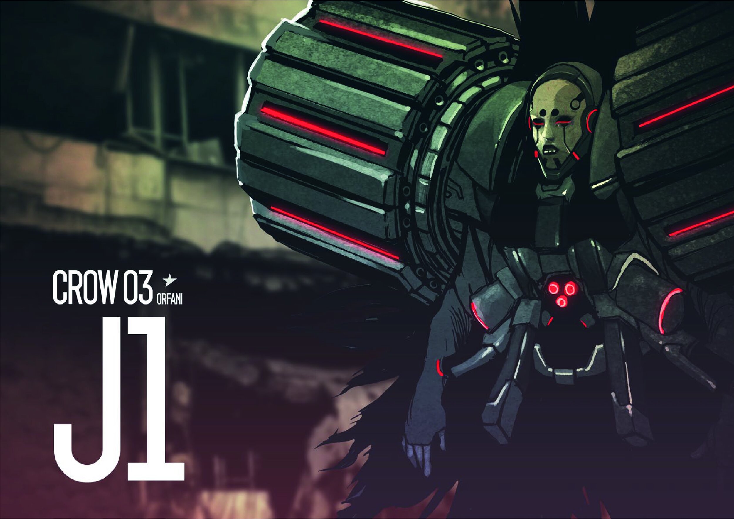
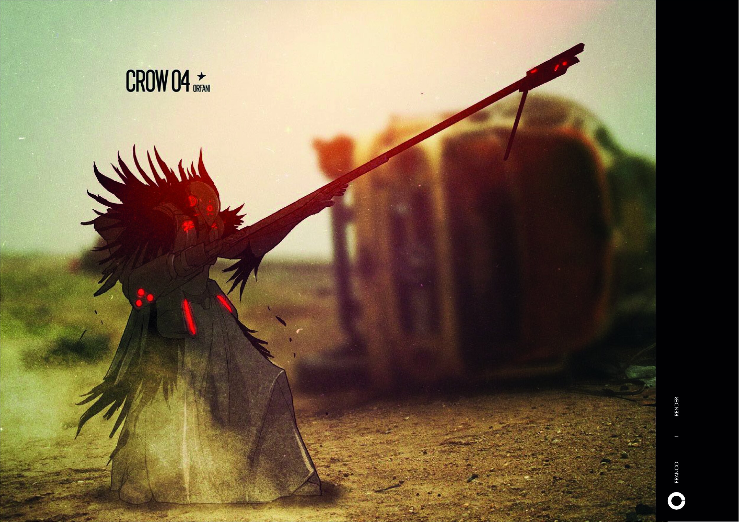

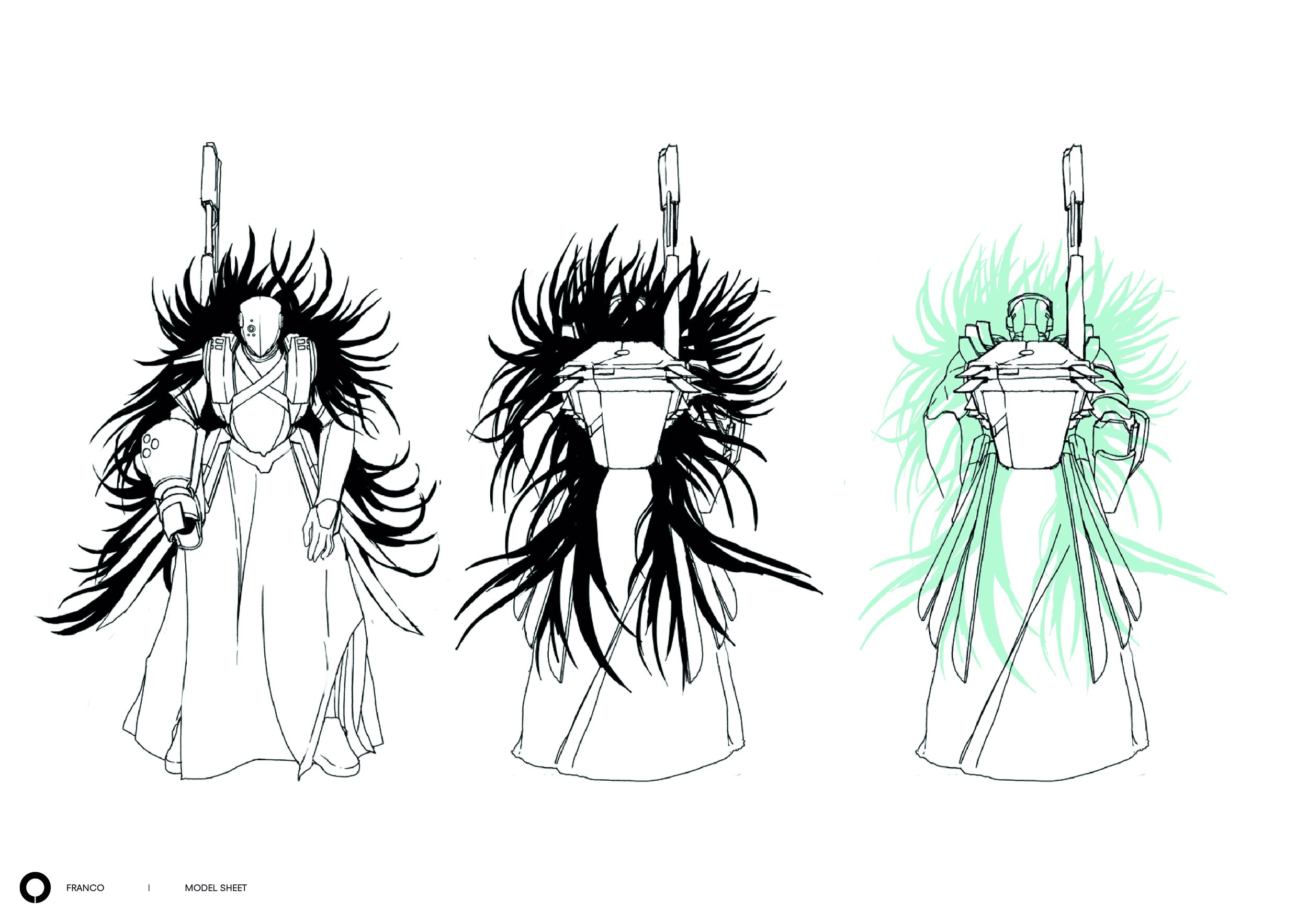
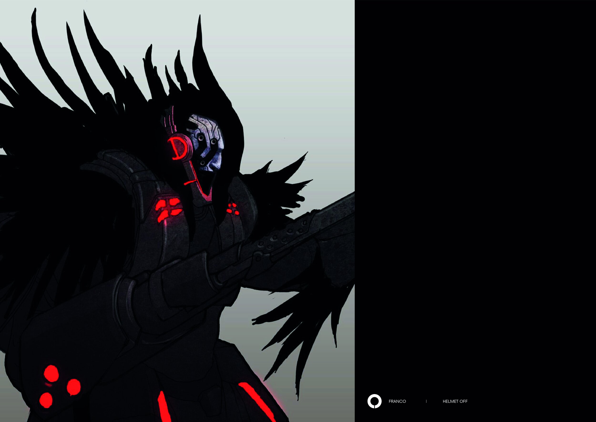
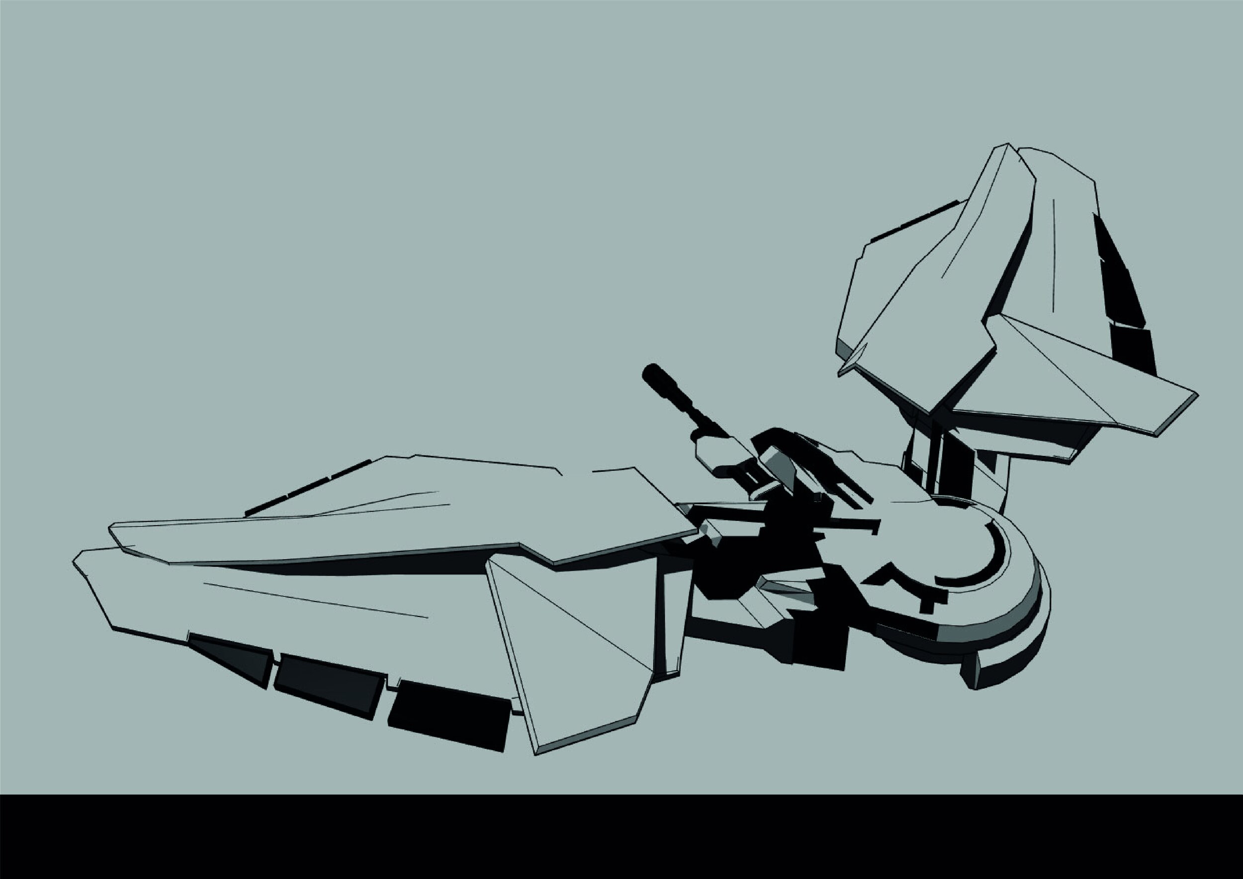
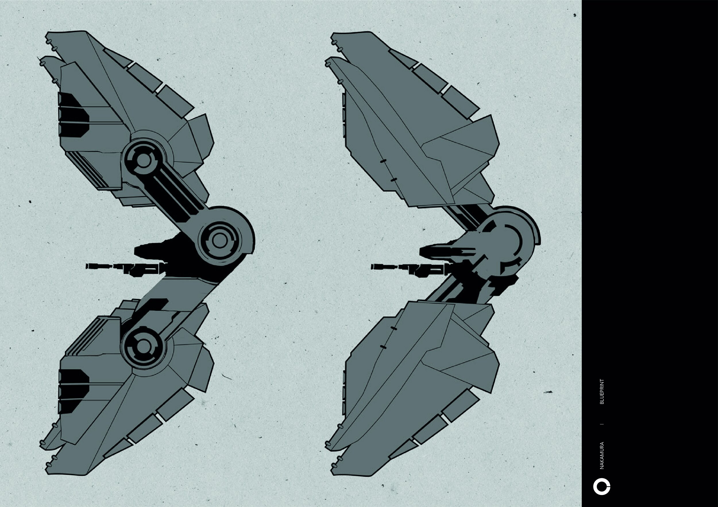

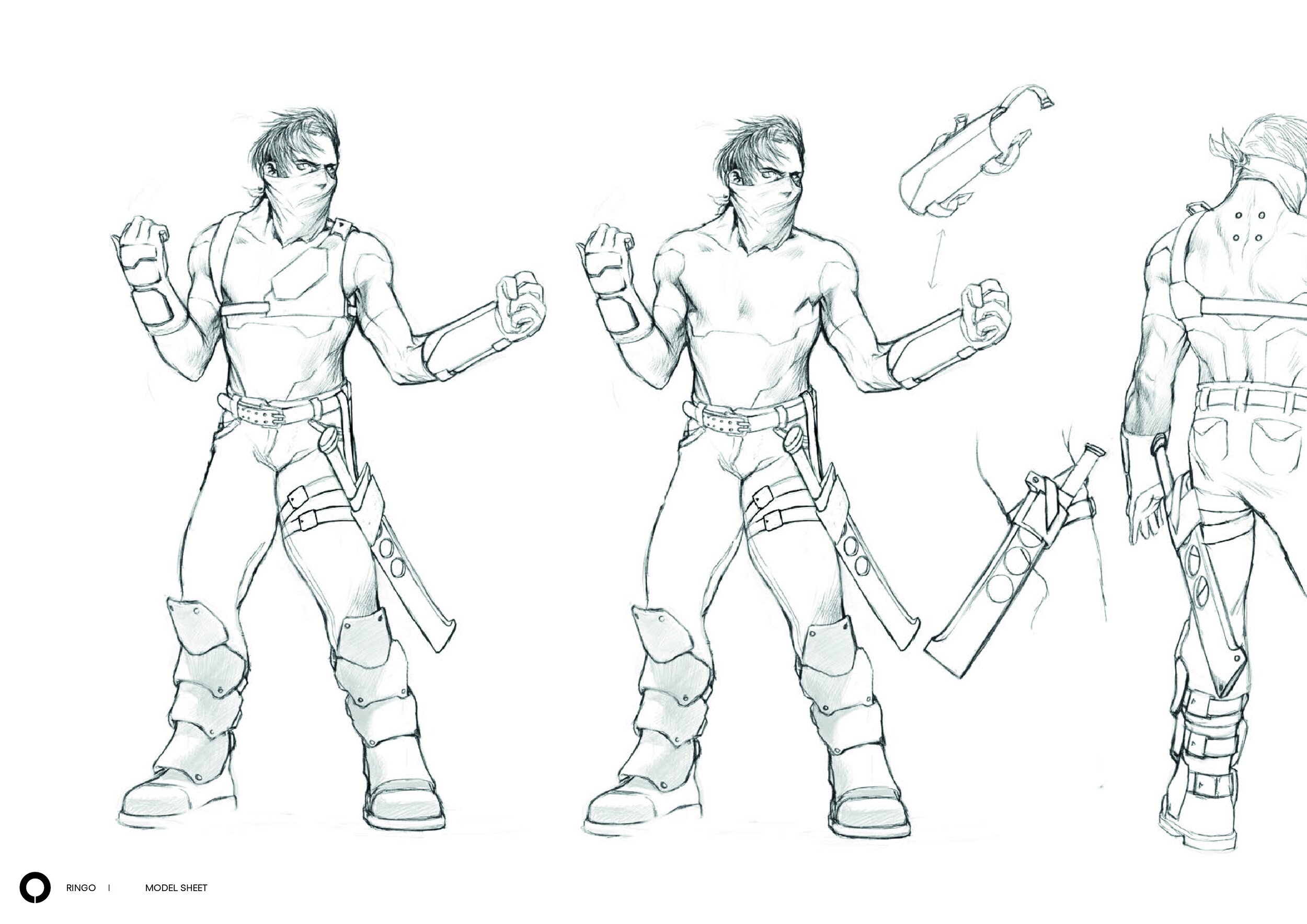
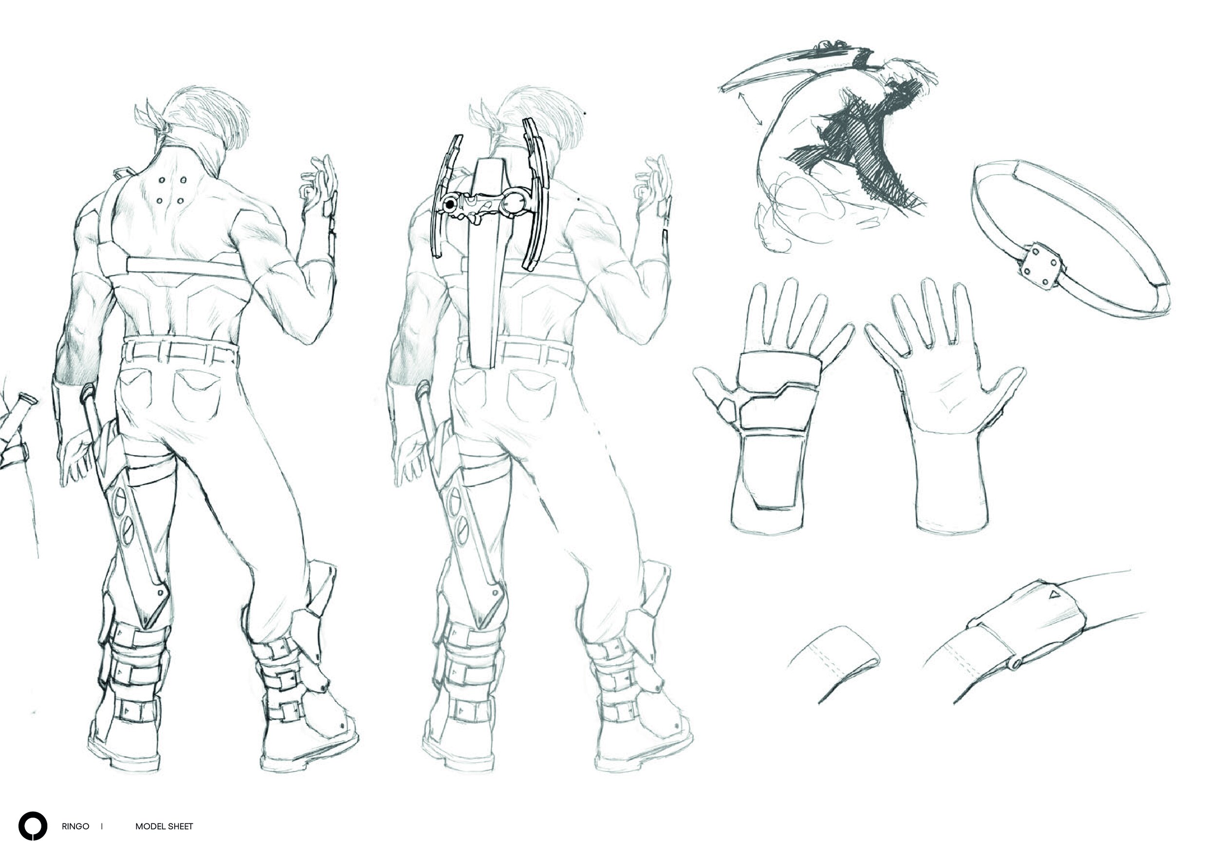

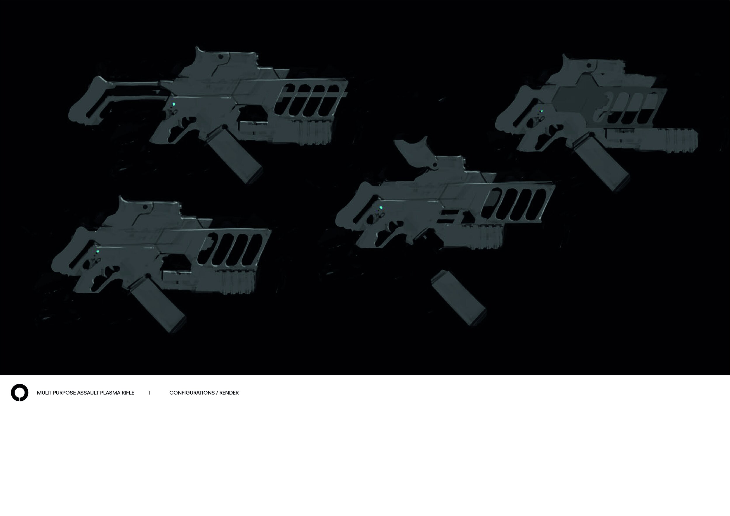

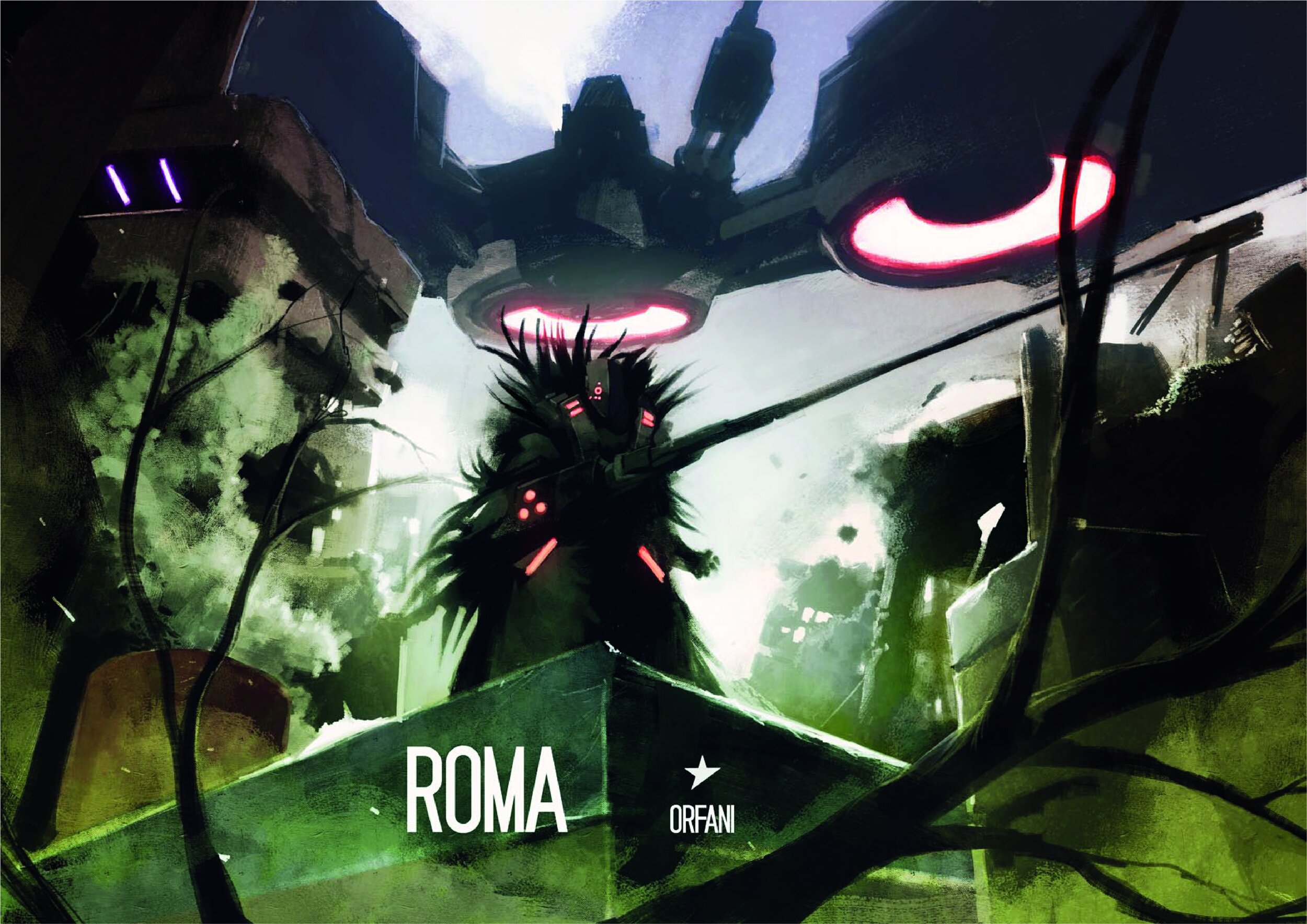
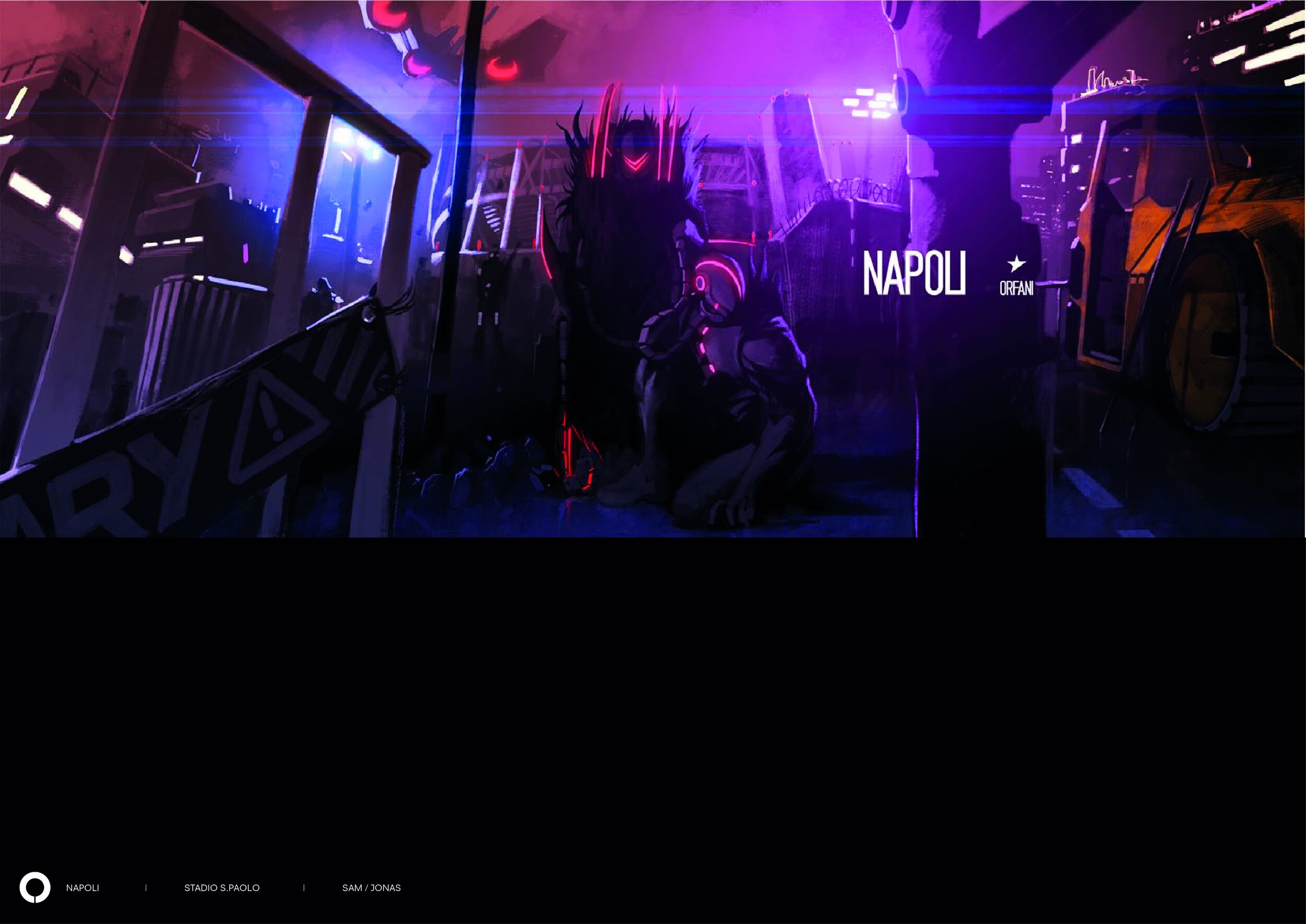
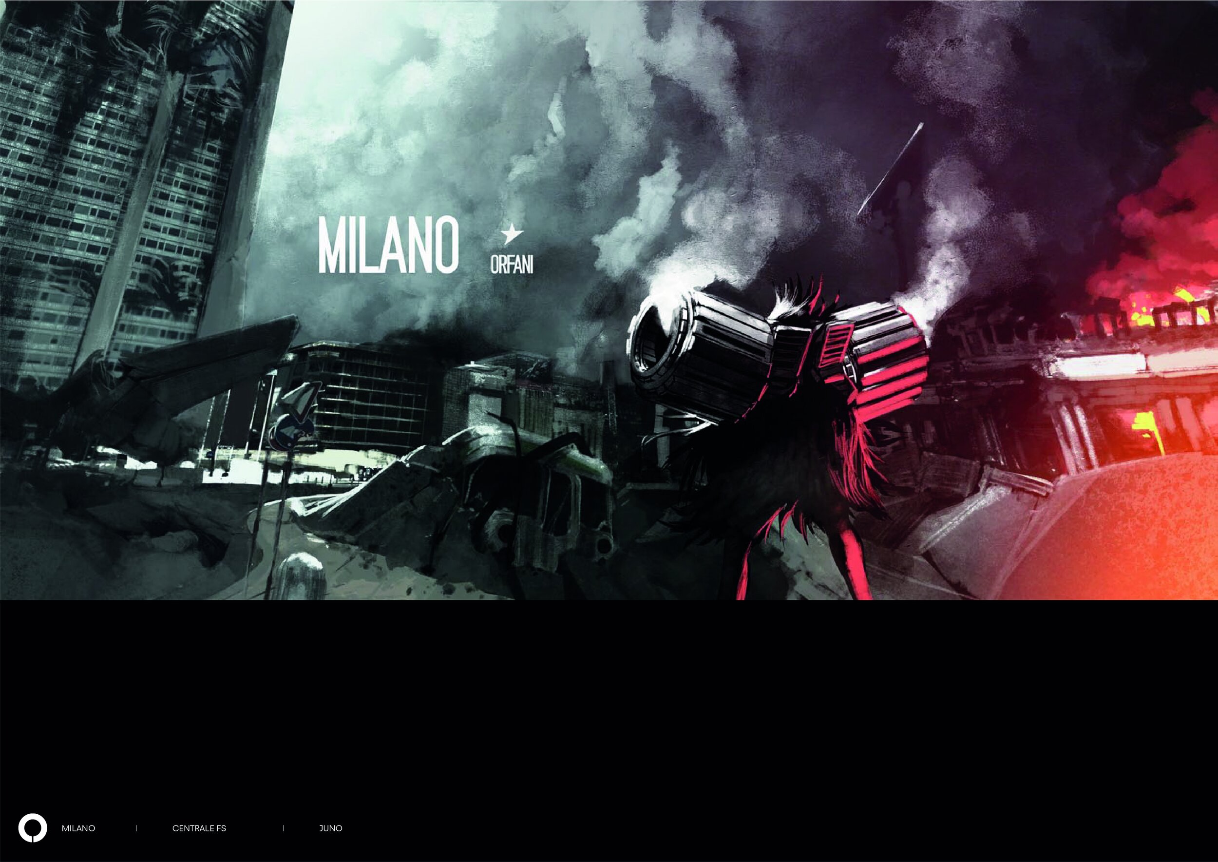

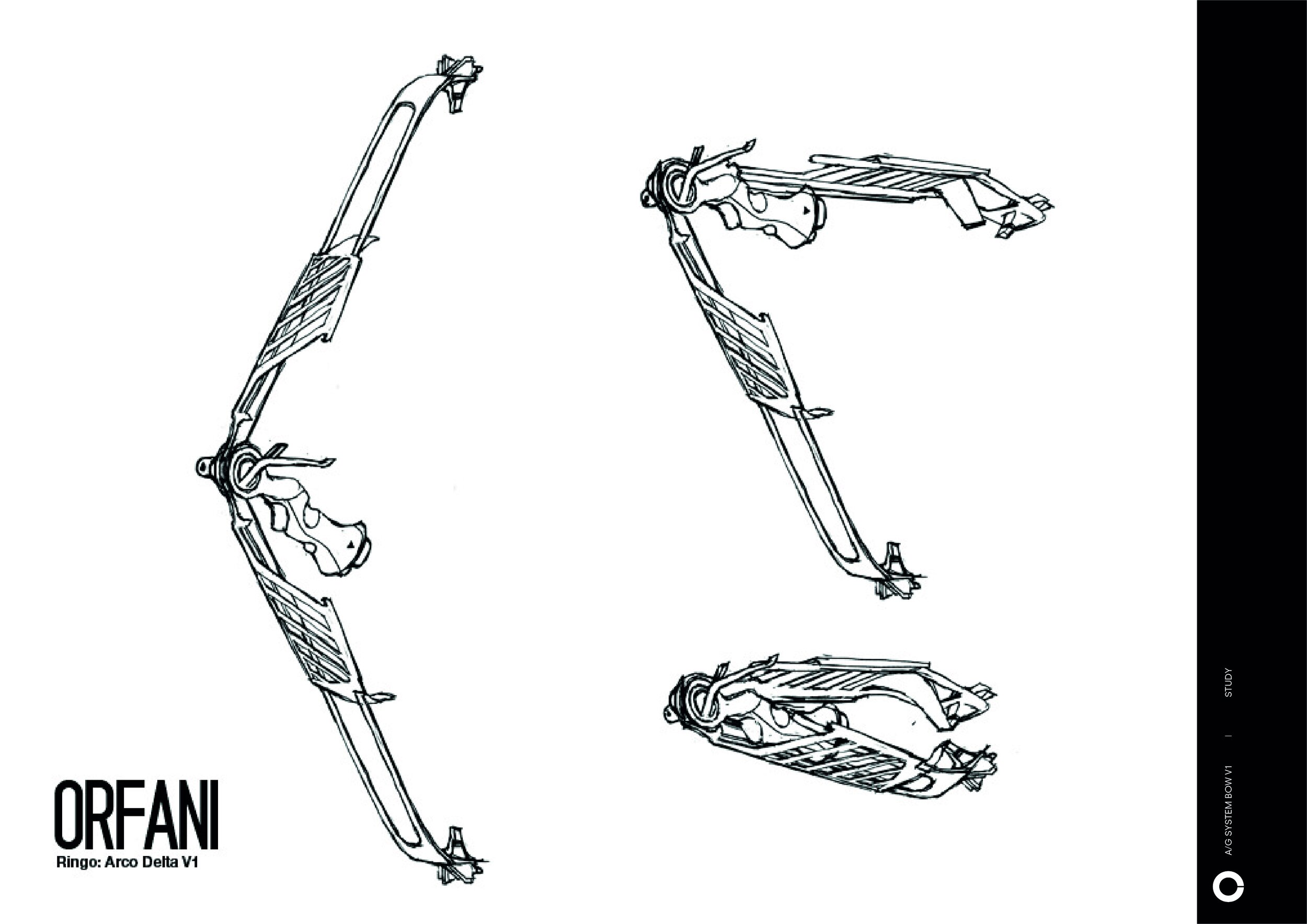
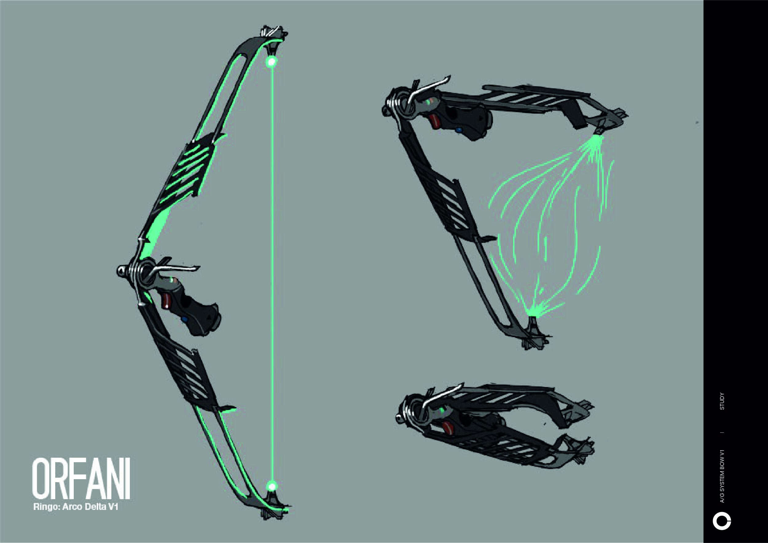
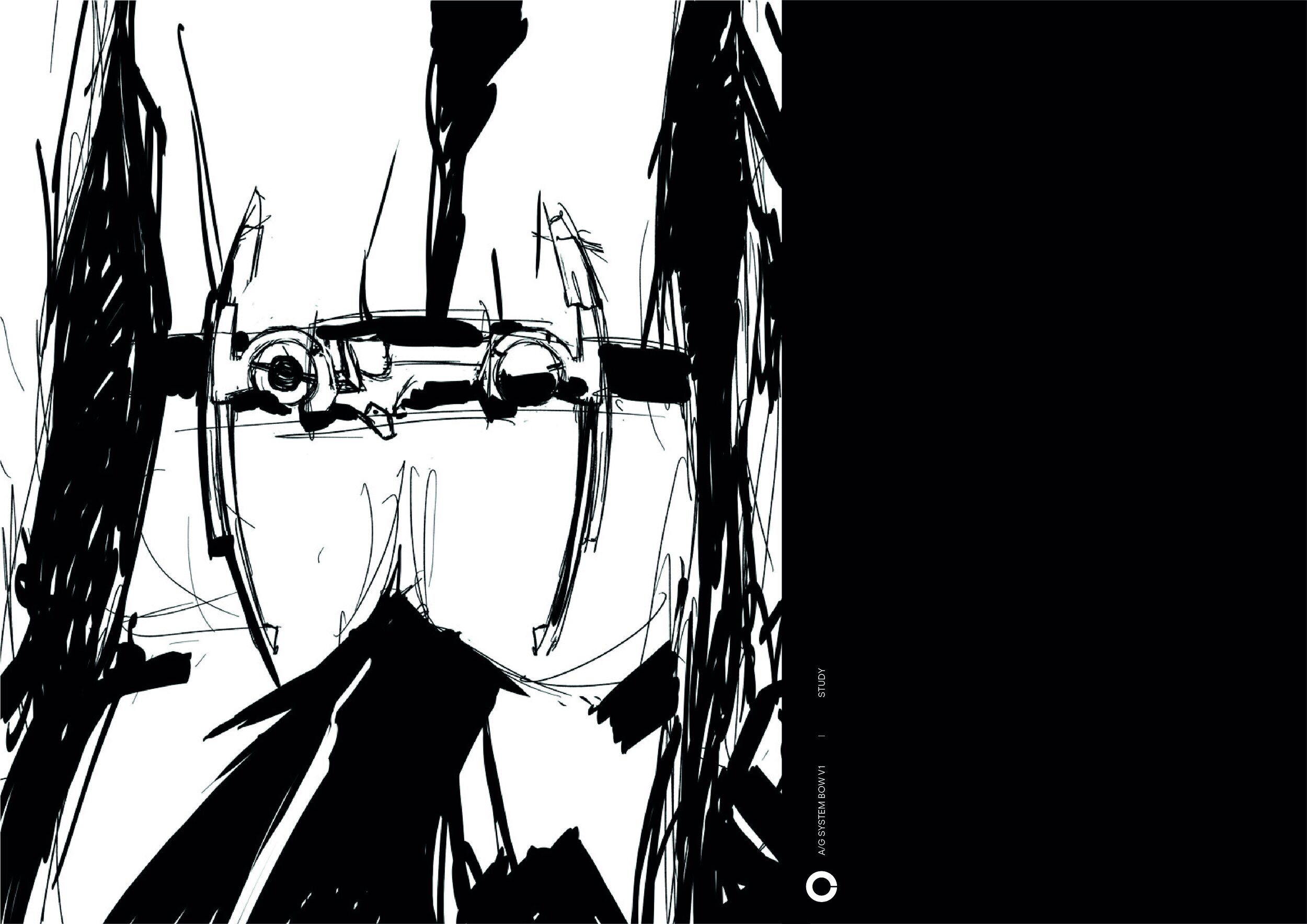
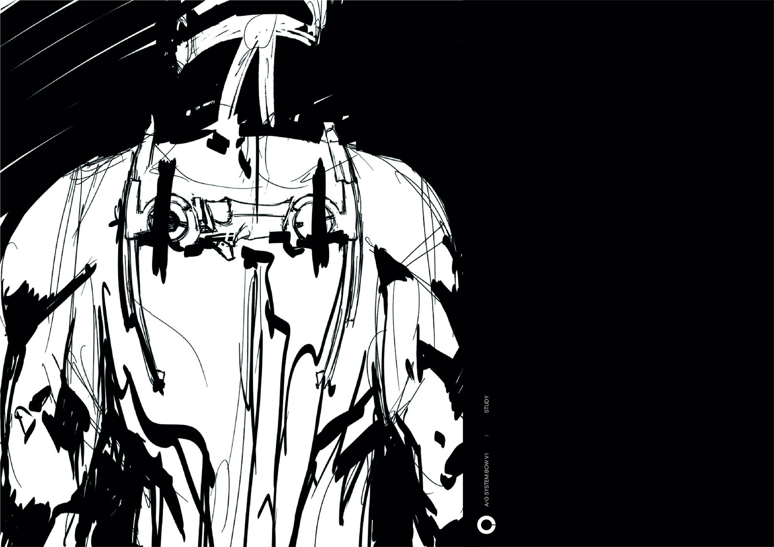
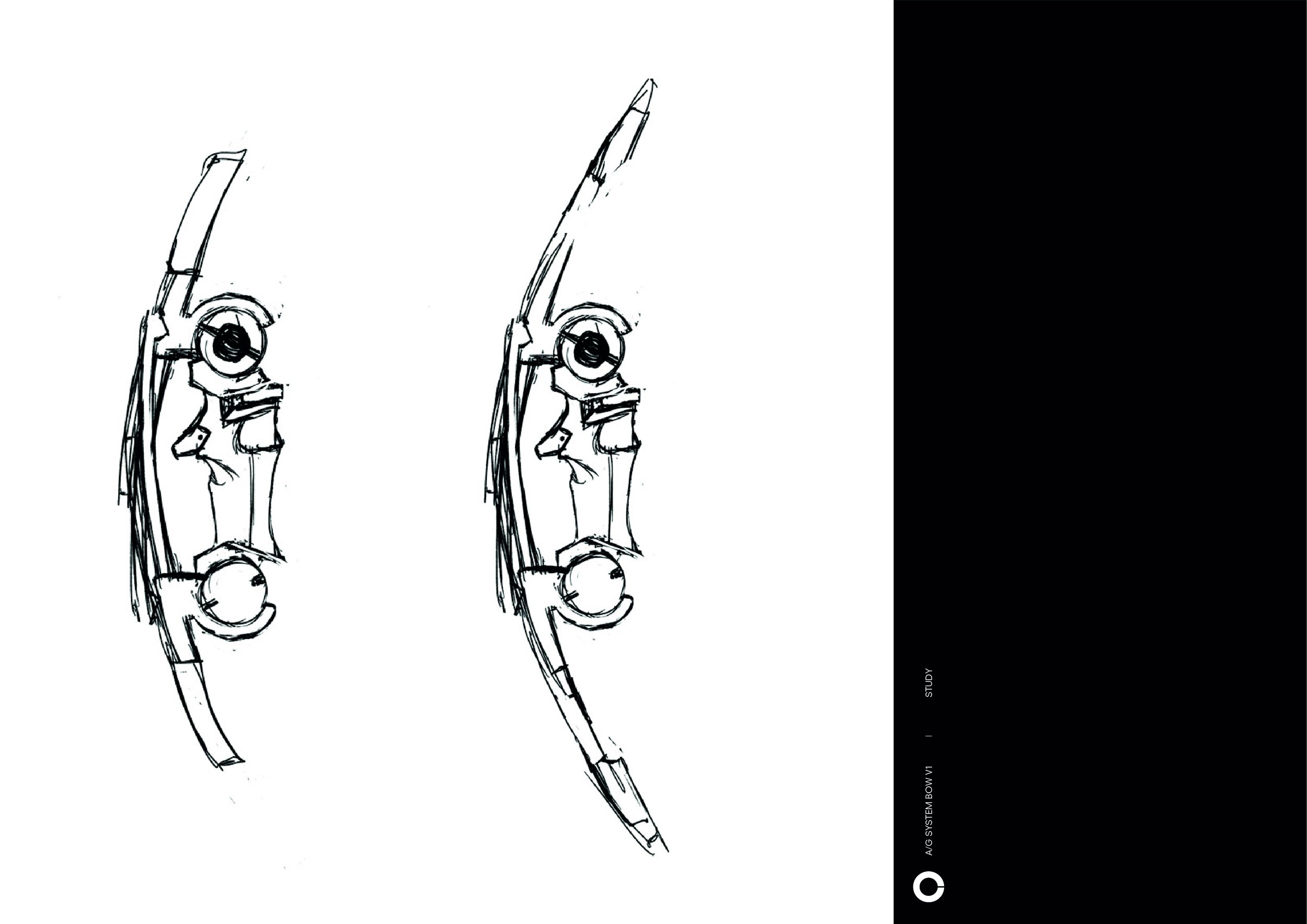
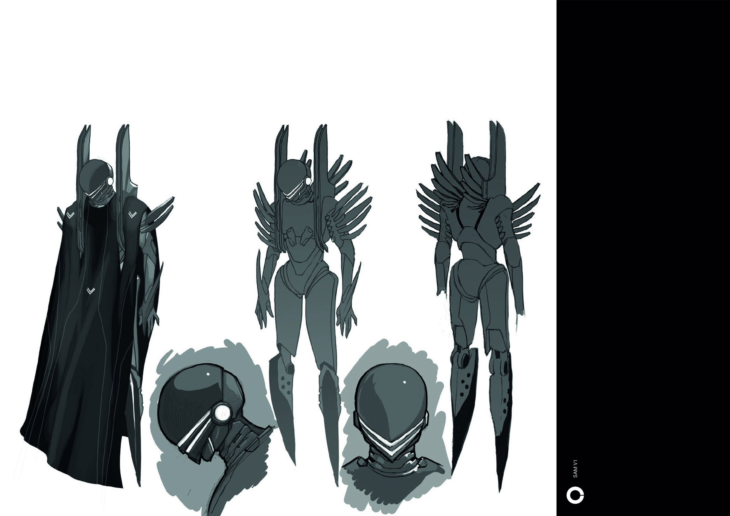
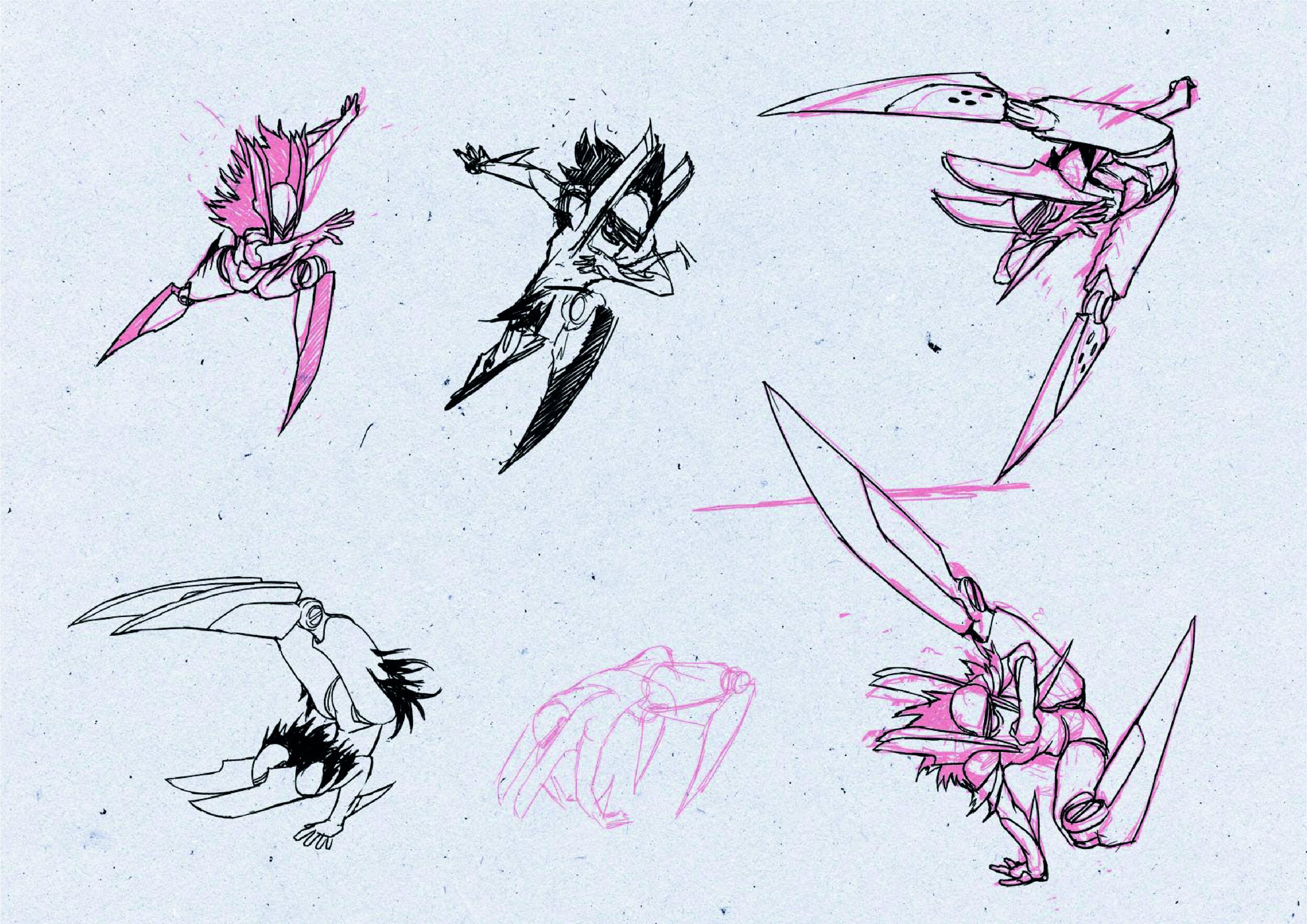
Orfani Season 2 Concept
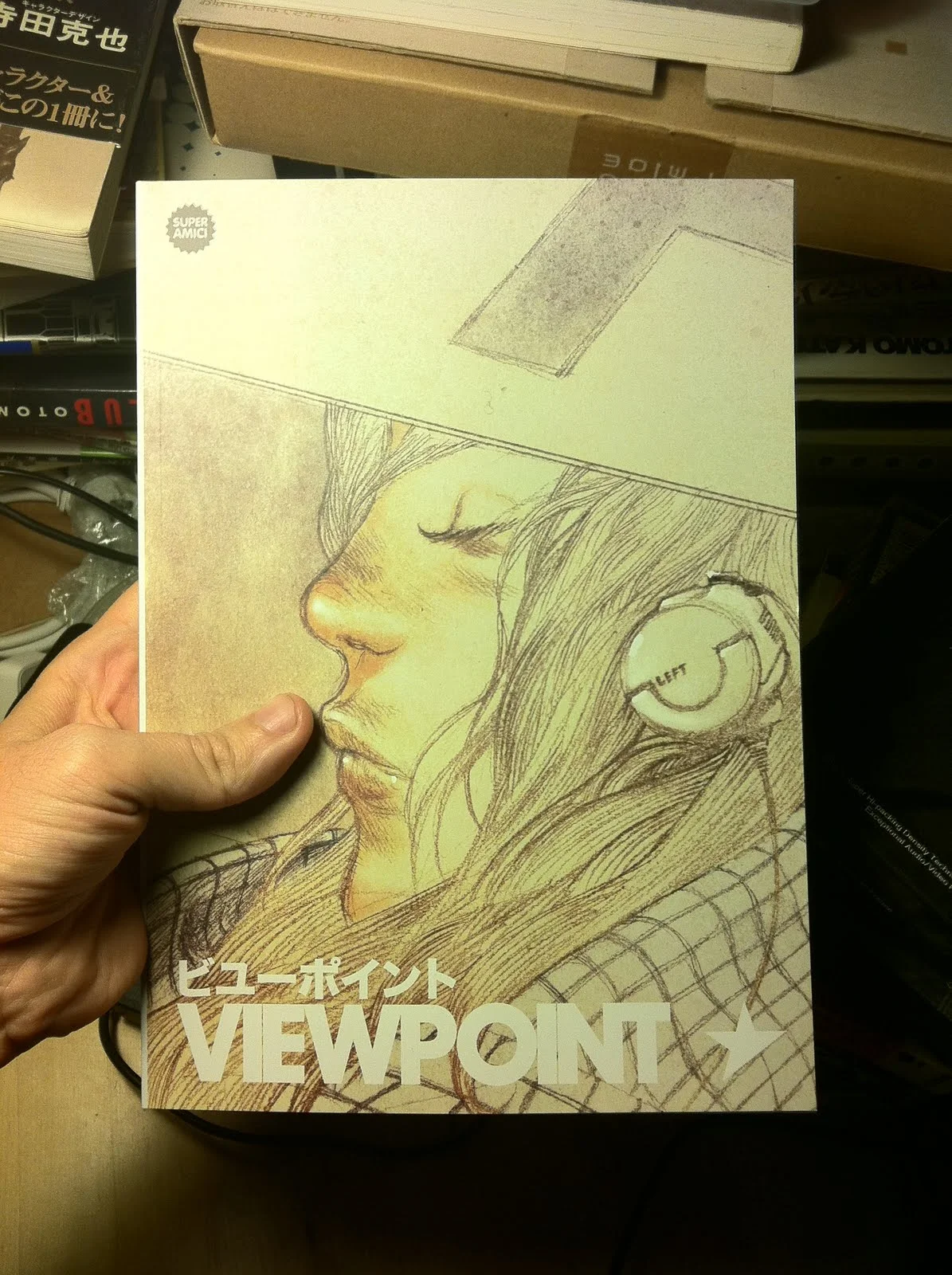
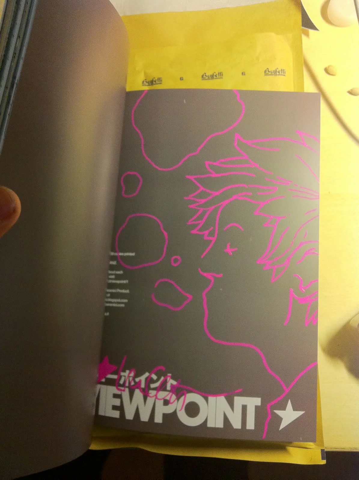
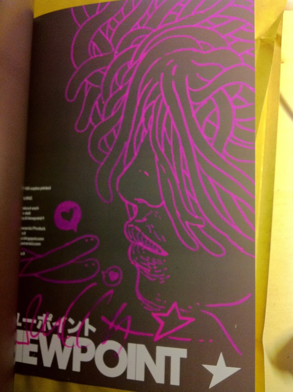
VIEWPOINT
"VIEWPOINT"18.2cm x 25.6cm 128 pages, full colour, digital.
A super limited edition (first run is 100 copies)of a deluxe book to come.Contains a broad selection of my works.VIEWPOINT is the first of a serie of book limited prototyping process. Everything, layout graphics to shipping is by LRNZ.
Each copy is signed and decorated with a flashy pink unipaint.
Price: €25.00 + Shipping


SUBDANCE DIS IRATIS NATUS


GOLEM | ROSABELLA FILAGONE
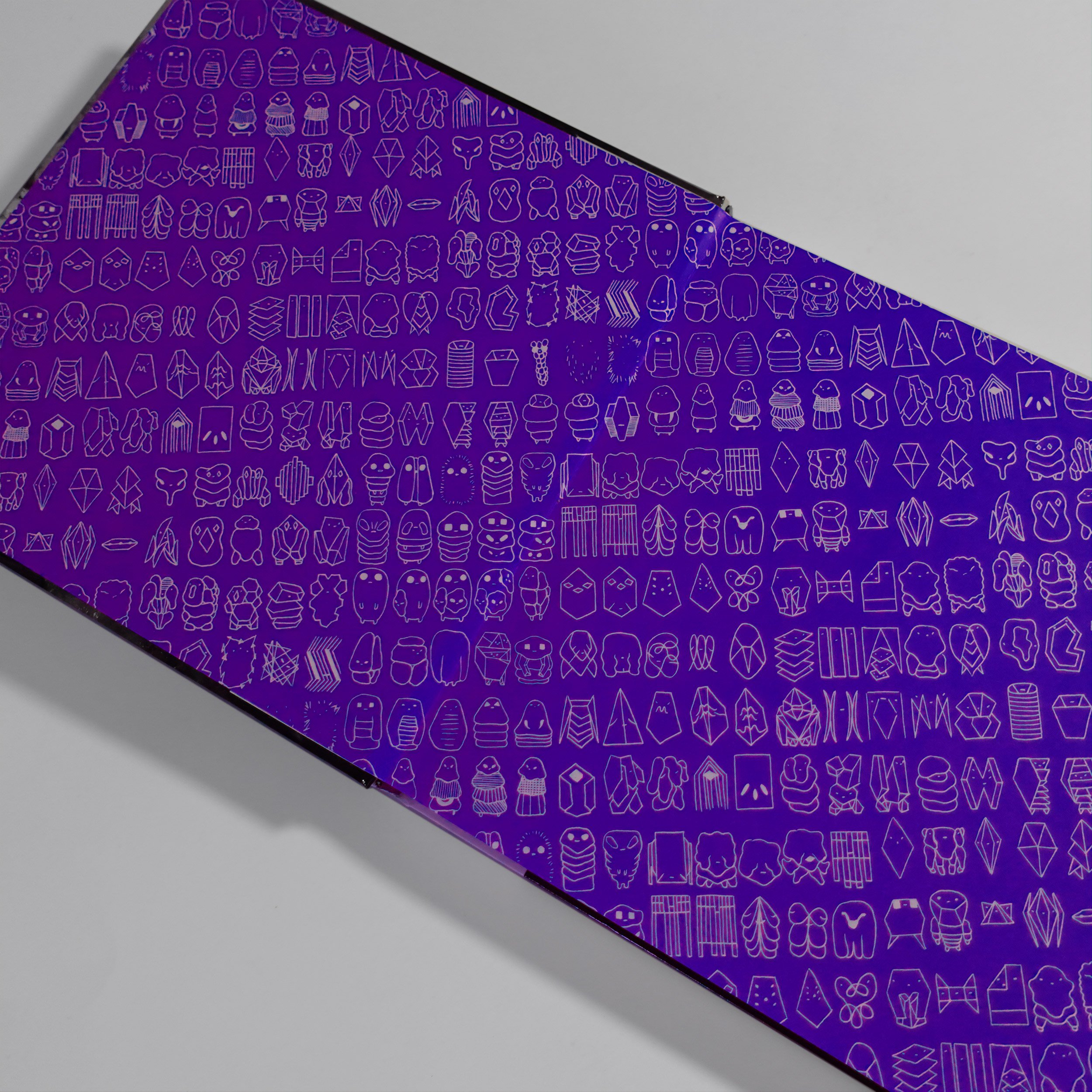
Some anticipations. Let me introduce you Rosabella. It's been a while since I did my last analog penciling work. In the gallery the original drawing I started from.
You can buy this work as an A2 Giclèe Ultrachrome print on Hanemuelhe 310g fine art ultra white rag paper (signed by the author) in the shop section.


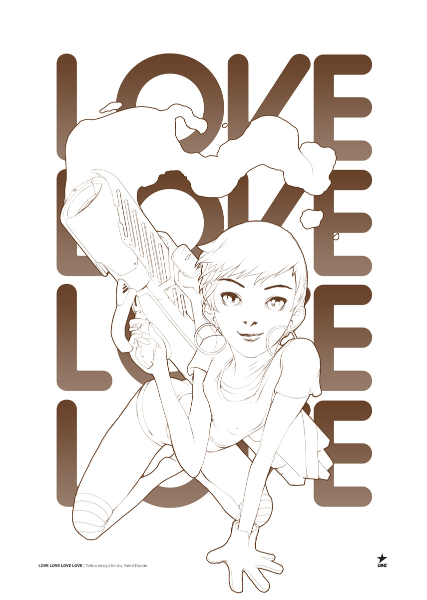
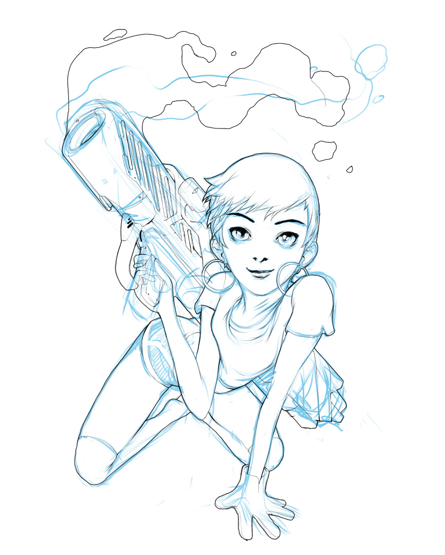
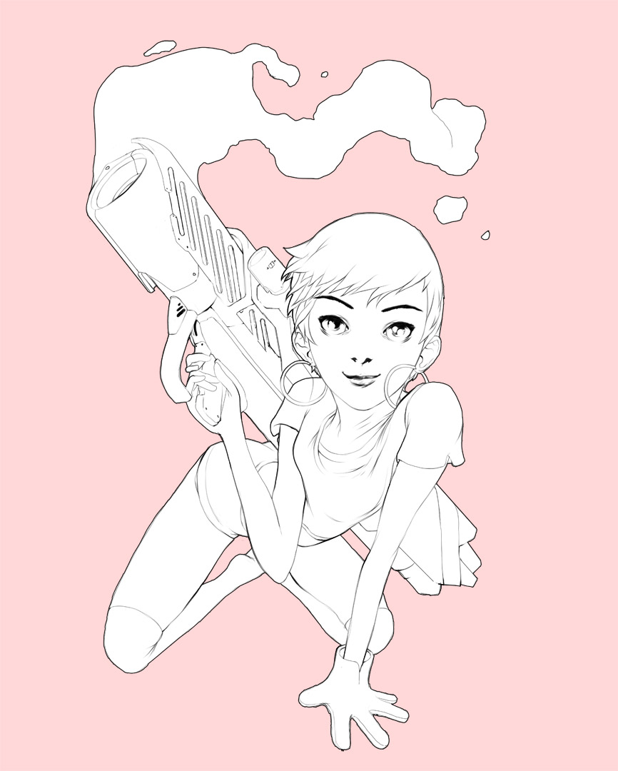
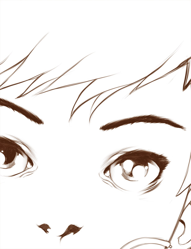
LOVE LOVE LOVE LOVE
LOVE LOVE LOVE LOVE
APPROACHING SECTOR X VIDEO
A quick visualization test for an old track of mine. It was the first monomachine + machinedrum only track i've ever made.
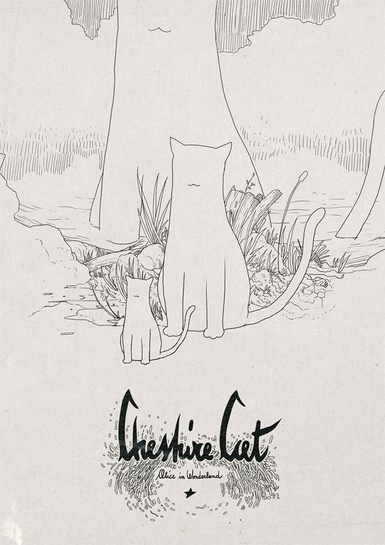
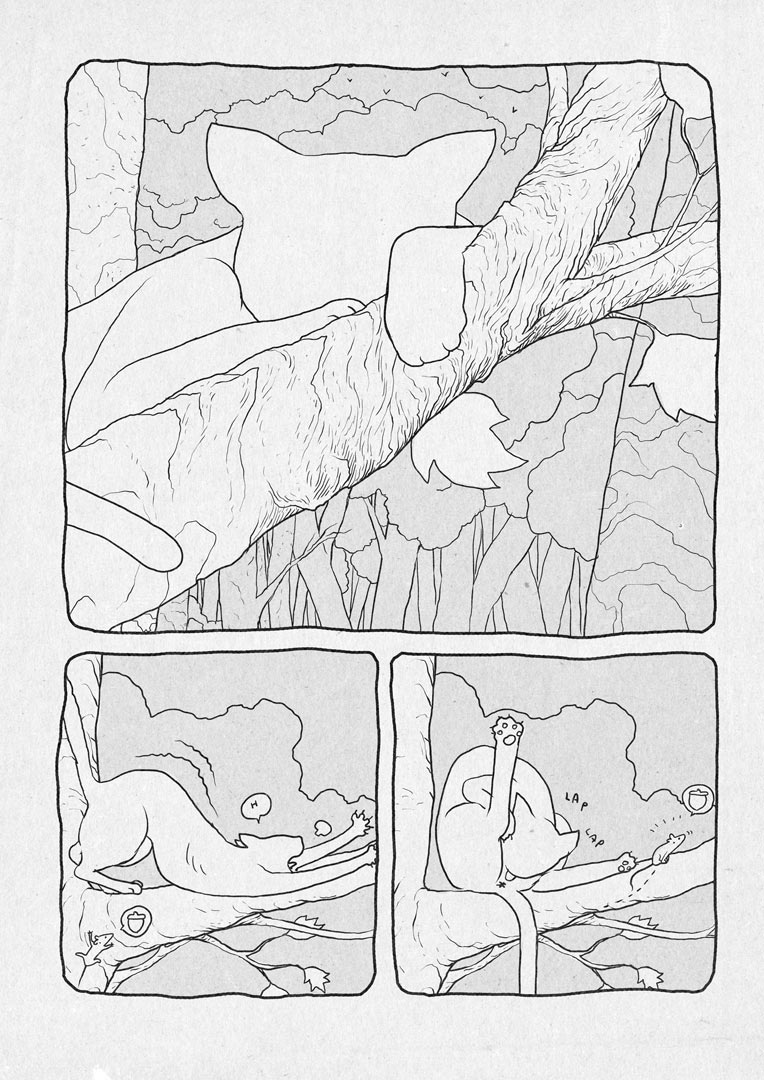
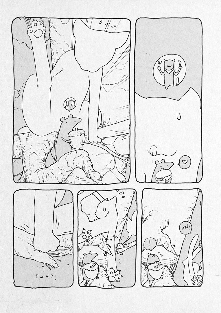
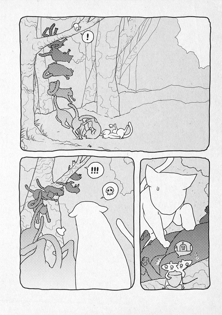
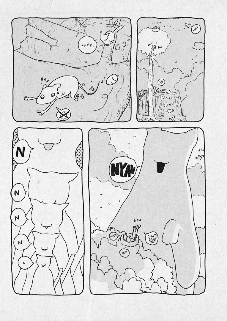
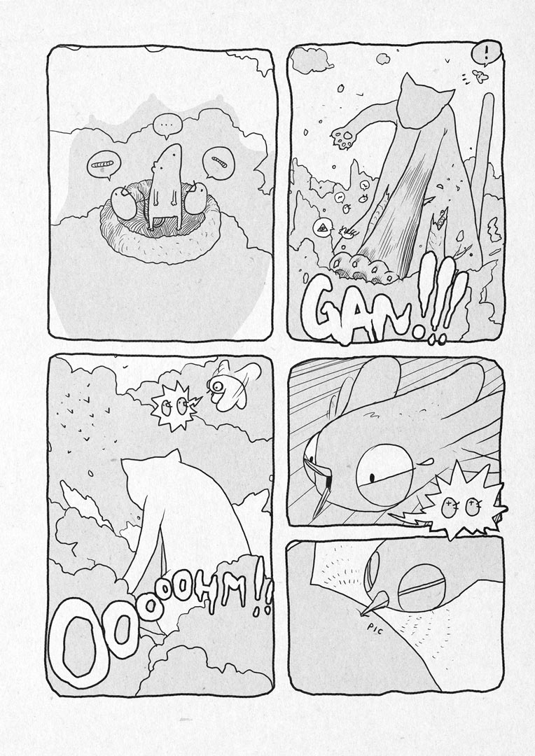
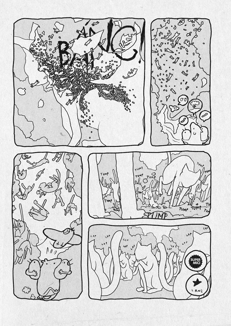
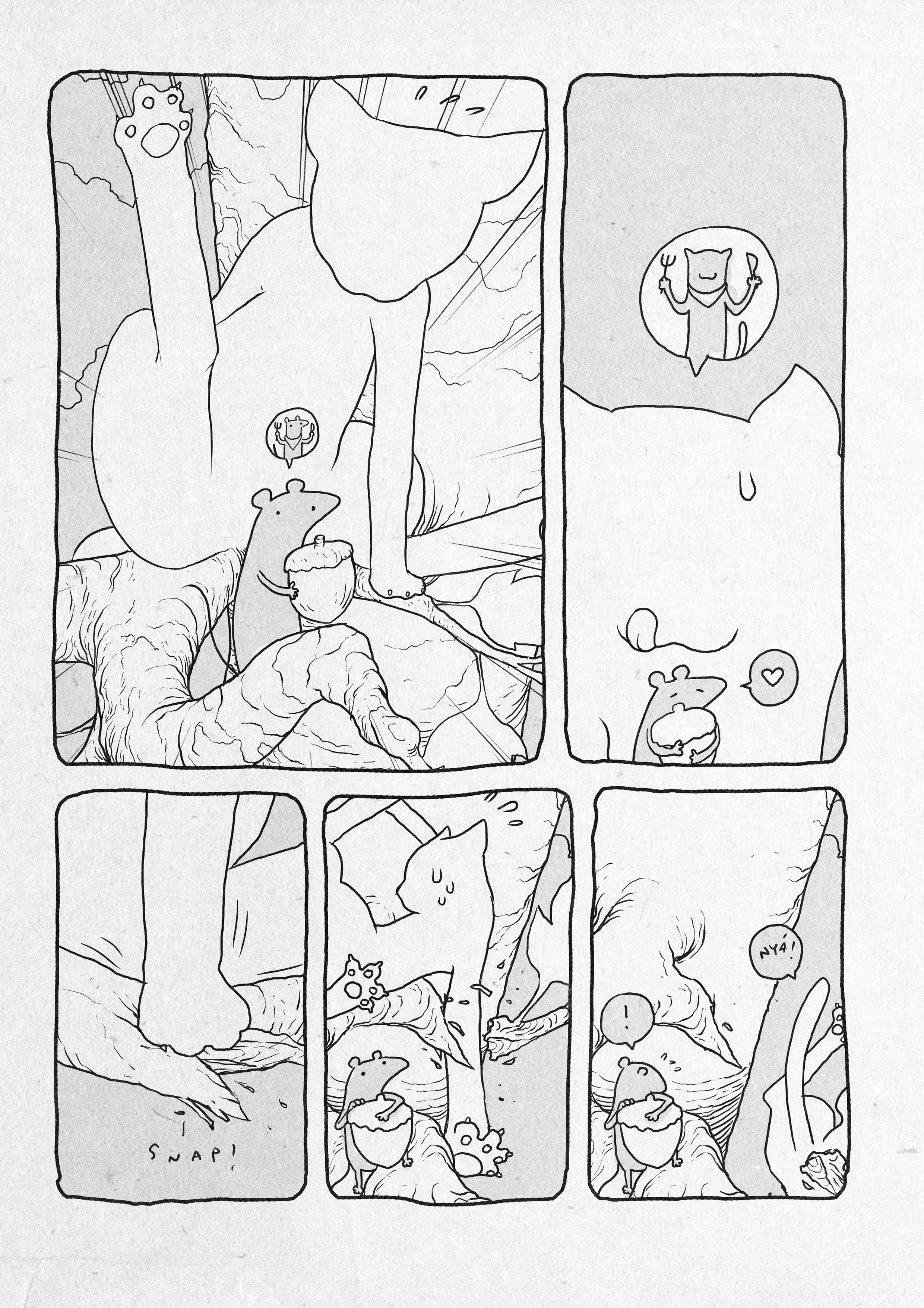
CHESHIRE CAT
My take on a super classic.
The book is called "WOnderland, wuando alice se ne andò", edited by Nicola Pesce editore.
It is an anthology about the life of wonderland inhabitants, without Alice.
Each character has it's own short story drawn by a different artist.
Hope you'll like it!

Finalfrontier | Logos and Idents


Complete set of logo redesigns for Nature, Finalfrontier and Pigna labels.
PIC NIC Magazine
PIC NIC Magazine is a comic free press magazine published by Superamici (my old artistic collective) in 2010 in collaboration with the communication agency xister. From a design standpoint the magazine itself is pretty unhorthodox. Each number of PIC NIC Magazine comes as a box containing three individual books, each one for a specific comic genre.
Issue number one features the works of: Paolo Bacilieri, Adriano Carnevali, Francesca Ghermandi, Maicol&Mirco, Junko Mizuno, Tuono Pettinato, Giuseppe Palumbo, Dr. Pira, Ratigher, Sara Varon, Davide Toffolo. I’m also in it with the first version of Golem.
“Ah ah!!” for humour comics, “Bang” for action comics, “Mumble” for more serious or intellectual ones.
Each book has a full bleed cover image with no typography on it.
All the informations you would normally see on a front cover went in a obi-ish side box in the back cover.
I did all the product and graphic design. I also designed the PIC NIC logo. An in depth analysis can be found in this other page.


Another unique feature was that each article was commented by our avatars and all the interviews were designed to look like comics themselves: we graphically represented our guests on the same level of our avatars and made them answer our questions with text balloons.


PIC NIC was printed and distributed in selected stores in Italy. The first run is 40.000 copies. I designed a website for it.


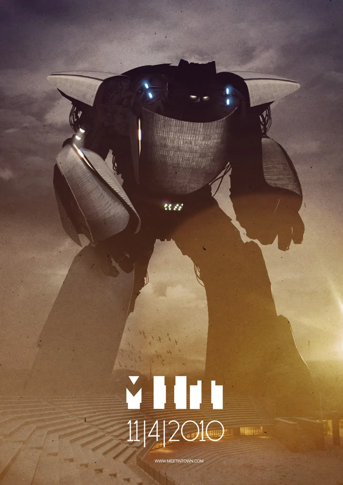
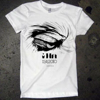
MIT MEET IN TOWN 2010


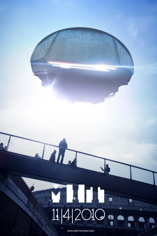
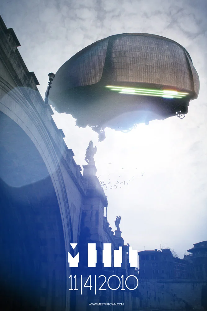
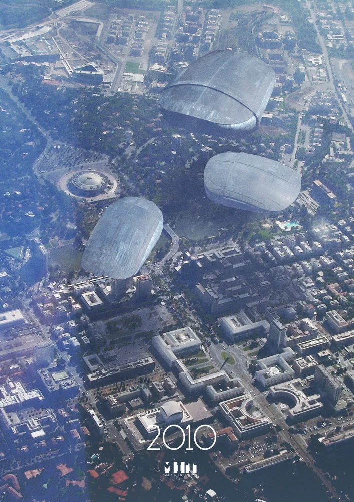

Ok I know: this is a borderline illustration work.It's more a illustration on photos process.I usually don't like people working with photos.
Still I want to share it on this blog.
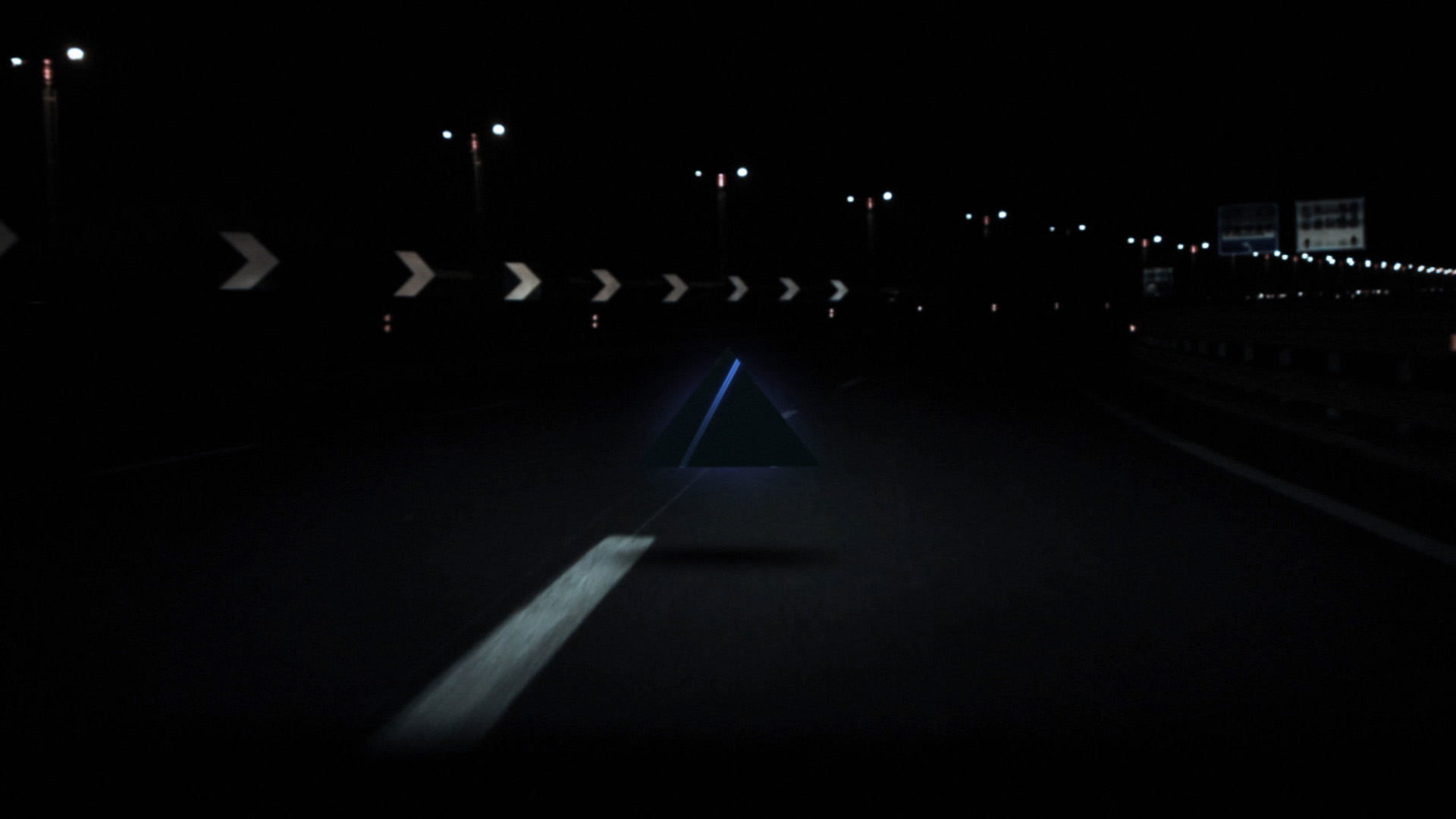
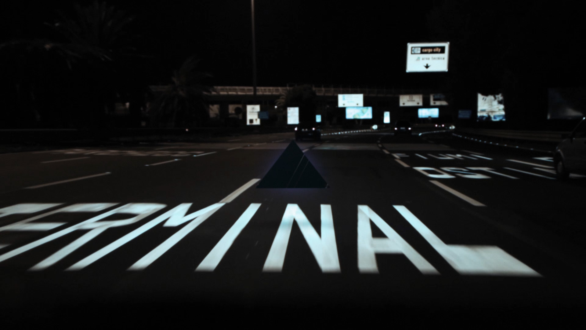
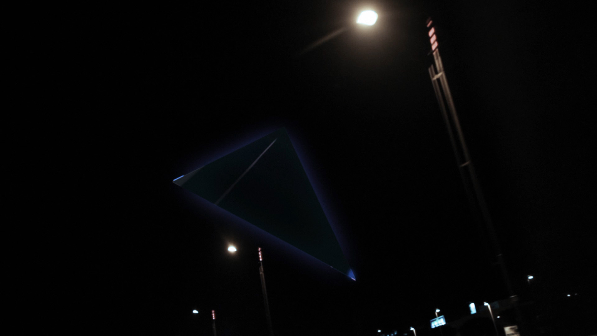
It's my work for Meet in Town, a music festival in Rome.Xister involved me in the project as a creative director.
Honestly, I started working on it as a joke, but it did get dead serious in the end!The basic idea was to develop a 3 step communication process, a teaser, the evolution and the final images.
Each step is made of 3 images and three simple animations I made starting from the illustrations.
The concept is very easy: 3 huge mysterious objects are coming, one from the desert, one from the ocean and one from the sky (yes, it's a SENTAI tribute).Where do they come from and what are they coming for?
Then I got this idea to use the main auditorium structures as alien vessels and it was very fun to develop.Hope that Renzo Piano will have fun as much as I did.
I hope that after the whole set of posters is out, somebody will think of the real auditorium as a GIANT action figure set of a sci fi movie rather than modern architecture. Maybe it will look like a fake repro of my spaceships.
Moreover: you are actually going INTO those BIG spaceships - to party.
These are the first images, including some previews for the next round of illustrations. Enjoy!
Font by ADE Creative Studio!
You can buy this work as an A2 Giclèe Ultrachrome print on Hanemuelhe 310g fine art ultra white rag paper (signed by the author) in the shop setion. Set pricing available.
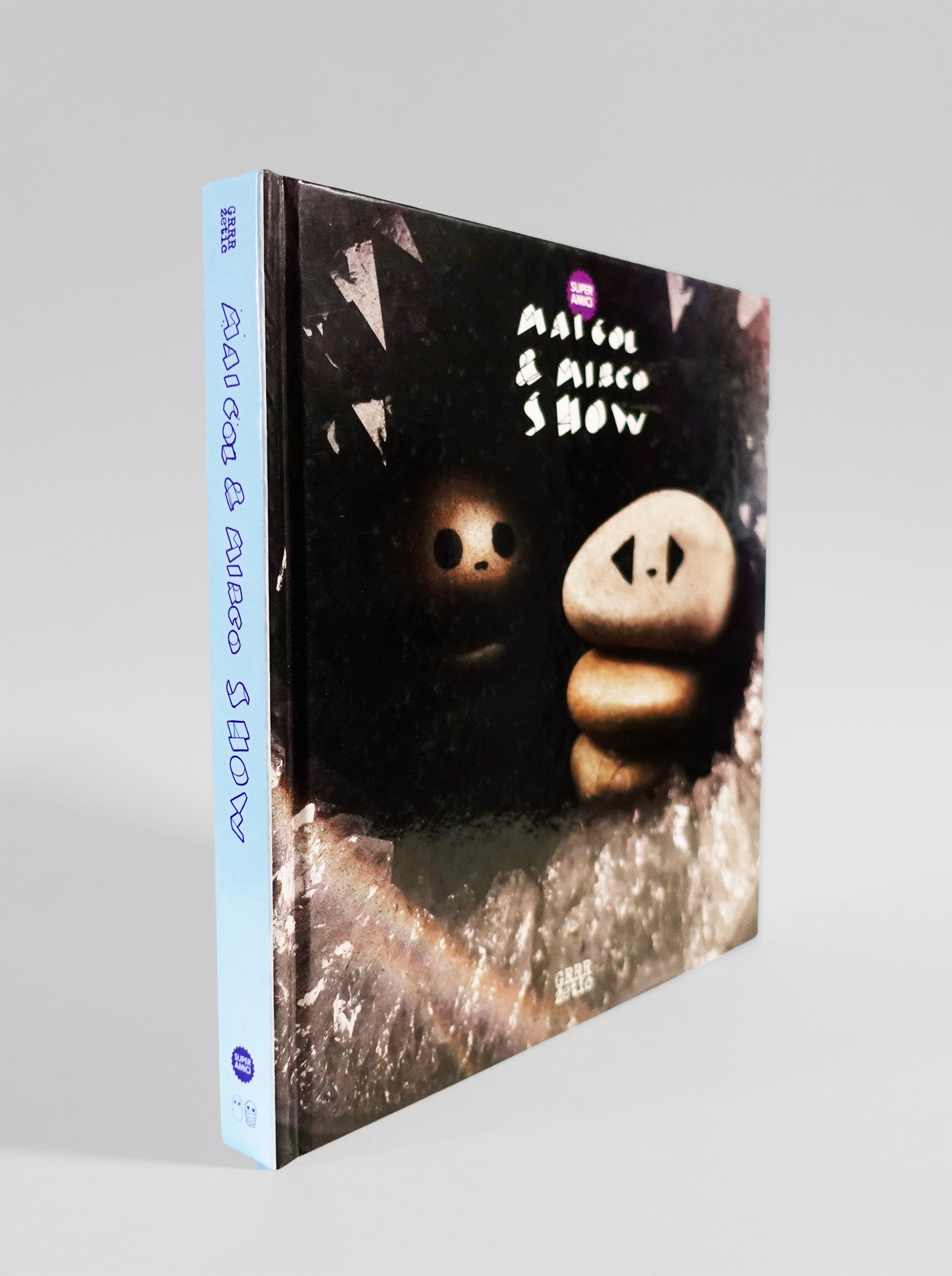
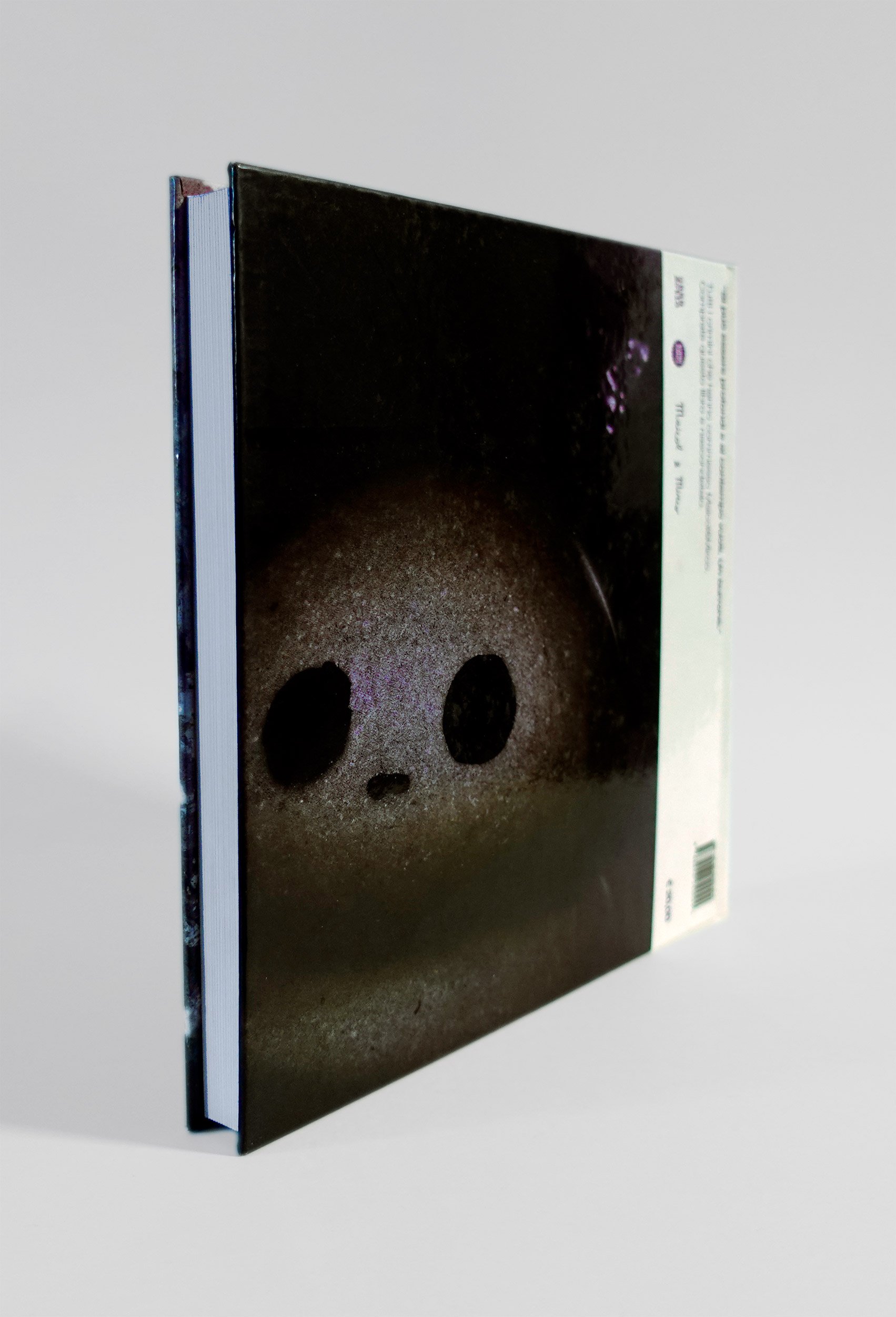
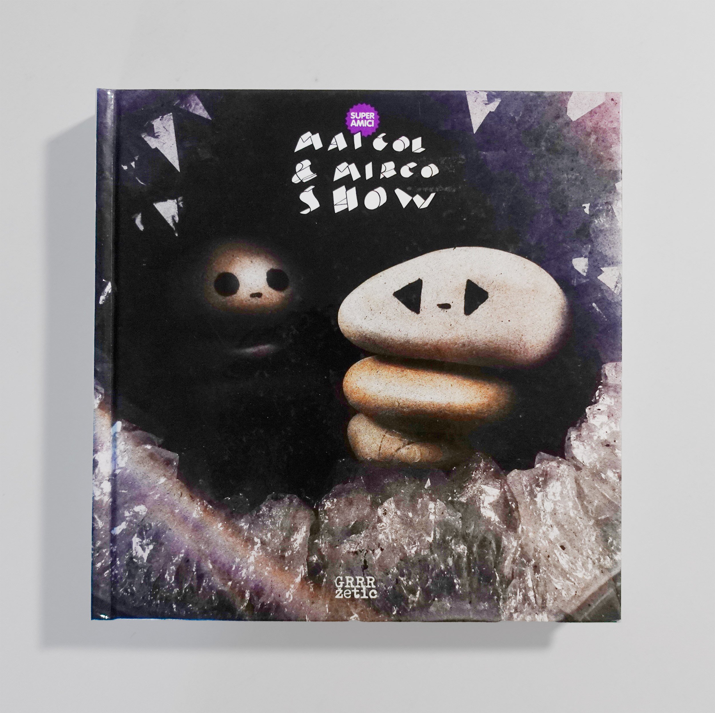
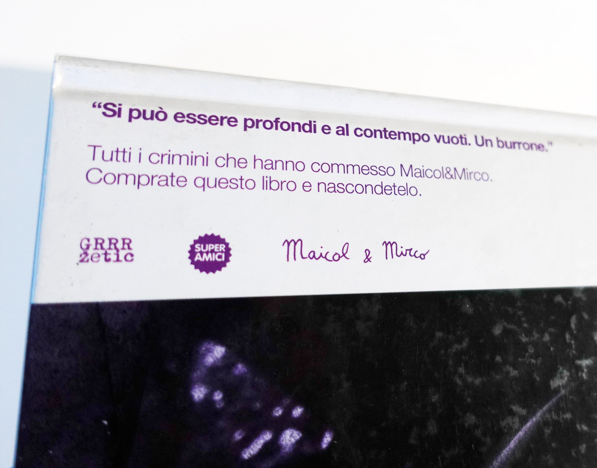
Maicol&Mirco Show Cover Design
Book cover design for one of my favourite comic book artists of all time, Miacol&Mirco.


EVENT HORIZON
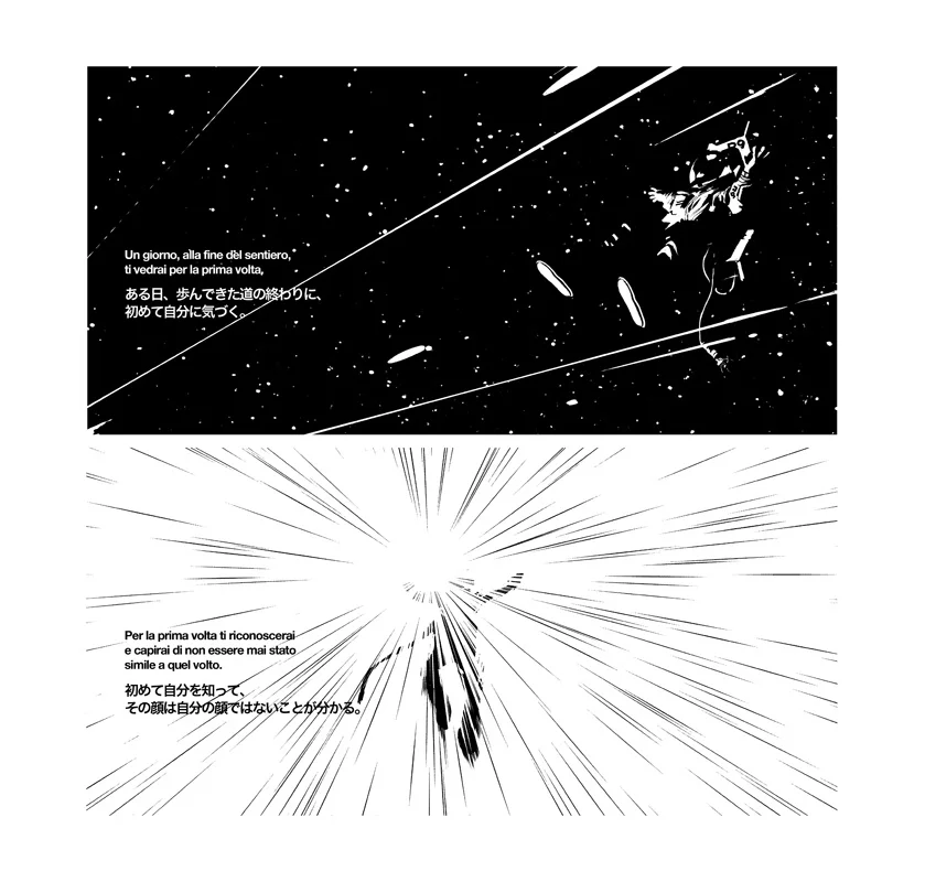
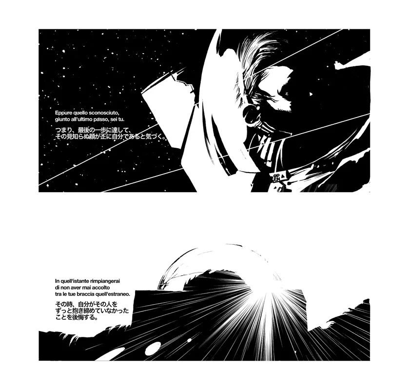
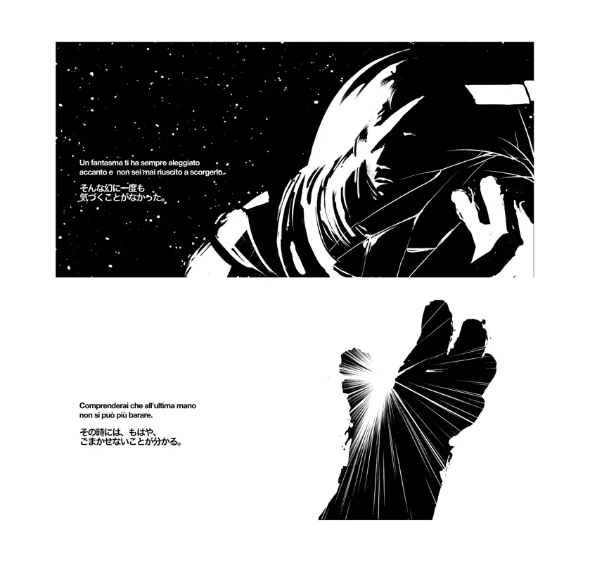
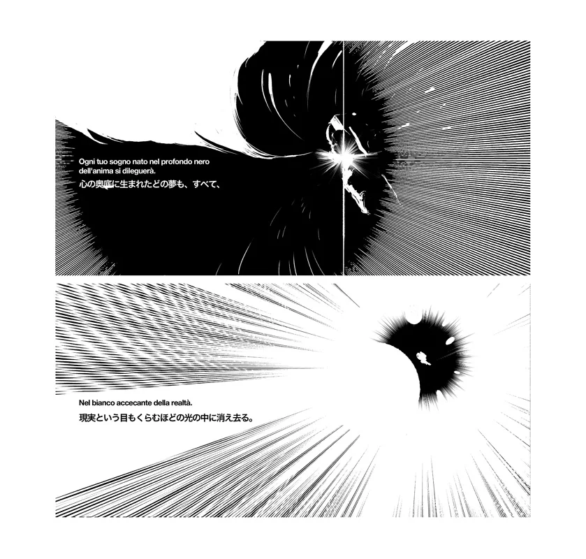

VERY VERY honoured to be selected for Futuro Anteriore 2010 (BLACK) at Napoli COMICON.
Event Horizon, my story, is about a lost spaceman that turns into a black hole, devouring the entire universe as we know it.
Event Horizon will be printed as part of the Futuro Anteriore 2010 book.
You can see the panels at Napoli Comicon.
Text by Alessandro Caroni.
Japanese Adaptation Federica Lippi.
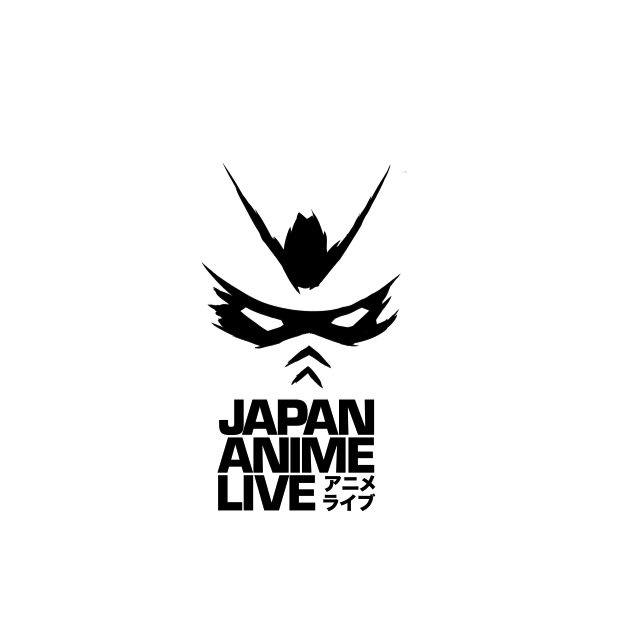
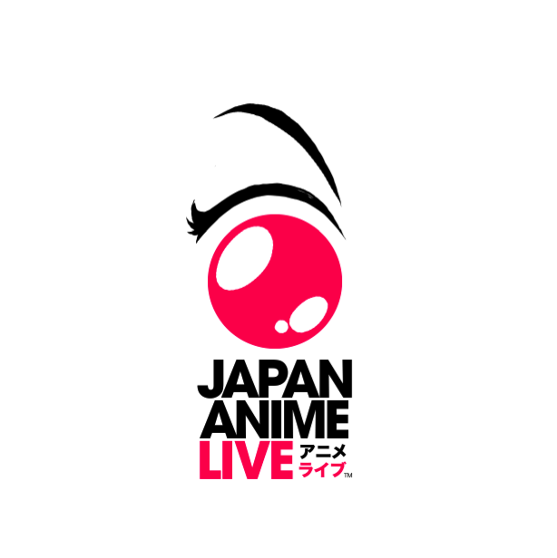
Japan Anime Live


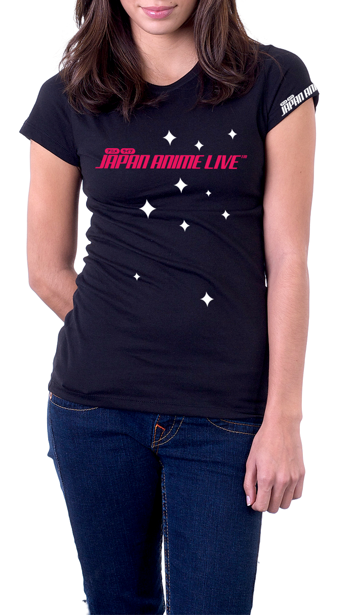

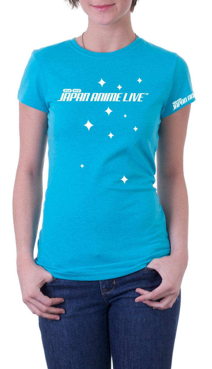
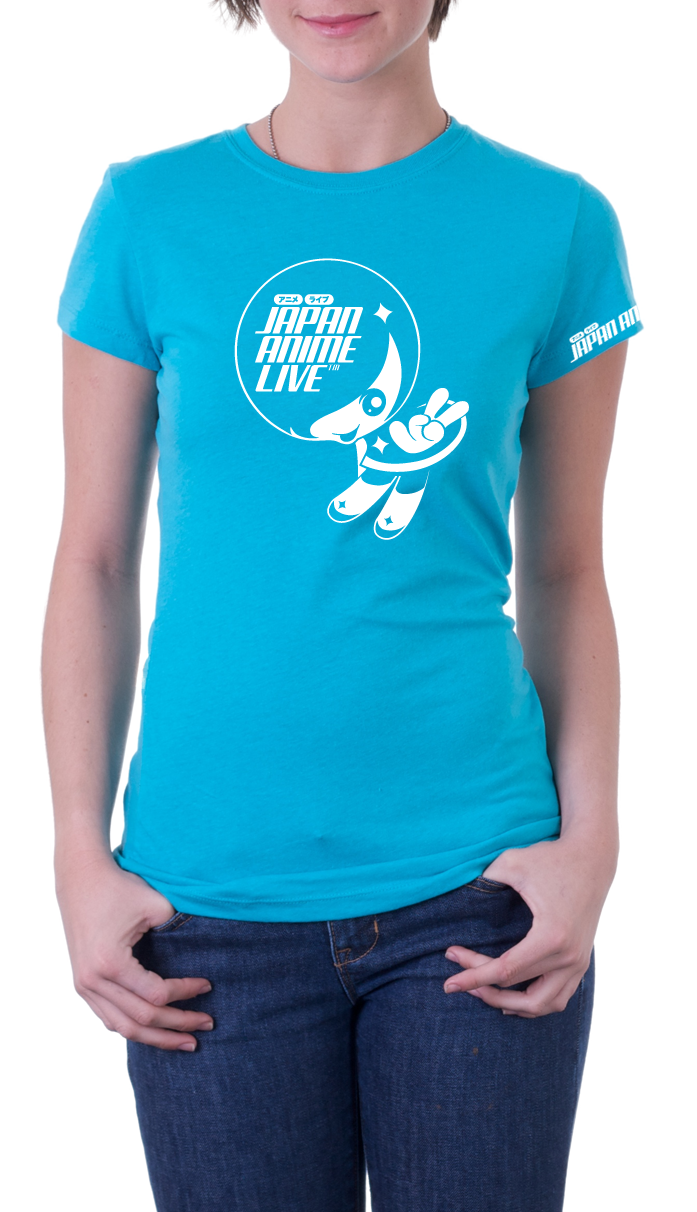
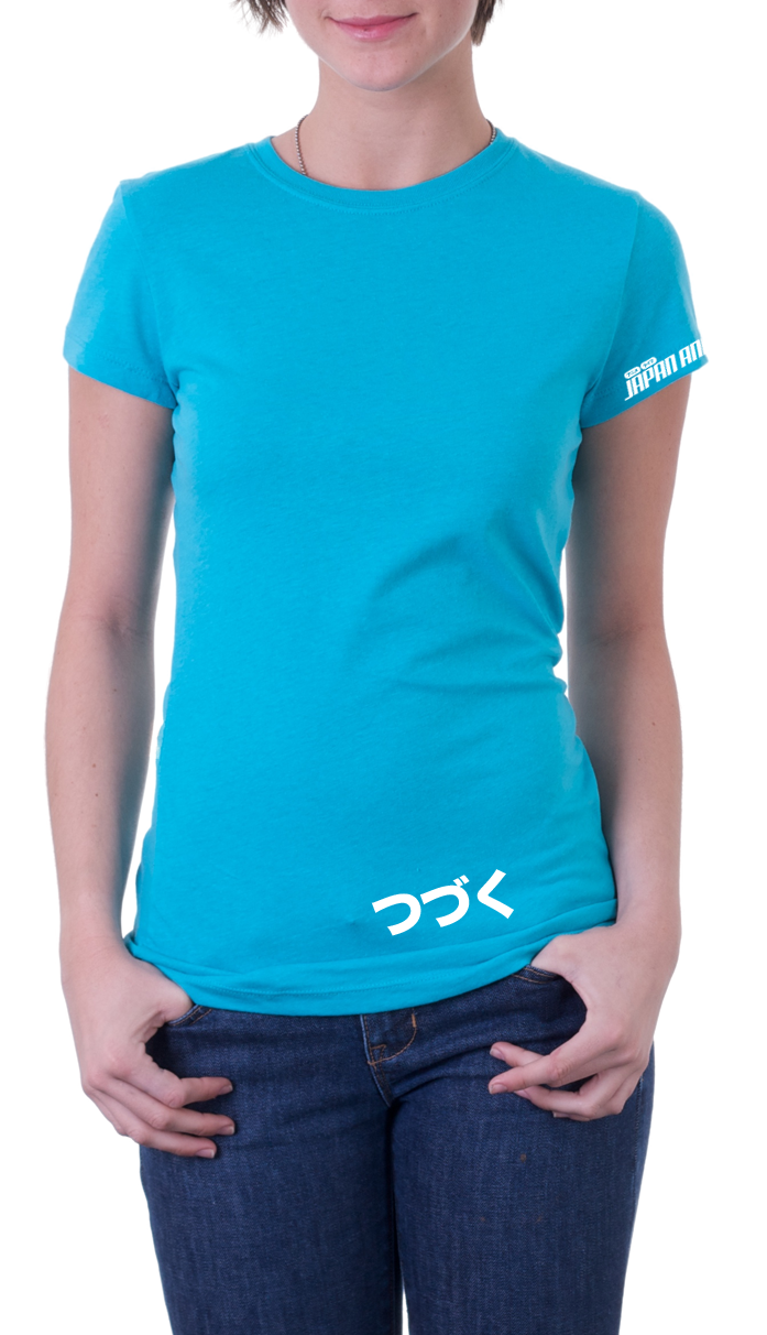
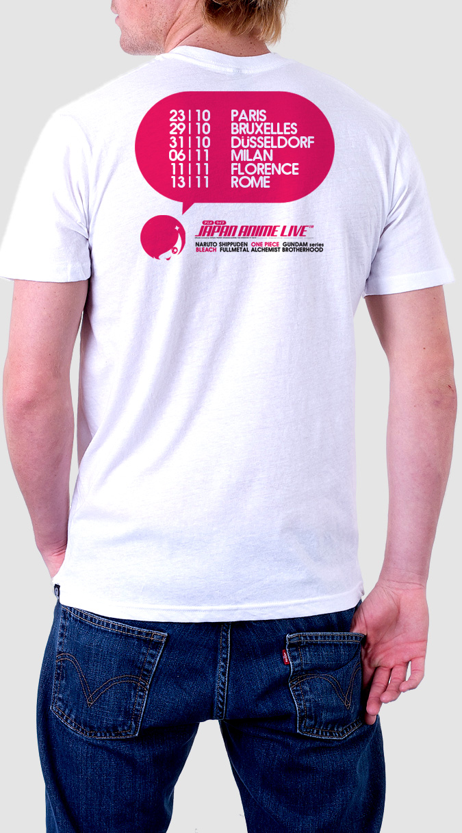
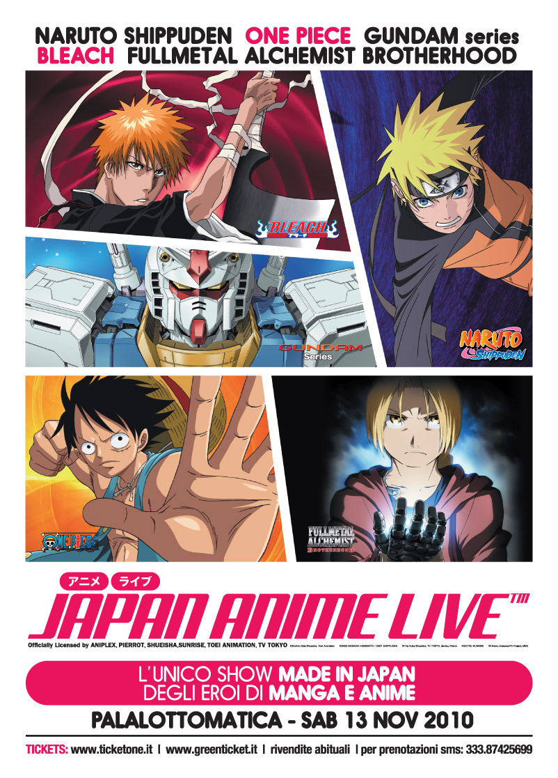
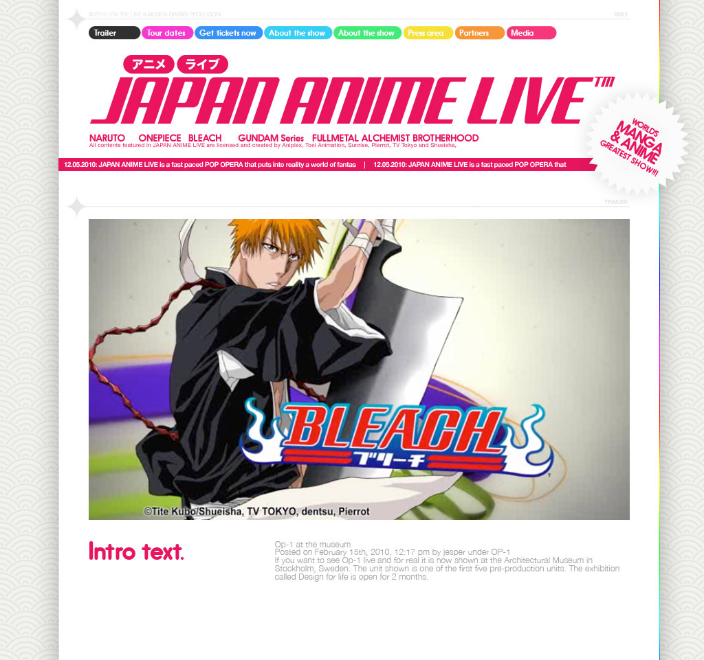
Designed this logo/mascotte for THE international Anime event, in collaboration with BANDAI, Shueisha, Studio Pierrot, SONY ANIPLEX, Toei Animation, TV Tokyo and Sunrise.
From their website:
The first and official live event made and performed by the Japanese creators of the famous Manga and Anime series WORLD PREMIERE – PARIS, Zénith - October 2010 The Greatest SHOW OF MANGA & ANIME ever conceived in the World. JAPAN ANIME LIVE is an extraordinary event that brings live on stage the “all-star” of the world of Japanese animation such as NARUTO-SHIPPUDEN, FULLMETAL ALCHEMIST BROTHERHOOD, BLEACH, ONE PIECE and GUNDAM Series. A unique show for the first time on tour in Europe. JAPAN ANIME LIVE is a mix of live action, live recitation, special stories, flamboyant effects and live music to sing along with the public the original theme songs of the TV series. JAPAN ANIME LIVE is a fast paced POP OPERA that puts into reality a world of fantasy and its heroes. A time-space gate that connects the fans with the dream world of Anime. A “must-attend” event for all cosplayers and Japanese pop culture lovers in general. JAPAN ANIME LIVE is what you will never watch on TV: in fact all animations and stories have been re-created and re-edited exclusively for the show and what’s more, they contain hidden facts about the stories of the beloved Anime characters. Over two and half hours of breathtaking show, divided into five chapters, each one devoted to an animated series, dynamically orchestrated by a script that combines all the different elements of the show. All contents featured in JAPAN ANIME LIVE are licensed and created by Aniplex, Toei Animation, Sunrise, Pierrot, TV Tokyo and Shueisha, which are the major JapaneseAnime-maker companies.
In the gallery below you can see some other discarded Logo drafts I made for the event.


QOOB ID3

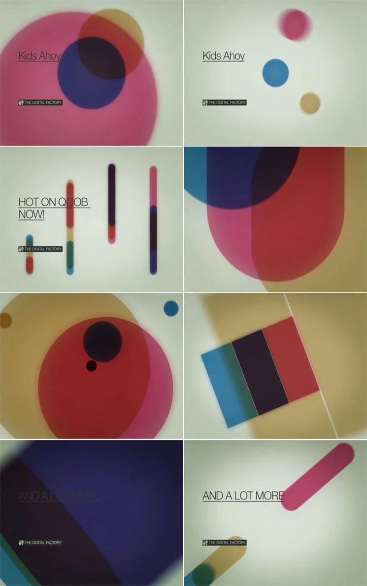
Doing this work was a real pleasure, as I had the chance to work again with my artistic stepbrother Gianluca Abbate, my colleague and inspiration during the Studio Brutus adventure. Gianluca founded his own Design Firm called ADE Creative Studio along with his old time friend and multitalented music producer Alberto Spezzaferro and worked since day one very closely to QOOB (first known as YOS and FLUX) producing anything they could need for a TV channel. It was a huge work. 2 years passed and they needed a new take on the QOOB identity. Gianluca and Alberto wanted me in for a new twist. I started my creative process trying to stay away from ADE past works for two reasons: it was SO good that I would never do anything better in the same style, change is a change so I tried to break every strong stylistic element ADE did build in two years of work, agreeing with ADE that the old ID grew so rich and without boundaries that it was almost impossible to find a true stylistic guideline.
So I started from the basic writing down a new corporate ID manual for QOOB, slightly altering the logotype structure and extabilishing the rule that changed the game: QOOB logo will not be animated anymore. It will only appear or disappear by unveiling using chromatic additive or negative tricks. I developed then the whole concept behind the typography system: web and TV now could use the same language. Happily used an underline custom version of Helvetica: good typograpy banned underline ornaments from design so it was impossible to have an underline text in a procedural web/video environment. Still I wanted it very badly: underlined linking is very specific of web visual language and being QOOB a user generated TV with a HUGE web based community it was a must to have it coded in their visual DNA.
Then I produced some draft concept videos that ADE presented to Lorenzo Banal (MTV art director) to explain the whole visual idea.
Concept was: from minimal/digital to basic/analog, with a strong back to the broadcast design roots flavour. Gianluca Abbate then did his job, and, as always, delivered the thing of beauty that QOOB ID3 is.
Here I will report directly from ADE Creative Studio webpage:
"At its third identity season refresh the Qoob.tv project, in perennial change, aimed at repositioning its brand so as to become a sort of production factory.
The project was coming of age and was ready to communicate also with an institutional audience, unlike at its first stage when it was mainly addressed to a young audience.
The new identity, created by Ade together with Lorenzo Ceccotti and under the supervision of Mtv and Qoob’s art director Lorenzo Banal, therefore abandoned all modular dissection strategies at the heart of all previous concepts and pointed instead on the solidification of the Qoob brand no longer dissectible nor transformable.
The task of unveiling the brand therefore lay in the additive and subtractive properties of colours with their closed essential geometrical shapes, a concept drawing inspiration from Swiss designer Josef Muller Brockmann’s early works of the 1960s.
As for the fonts, Thermo, planned by Lineto which embodied connotations no longer suitable for the dimensions was put aside in favour of a specially created variation of Helvetica Neue, much more versatile and suitable for the new needs.
Even the sound design shifted towards a softer and more electro-acoustic sound and for the first time a real Sound Logo was produced."
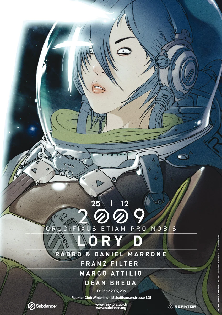
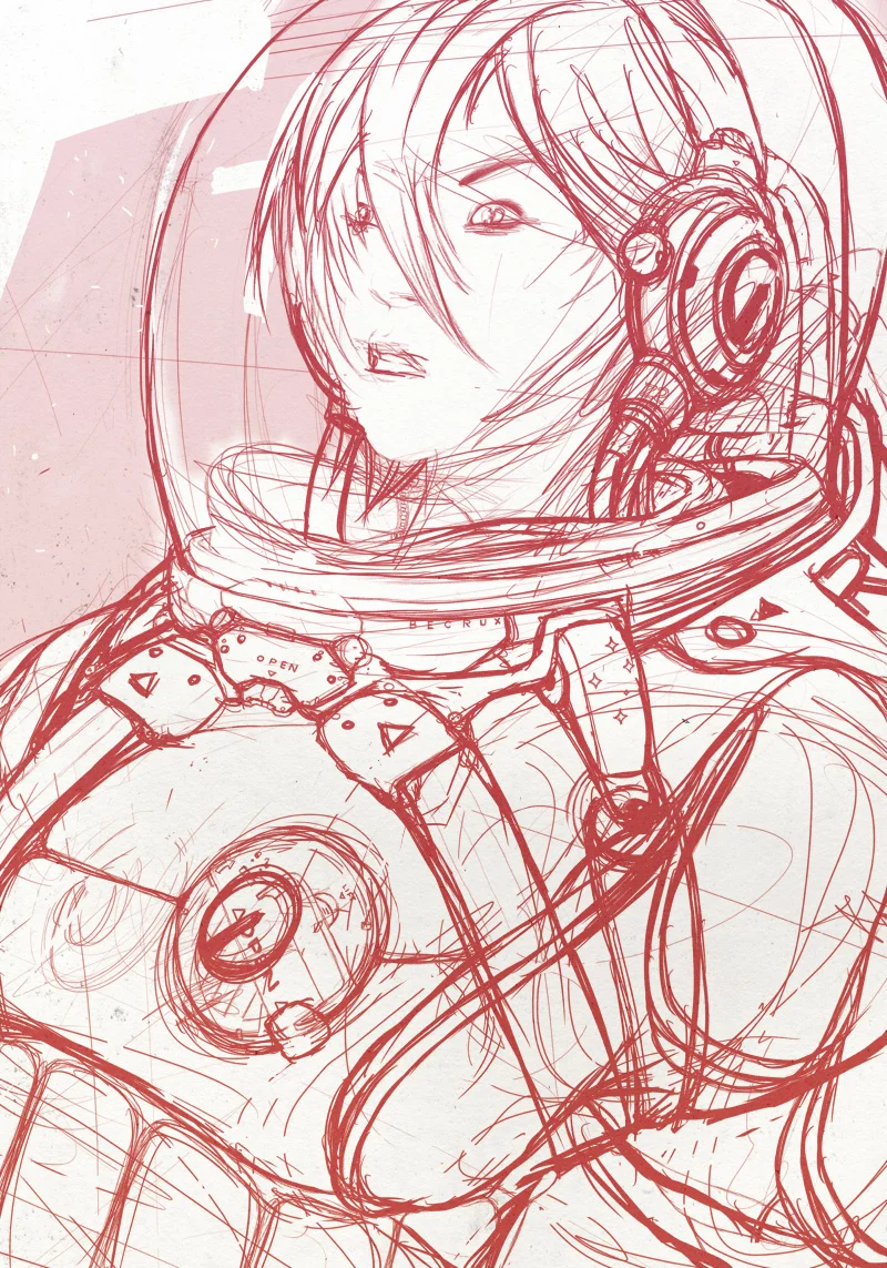
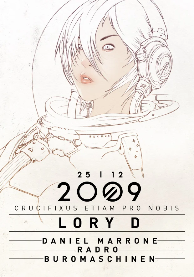
SUBDANCE CRUCIFIXUS ETIAM PRO NOBIS
My friend RADRO from Subdance Records asked me an illustration for a music event in Winterthur, switzerland. Here it is, a weird space encounter. It will be printed as a flyer and as a A2 Poster.
Below some in between steps!
You can buy this work as an A2 Giclèe Ultrachrome print on Hanemuelhe 310g fine art ultra white rag paper (signed by the author) in the shop.