
Doing this work was a real pleasure, as I had the chance to work again with my artistic stepbrother Gianluca Abbate, my colleague and inspiration during the Studio Brutus adventure. Gianluca founded his own Design Firm called ADE Creative Studio along with his old time friend and multitalented music producer Alberto Spezzaferro and worked since day one very closely to QOOB (first known as YOS and FLUX) producing anything they could need for a TV channel. It was a huge work. 2 years passed and they needed a new take on the QOOB identity. Gianluca and Alberto wanted me in for a new twist. I started my creative process trying to stay away from ADE past works for two reasons: it was SO good that I would never do anything better in the same style, change is a change so I tried to break every strong stylistic element ADE did build in two years of work, agreeing with ADE that the old ID grew so rich and without boundaries that it was almost impossible to find a true stylistic guideline.
So I started from the basic writing down a new corporate ID manual for QOOB, slightly altering the logotype structure and extabilishing the rule that changed the game: QOOB logo will not be animated anymore. It will only appear or disappear by unveiling using chromatic additive or negative tricks. I developed then the whole concept behind the typography system: web and TV now could use the same language. Happily used an underline custom version of Helvetica: good typograpy banned underline ornaments from design so it was impossible to have an underline text in a procedural web/video environment. Still I wanted it very badly: underlined linking is very specific of web visual language and being QOOB a user generated TV with a HUGE web based community it was a must to have it coded in their visual DNA.
Then I produced some draft concept videos that ADE presented to Lorenzo Banal (MTV art director) to explain the whole visual idea.
Concept was: from minimal/digital to basic/analog, with a strong back to the broadcast design roots flavour. Gianluca Abbate then did his job, and, as always, delivered the thing of beauty that QOOB ID3 is.
Here I will report directly from ADE Creative Studio webpage:
"At its third identity season refresh the Qoob.tv project, in perennial change, aimed at repositioning its brand so as to become a sort of production factory.
The project was coming of age and was ready to communicate also with an institutional audience, unlike at its first stage when it was mainly addressed to a young audience.
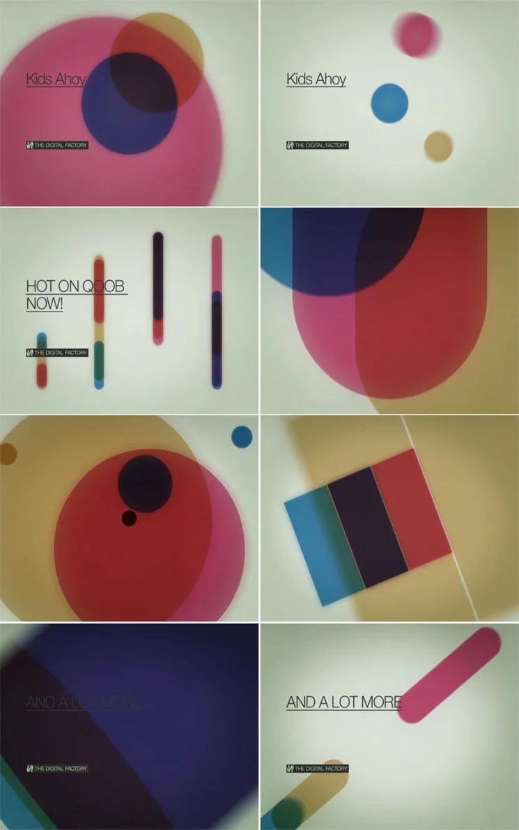
The new identity, created by Ade together with Lorenzo Ceccotti and under the supervision of Mtv and Qoob’s art director Lorenzo Banal, therefore abandoned all modular dissection strategies at the heart of all previous concepts and pointed instead on the solidification of the Qoob brand no longer dissectible nor transformable.
The task of unveiling the brand therefore lay in the additive and subtractive properties of colours with their closed essential geometrical shapes, a concept drawing inspiration from Swiss designer Josef Muller Brockmann’s early works of the 1960s.
As for the fonts, Thermo, planned by Lineto which embodied connotations no longer suitable for the dimensions was put aside in favour of a specially created variation of Helvetica Neue, much more versatile and suitable for the new needs.
Even the sound design shifted towards a softer and more electro-acoustic sound and for the first time a real Sound Logo was produced."