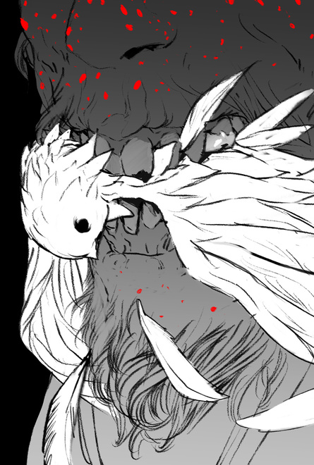
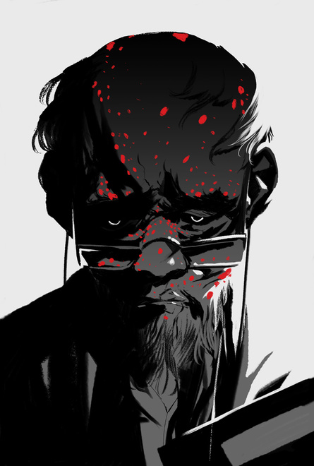
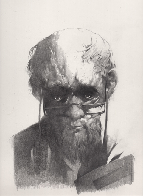
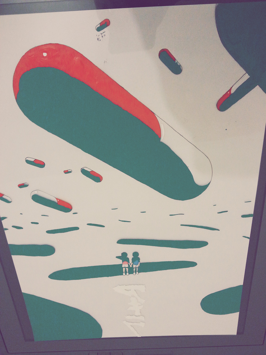
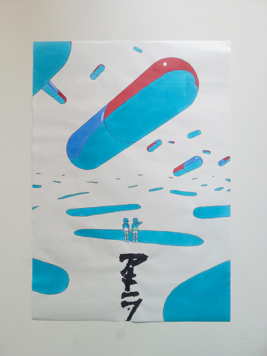
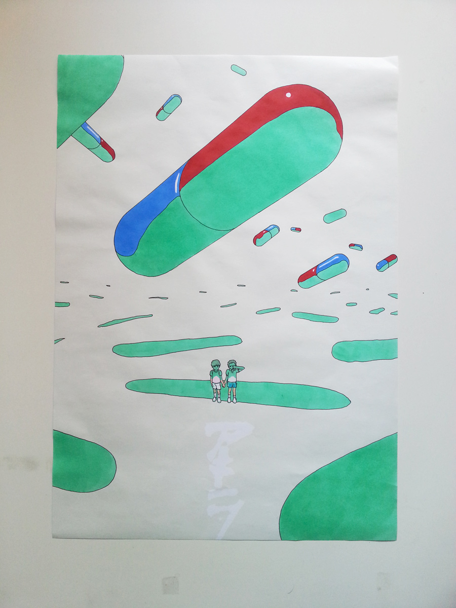
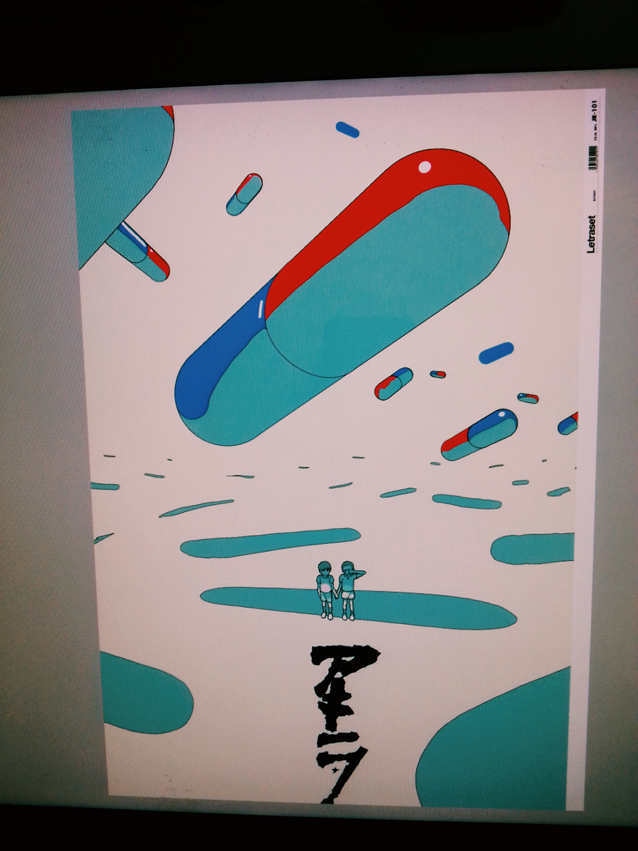
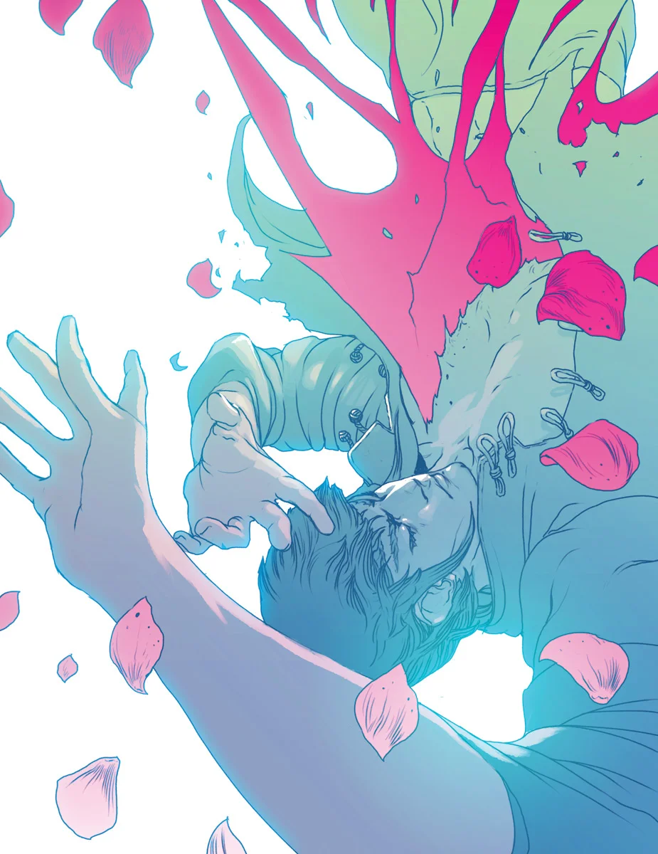
Testing some new analog techniques for my next Graphic Novel, Geist Maschine. This one is made with Nicker Poster Color, Talens Ecoline, Promarker and Copic alcool markers.
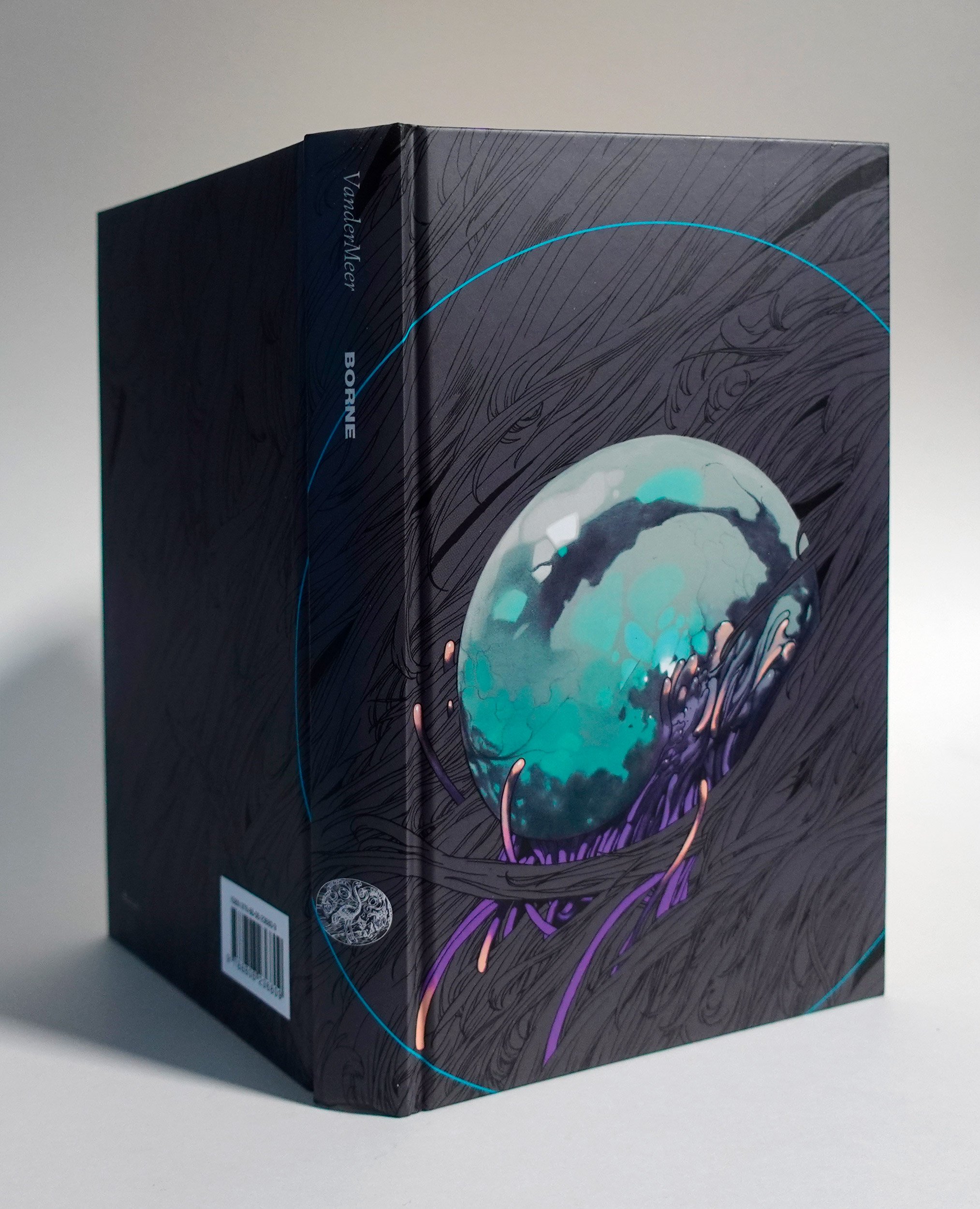
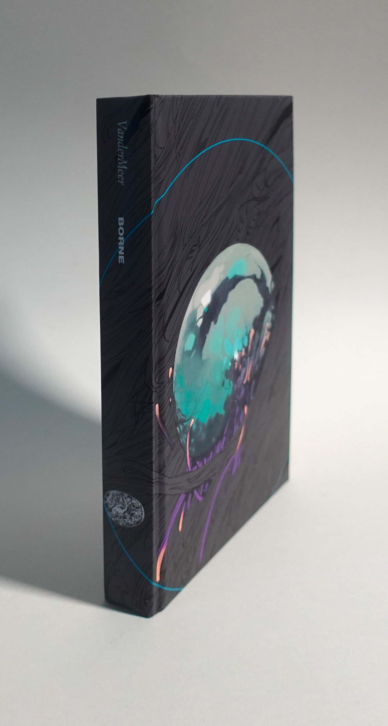
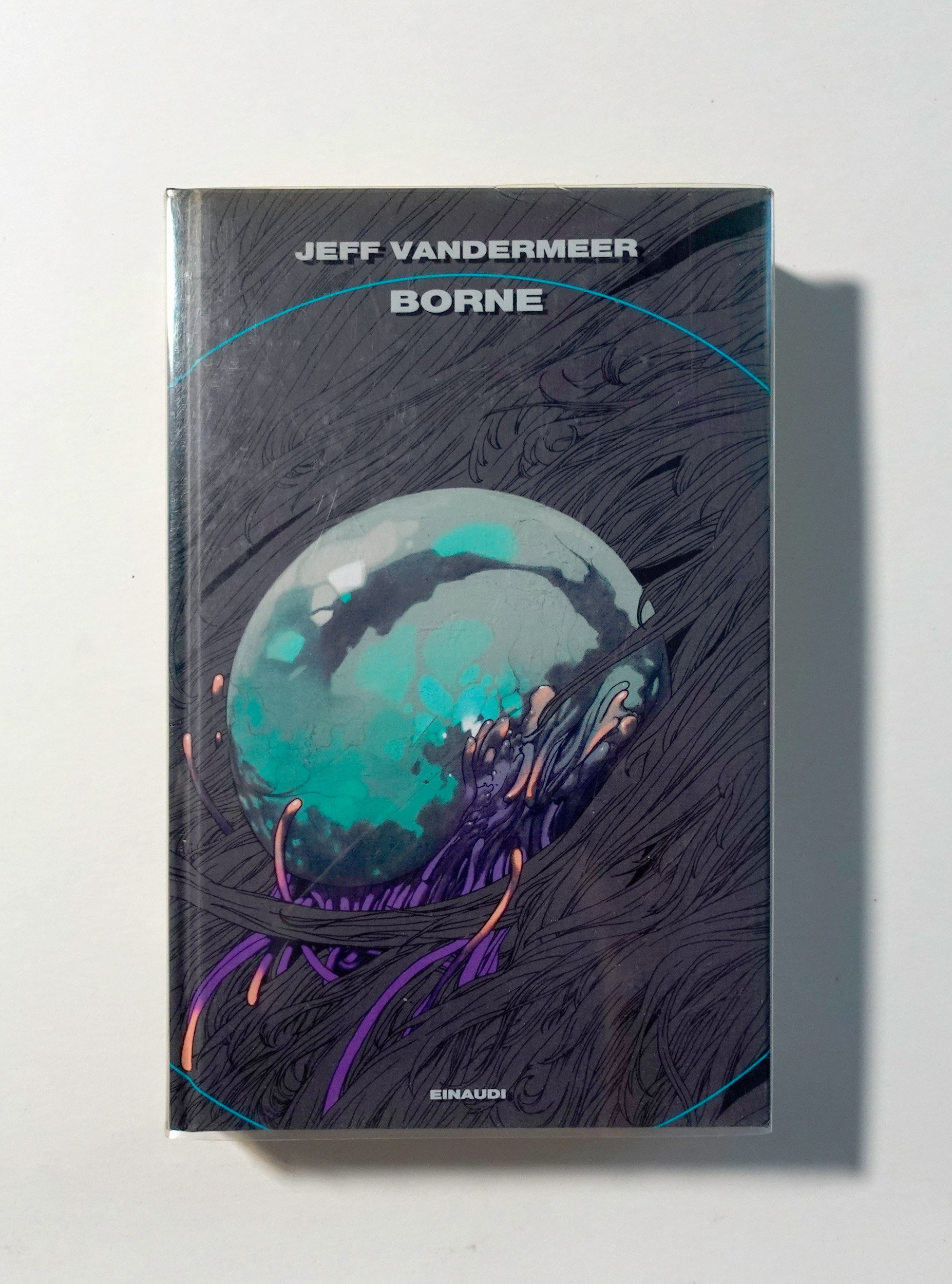
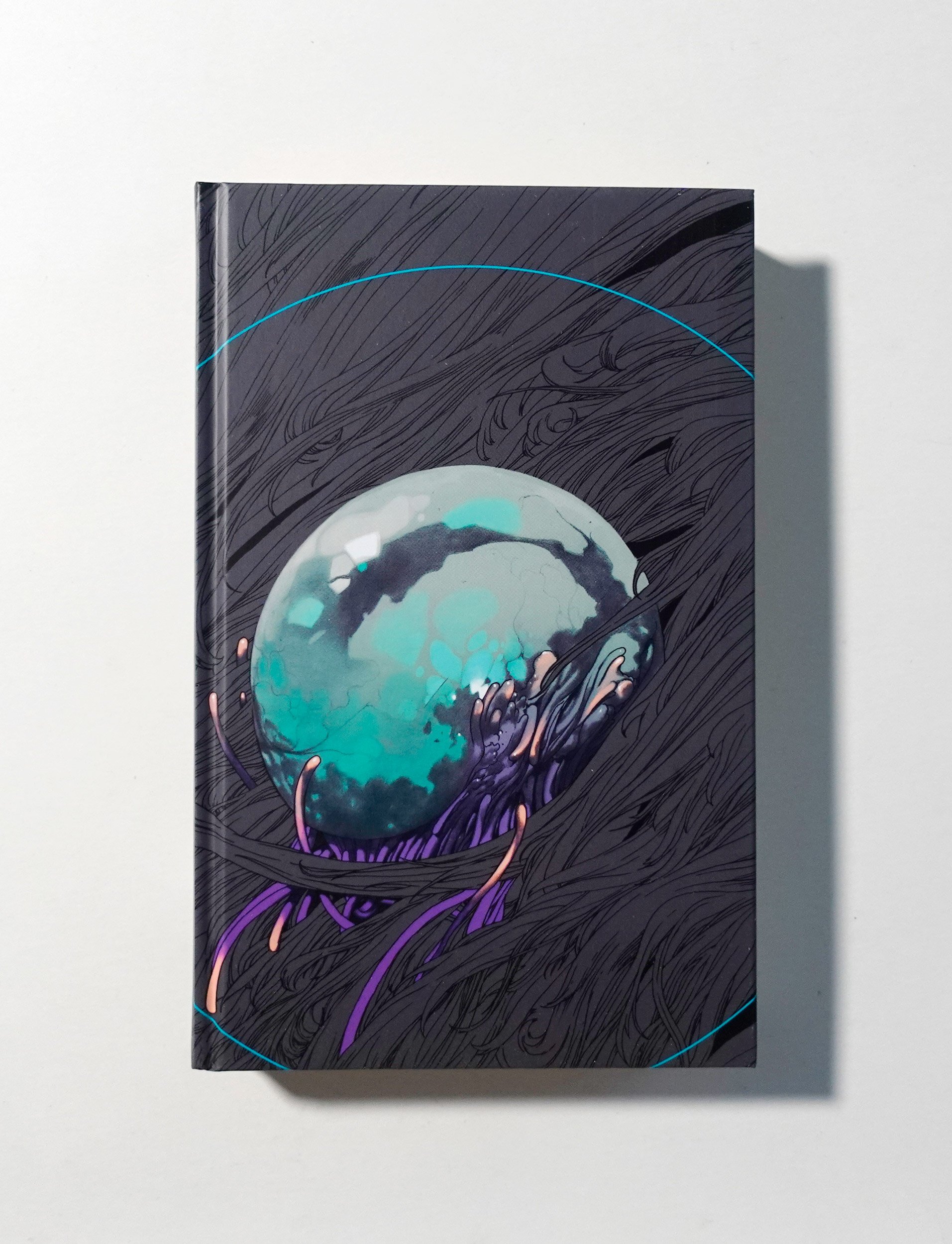
Jeff Vandermeer's Borne | Cover Illustration

A graphic mockup for the final cover design, dummy text.
Once again I make my way in Jeff Vandermeer's imagination, trying to explain what I saw in his powerful, mind bending words. Once again, thanks to Monica Aldi, Viviana Gottardello and Francesco Guglieri for choosing me: it was such a fun project to work on!
Jeff Vandermeer's Borne will be published in Italy by Giulio Einaudi Editore.
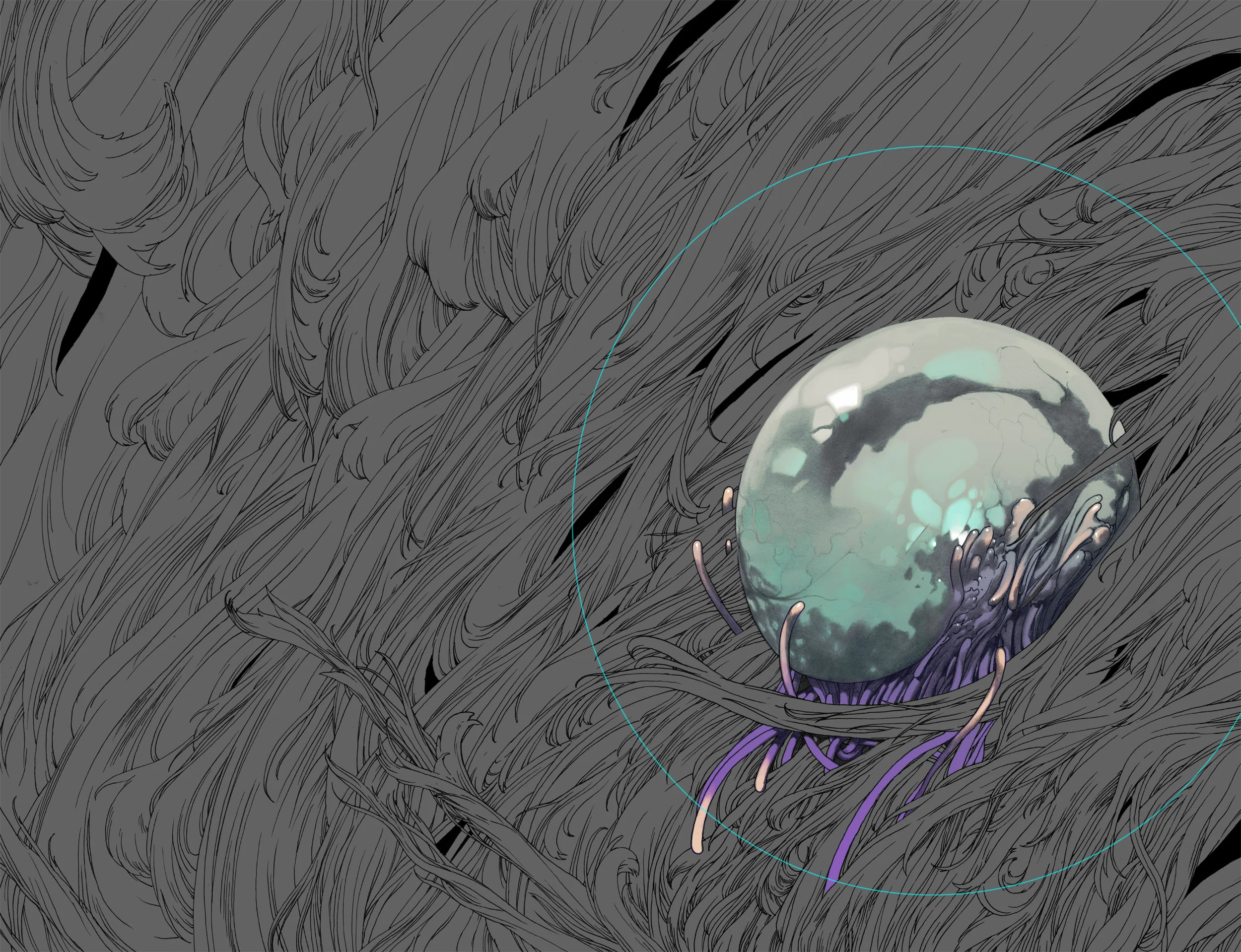
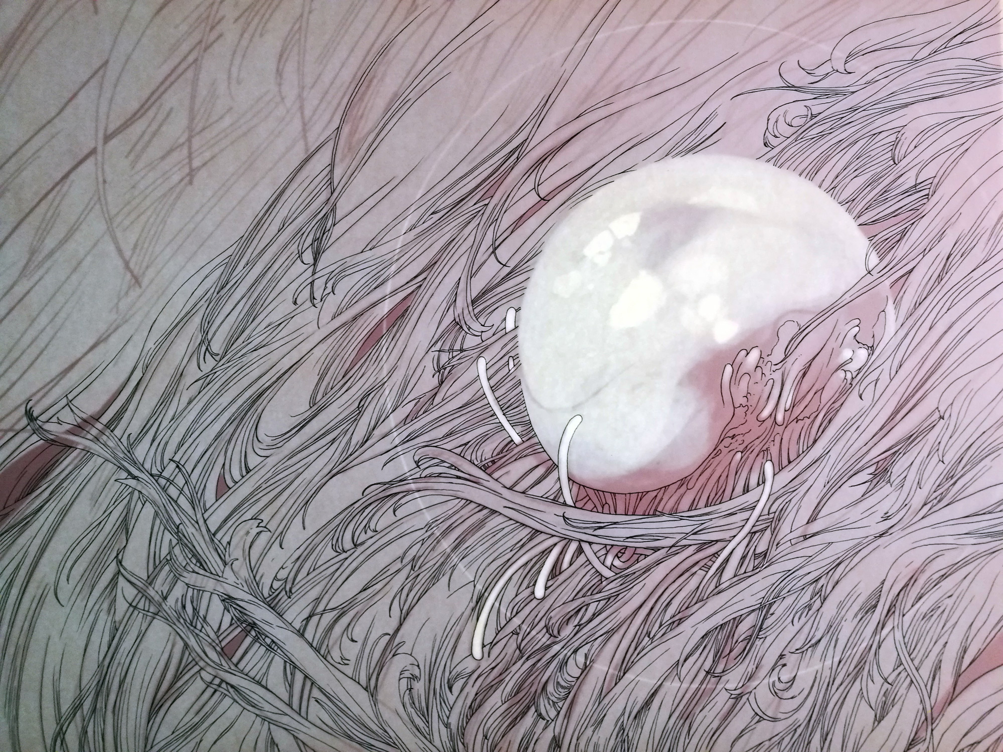
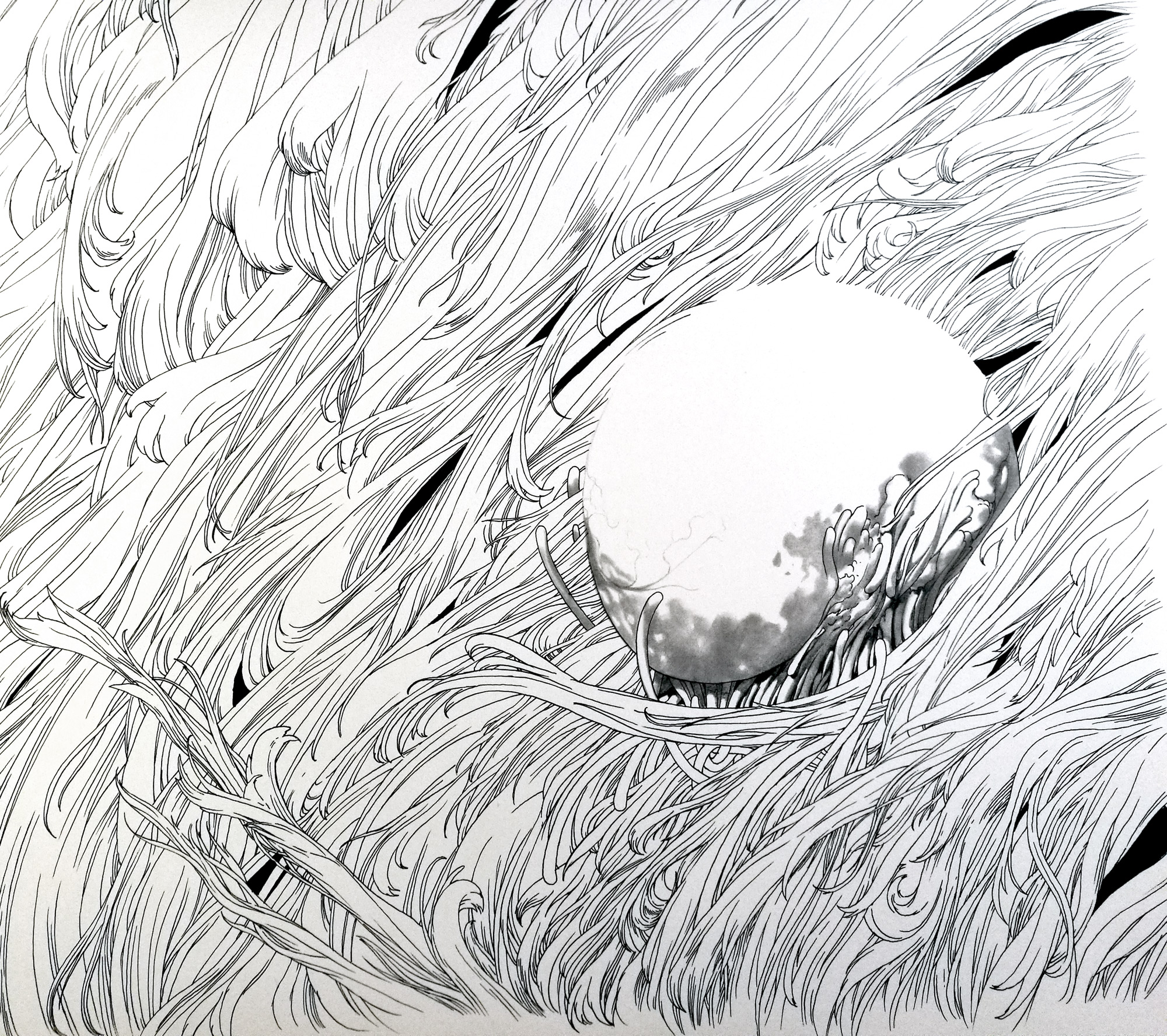
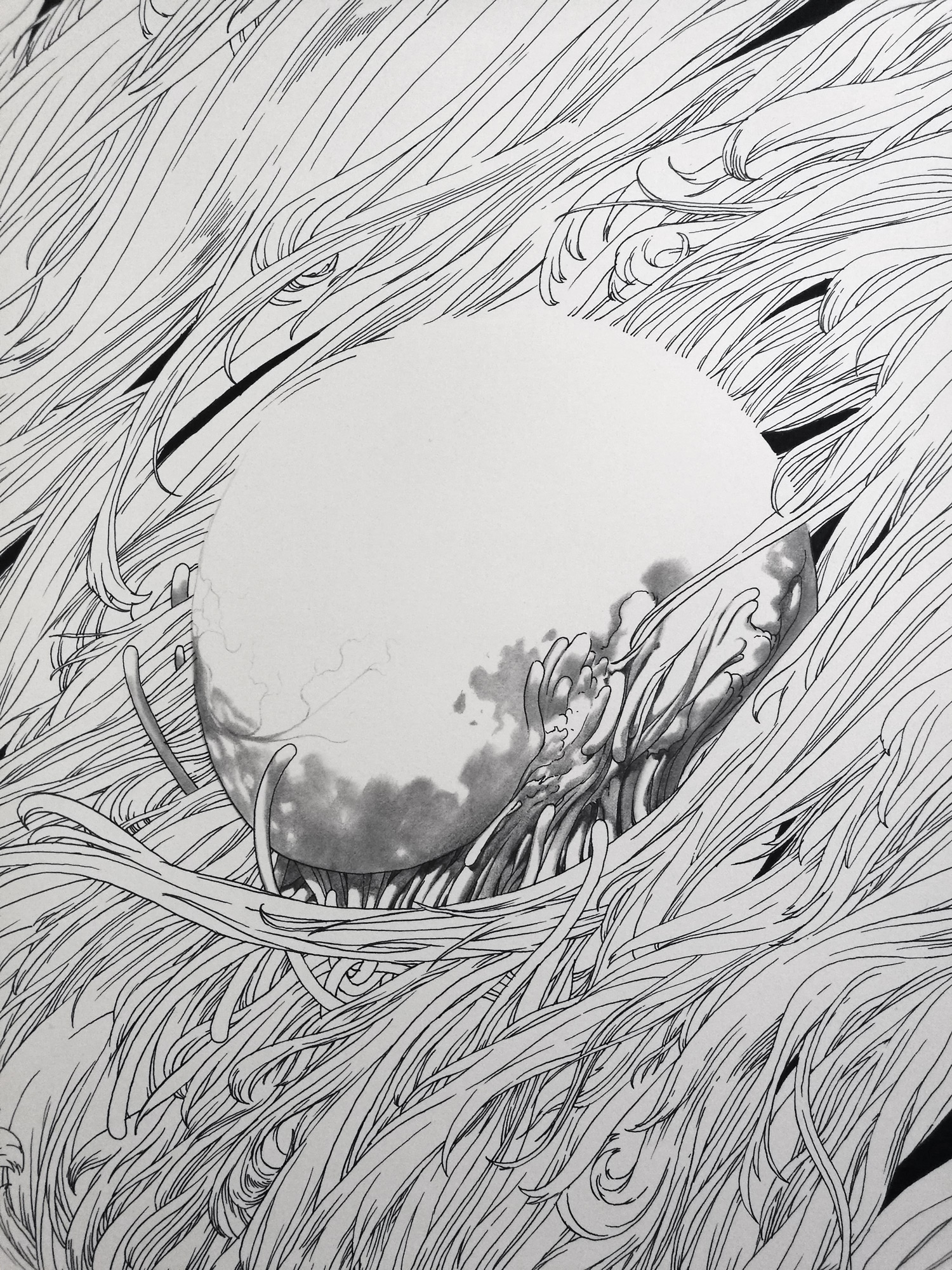
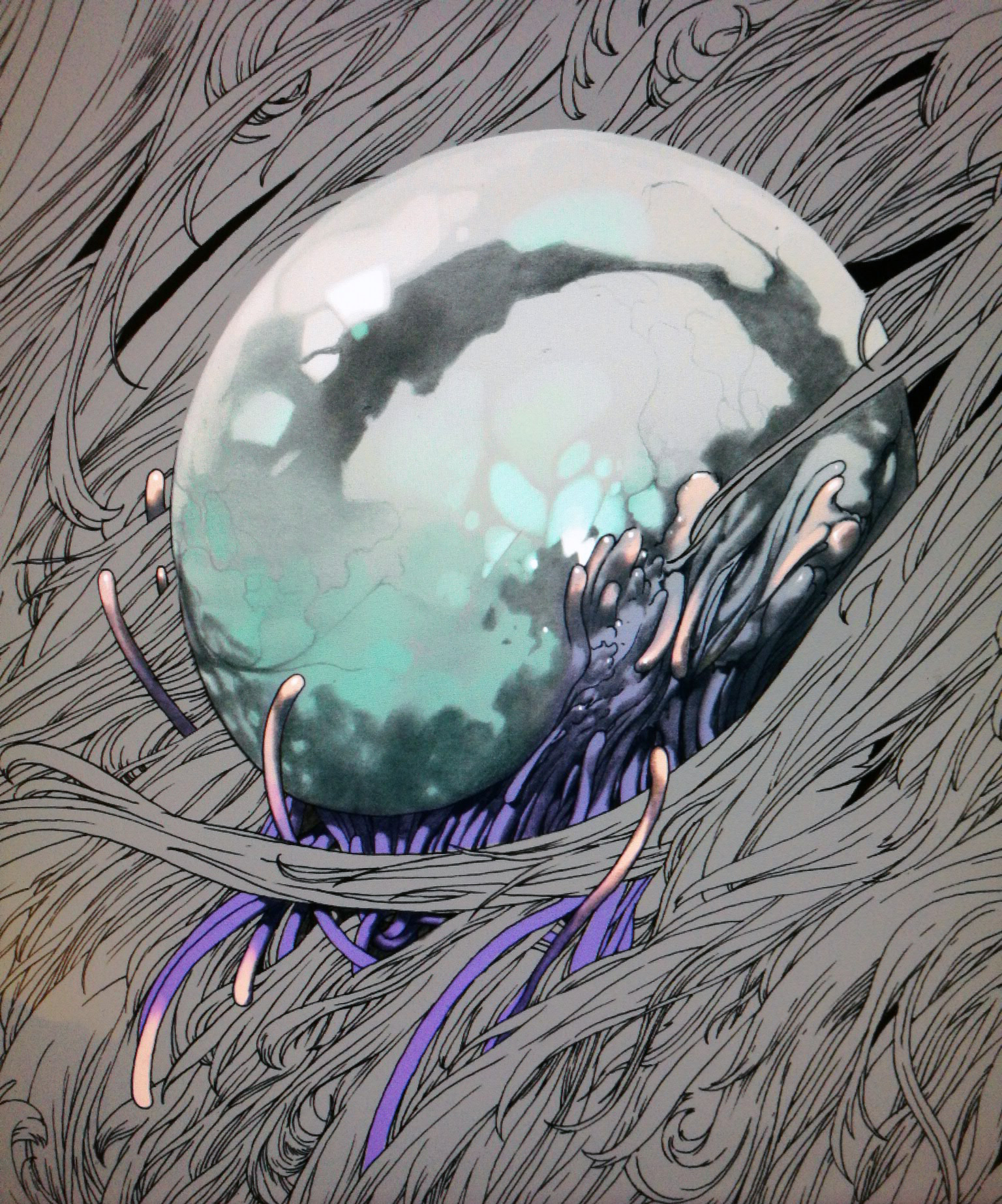
The final cover illustration will be printed in two physical layers: a transparent one with typography assets and the cyan circle while everything else is printed on a traditional hardcover print.
I made this drawing starting with an ink and graphite underpainting on 46 x 61 cm 310 GSM hot pressed / satin Arches paper. You can buy this drawing in my online store.
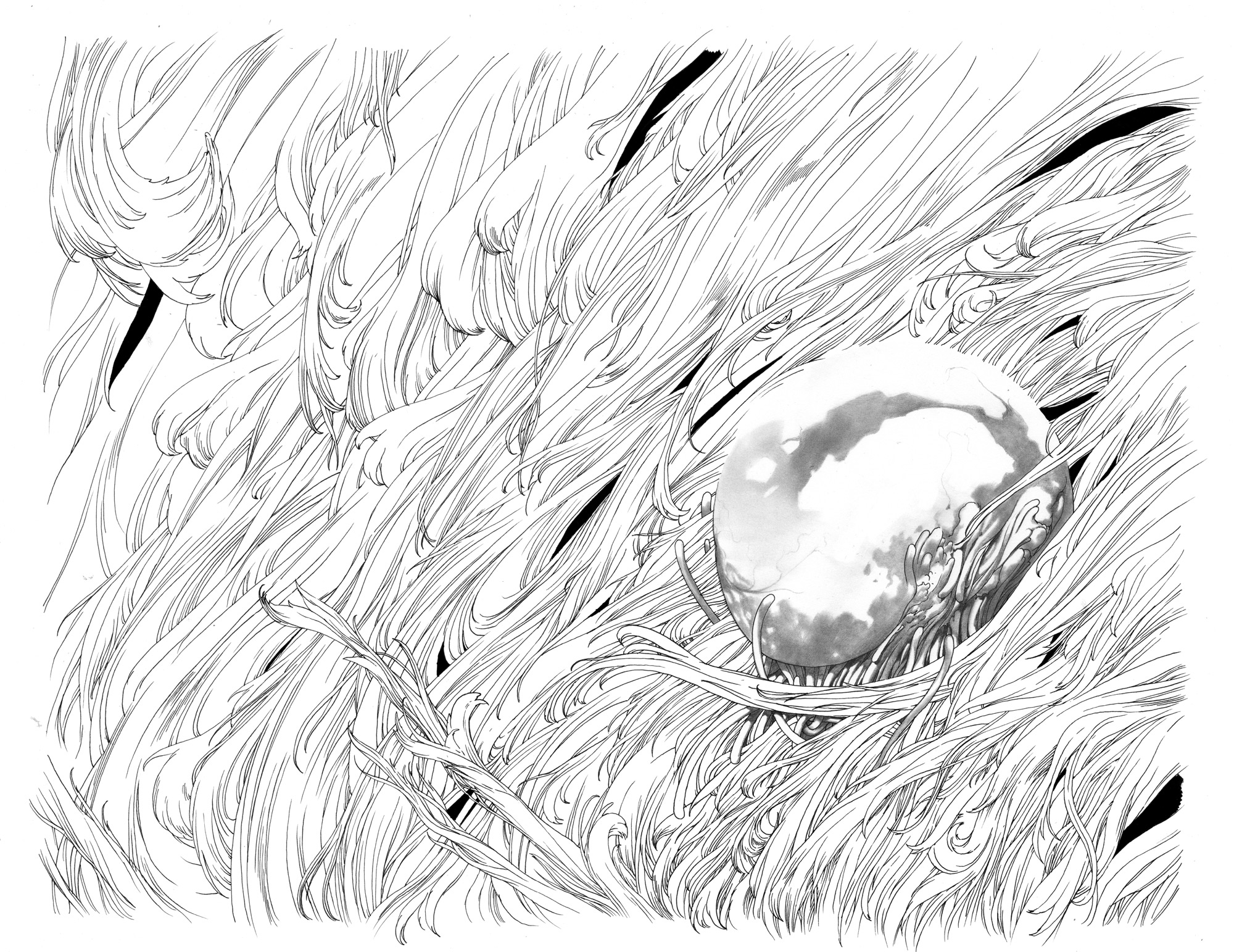
Then I colored it digitally. Here is a making of gallery.
L'Eternauta | cover illustration
I was asked by Antonio Scuzzarella and Alessio Trabacchini to design the 60th anniversary cover for "L'Eternauta", the sci-fi immortal classic by Francisco Solano Lopez and Hector German Oesterheld. Published in Italy by 001 Edizioni, this editon features various extra contents ranging from an exclusive new and exhaustive critical apparatus to a graphic short novel by Zanotto about the life and work of H.G. Oesterheld.
The illustration itself is a 46x61 cm graphite ad watercolour drawing on 300gsm Arches satin paper.
Discarded image for a music event.
Discarded image I did while working on the visual identity for a music event in Rome.
Ladyhawke
EN: I made this fake Ladywake poster for an independent movie fanzine called Chicken/Broccoli, by Sebastiano Barcaroli.
You can buy it as a huge printed poster on Chicken/Broccoli online store.
Size: 27,5 x 27,5 in
Paper: Glossy coated 110 gr
Print: front (full color)
Ships folded.
IT: Realizzato per il CHICKENBROCCOLI ZOO, una mostra esposta a Empoli il 22/23 Aprile 2017 in occasione del Ludicomix e organizzata dal collettivo Le Vanvere. Potete comprarlo nel Chicken/Broccoli online store o direttamente all'Arfist Alley, se passate all'edizione 2017 di ARF!, 26-28 maggio, Macro Testaccio!
Formato: 70 x 70 cm
Carta: Patinata Lucida 110 gr
Stampa: fronte (a colori)
Viene spedito piegato.
Here it is, in it's offset printed glory:
EXTRA!
Some info about process.
Process was a three step business. Started with a digital sketch:
Traced a pretty big pencil drawing (roughly 50x50cm) out of it:
Then added digital color and typography. Ah, almost forgot to mention: the original film logo is freakin'cool.
CP Company | Fashion in Otomo's Akira
I made this illustration for CP Company magazine, an italian fashion magazine sponsored by a well known fashion brand for their peculiar jacket capes with embedded goggles. The article i was called to collaborate to was about fashion in Otomo's Akira.
Ultrachrome giclee print on hahnemulhe 310gsm rag bright white, printed and signed by me is available in my online store.
EXTRA!
Here is some process work.
The drawing is made with black indian ink on Arches paper, pretty big one (60x45 cm). Color is digital. I developed the drawing starting from a digital rough sketch:
Then I printed out my sketch and traced an ink drawing out of it:
Then I did some fixes and added color before going for the final piece with typographic elements.
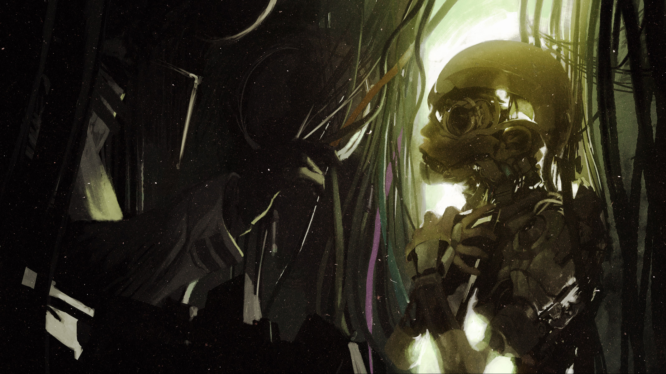
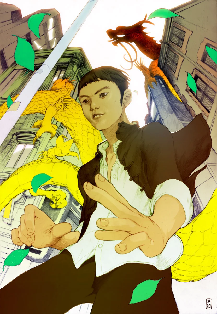
Otaku
Concept art illustration I made for a massive sci-fi world building project by Joshua Jenkins. Joshua sent me a huge documentation on his deeply articulated view about the odd future of mankind asking me to develop a very weird and beautiful character, and so I did.
Ultrachrome giclee print on hahnemulhe 310gsm rag bright white, printed and signed by me will be soon available in my online store.
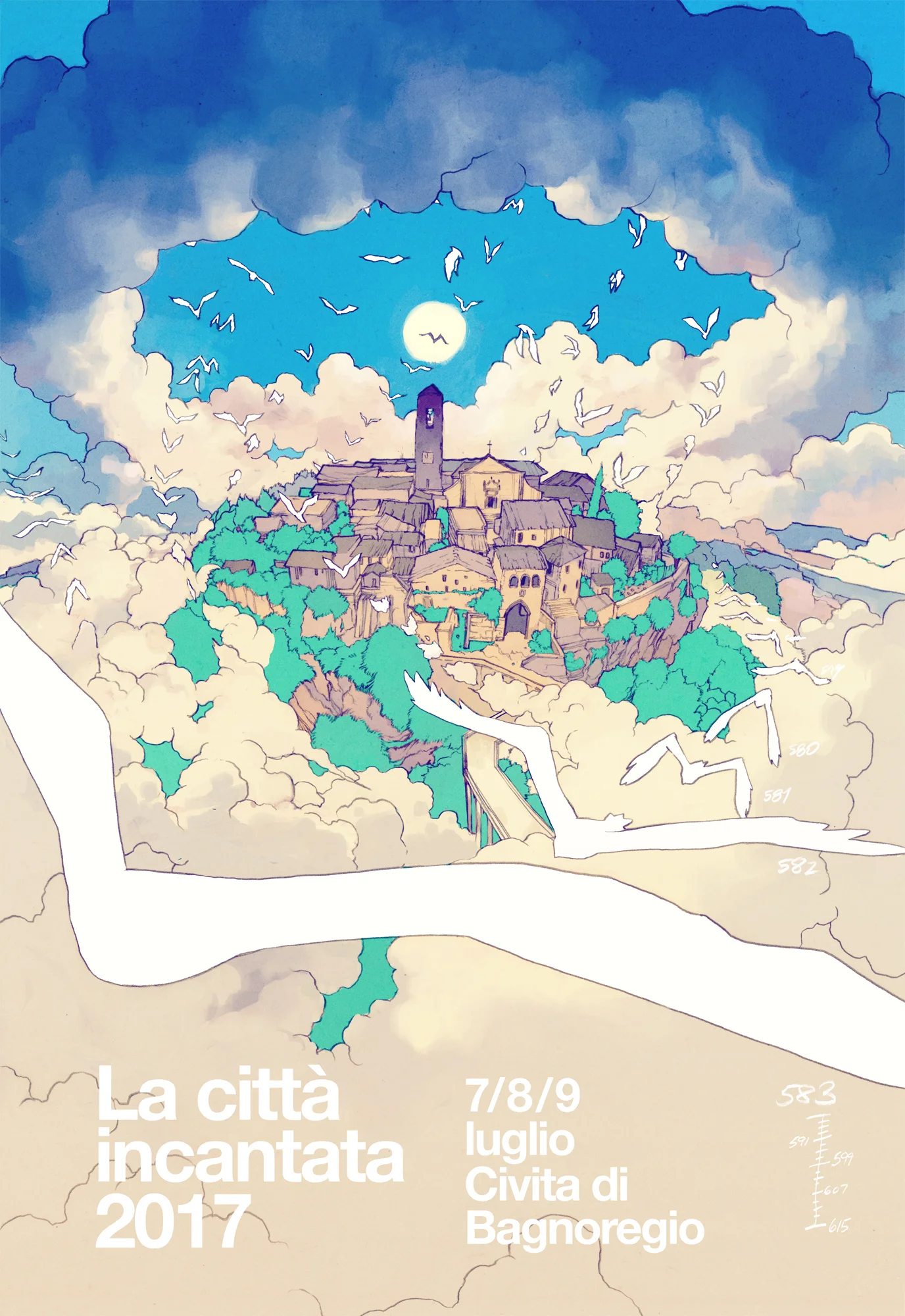
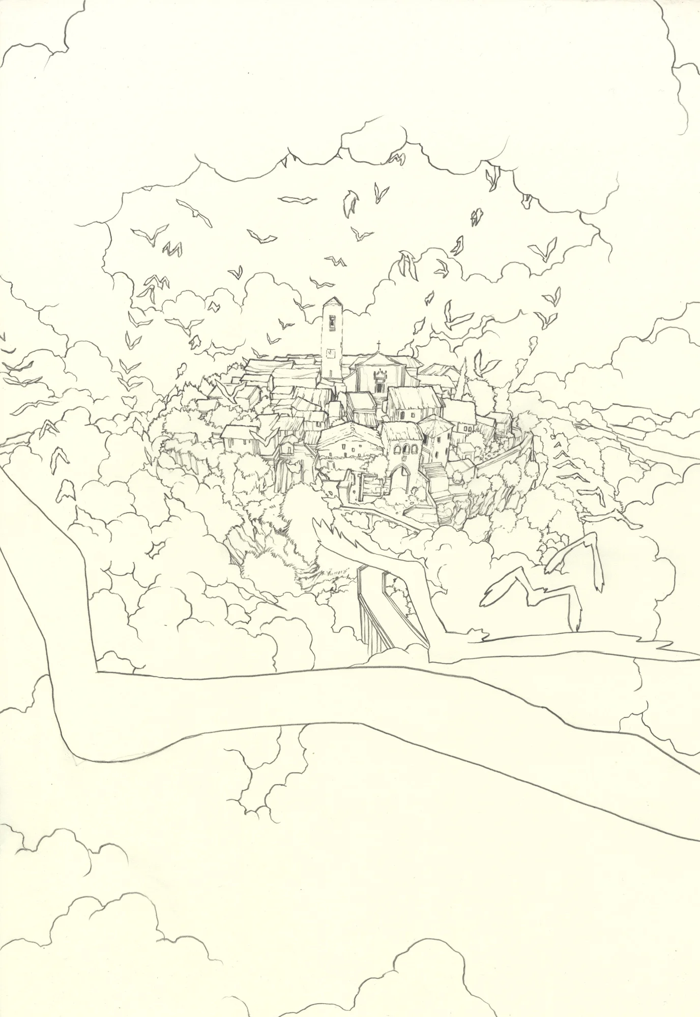
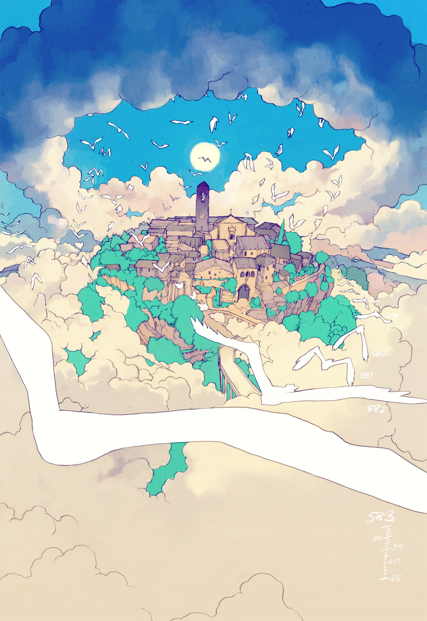
La Città Incantata | 2017 official poster
Luca Raffaelli asked me to create an illustration for the 2017 edition of "La Città Incantata" official poster. "La città incantata" is an international animation film festival in Civita di Bagnoregio, Italy, featuring the cream of the crop of the worldwide animation production.
Here is a quick process breakdown.
I started with a digital sketch:
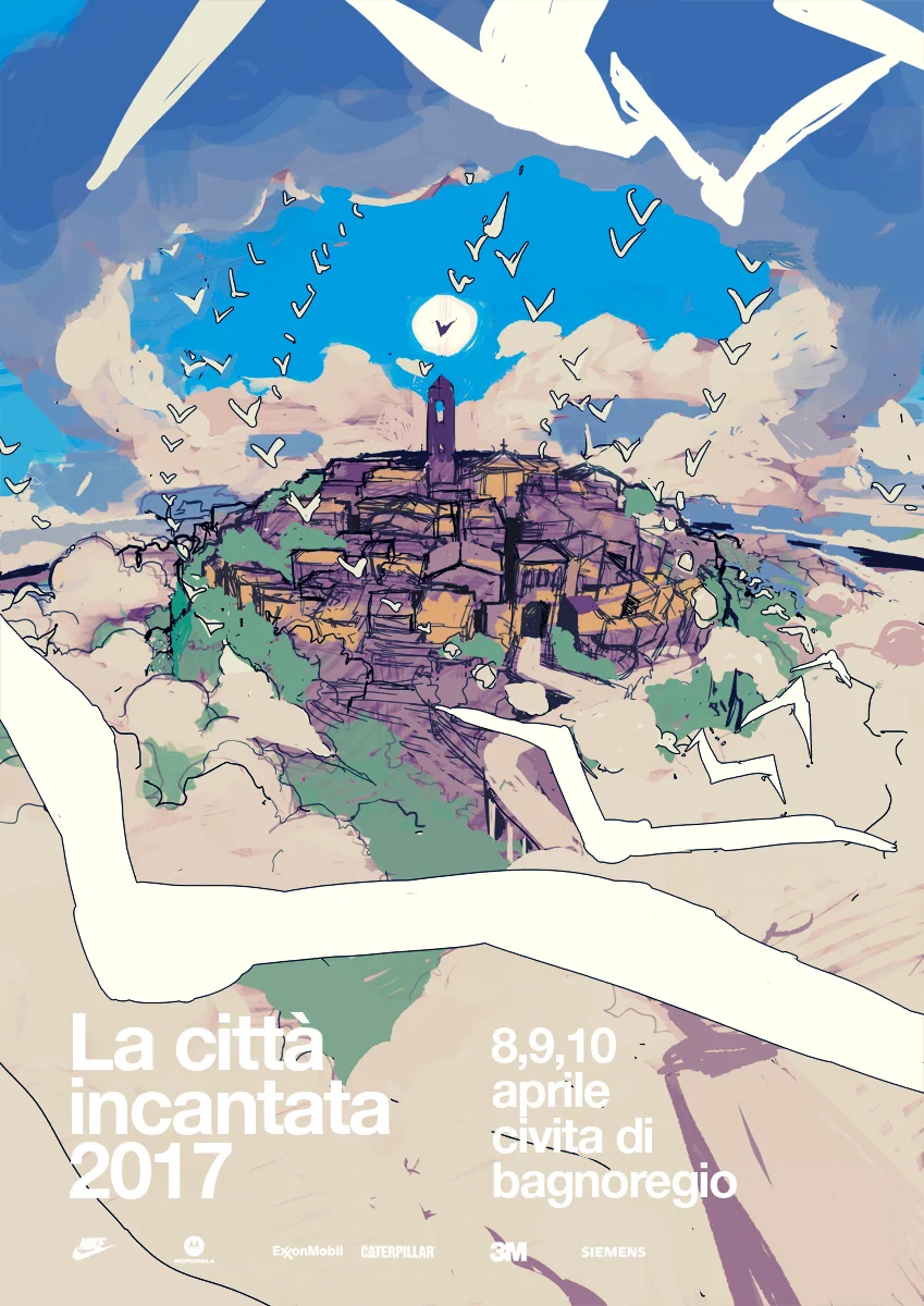
Then I traced it as an hard black lumograph pencil drawing on 300gsm hot pressed Fabriano Artistico, 30,5 x 45,5 cm. This passage ensures the best possible stroke dynamic range and texture. (For sale in my store)
Then I added color in Photoshop.
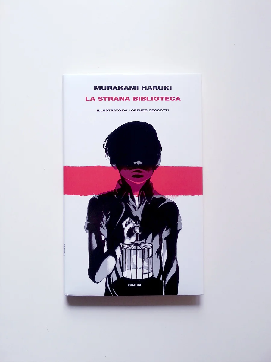
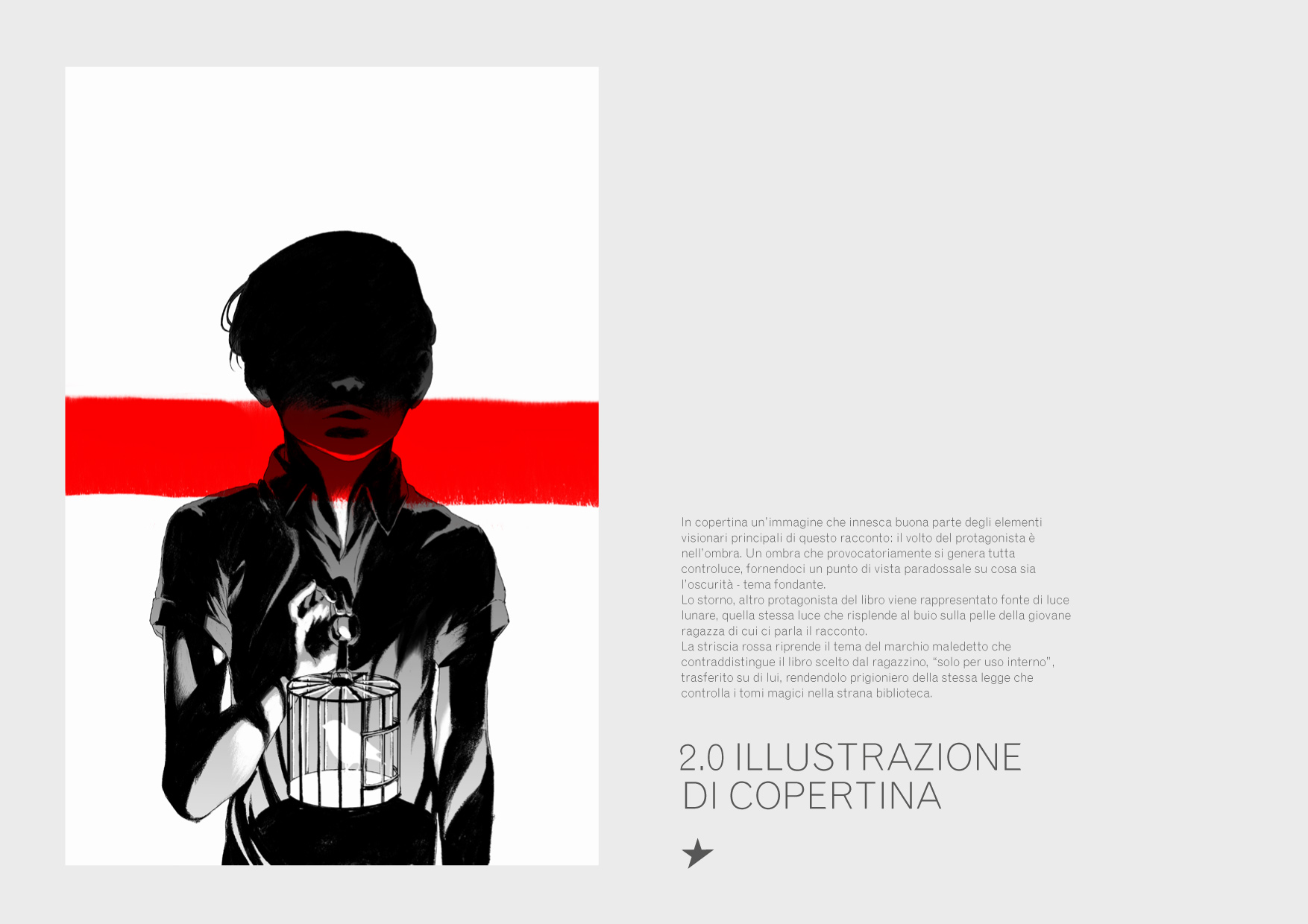
MURAKAMI HARUKI | LA STRANA BIBLIOTECA
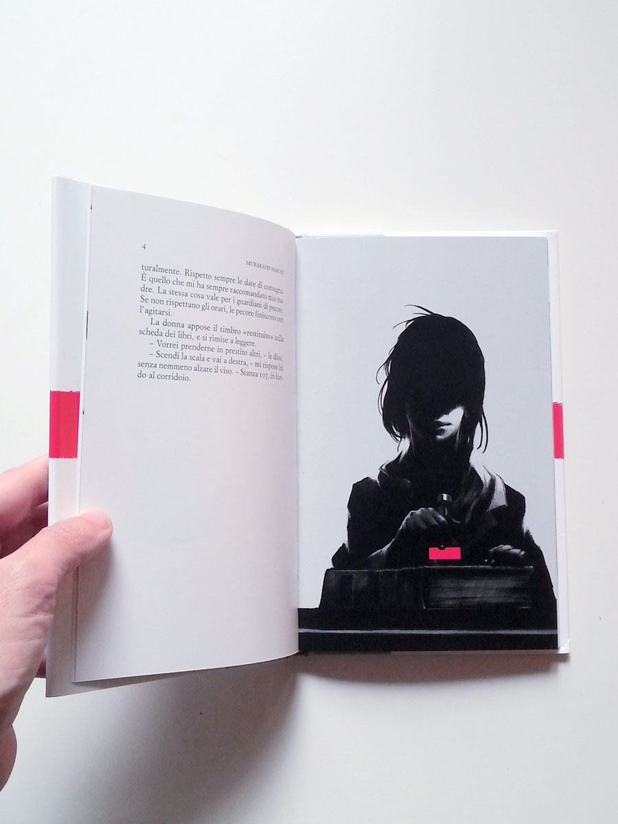
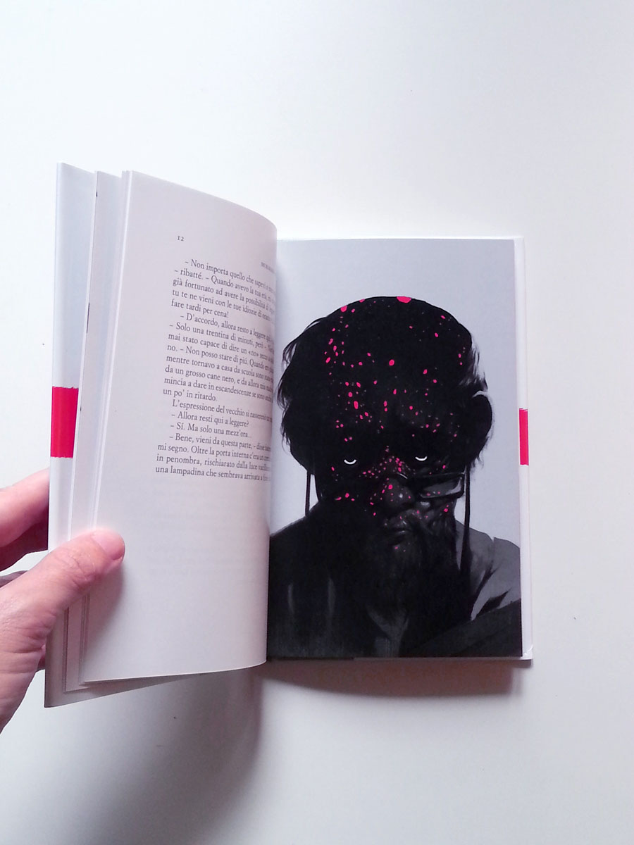
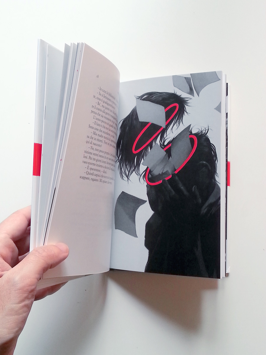
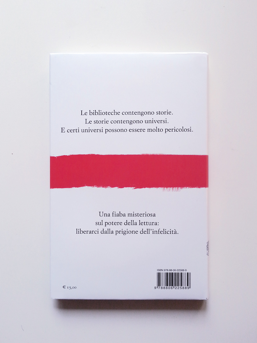
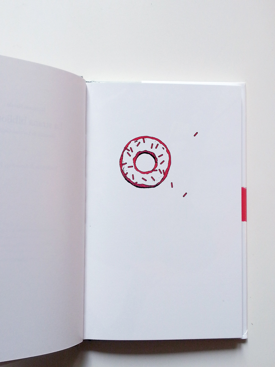
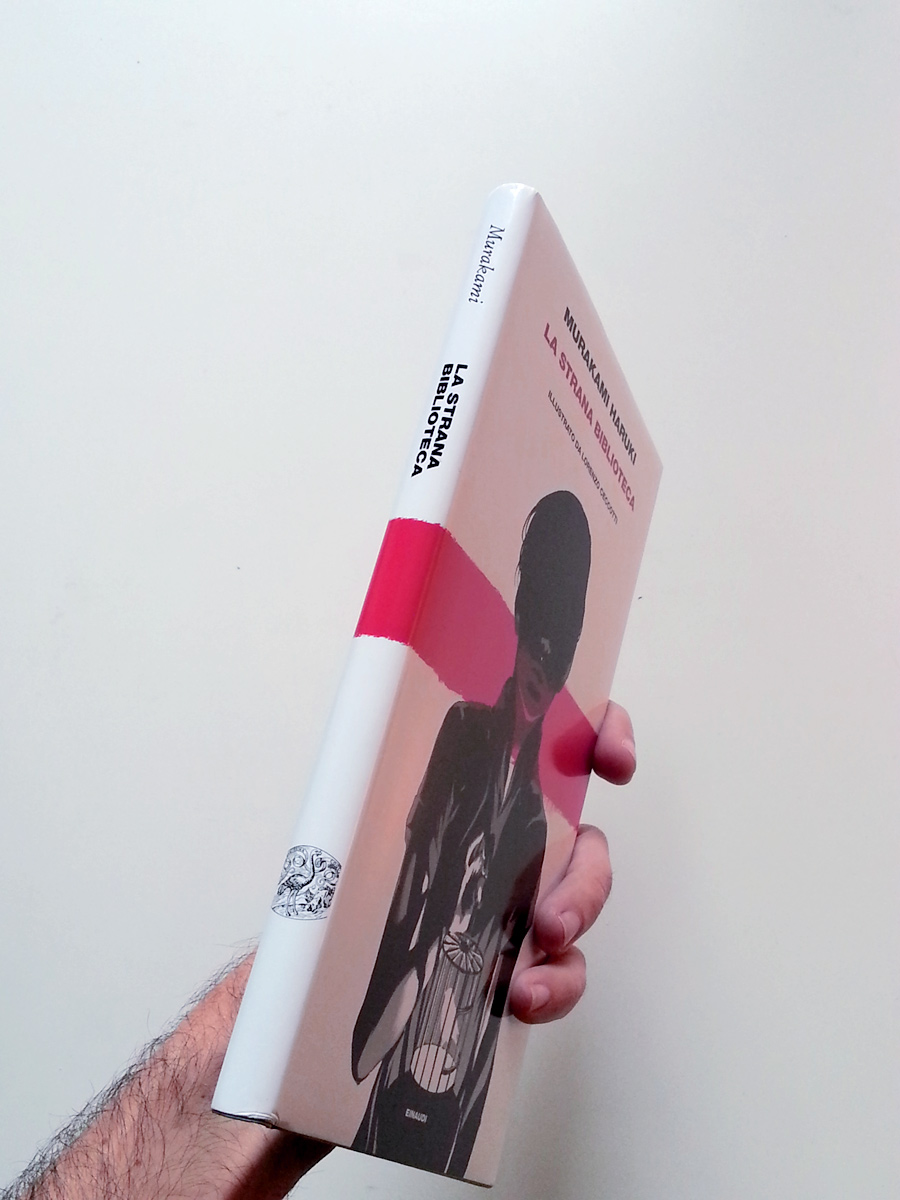
I had the luck and honour to illustrate "A strange library" by Murakami Haruki for Giulio Einaudi Editore.
It's 25 illustrations including the cover piece.
I drew all the pictures during a 6 month work trip in the USA. The llustrations were completed in the Utah deserts so I had to adopt a very basic technique: HB lumograph pencil was the tool of the trade with some rare intrusion of a prismacolor black pencil.
I started from quick but precise digital sketches so I could have a very early approval for the subjects.
Then I made pencil illustrations that would work as a black channel for three spot colour silkscreens.
Whenever I had the chance to work on a computer I did the final digital touches.
It was an amazing opportunity: this short story is a thing of beauty, and I still can't believe I had the chance to visualize it. Moreover the other international editions are by huge artists like Chip Kidd, Kat Menschik and Maki Sasaki: it took a very deep breath to accept the challenge!
Hope you'll like it!
(A little extra in the gallery below: some excerpts from the original draft presentation.)


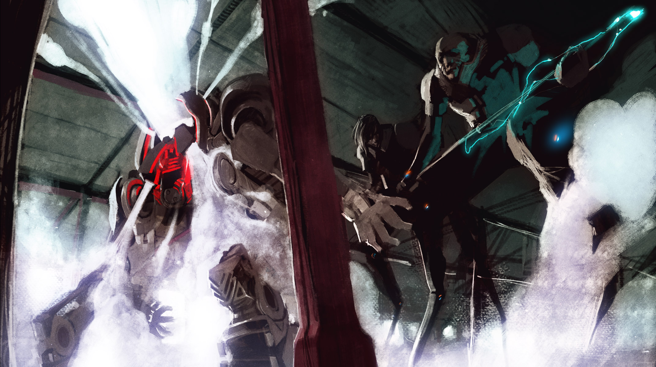
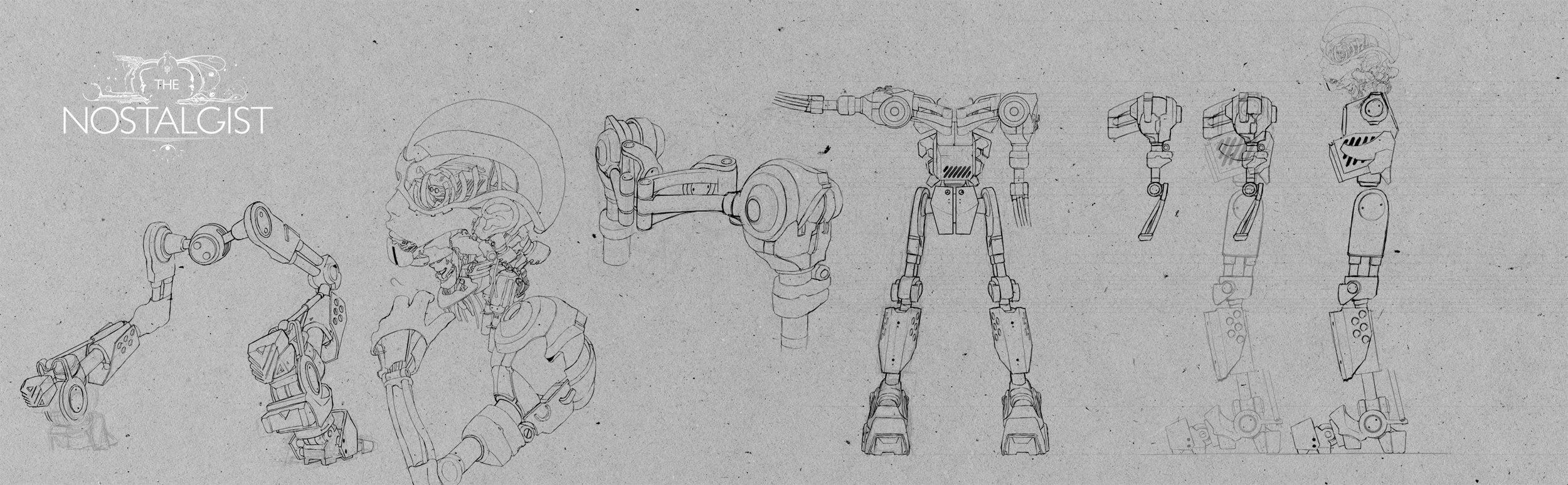
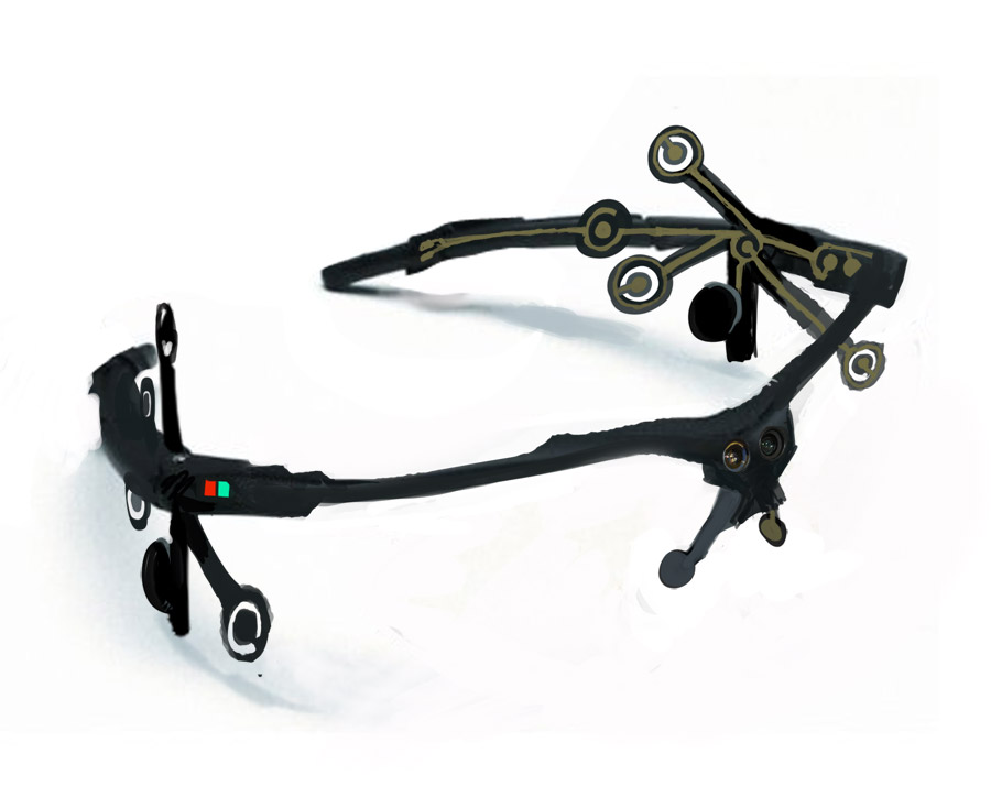
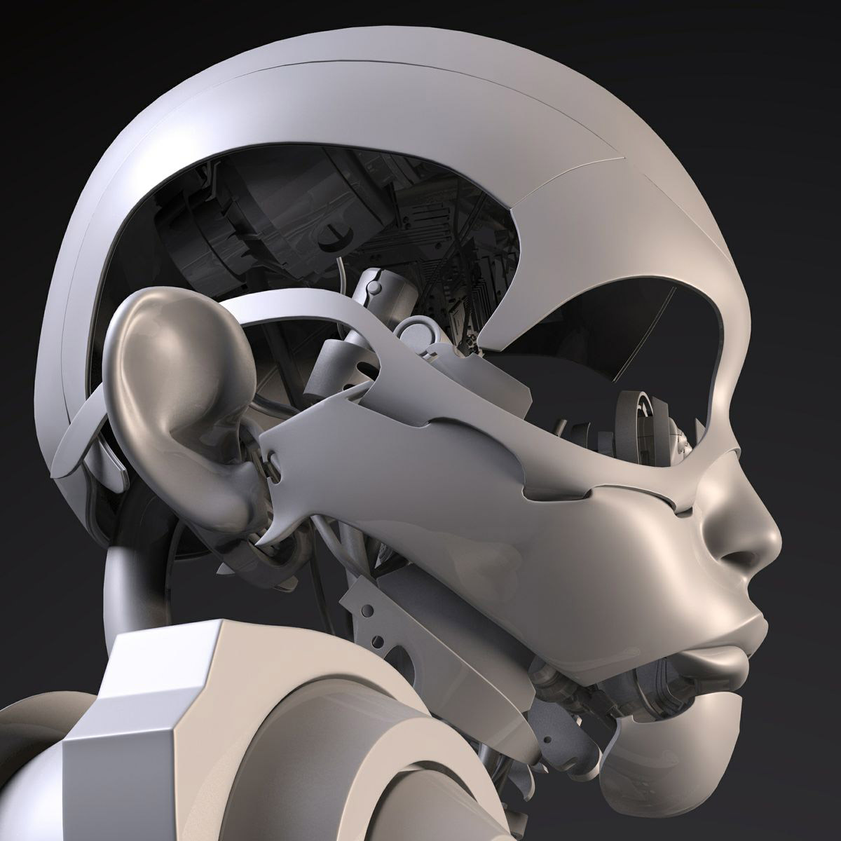
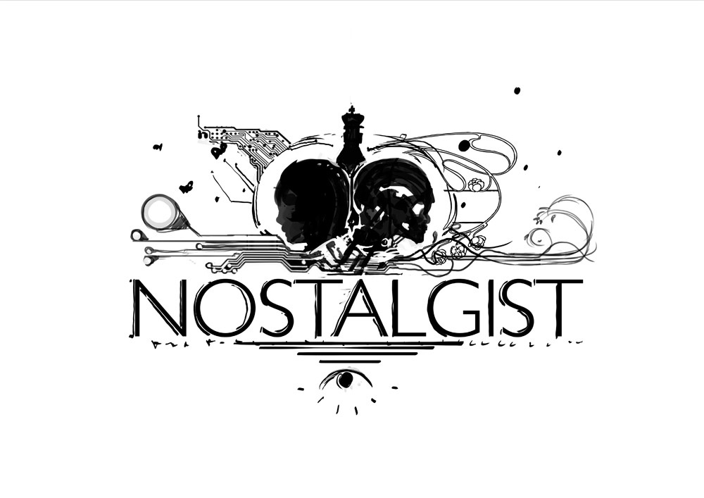
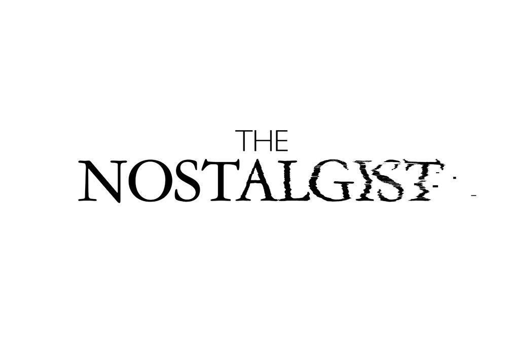
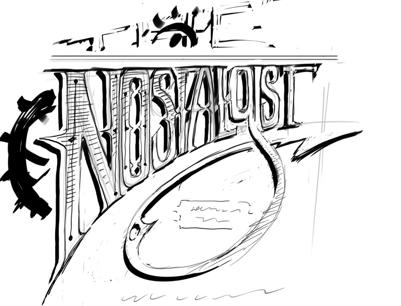
The Nostalgist | Free streaming on Wired Video

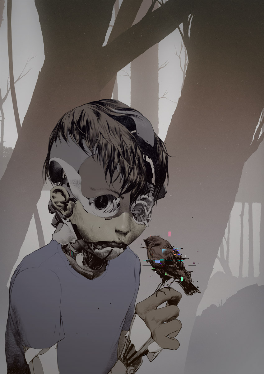

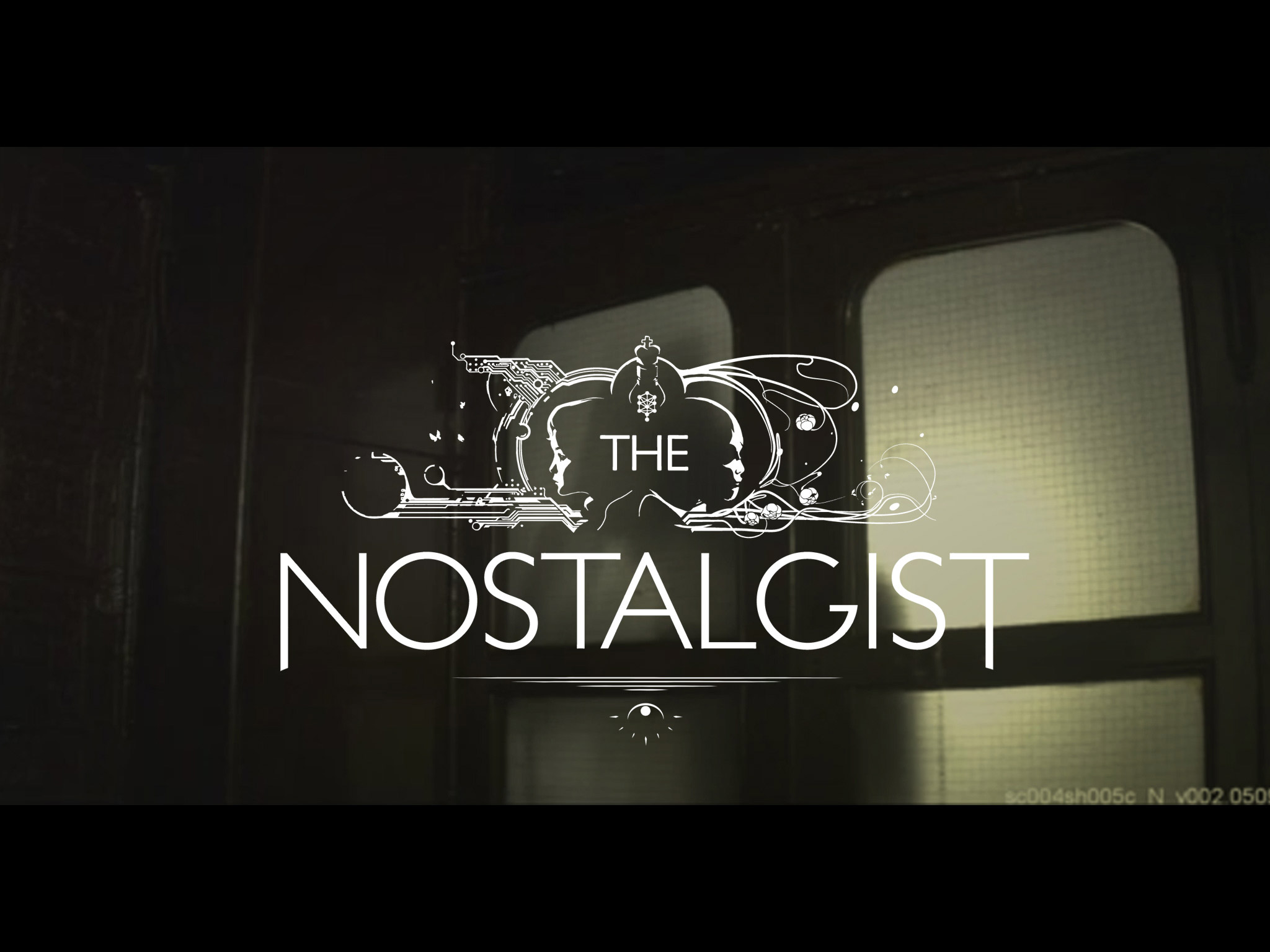

After a couple of years, "The Nostalgist" goes free streaming online, hosted by WIRED VIDEOS.
You can watch it here: http://video.wired.com/watch/the-nostalgist-a-short-film-by-giacomo-cimini
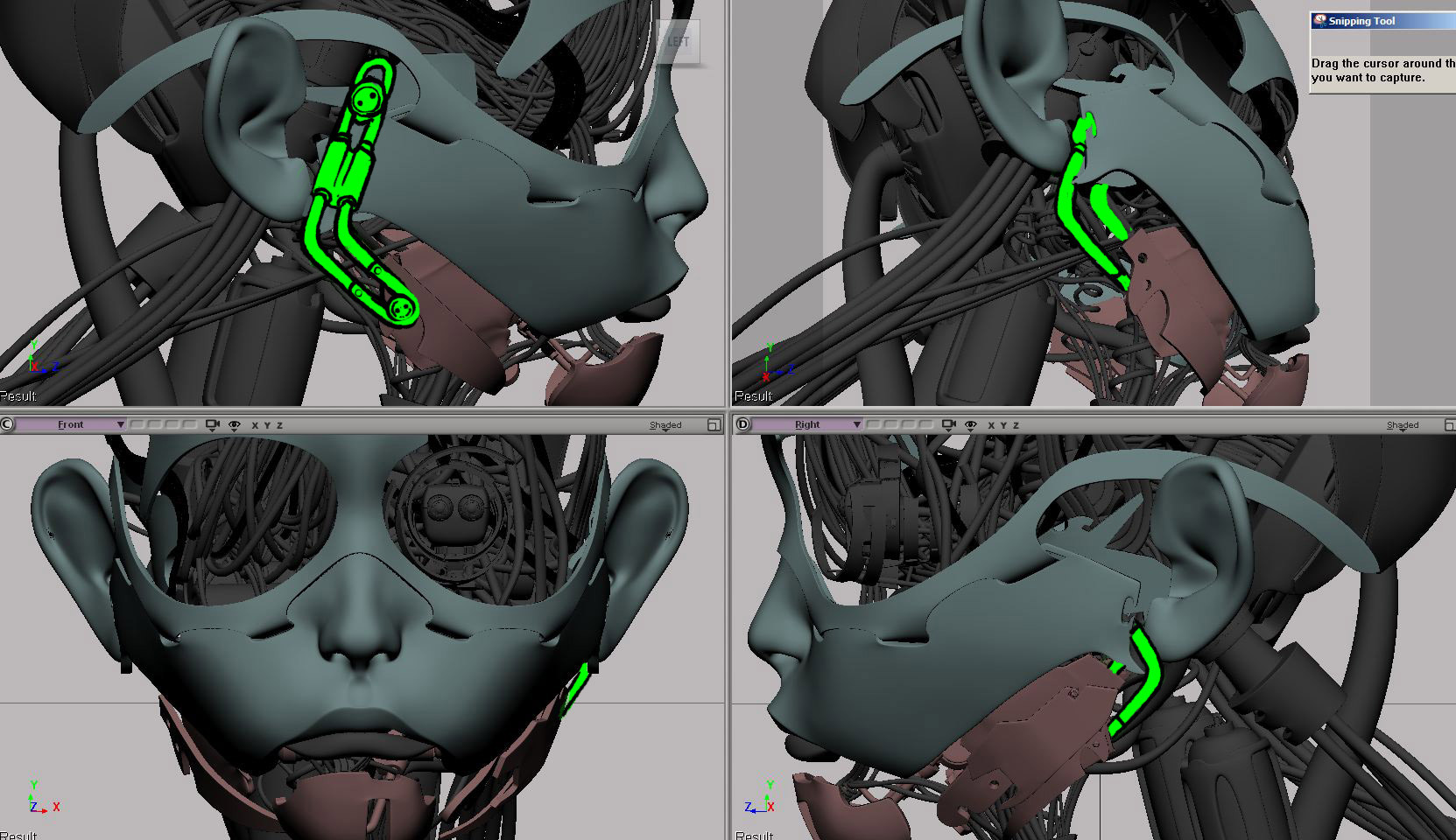
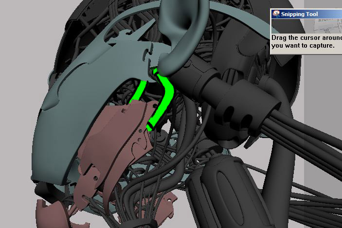
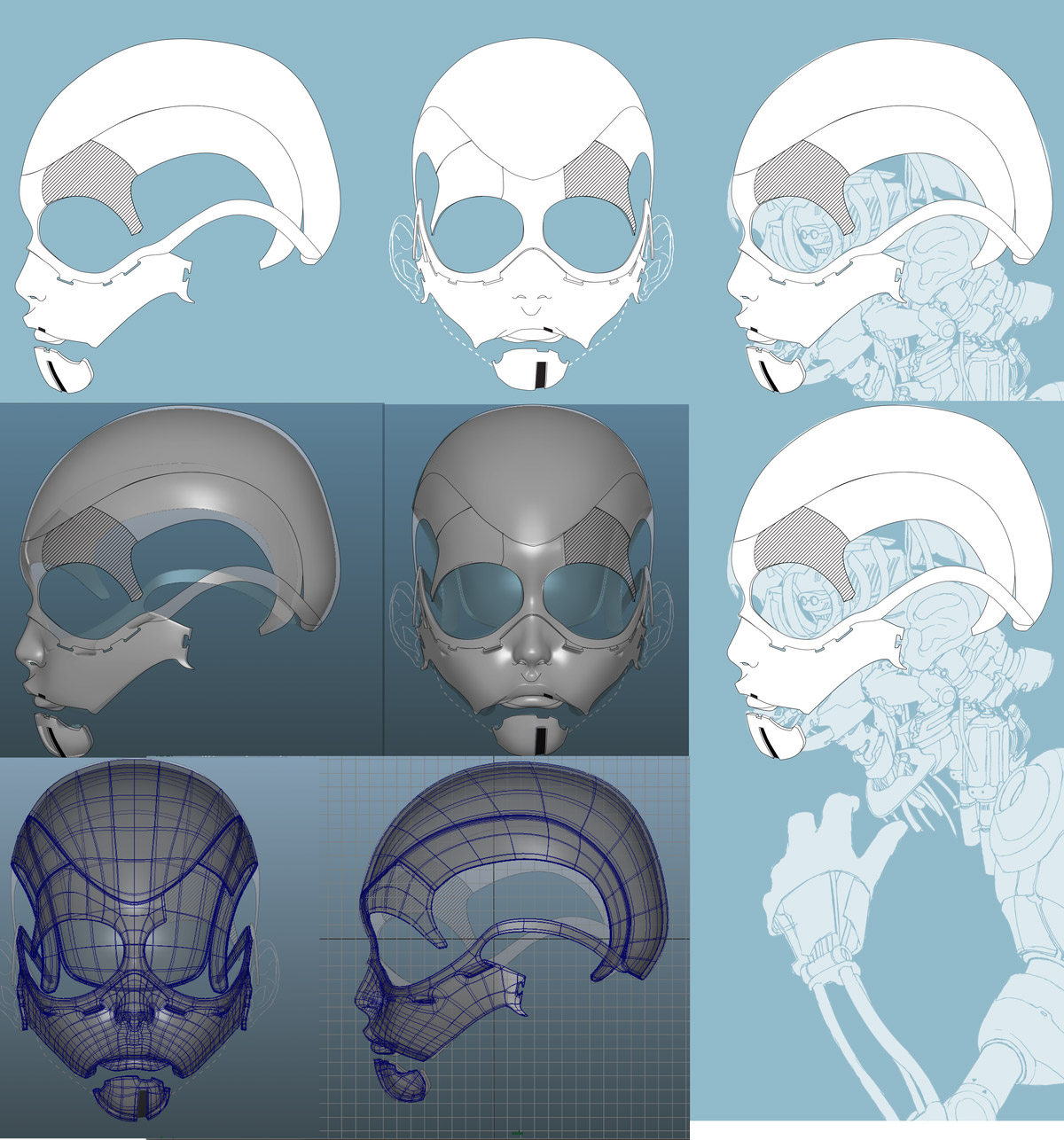
My contribute to this incredible effort by a marvelous crew and their visionary director was the creation of some visual assets in the concept art field: I mainly designed the little robot and visualized the militiamen. Did the movie poster and logo too. It was great taking part to this journey, seeing what a passionate bunch of great people can do. Hope you'll like it!
From "The Nostalgist" Wiki Page:
The Nostalgist is a 2014 science fiction short film, written and directed by Giacomo Cimini, based on the short story The Nostalgist by Daniel H. Wilson.It was produced by Giacomo Cimini, Tommaso Colognese and Pietro Greppi for Wonder Room Productions. It stars Lambert Wilson as the father and Samuel Joslin as the son. The short film was filmed in London and explores the themes of loss, nostalgia and robotics. It is noted for its performances and visual effects.
The short film was partially financed through a Kickstarter campaign.
The short film premièred Jun 19, 2014 at the Palm Springs International Festival of Short Films and went on to participate in the Fantastic Fest 2014, the Clermont-Ferrand International Short Film Festival 2015 and the Cleveland Film Festival 2014.
It later had a limited release in the United States and Russia.
It also premièred as video on demand on the We Are Colony on-line platform in October 2014.
The short film was included in the short film programme Cult of the BFI London Film Festival 2014.
In 2014 it won the Méliès d’Argent, the Audience Awards at Trieste Science+Fiction and Utopiales, as well as Best Short Film at the Giffoni Film Festival 2014.
The short film was selected for the Short Takes section of the December 2014 issue of the American Cinematographer.
Awards:
2nd place Best Short Film over 15 minutes - Palm Springs International Festival of Short Films 2014.
Best Short Film (Generator +18) - Giffoni Film Festival 2014.
Prix du Publique - Utopiales, Festival International de Science Fiction 2014.
Méliès d’Argent and Audience Award - Trieste Science + Fiction Festival.
Best Sci-Fi Short film - 28th Leeds International Film Festival.
Best Professional Short Film over 10 minutes - Raw Science Film Festival.

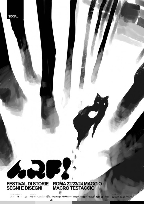
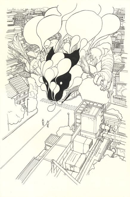
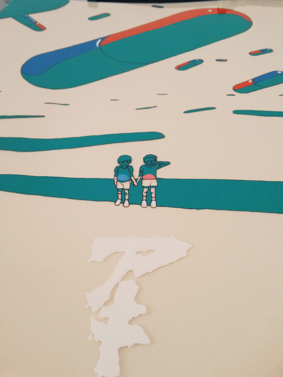
ARF! 2016 Official poster illustration
"Io da Roma proprio non riesco a separarmi.
I motivi sono tanti, è chiaro, ma ce n’è uno in particolare che è senza dubbio il più forte.
Non credo esista un posto con un’intensità artistica maggiore di Roma, nel mondo, e l’idea, per quanto assurda, di provare ad avere una risposta da una città severa come Roma al mio amore sfrenato è forse il giogo più stretto che mi ci tiene attaccato. Quando ti capita l’occasione di disegnare sulle strade della città con un manifesto di un evento importante come ARF! (che oltretutto la incarna quella antica forza visionaria), è uno di quei rari momenti in cui Roma abbozza di nascosto una risposta al tuo messaggio d’amore.
Il mio manifesto per ARF! è, prima ancora che un ennesimo atto d’amore per questa città, uno di quei rarissimi, preziosissimi, atti di amore che la città mi concede."
This is from a post I made on social networks when the poster was revealed: long story short: it's a HUGE honour to have been chosen to illustrate the official poster image for ARF! Festival 2016.
ARF! Festival is a young yet amazing event, reuniting immense talent in a three days love trip for comic enthusiasts or simply people that want to plunge deep into the excellence of sequential narrative or even to just have a first contact with this mesmerizing art form.
Moreover this year event will take place at MACRO TESTACCIO, a beautiful museum obtained from an old slaughterhouse in the center of Rome and one of the most important exhibition spaces in the capital.
Extras!
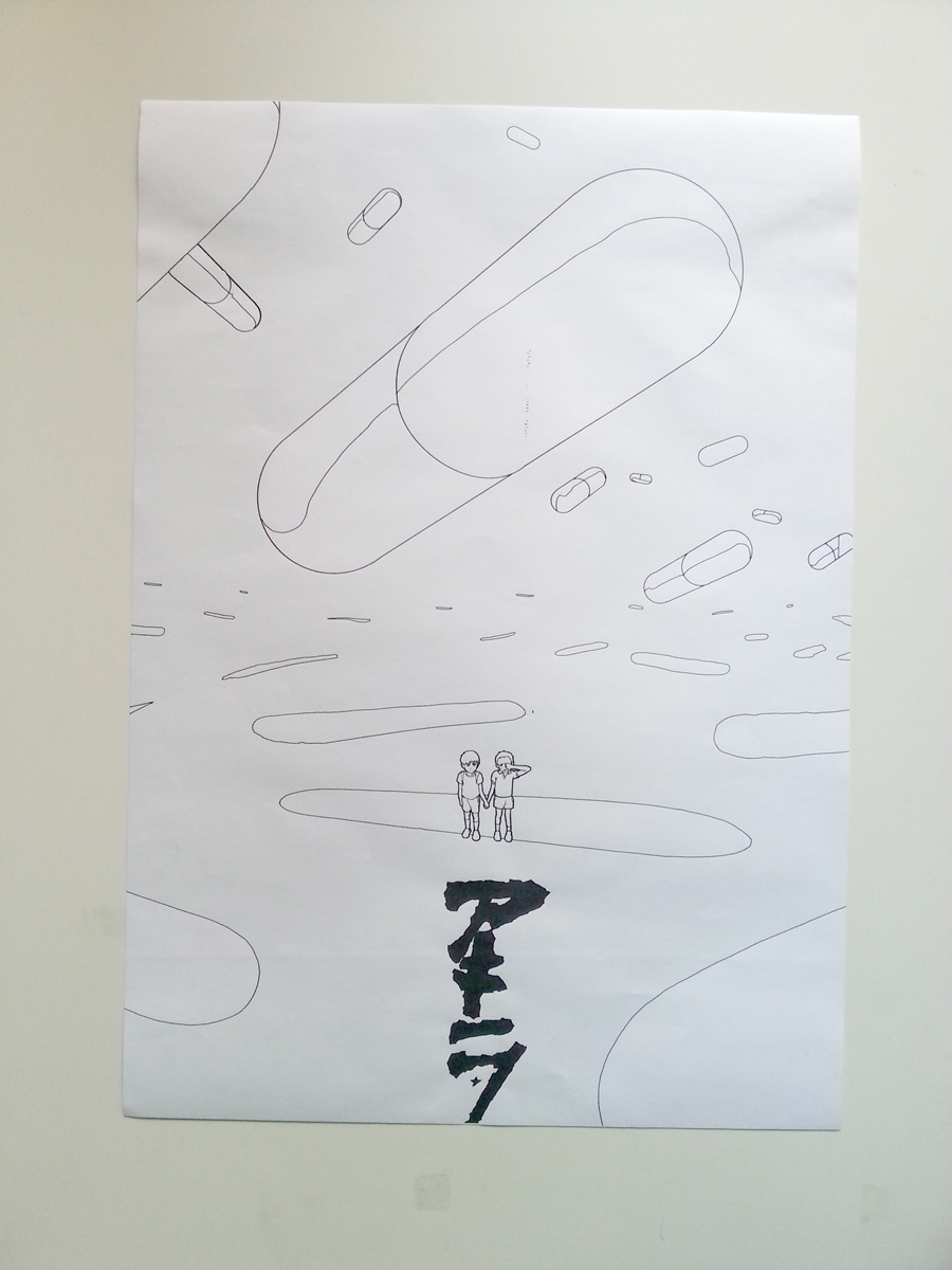
Some behind the scenes/process!
I started with some rough concept ideas, and drafted out some value sketches.
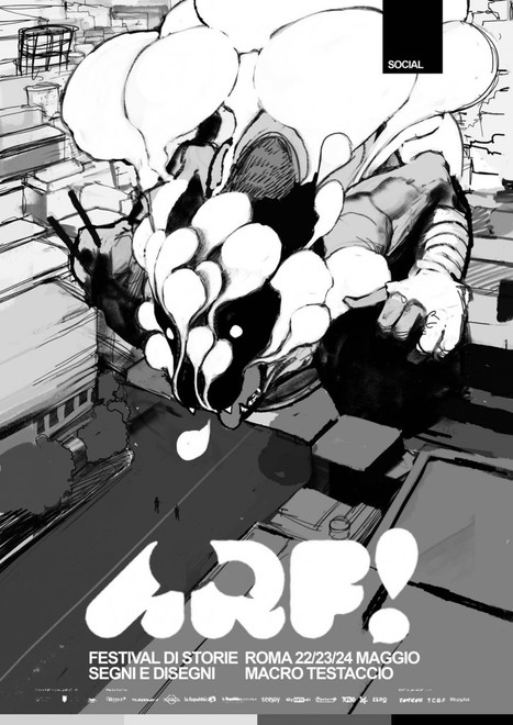
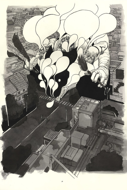
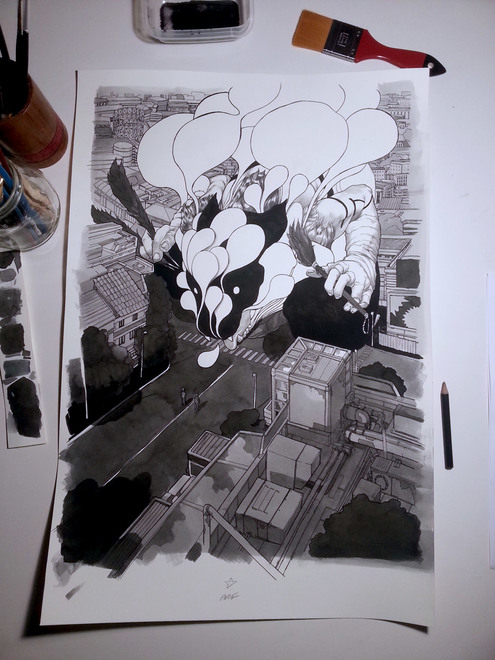
Then, once the main subject was selected by the ARF! crew I started working thru all the different stages: black ink lineart, watercolour and pencil shading, digital coloring, graphic design mock up. The on paper part of the drawing is quite big: it's watercolour, pencil and ink on an A2 Fabriano Artistico hotpressed satin watercolour paper.
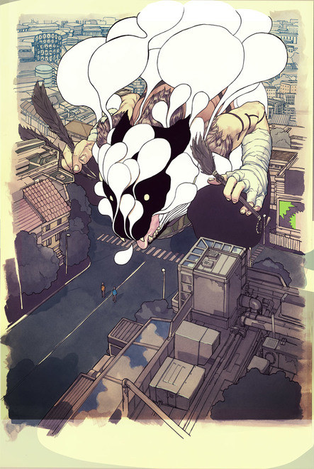
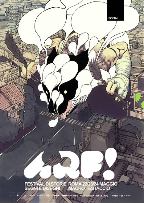
And this is the final piece with the graphic design provided by Fabrizio Verrocchi and Paolo Campana.
Thanks to everybody at ARF!


Vinyle | Tribute to Stefano Tamburini

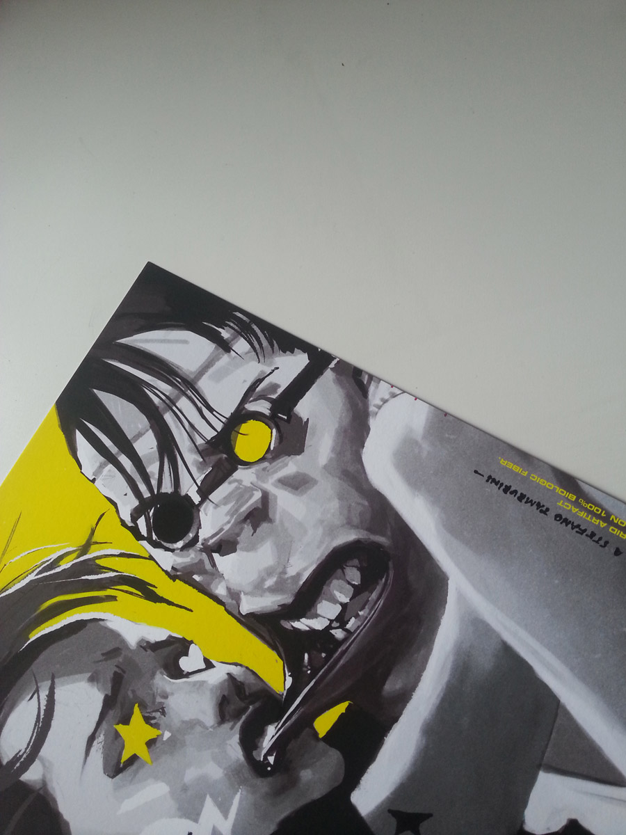
Ibrido analogico digitale. (Black indian ink / Ultrachrome Print on Hanemuhle rag paper)
Digital/Analog hybrid. (Black indian ink / Ultrachrome Print on Hanemuhle rag paper)
Pubblicato nella raccolta "VINAVYL":
VINAVYL. Omaggio grafosintetico a Stefano Tamburini Pubblicazione realizzata dall'Associazione culturale MUSCLES per i suoi soci 2016. info: undermuscles@gmail.com


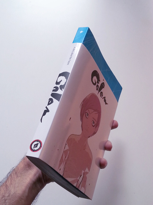
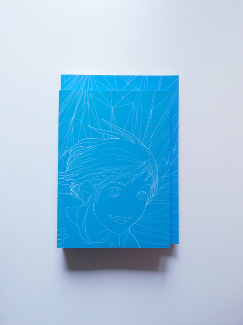
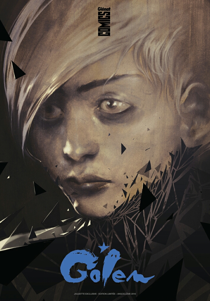
Golem: kinokuniya limited edition


U.S. edition of Golem will be distributed in a special limited version for the Kinokuniya bookstores network only.
Kinokuniya is the largest bookstore chain in Japan, with 56 shops around the country, in cities such as Osaka, Kyoto and Sapporo. Overall, it has more than 80 stores in Japan and overseas (Australia, Singapore, Malaysia, Taiwan, Thailand, United Arab Emirates).
I love Japanese art. I love japanese art books, A LOT.
Everytime I have a reasonable amount of free time (20 days is a minimum) I fly to Japan to enjoy all of it's artistic beauties. And as an artist myself, I can't avoid being sucked in those mesmerizing bookstores Japan has to offer.
My home bookshelf is half japan, half rest of the world.
I spent most of my "japanese" time in bookstores, Kynokuniya stores are among those sacred art shrines. They always felt like a forbidden, unattainable stage for my artwork. I thoroughly searched the Shinjuku stores, book by book, to learn as much as I could from the masters, young and old, that Japan has to offer to the world's visual culture.
So, all of a sudden, knowing that my book will be in the same Kinokuniya stores I so much enjoyed really is a dream that comes true. It's unbelievable: I feel so honoured and lucky to have been chosen for this collaboration between Magnetic Press and Kinokuniya Books I will be always grateful for this amazing gift: It's a milestone in my artistic career and my life.
It means a lot to me.
All the details about this Magnetic Press/Kinokuniya collaboration can be found here, in this Publishers Weekly article.

OK OK OK | doodle
I guess it's ok

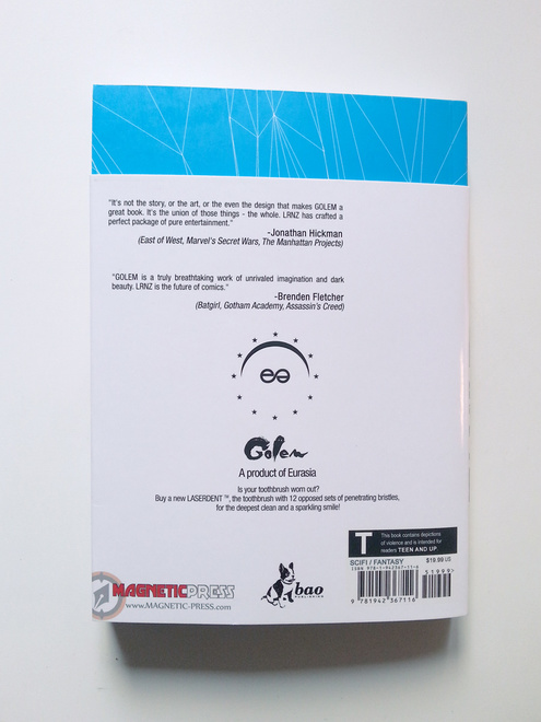
GOLEM out in USA by Magnetic press!
http://www.magnetic-press.com/golem/
Thanks to Magnetic Press, Golem will have it's printed USA release on february 23rd.
Golem got some asskicking endorsements by huge names in the industry:
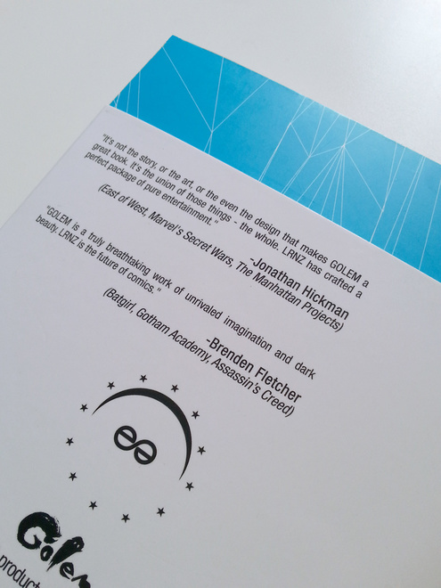
Jonathan Hickman
(East of West, Marvel's Secret Wars, The Manhattan Projects)
“It’s not the story, or the art, or the even the design that makes GOLEM a great book. It’s the union of those things – the whole. LRNZ has crafted a perfect package of pure entertainment.”
Brenden Fletcher
(Batgirl, Black Canary, Gotham Academy, Assassin’s Creed)
“GOLEM is a truly breathtaking work of unrivalled imagination and dark beauty. LRNZ is the future of comics.”
Nick Dragotta:
(East of West, X-Statix, Superman: American Alien)
“Lrnz on Golem is a revelation. It’s an incredibly crafted comic, drawing upon all the best comics has to offer, and Lrnz’s imagination makes it uniquely its own.”
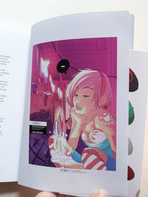
After a first digital release on Comixology (it's split in episodes, still ongoing - check it out at: https://www.comixology.com/Golem-1/digital-comic/317111) Golem finally has a beautiful USA edition: a little smaller than the italian and french one, packs all of the goods in a badass thicker cover jacket.
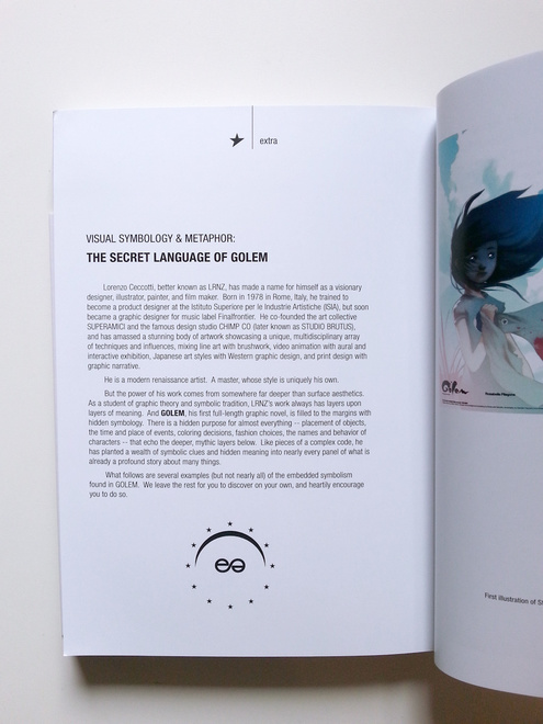
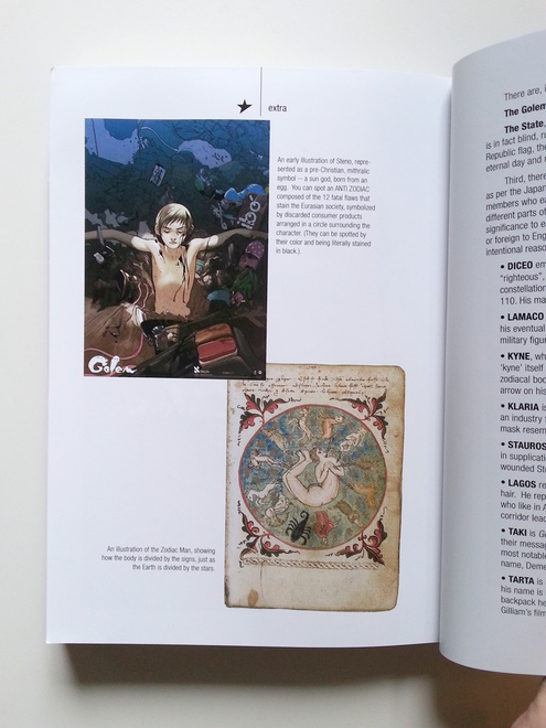
The U.S. edition features an advanced reading guide with some hints about Golem mithology and symbols: very useful if you want to challenge yourself in a more accurate decryption of the book's ultimate hidden meaning.
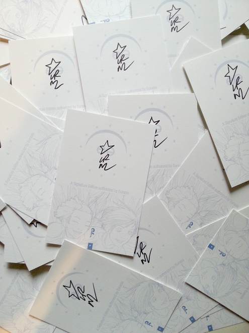
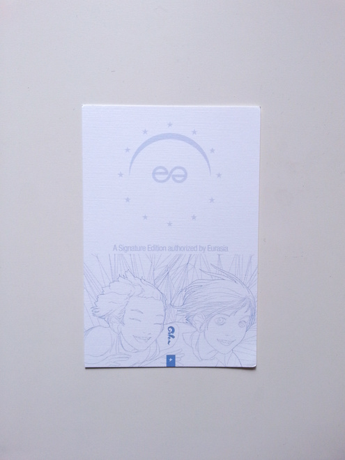
A signature edition will be available with a special Eurasian approval card.
Magnetic Press did print some fancy promotional posters too!
Coooool!
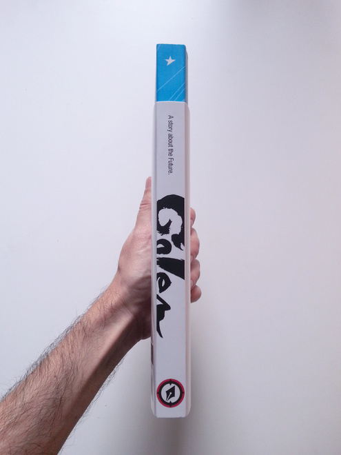
After a first digital release on Comixology (it's split in episodes, still ongoing - check it out at: https://www.comixology.com/Golem-1/digital-comic/317111) Golem finally has a beautiful USA edition: a little smaller than the italian and french one, packs all of the goods in a badass thicker cover jacket.
The U.S. edition features an advanced reading guide with some hints about Golem mithology and symbols: very useful if you want to challenge yourself in a more accurate decryption of the book's ultimate hidden meaning.
A signature edition will be available with a special Eurasian approval card.
Magnetic Press did print some fancy promotional posters too!
Coooool!


AUTOTOMISM | OTOMO TRIBUTE EXHIBITION IN 43RD ANGOULEME FIBD
Thanks to Julien Brugeas and Gallerie Glénat, I had the chance and immense honour to partecipate to the OTOMO TRIBUTE Exhibition in Angouleme, during the 43rd Bande Dessinee International Festival. My entry is a cel painted A3 drawing and is available to buy at Galerie Glénat Paris.

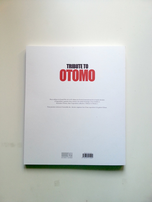
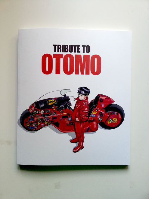
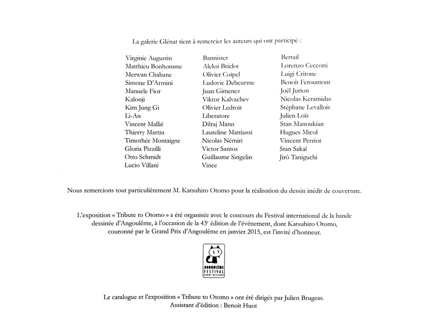
Moreover, an excellent exhibition catalogue has been made by Glénat, sporting a cover art illustration by Otomo sensei himself. As a huge extra to this beautiful experience: I had the chance to meet Otomo in person and It's been probably one of the most intense moments of my whole life.
The artist roster for the exhibition includes: Virginie Augustin, Bannister, Dominique Bertail, Matthieu Bonhomme, Aleksi Briclot, Francesco Cattani, Merwan Chabane, Olivier Coipel, Luigi Critone, Simone D’Armini, Ludovic Debeurme, Benoît Feroumont, Manuele Fior, Juan Gimenez, Joël Jurion, Jean-Philippe Kalonji, Viktor Kalvachev, Nicolas Keramidas, Kim Jung Gi, Olivier Ledroit, Stéphane Levallois, Li-An, Liberatore, Julien Loïs, Vincent Mallié, Dilraj Mann, Stan Manoukian, Thierry Martin, Laureline Mattiussi, Hugues Micol, Timothée Montaigne, Nicolas Némiri, Vincent Perriot, Gloria Pizzilli, Victor Santos, Stan Sakaï, Otto Schmidt, Guillaume Singelin, Jirô Taniguchi, Lucio Villani & Vince.
Huge thanks to Alessio Tommasetti and Paolo Maddaleni for the technical infos on how to actually paint a cel!

WTF | Doodle
???
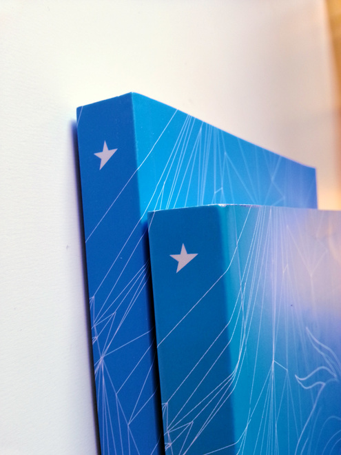
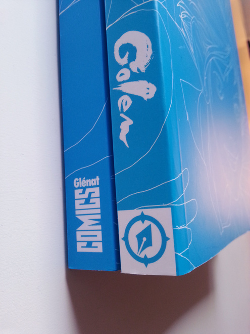
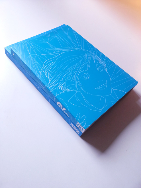
Golem and more at 43rd Angoulême BD Festival
Today I'll be at the 43rd Festival de la Bande Dessinée d'Angoulême.
It's my first time in Angoulême. Moreover I'll be at Glénat Comics booth presenting my first french comic book, Golem!
I did a small limited variant cover to celebrate this special moment, and I'll be very happy to draw a little sketch on your copy and sign it.
The new cover is a digital/traditional hybrid, with an oil painting mixed with vector graphics.
Here you can read my dedicace schedule:
http://www.glenatcomics.com/festival-angouleme-2016-les-auteurs-invites
On friday I'll probably show up at Galerie Glénat to have a look to the Otomo tribute exhibition where I have a small illustration on display.
See you in Angoulême!
LONG WEI | A LOOK BACK


My first batch of cover art is finally complete. A last look to all of them, alltogether. It was very nice to fight along with you every month, Long Wei. Farewell.
Don't forget! You can buy very high quality giclee prints of my cover work in the online store!
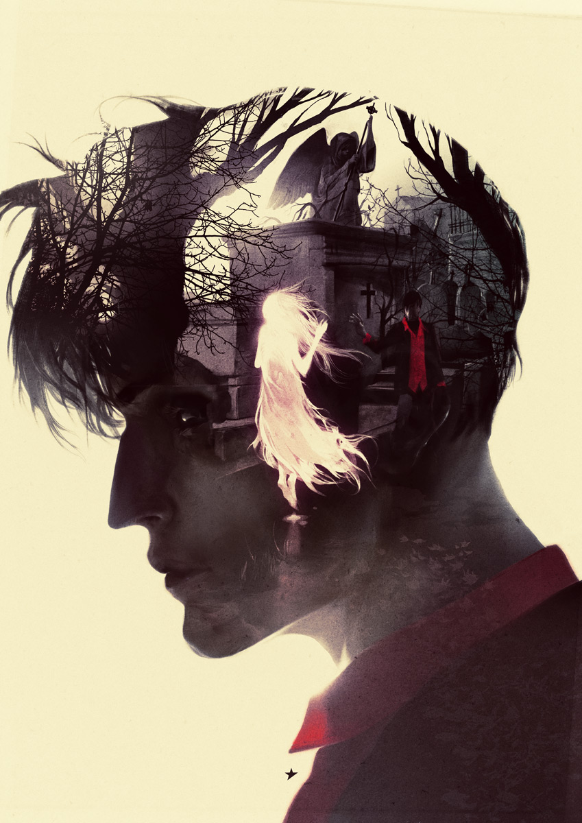
Dylan Dog Color Fest: Cover


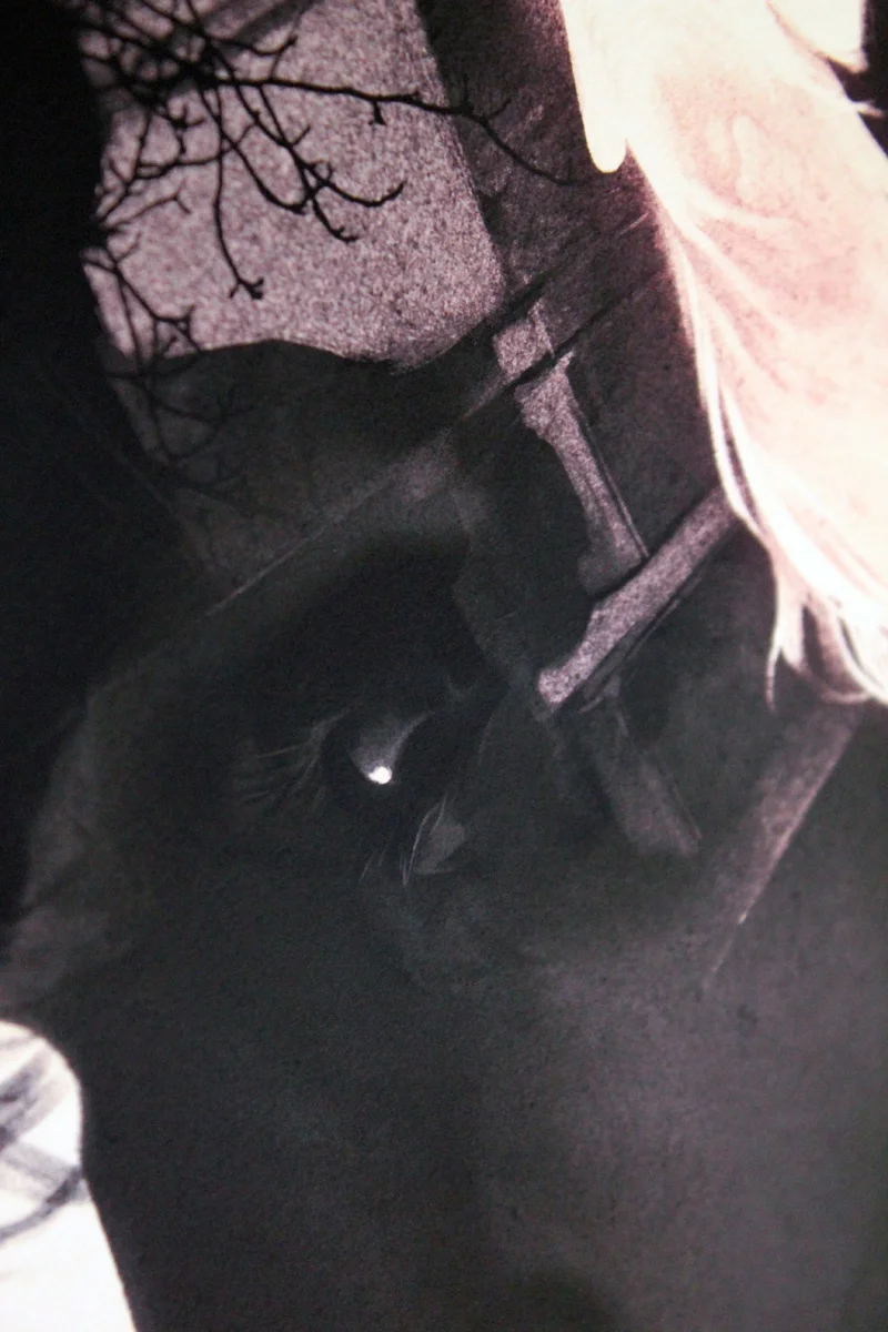

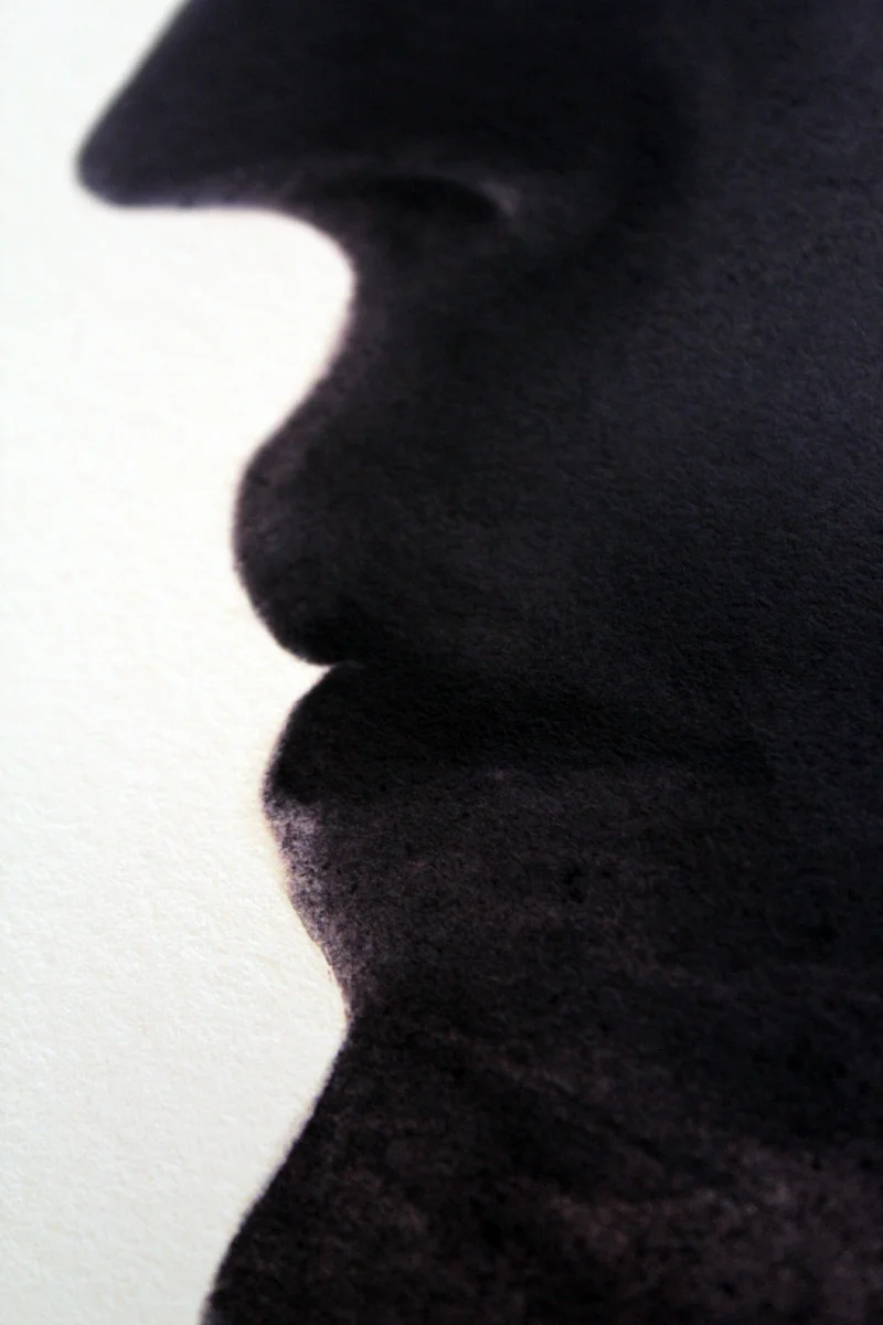
E' stata finalmente annunciata e rivelata la versione definitiva della mia cover per Dylan Dog Color Fest. Posso quindi finalmente parlarne liberamente. La cover definitiva scimmiotta una tecnica fotografica, l'esposizione multipla, nello specifico la doppia esposizione. Con questa tecnica è possibile foto incidere due immagini sullo stesso negativo, creando direttamente in macchina degli effetti strabilianti. In sostanza le parti scure del primo scatto, diventano il supporto utile per il secondo. Giocando con una tecnica di silhouette e scatti dettagliati sovrapposti si possono ottenere delle immagini molto suggestive, dalla forte carica simbolica. Questa tecnica è antica come la fotografia stessa: grandi fotografi come Mapplethorpe o lo stesso Man Ray hanno creato scatti meravigliosi usando le doppie esposizioni. Questo suo essere senza tempo, non necessariamente digitale insomma, mi ha dato quel limite e quella ricchezza che cercavo da un punto di vista tecnico. Di sicuro una esposizione sarebbe stato un ritratto di Dylan. Facendo ricerche ho trovato dei ritratti stupendi realizzati con questa tecnica, in particolare i modernissimi lavori di Dan Mountford che mi hanno aperto la via.
Riguardo al disegnare Dylan vi rimando a questo post qui dove ne ho parlato diffusamente. Avendo lavorato sui risvolti interiori e culturali di Dylan con la prima esposizione, per l'interno mi interessava esaltarne la parte più avventurosa. Ho provato a ricostruire un'immagine che tenesse dentro di se una serie di punti fermi, cinematografici, che fossero contemporanei alla nascita del personaggio: da Ghostbusters a Indiana Jones, fino allo Young Sherlock Holmes che ho sempre amato. Ho provato a disegnare un vero indagatore dell'incubo, un uomo coraggioso, che non ha mai smesso di avere paura e di essere affascinato come la prima volta che ha visto un fantasma. Che coglie ancora la bellezza di un evento così lontano dalla normalità, ed è la vera molla che lo spinge ancora nel suo, piuttosto singolare, lavoro. Mi piace l'idea di rappresentare l'interiorità di Dylan attraverso le sue esperienze, attraverso i ricordi che porterà per sempre dentro di se. Quante avventure incredibili deve aver vissuto un uomo così? Mi piacerebbe, incontrandolo, assorto per le vie di Londra, potergli leggere nel pensiero, perchè la testa di uno come Dylan dev'essere un posto piuttosto movimentato, anche mentre fa il biglietto per la metro.
Per gli appassionatissimi: nella gallery sotto trovate un po' di step di making of, e anche un paio di idee che sono state in lizza fino all'ultimo.