Lorenzo Orsetti.
Manifesto per Antifanzine.
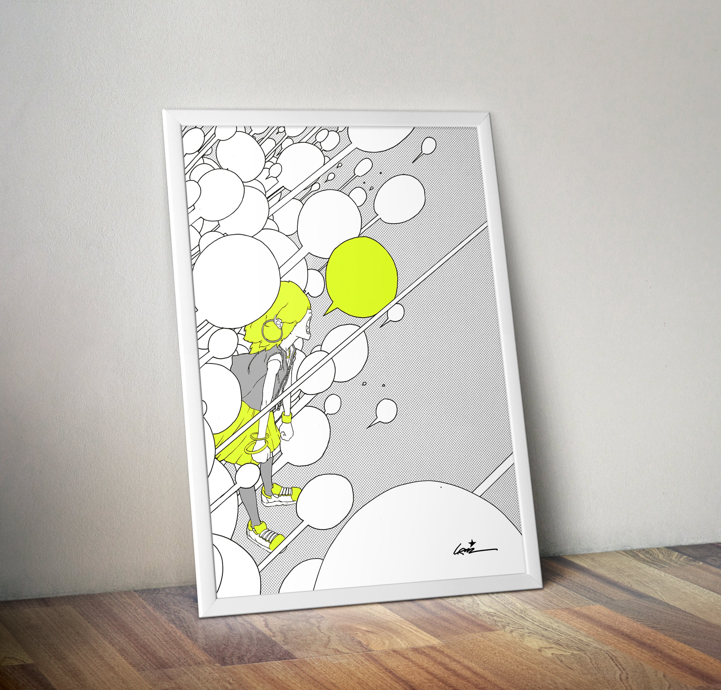
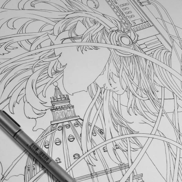
The image is a mix of analog and digital processes.
Here you can see the main analog pass, graphite on digitally printed flat colors.
Lorenzo Orsetti.
Manifesto per Antifanzine.
The image is a mix of analog and digital processes.
Here you can see the main analog pass, graphite on digitally printed flat colors.
Promotional 50 by 70 cm silkscreened poster for Publifarm clients.


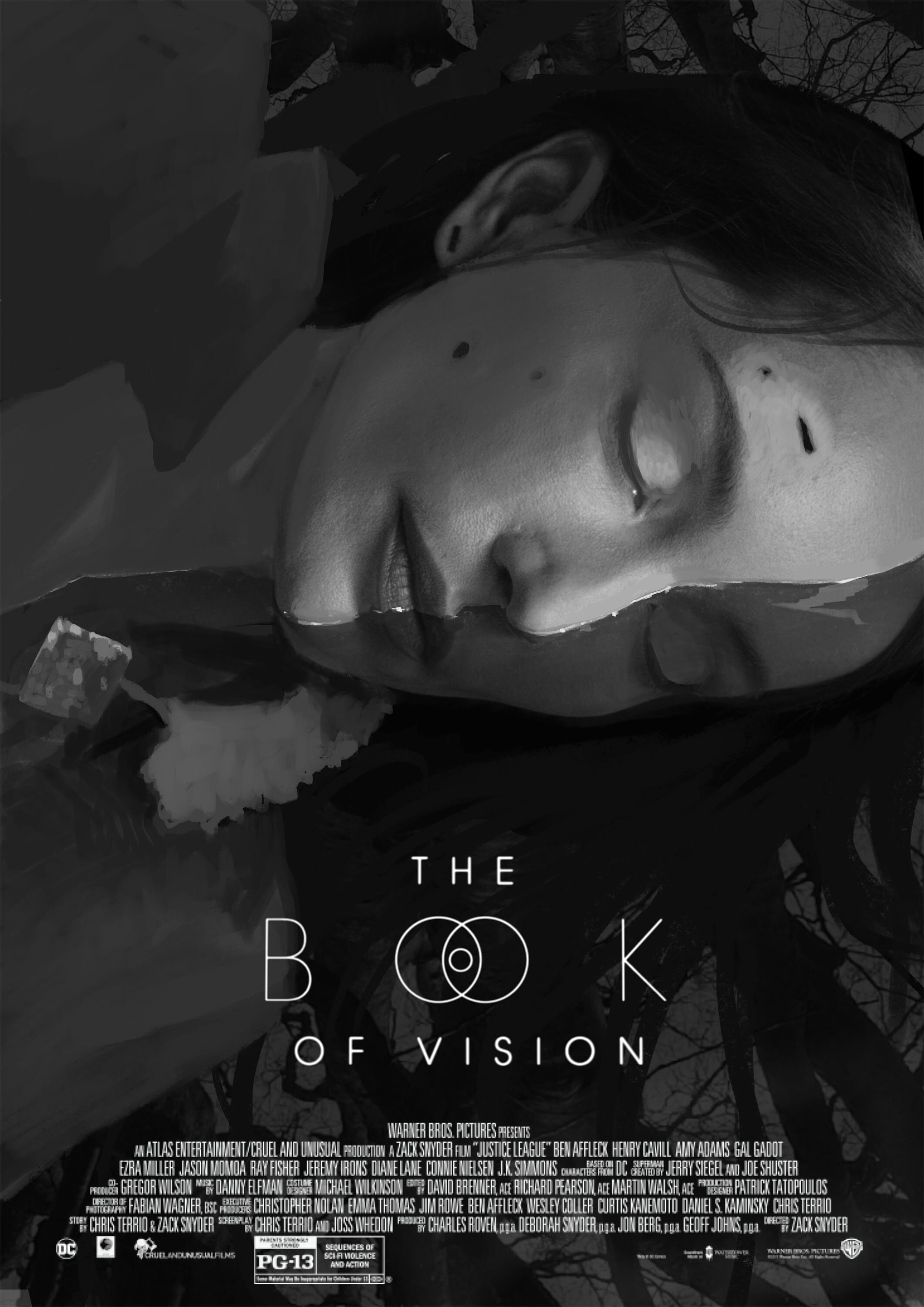
I was very lucky, honoured and proud to have the chance to design the official movie poster for “The Book of Vision”, by Carlo S. Hintermann, produced by Terrence Malick.
I contributed to various creative aspects of the movie: conceptual visual design and VFX supervising mostly, but I also designed the logo and the opening and closing title sequences.
I spent some incredible days on ad off thr set, collaborating with truly outstanding artists.
I followed the movie production since the very beginning, so I was very confident and had a lot of inputs to develop in a poster image for it.
After designing the logo, I designed several rough concepts for the movie poster. I tried to produce as many different ideas as I could: I wanted to explore as much visual possibilities the movie had to offer and there were so many!
More than I could possibly handle, actually :)
Here you can see a brief selection of the various concepts I developed.
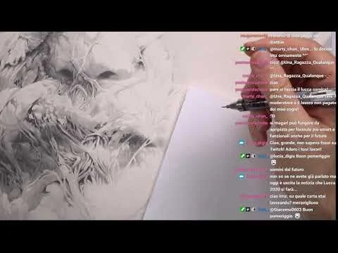
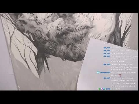
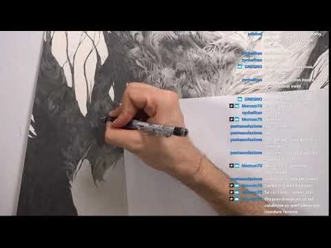
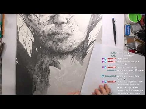
I ended up with this close up frontal portrait of Eva (Lotte Verbeek), the main movie character, kind of mutating and blooming, sprouting from a giant tree.
The drawing itself is a graphite on ultrachrome light black ink underpainting on 61x46 cm Arches hot pressed 100% cotton paper.
Then I added digital color.
I also heavily changed some parts of the drawing, I wasn’t very happy with the result of some details (the right ear, mostly) and digital came to the rescue.
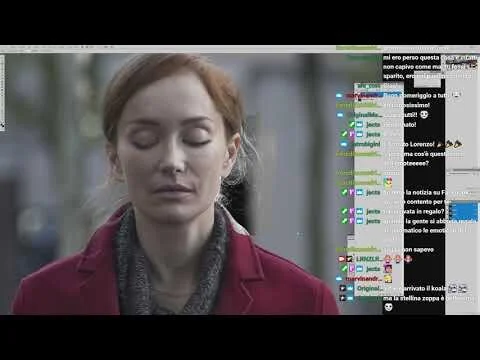
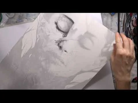
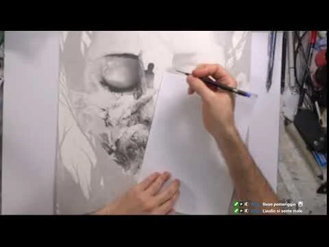
For the hard core process lovers: the whole drawing and design phase was live streamed so If you are really into behind the scenes kind of footage you can find all the clips in these youtube videos below. Bear in mind they are not edited at all, so expect some very long videos with some random chatting.
One of a kind 6 meters wide poster to promote “Chorus Life”, a new district in Bergamo (IT).
One of a kind 6 meters wide poster to promote “Chorus Life”, a new district in Bergamo (IT).
One of a kind 6 meters wide poster to promote “Chorus Life”, a new district in Bergamo (IT).
A limited edition poster to celebrate the italian edition of Ghost In The Shell | Global Neural Network, published by Star Comics Italia. It will be available at “Lucca Comics & Games 2019”, at Star Comics Edizioni’s booth.
Fun fact: this drawing started as a spare time tribute for my live stream channel on Twitch (twitch.tv/lrnzlrnzlrnz). It ended up being an official Kodansha product: ah, the power of internet!
Below: the original ink and, markers graphite drawing I did on twitch, before the digital color pass.
Another great opportunity from IIT (Istituto Italiano di Tecnologia) to work on exciting topics. Flyer design for “RAM SPECIAL ISSUE: Humanoid robot application in real world scenarios” open call for paper submissions. Will be launched at officially at Humanoids 2018, China.
Guest editor in chief for this special issue of IEEE Robotics and Automation Magazine will be IIT engineer and robotics specialist Enrico Mingo Hoffman.
W&N ink on Schoeller Hammer paper, digital color.
Typography: Valerio Di Mario.
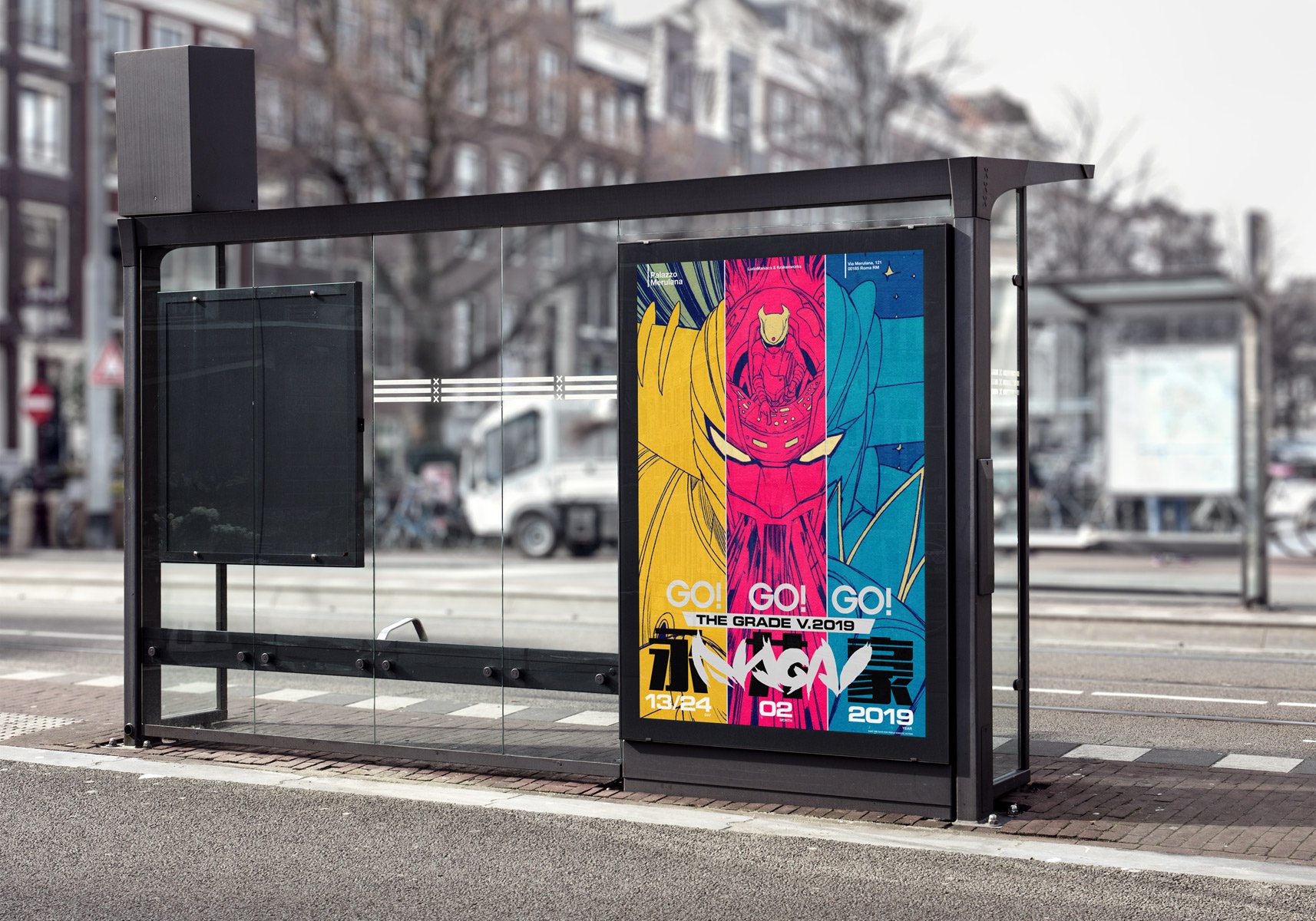
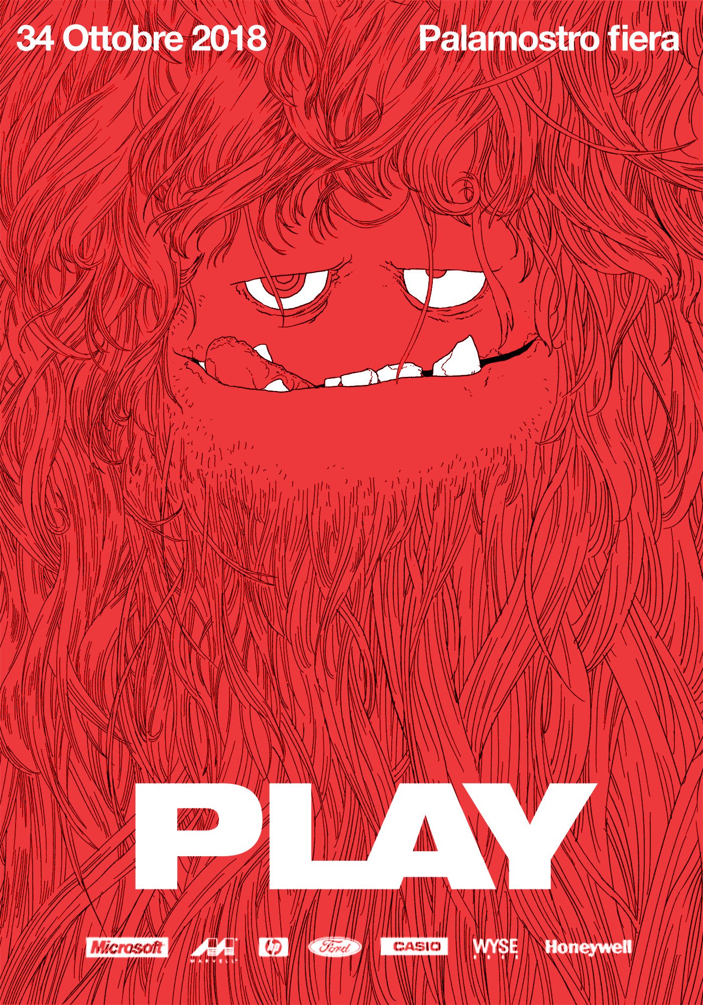
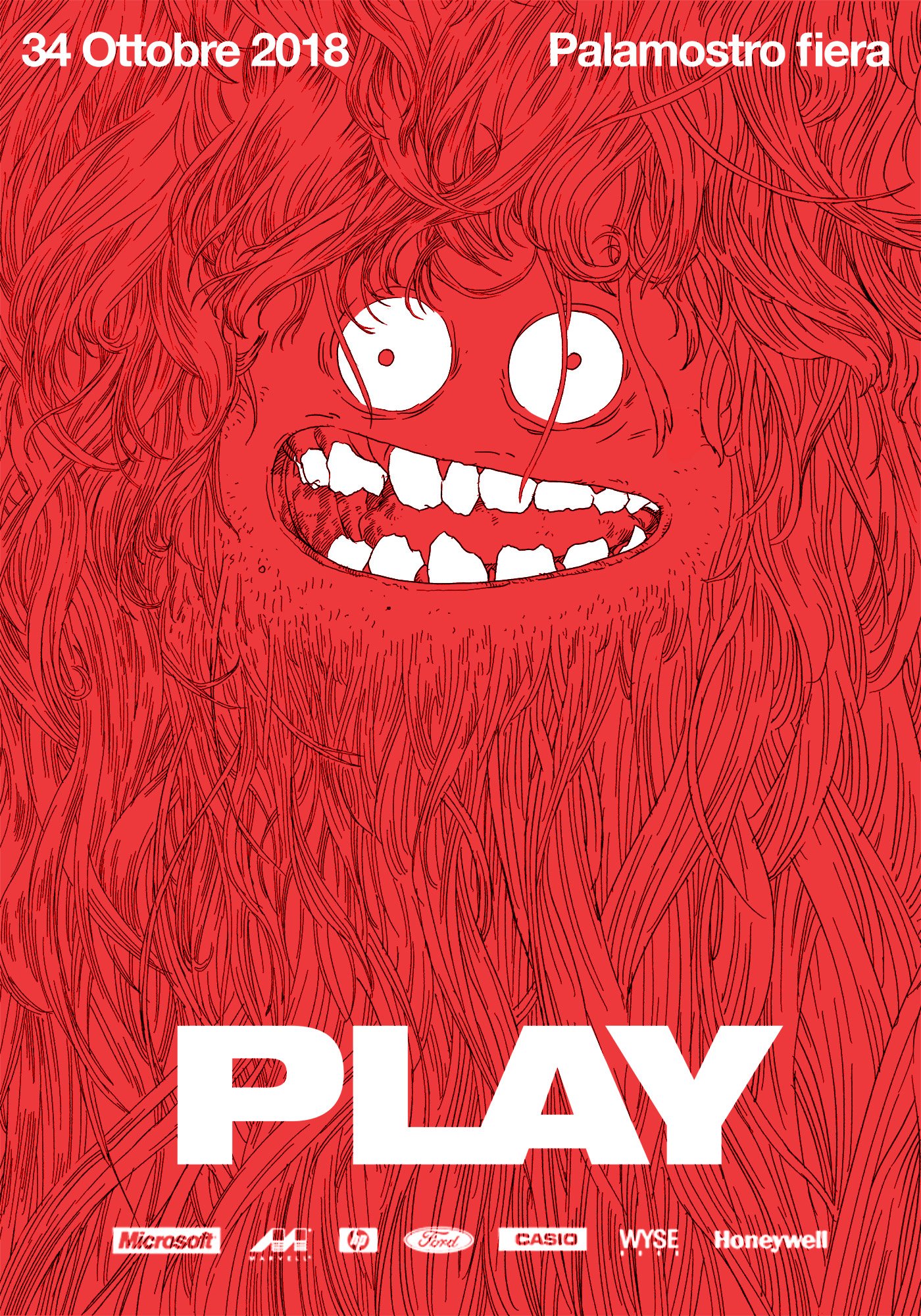
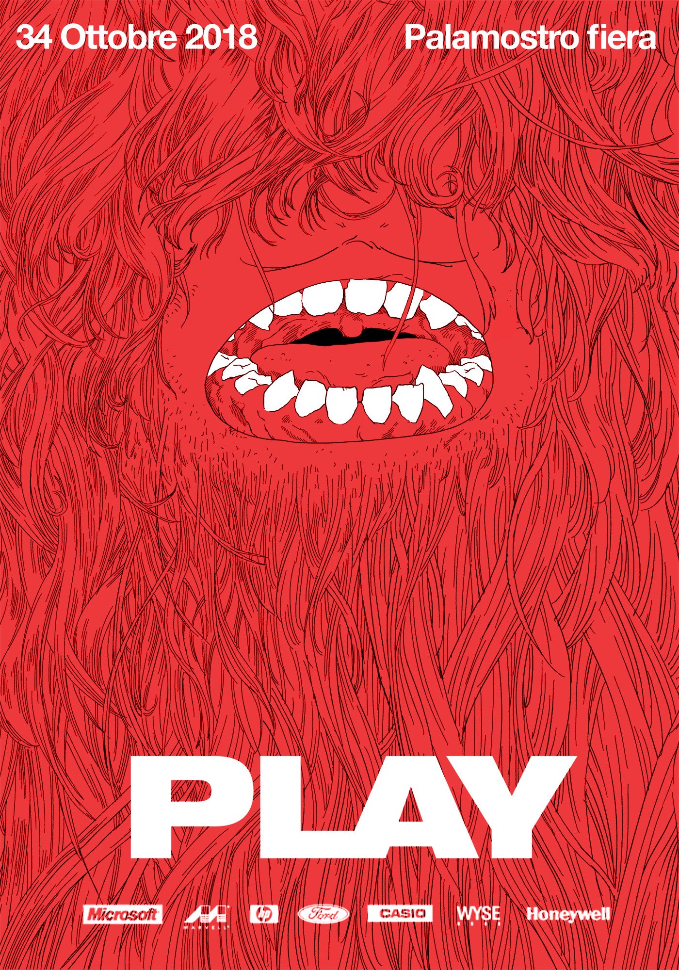
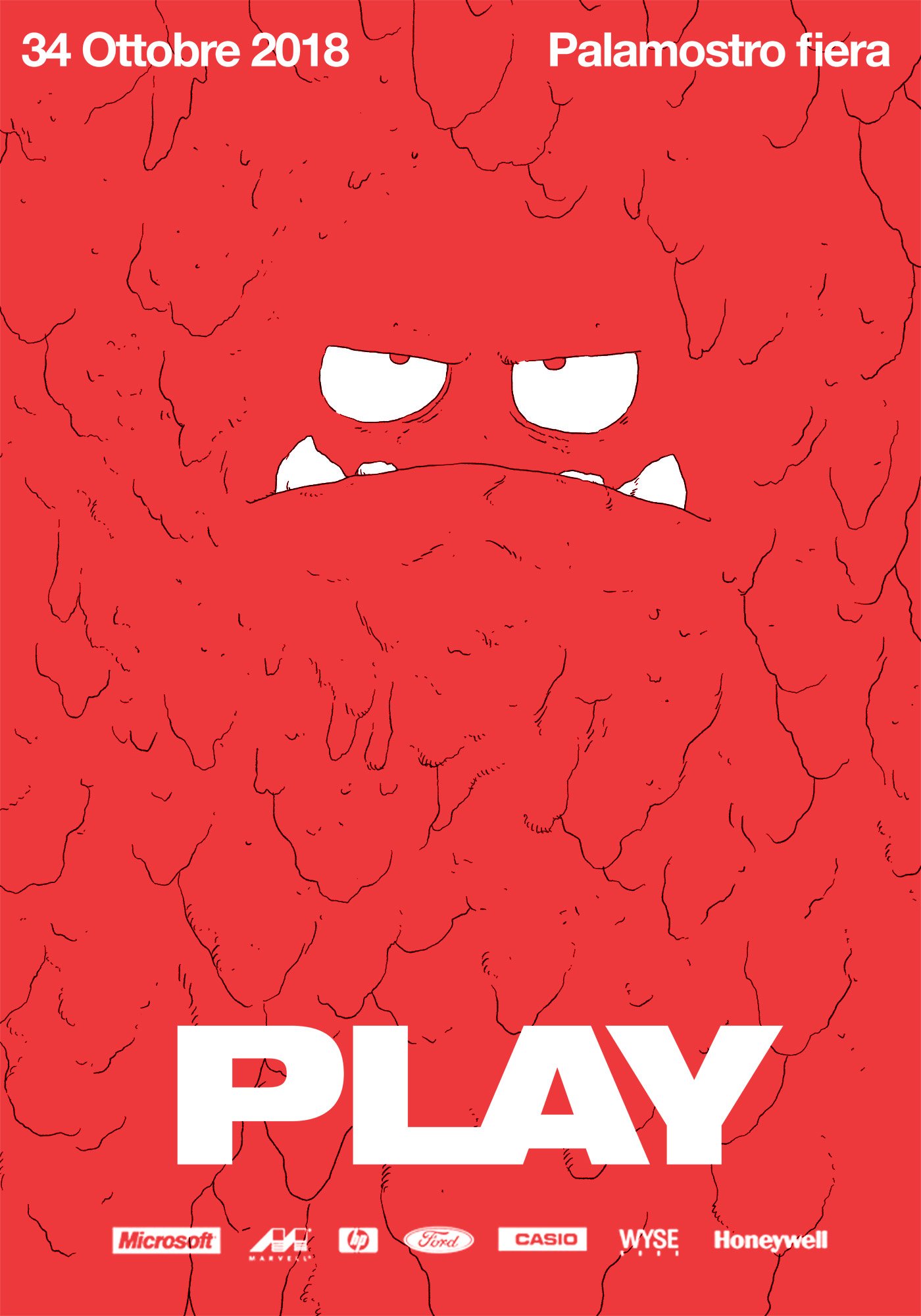
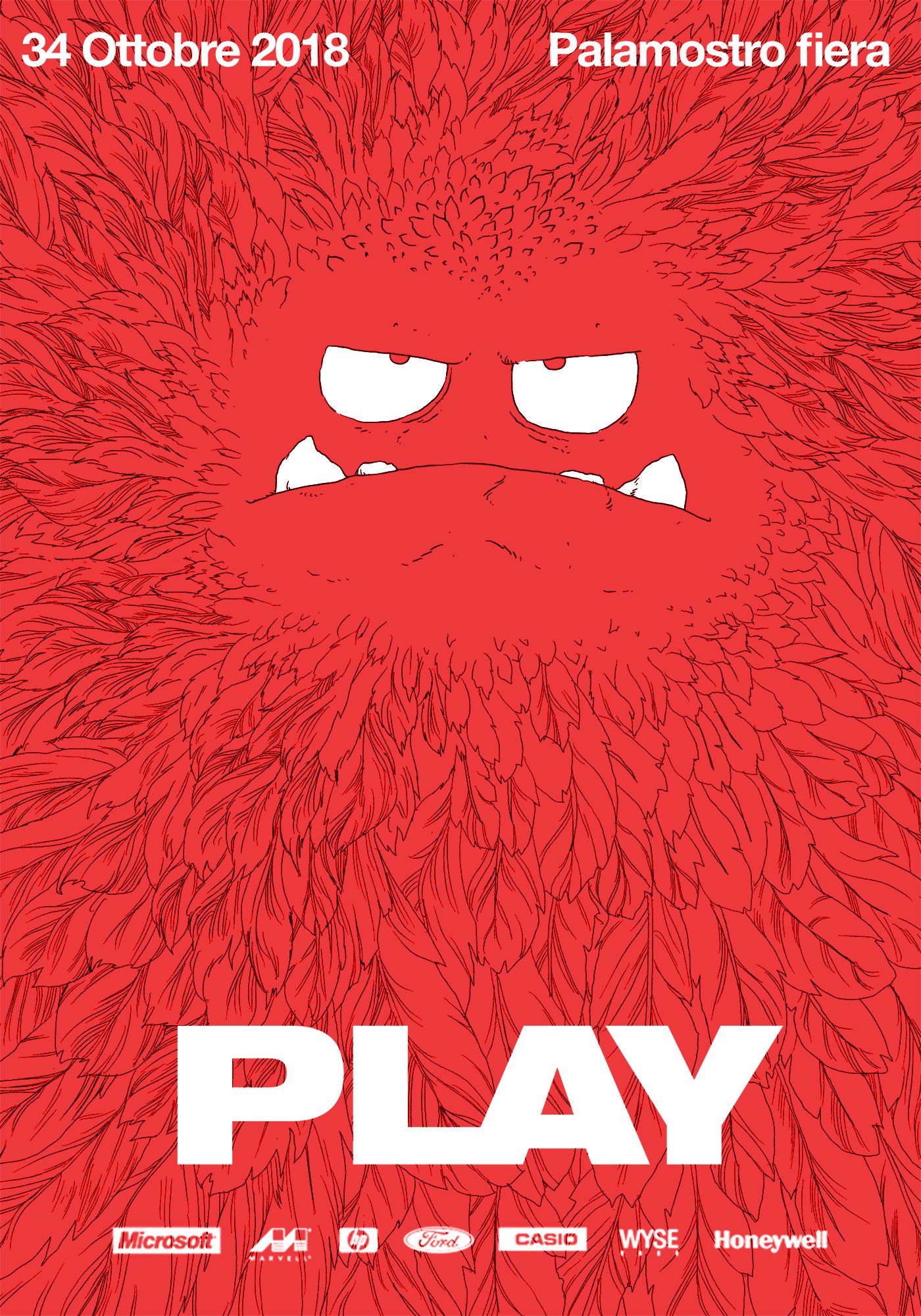
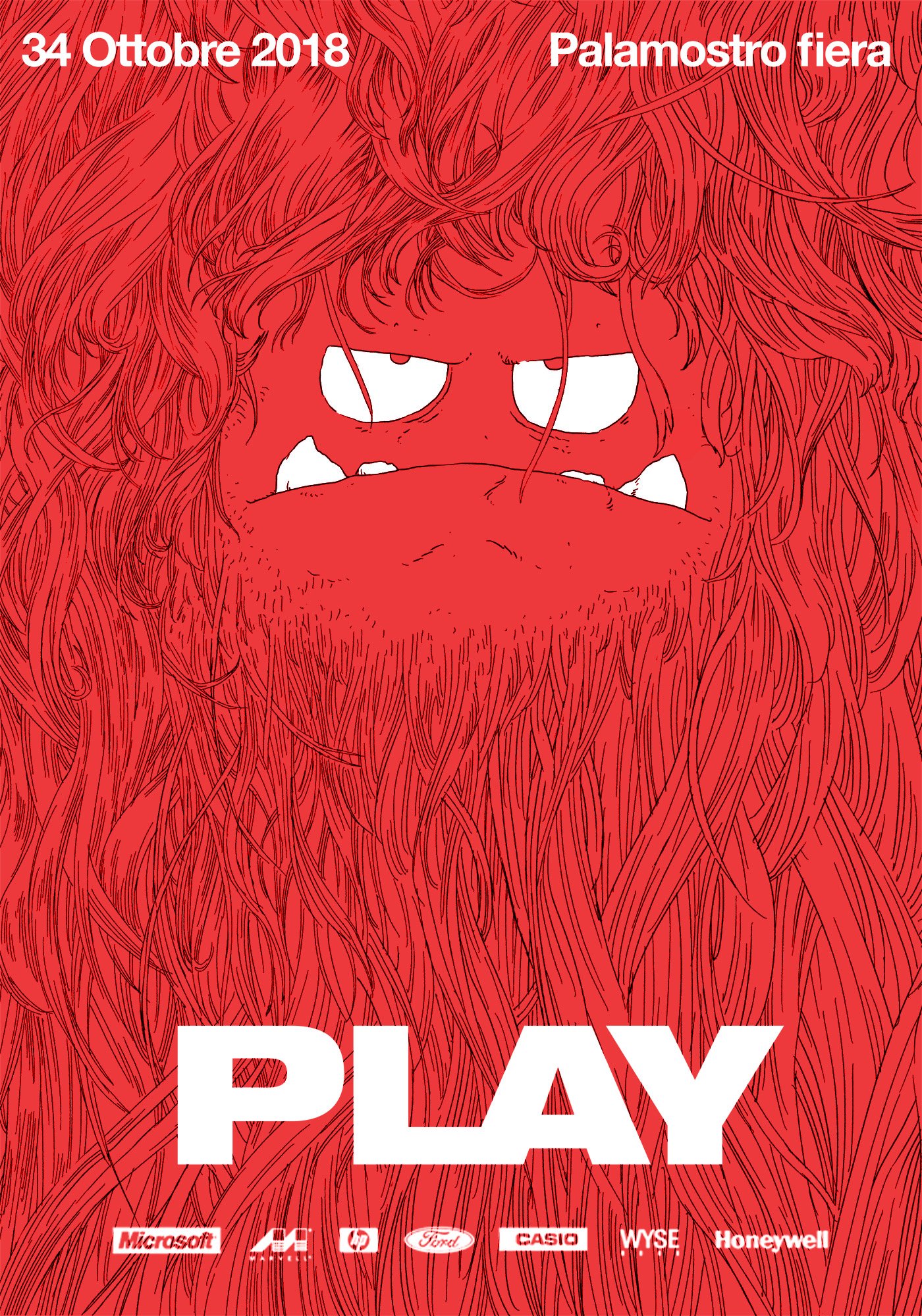
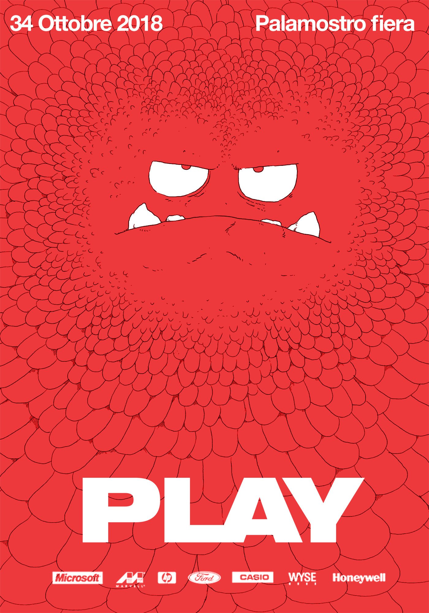
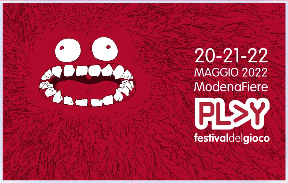
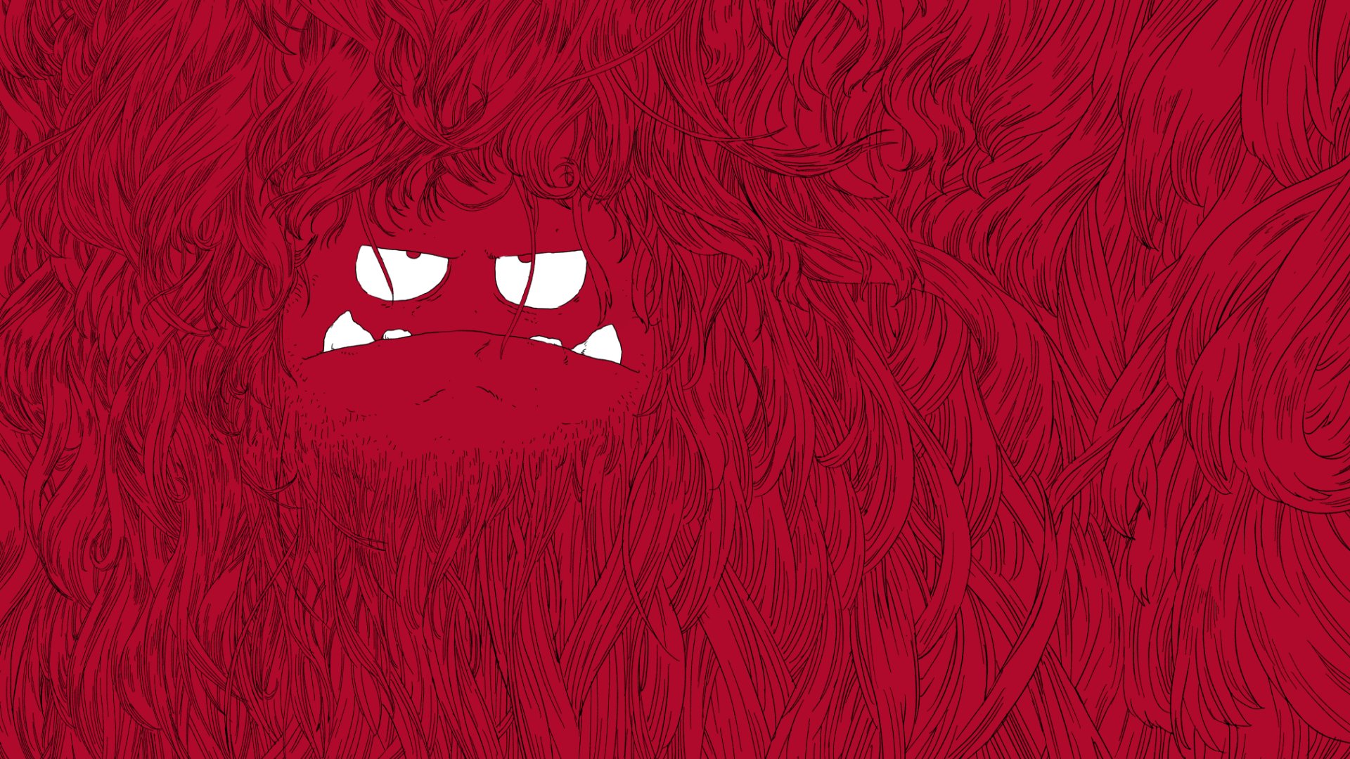
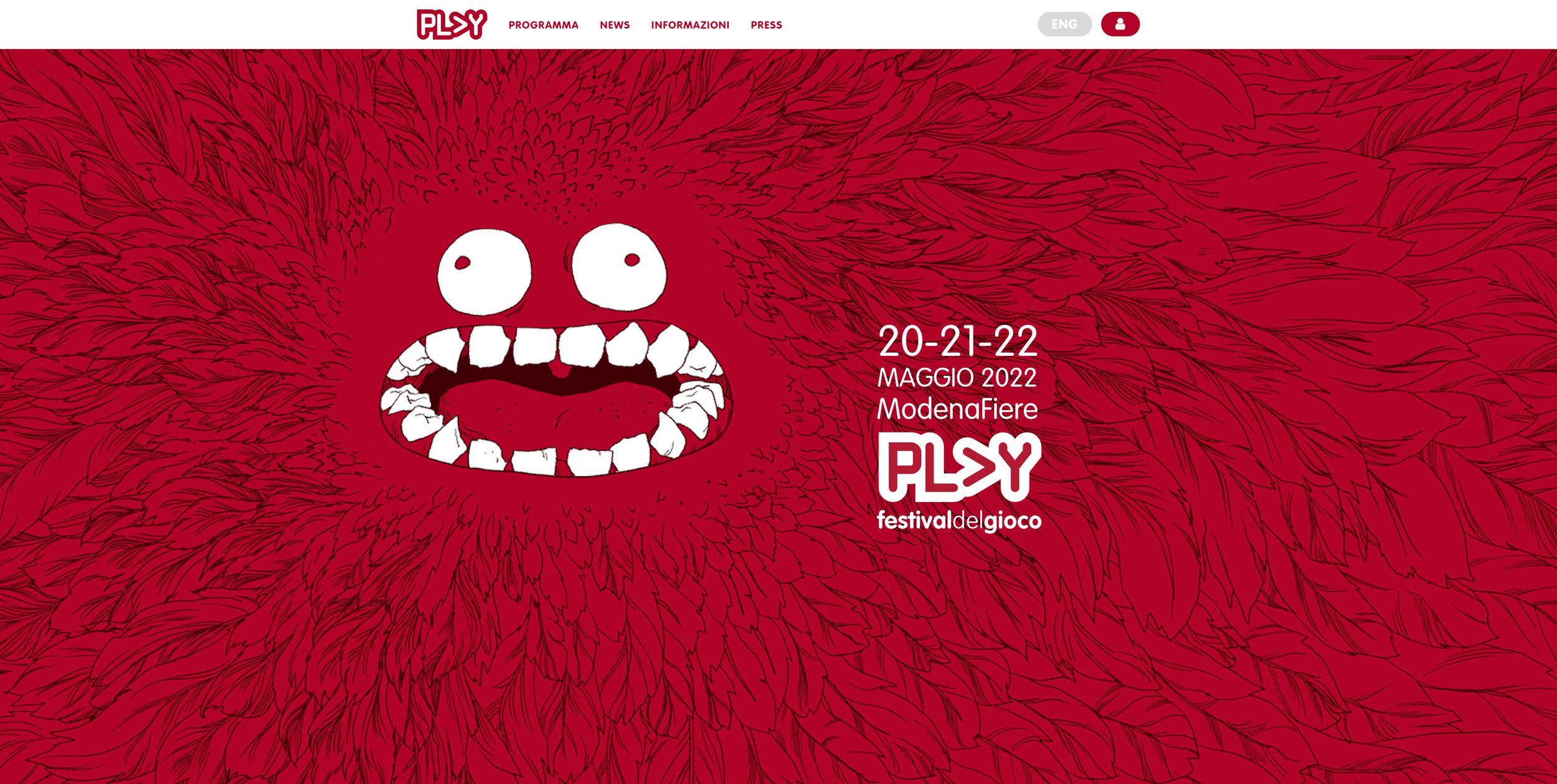
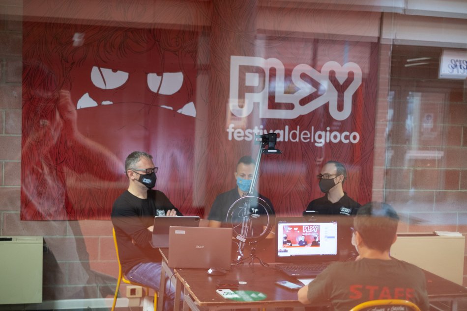
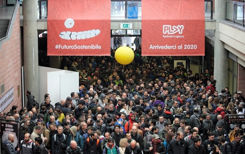
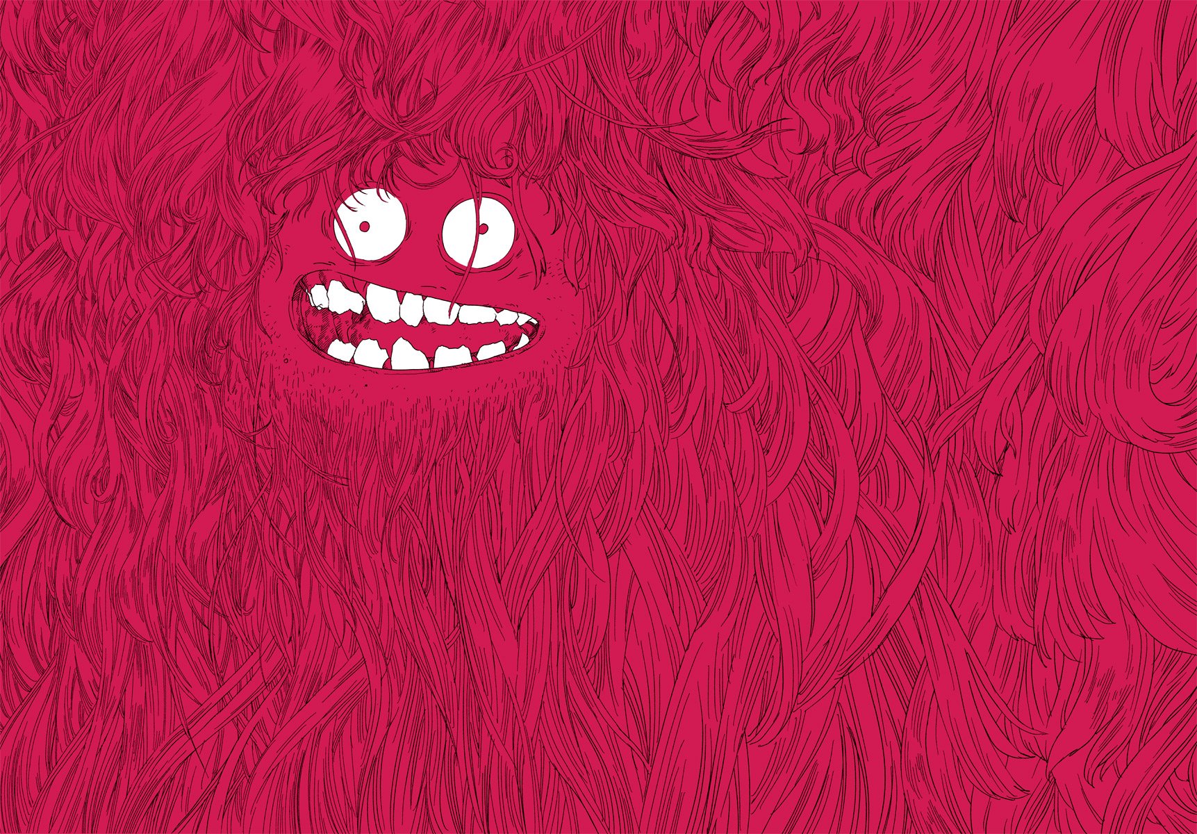
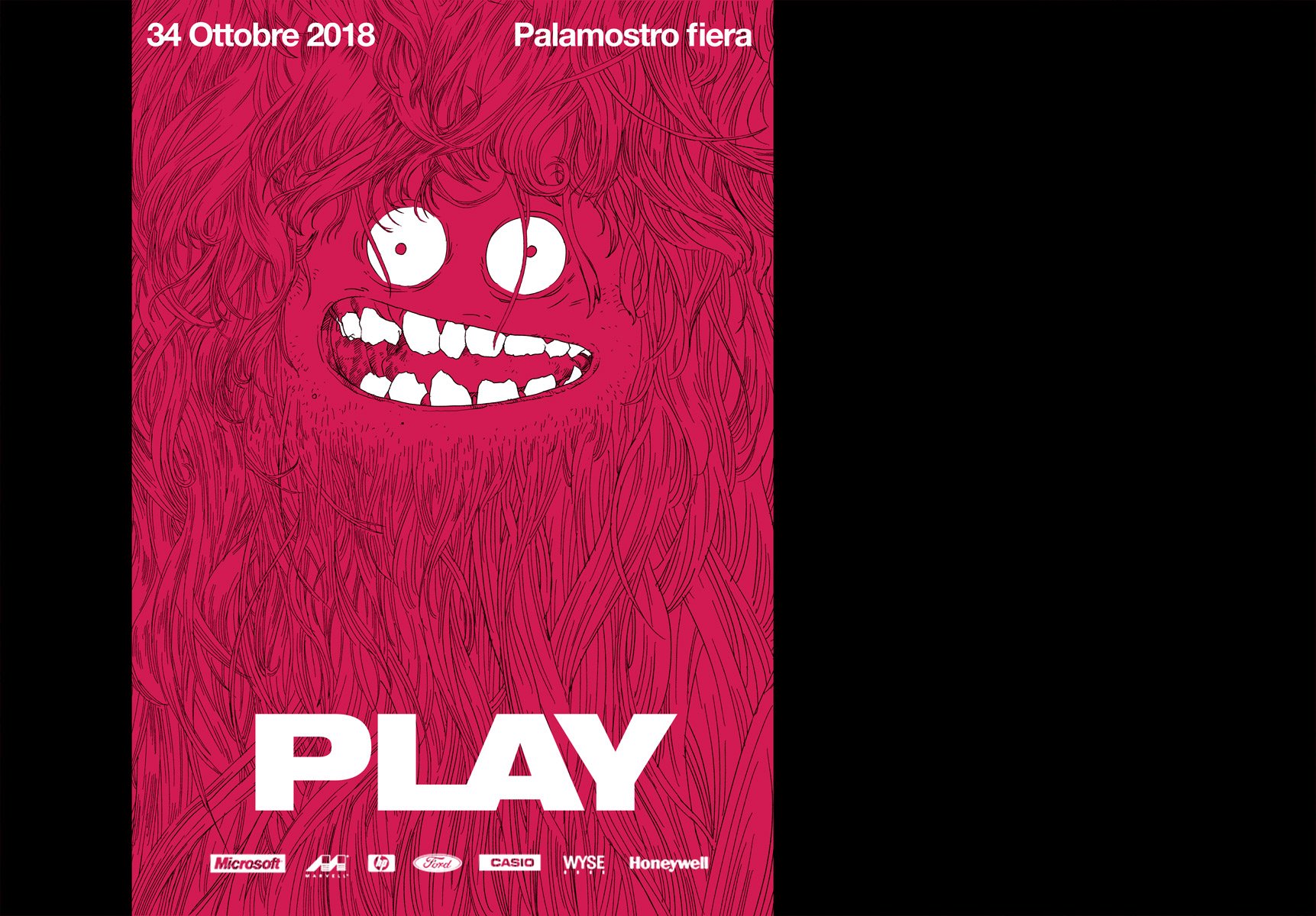
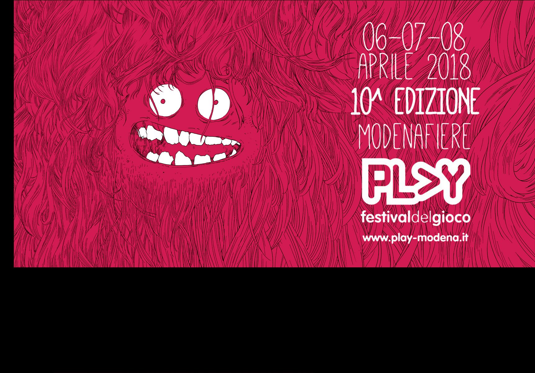
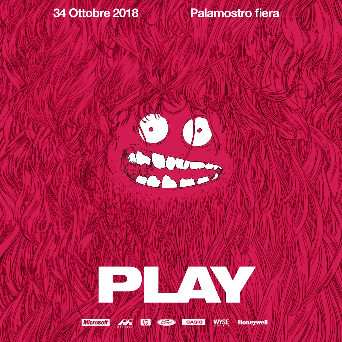
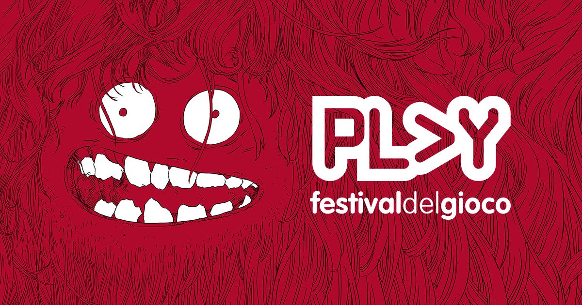
I designed a combinatorial poster system for Modena Play 2018.
It depicts a Moongha, the festival mascot.
The system consists in a series of Moongha expressions and textures that can be mixed together.
The poster system is also responsive ready with a great ratio flexibility.
Below: the Moongha expressions.
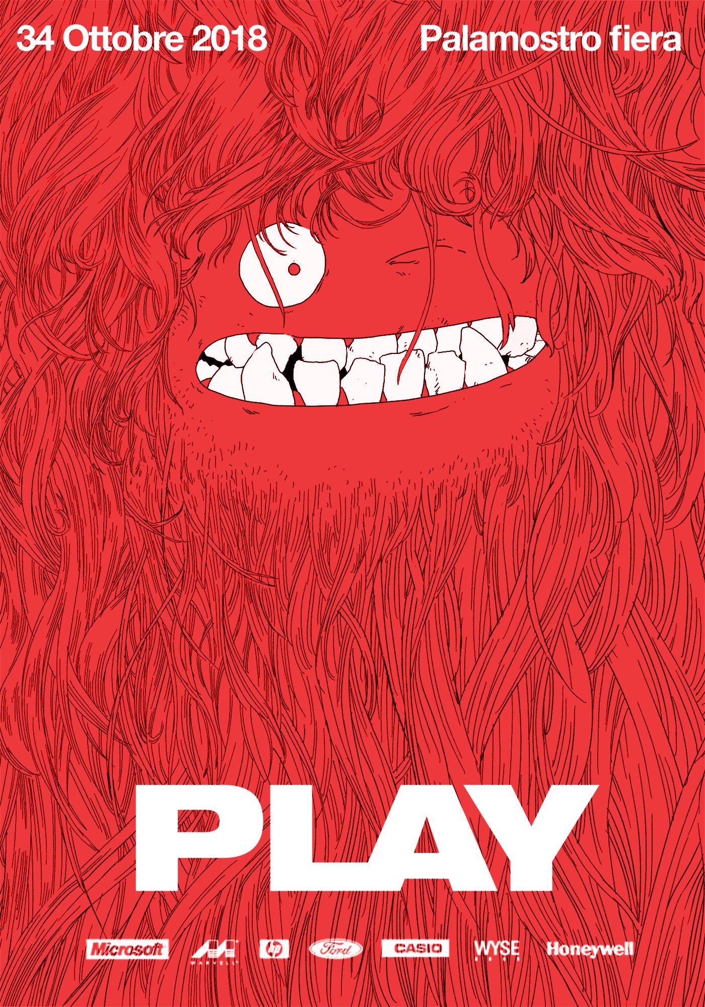
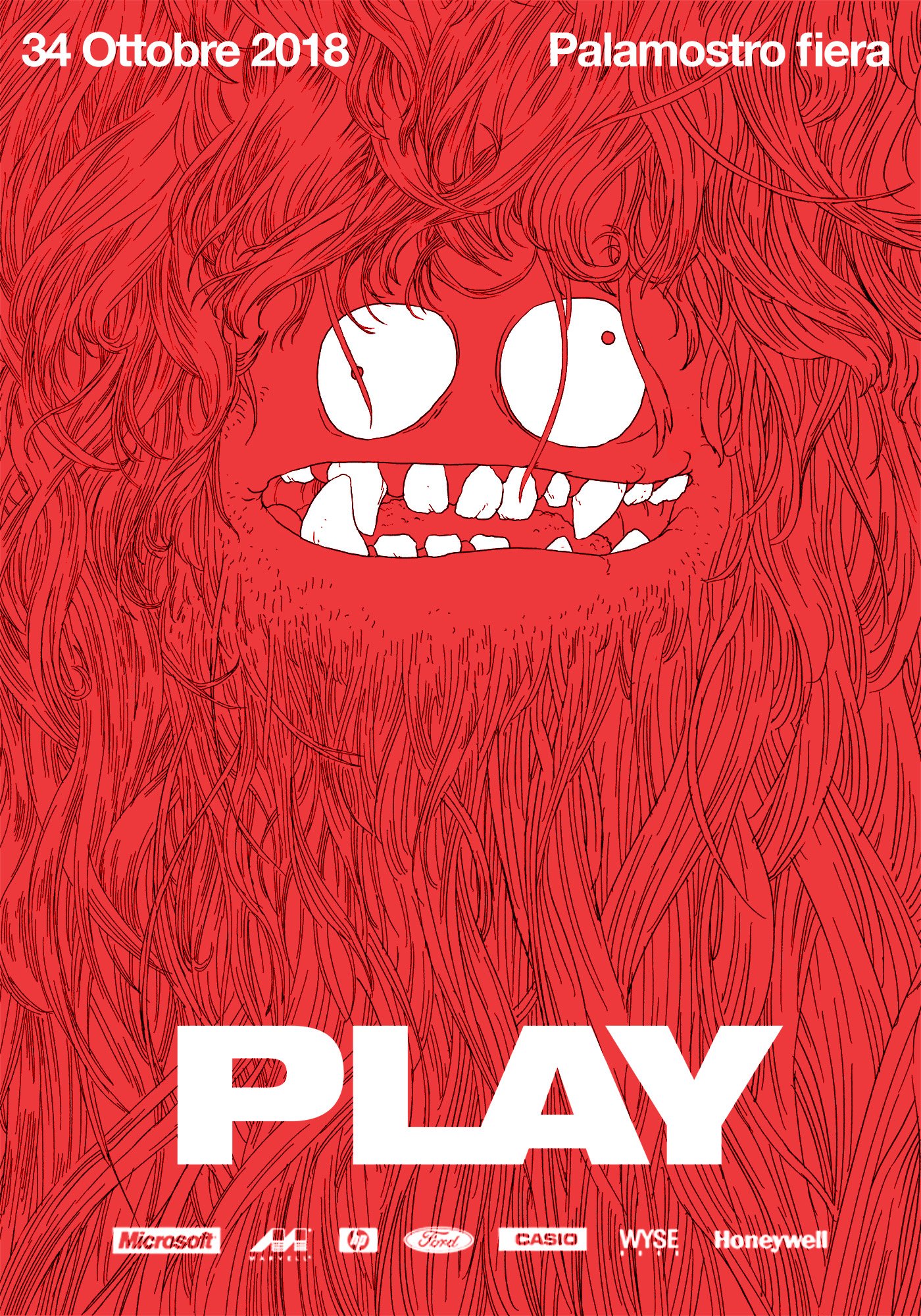
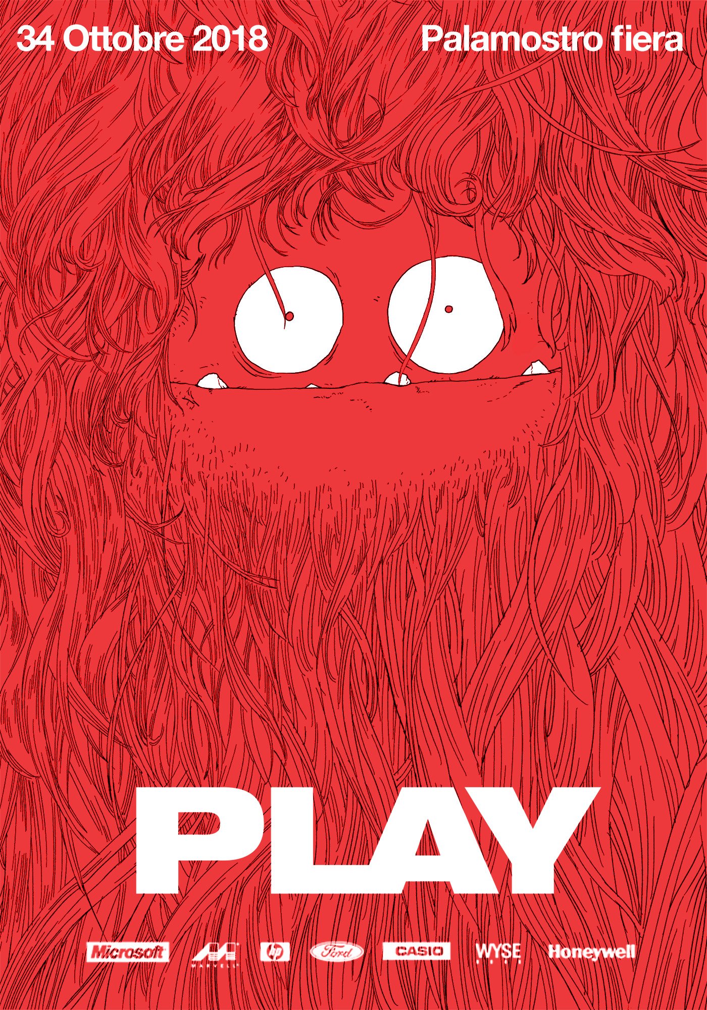
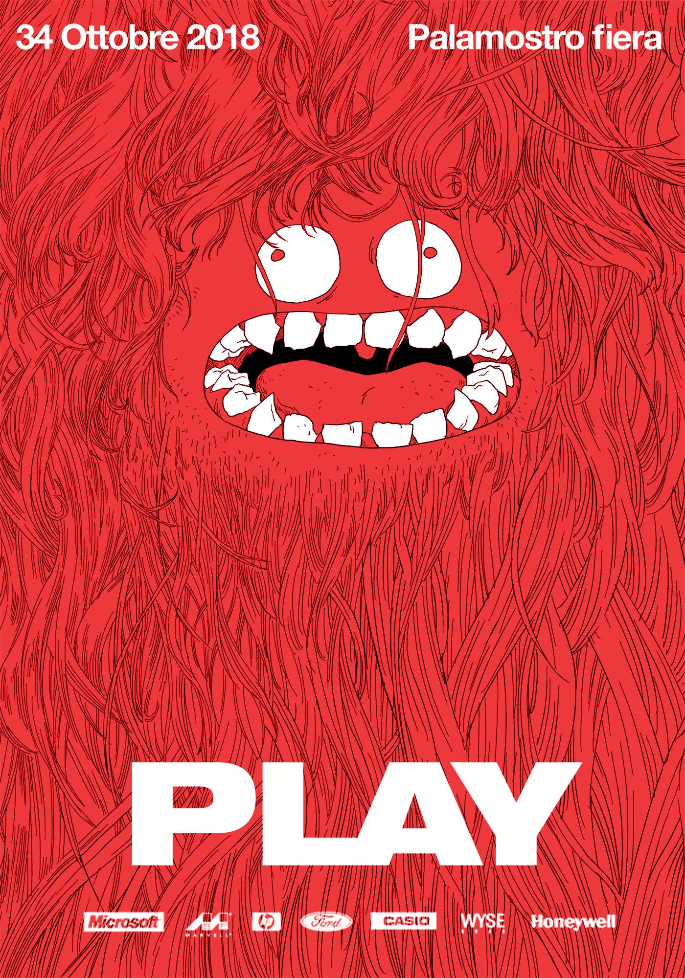

While these are the 4 differente textures: slime, feathers, fur and scales.
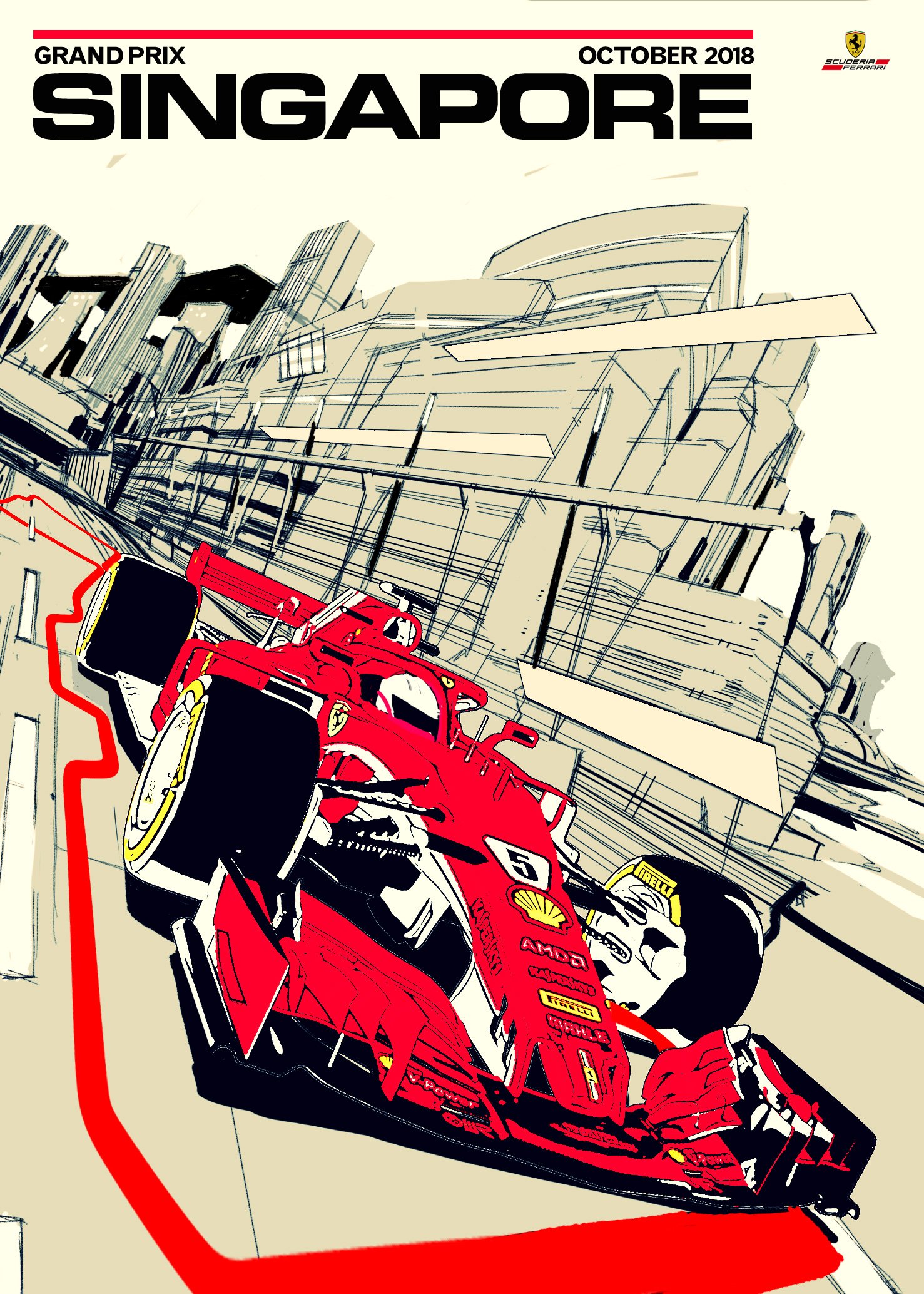
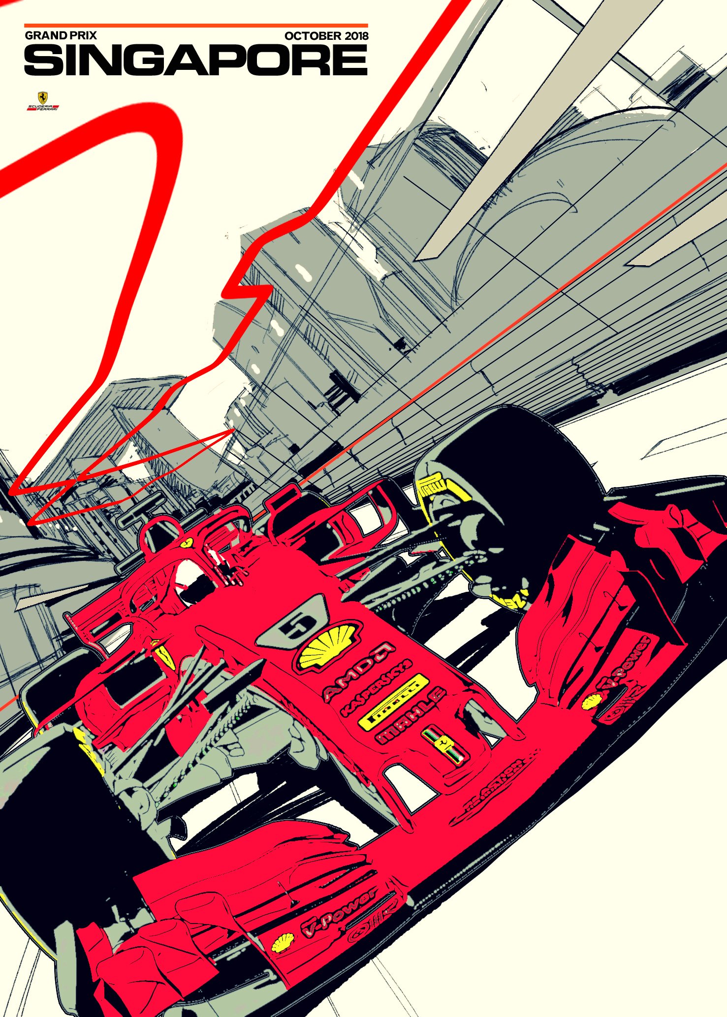
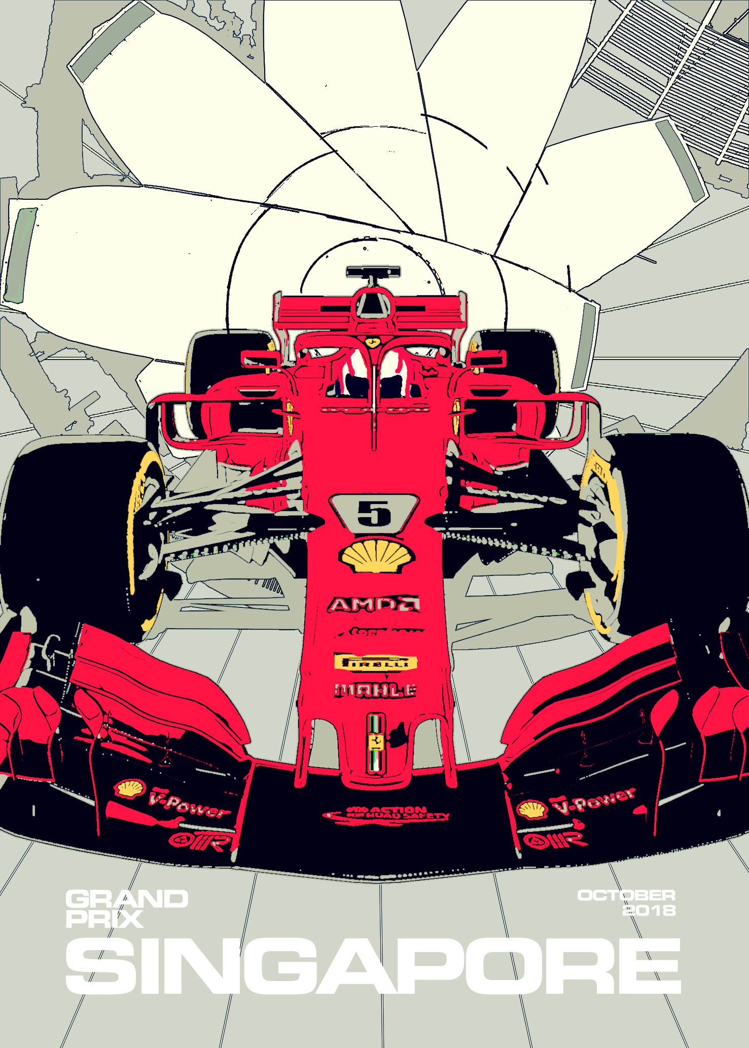
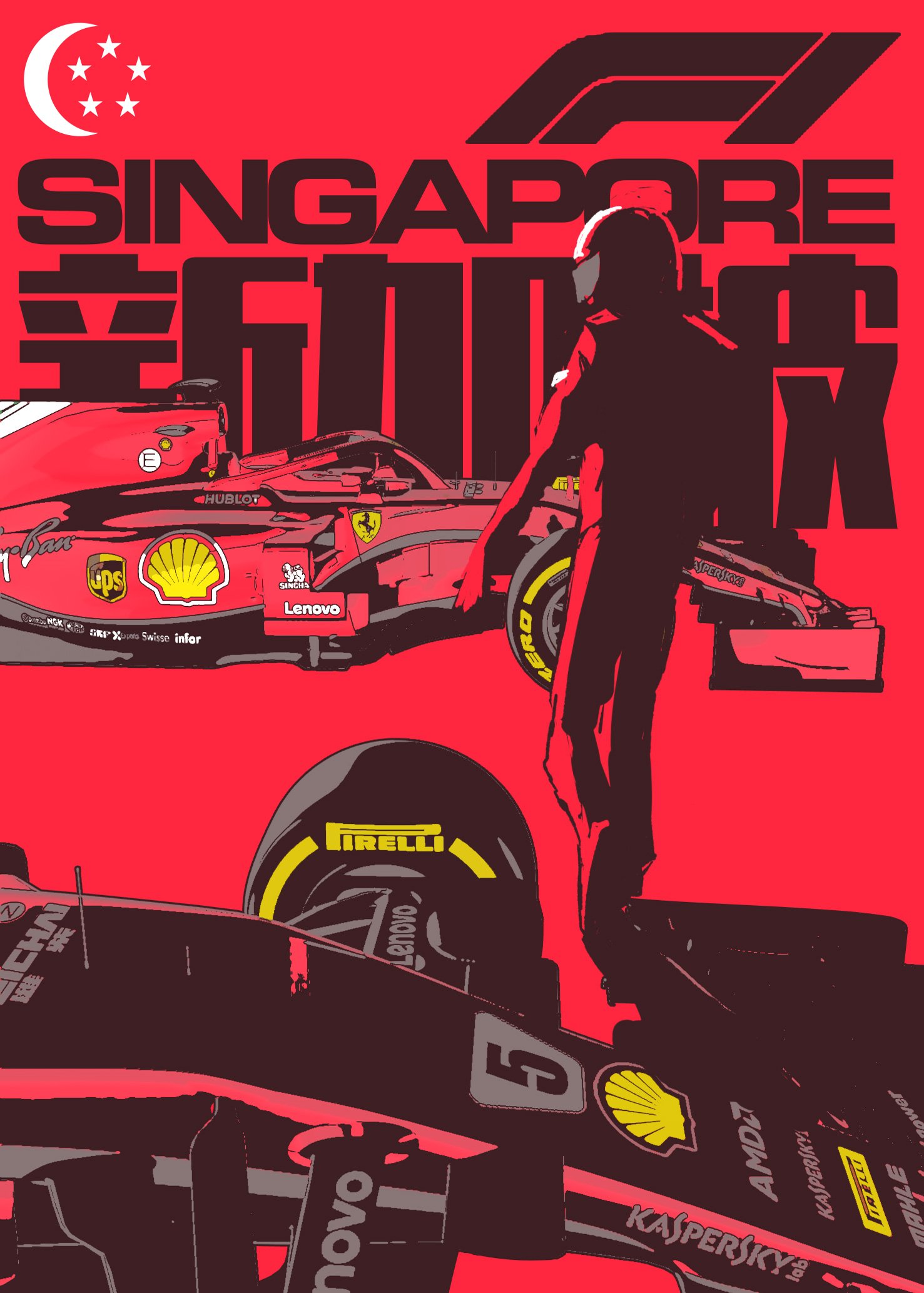
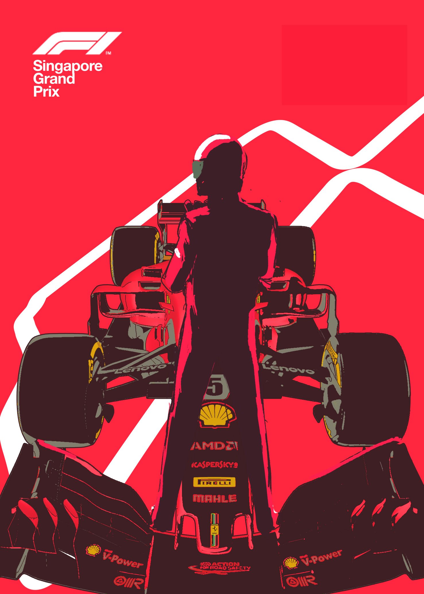
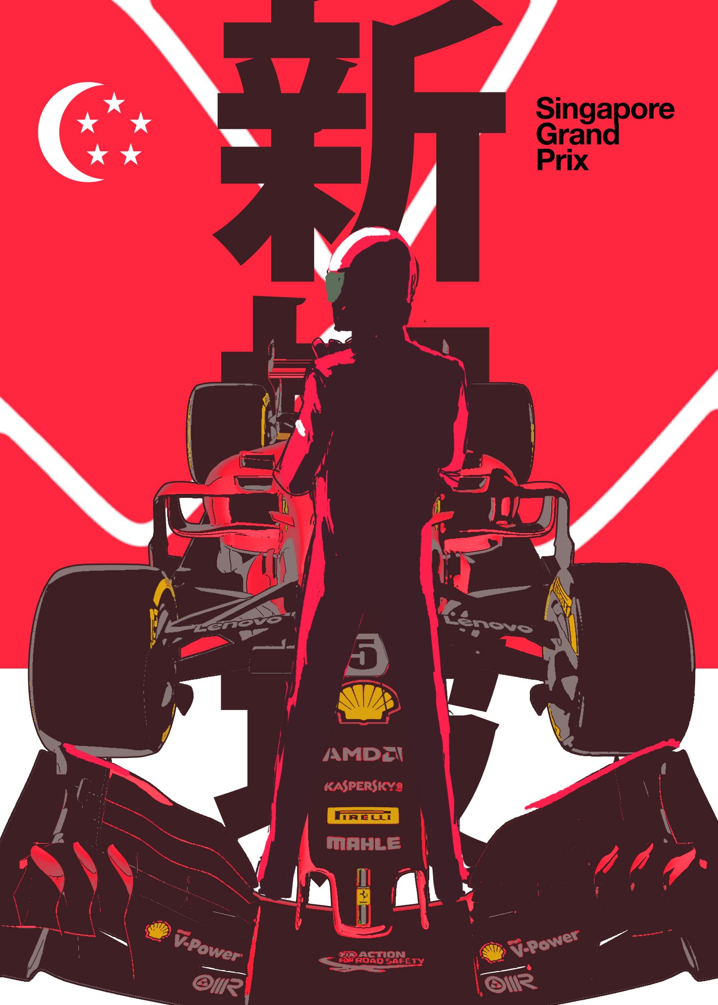
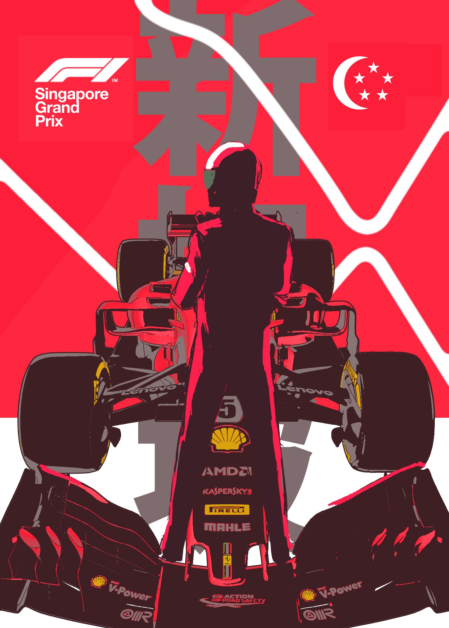
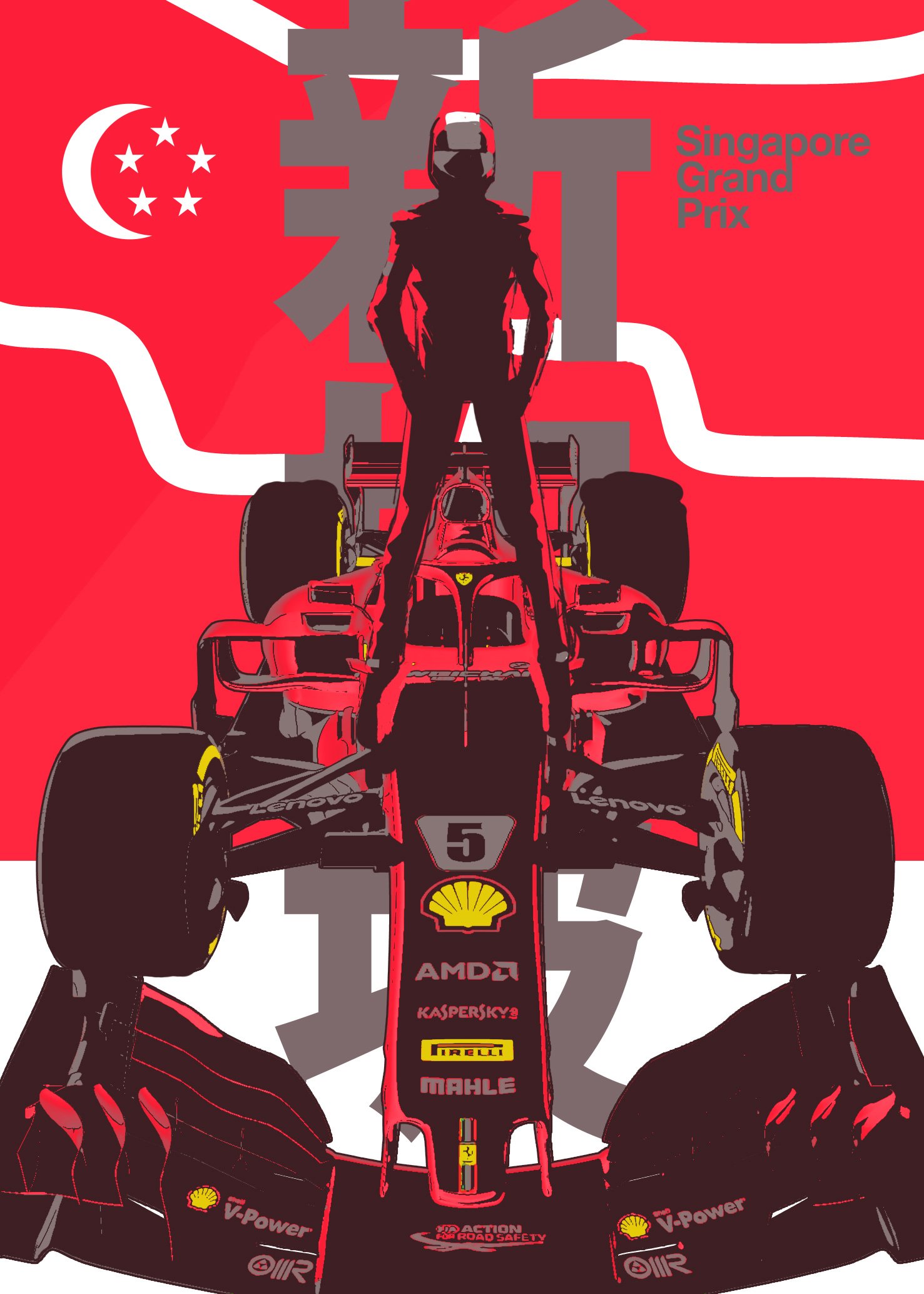
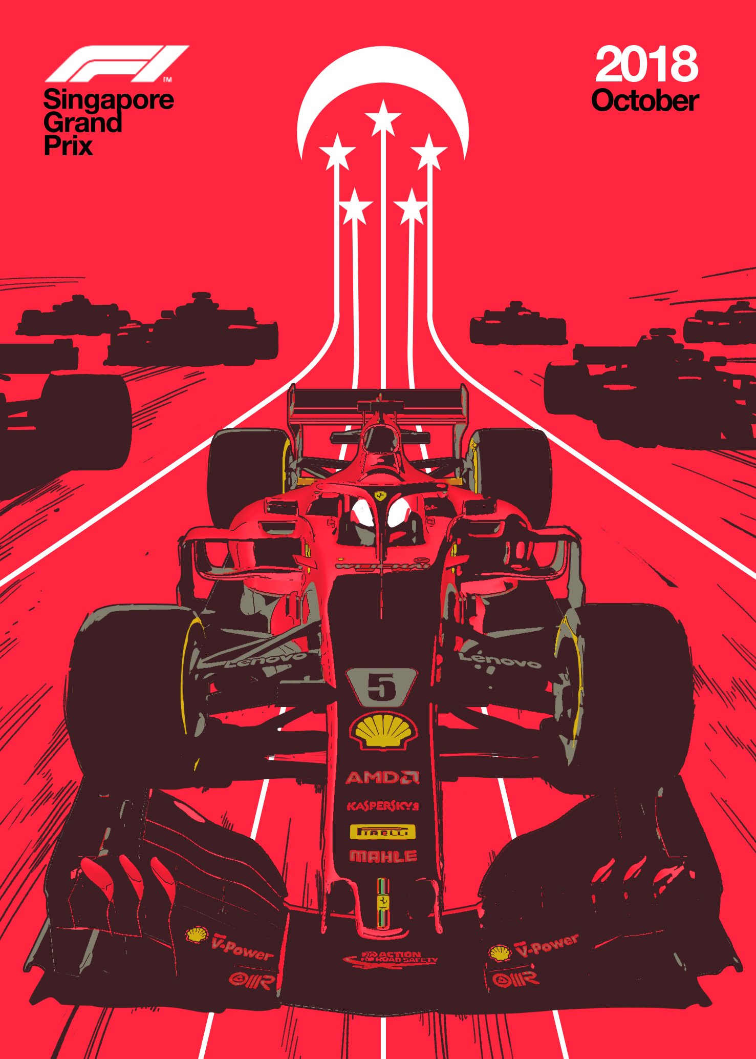
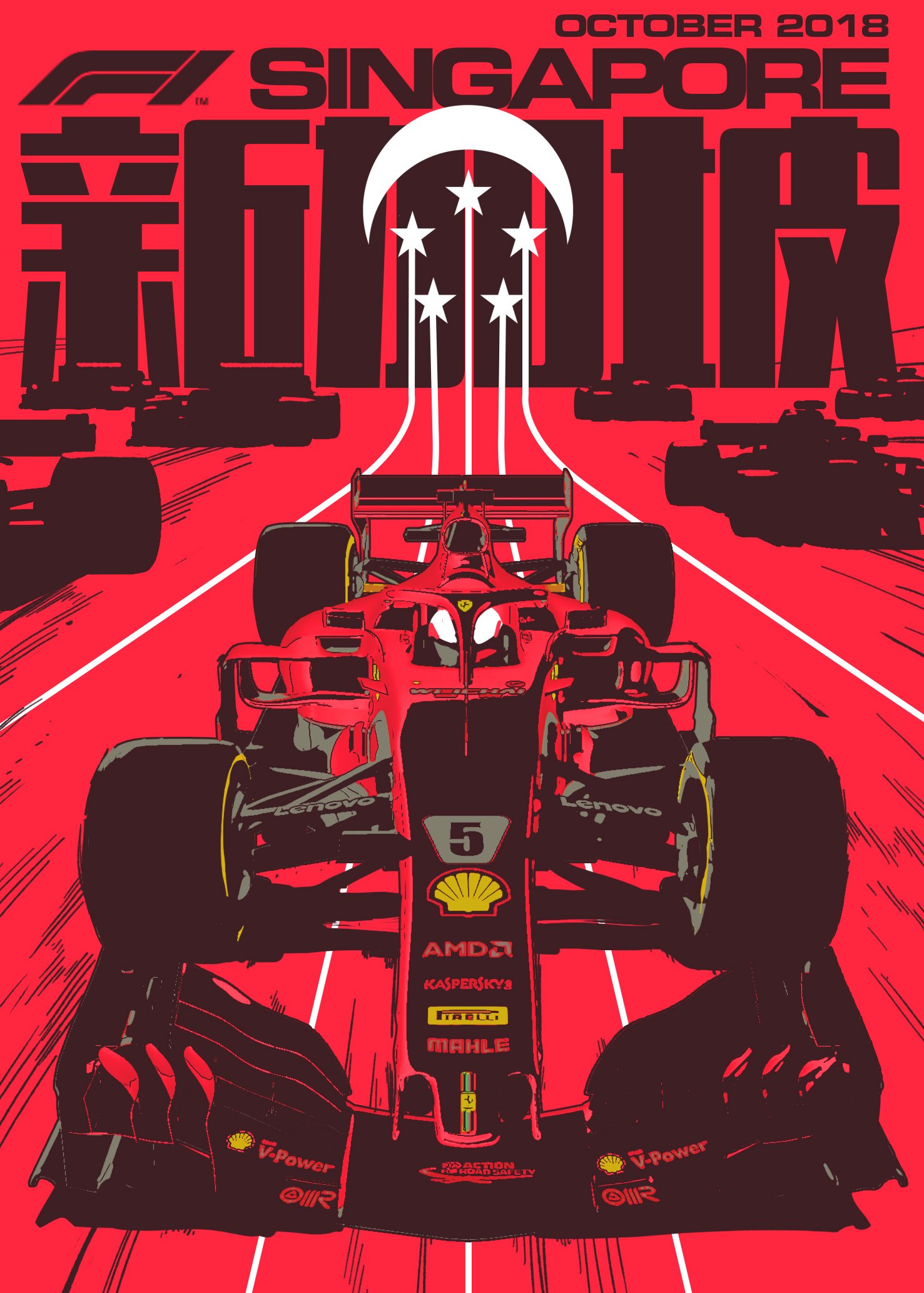
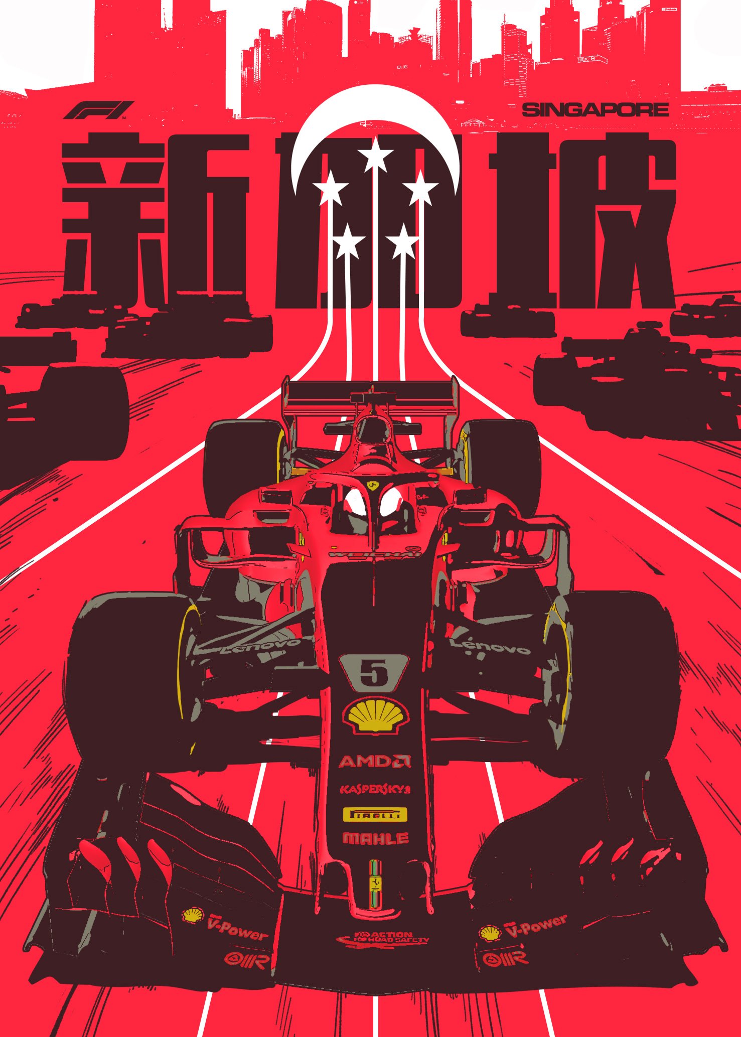
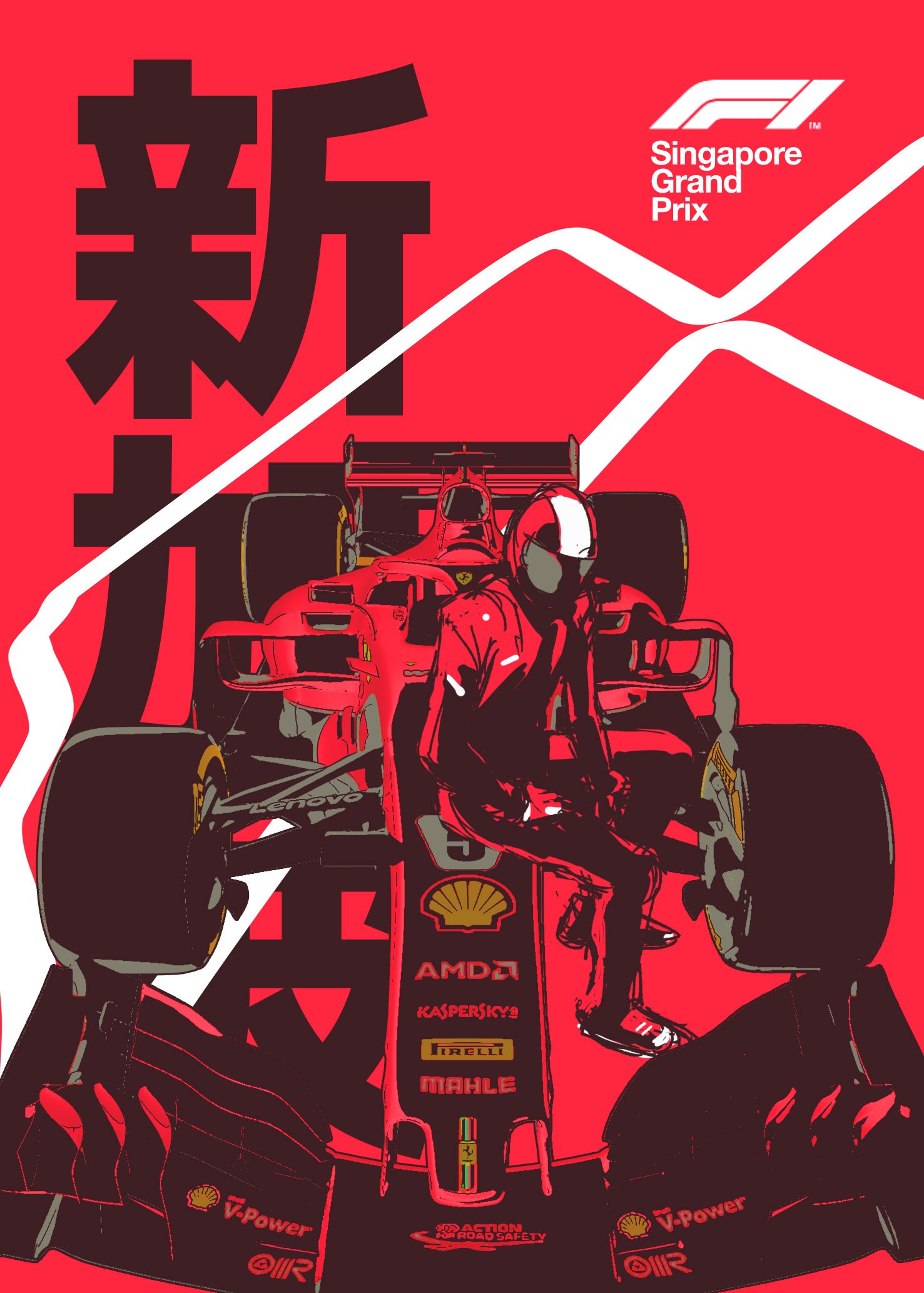
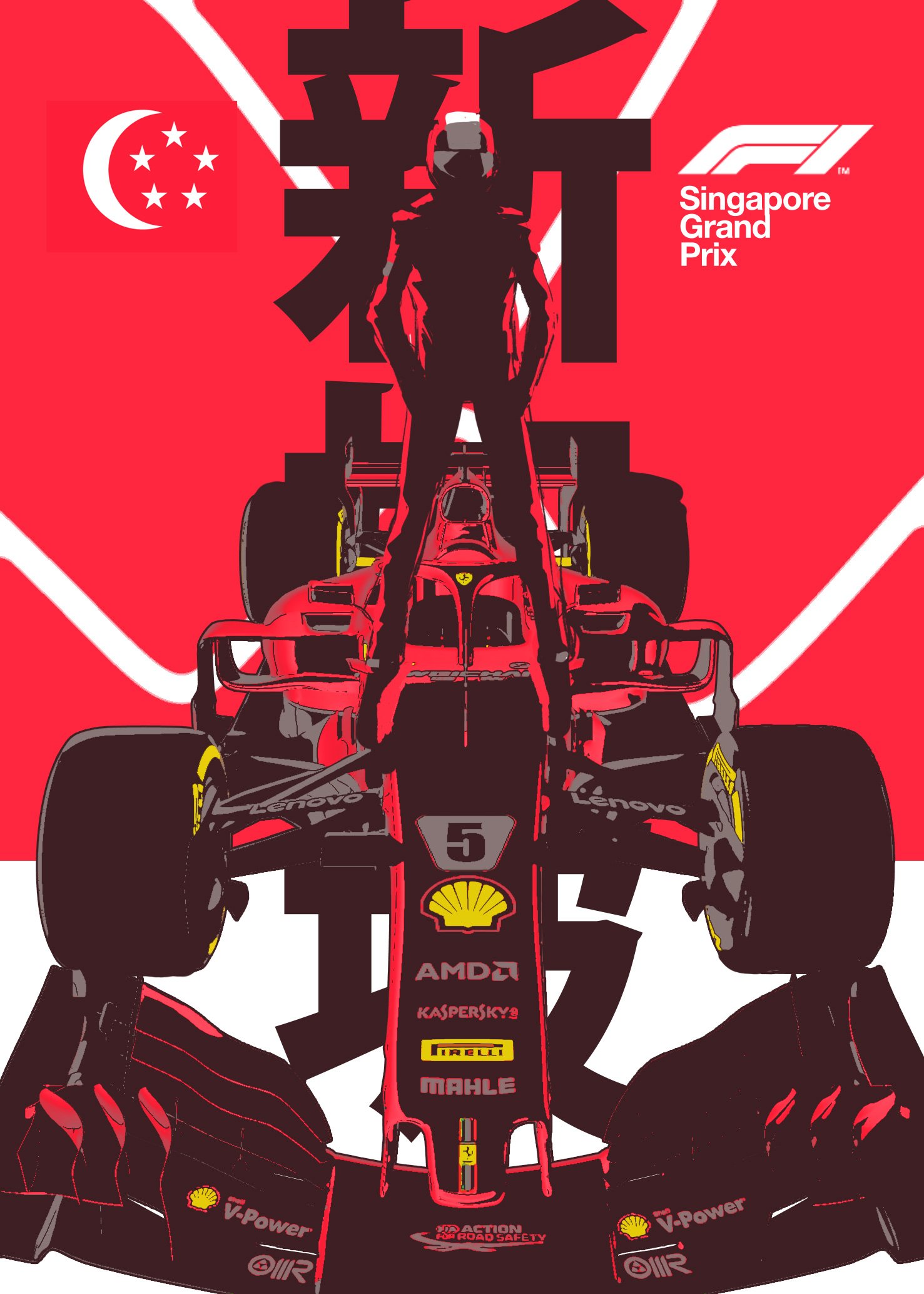
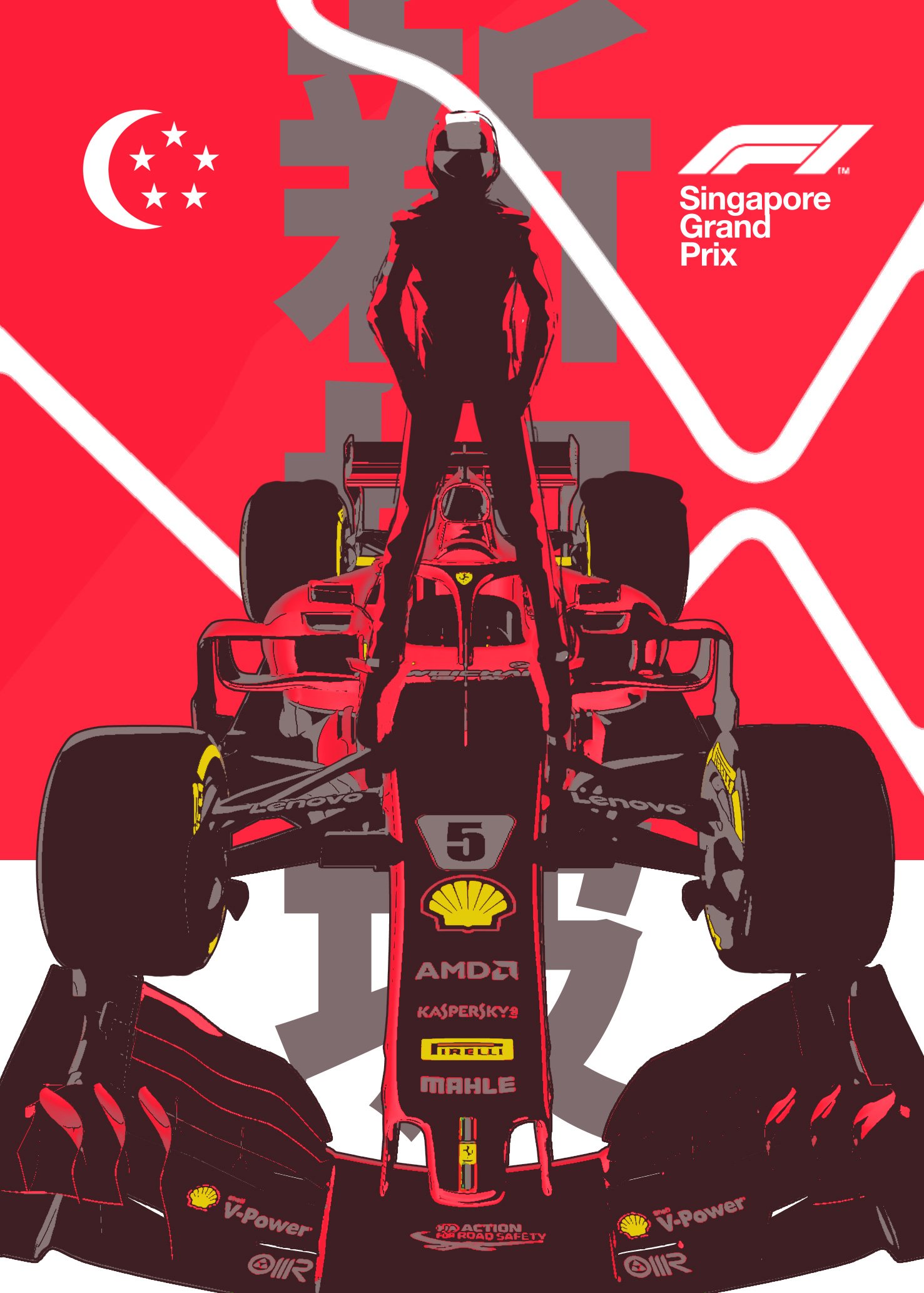
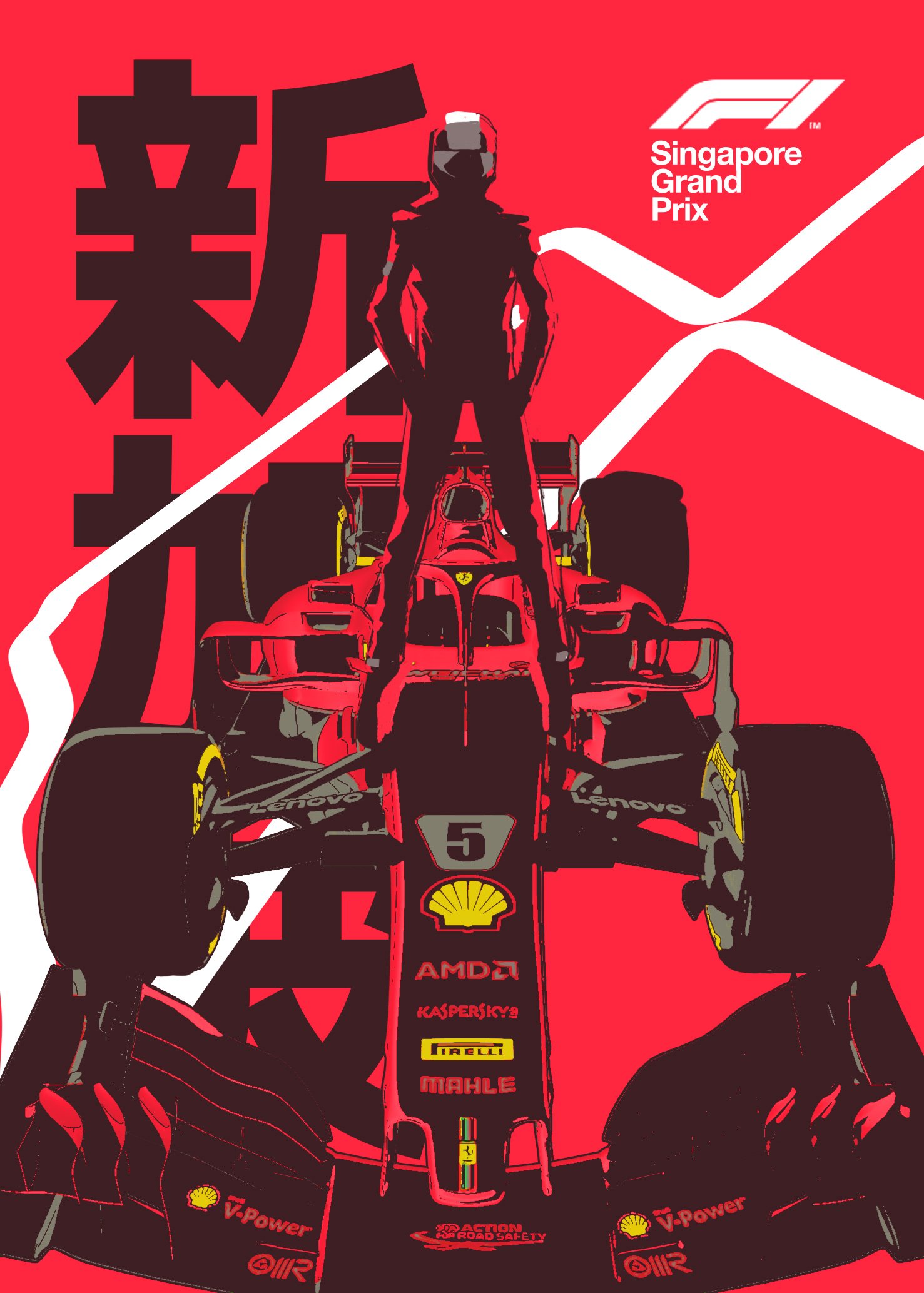
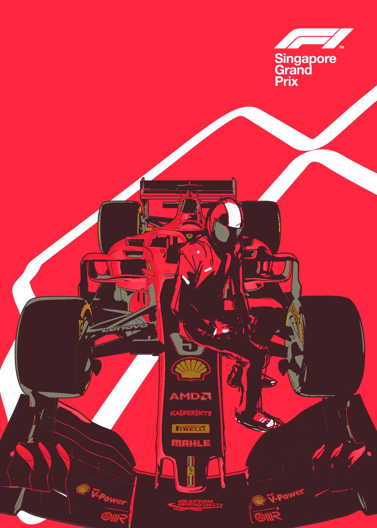
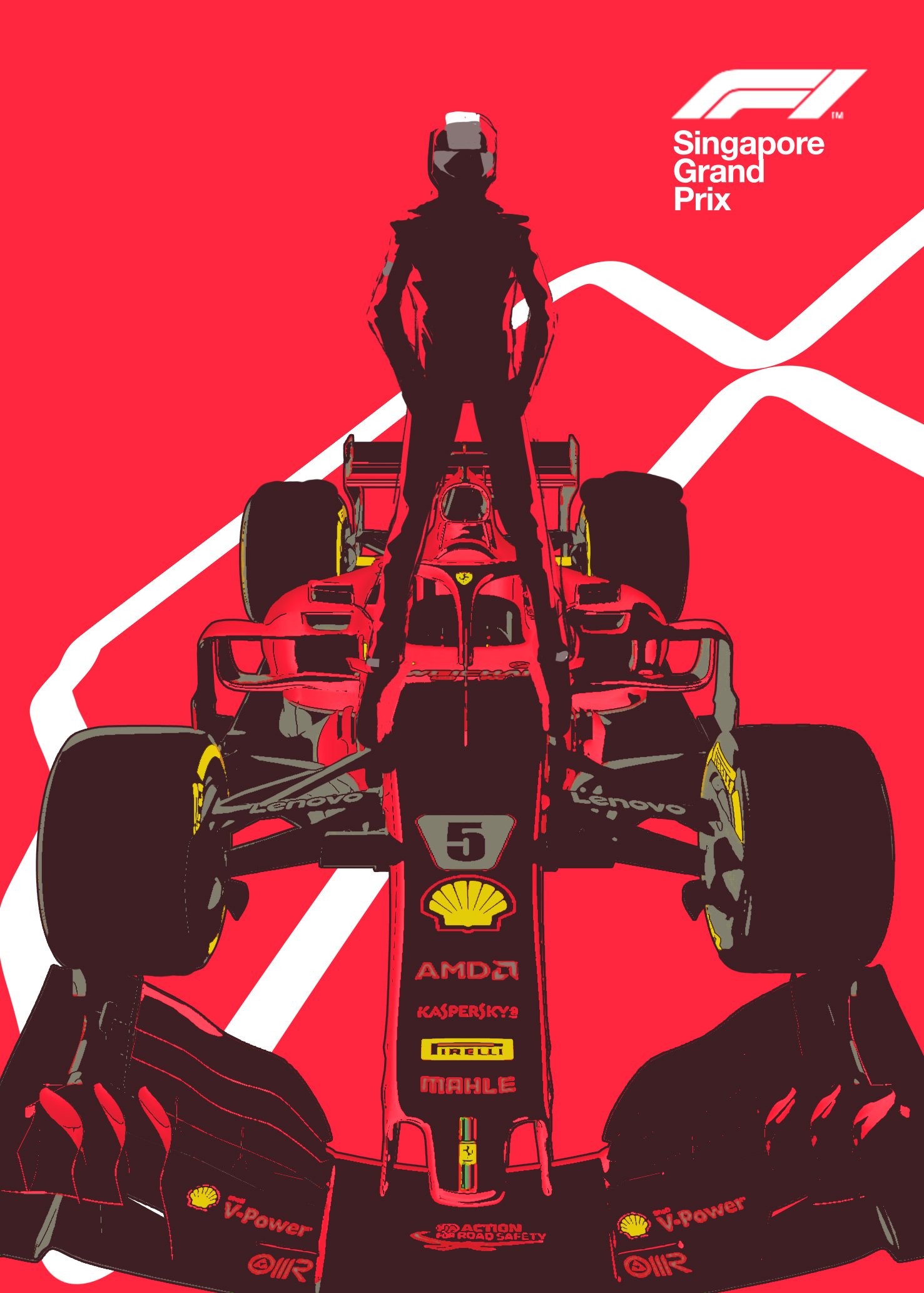
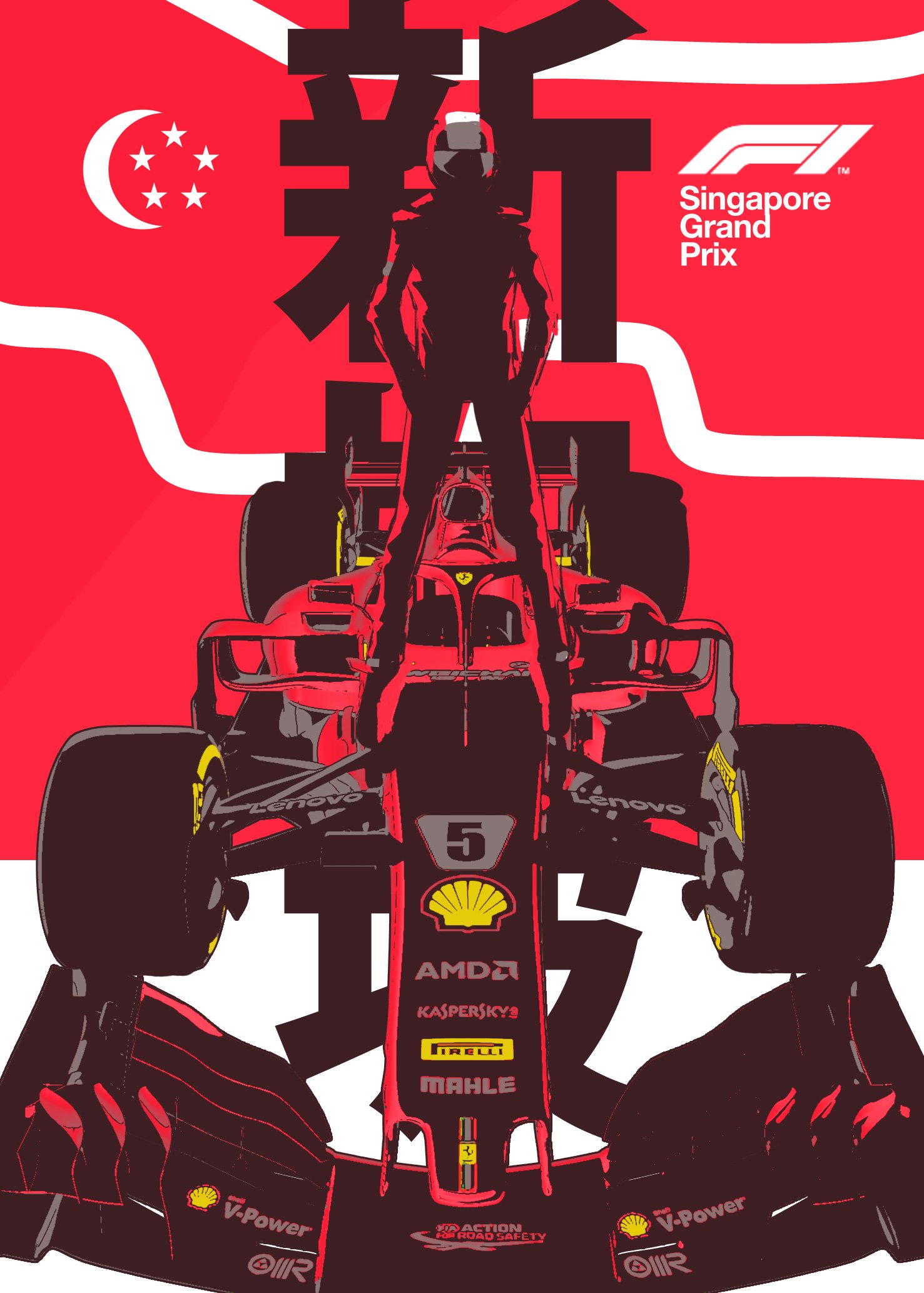
Poster for the october 2018 Singapore Grand Prix.
This poster went under 2 HUGE creative rounds, think it’s worth to see all the different proposals cause they’re pretty different.
Teaser poster for upcoming comic book series "Il Confine" by Mauro Uzzeo and Giovanni Masi. It will be published in Italy by Sergio Bonelli Editore and will be adapted as a TV series by Lucky Red.
It's an A3 graphite, airbrushed watercolour and gouache grayscale image on Fabriano Artistico Hot Pressed paper. Colour was applied with a digital post production process.
Here is the full step by step tech breakdown, from digital procreate sketches, to graphite pass, airbrush midtones, gouache highlights.
Dragonball official tribute poster, published on Dragon Ball X by Star Comics.

Quest'anno ho disegnato l'immagine ufficiale del festival del cinema di fantascienza di Trieste, Trieste Science + Fiction Fest. Con l'occasione il festival si è preso la briga di mettere insieme una mia personale, con una selezione eterogenea del mio lavoro da illustratore e fumettista.
Sarò presente solo al vernissage del 31 sera, se passate ci facciamo quattro chiacchiere. A presto!
"È dedicata all’autore dell’immagine del Festival 2017 la mostra personale allestita al Politeama Rossetti: una selezione di preziose tavole originali presenta al pubblico Lorenzo Ceccotti, in arte LRNZ. Tra i disegnatori di punta del panorama italiano, LRNZ opera in diversi settori dell’arte visuale: graphic design, motion graphics, animazione, illustrazione e narrazione sequenziale. Fondatore del collettivo Superamici, dal 2006 si è dedicato a lavori individuali, fra cui i libri a fumetti Golem e Astrogamma e il progetto Monolith per Sergio Bonelli Editore.
POLITEAMA ROSSETTI
mercoledì 1 novembre — domenica 5 novembre
dalle 14.00 a chiusura teatro"
Anton Giulio Gualtieri and Tiwi, a creative studio based in Reggio Emilia, asked me a social poster design for Scuderia Ferrari.
The final piece is an A2 watercolor and markers illustration, digitally corrected.
Process was quite straightforward.
I badly wanted to build a synthetic, minimal and modern image, while trying to retain the classic Japanese woodblock print mindset. I did three draft proposals and then we went for the one Ferrari liked the most.
Here are the three drafts:
Then I tried some different color palettes:
Traced the whole picture and inked it traditionally:

In the end we decided for a more corporate color palette, and went full red, digitally replacing the cyan parts with red ones.
The final, original piece was sold to Scuderie Ferrari.
L'illustrazione, senza grafica.
Nel 2016 Monolith era già in giro per festival, molto prima della sua uscita Italiana. Un anno, a occhio e croce. Fra i festival che si sono presi la briga di ospitarlo nei loro palinsesti c’era anche il Trieste Science Fiction Fest: considerato che dell’aspetto science fiction in Monolith, sottile e completamente strumentale, non speravo si interessasse qualcuno, la notizia è stata particolarmente piacevole, per me. Oltretutto era la mia prima volta a Trieste e quando arrivai sul posto (un teatro splendido a un passo dal moderno retrofit di Blade Runner) ho avuto modo di apprezzare la linea grafica e la comunicazione del festival: minimalissima, modernissima e assolutamente puntuale nella sua applicazione. Si trattava di un lavoro di Davide Toffolo, estremamente semplice e potente come al solito, esaltato dalla progettazione grafica di Francesco Paolo Cappellotto, che ho avuto modo e piacere di conoscere durante i giorni delle proiezioni.
Oggi Francesco mi chiede di provare a dire la mia sulla fantascienza in vece di illustratore ufficiale dell’edizione 2017 dello stesso festival. Considerato che l’anno scorso Toffolo si è spinto verso l’essenzialità, io ho cercato di calarmi nel ruolo di artista sci fi tout court, con un impianto formale decisamente più carico di informazioni, tutto volto a fissare su carta/schermo un’allucinazione dal futuro. Sono cresciuto con gli illustratori Sci Fi, fumettisti, illustratori o concept artist e la chiaroveggenza di alcuni di questi disegnatori continua a scioccarmi anche e soprattutto in quei casi in cui i futuri che hanno previsto non si sono poi affatto verificati, restando uno sguardo su un reale potenziale alternativo assolutamente coerente, desiderabile o temibile che sia.
Il futuro è stato il sogno o l’incubo di qualcuno, quindi mi piace particolarmente l’idea che un’allucinazione possa essere molto vicina al reale: facilita un inconsapevole e esaltante travaso della fantasia nel mondo di tutti i giorni. Odaiba Gundam, per dire, è una di quelle operazioni al limite. Passeggiando per Trieste, mi sono innamorato dei cantieri al porto. In particolare un cantiere stupendo proprio dietro la location del festival. I cantieri nei porti hanno sempre di queste macchine mastodontiche per svolgere lavori titanici, ma a Trieste, complice l’estensione a perdita d’occhio del suo splendido, astrattissimo lungomare e la bellezza senza tempo delle sue gru, non ho potuto fare a meno di immaginarmi un cantiere del prossimo futuro. La gru “Ursus”, fra i più stupendi oggetti dell’industria planetaria, forse, un giorno lontanissimo andrà in pensione e verrà sostituito da un nuovo baluardo della tecnica, un altro gigante buono meccanico. Mi andava, insomma, di godermi della fantascienza in cui l’uomo, con la scienza, trasforma la fantasia in realtà e ho provato a immaginarmi il porto di Trieste del futuro: ho disegnato una famiglia triestina, in basso a destra, sono piccolissimi - Linda, Annalisa e Andrea che a differenza di Ursus2 esistono veramente e li saluto - una mamma e un papà hanno portato la loro figlioletta a vedere di cosa è capace la fantasia.
Forza Ursus!
This image is part of a set of peliminary K Visual illustration proposals for a music event in Rome. FYI: 12Hz is the lowest musical frequency.
Step by step work in progress:
I started this image with a photobash: pretty unusual, I rarely start from photographic material, but I liked the general feel of this first test so I ended up sticking to its composition.
Then I drew a digital draft out of it: changed some elements in the background and tried to keep the bottom part as clean as possible to accept small and big text.
Then I traced it with an ink marker.
Here is the final ink piece, ready to be coloured in photoshop.
The ink illustration, approximately 50 x 70 cm on Arches 300 gsm hot pressed paper is for sale on my online store.
The photoshop color step, ready for text or other graphic element.
Riccardo Corbò asked me a poster illustration for an massive Batman related art exhibition in Città Di Castello, Italy. The event is patrocinated by DC Comics, of course.
I was requested to remix the famous castle cover by Bob Kane (luckily enough, my favourite Batman drawing of all time), in the heritage of Neal Adams' twist of it. Città Di Castello is literally a castle shaped small town in central Italy so we had a perfect chance to depict it into the poster.
The original image by Bob Kane.
Neal Adams' take.
Here is a partial list of the artists involved:
Simone Bianchi, Claudio Castellini, Gabriele Dell'Otto, Giuseppe Camuncoli e Matteo Casali, Alberto Ponticelli, Emanuel Simeoni, Riccardo Burchielli, Emanuela Lupacchino, David Messina, Tanino Liberatore, Lee Bermejo, Eleonora Carlini, Marco Santucci, Hugo Pratt, Bob Kane, Frank Miller, Francesca Protopapa, Rita Petruccioli, Giovanni P. Timpano, Michele Rech, Ale Giorgini, Leo Ortolani, Francesco D'Erminio Ratigher, Flavio Solo, Sio, Carmine Di Giandomenico .
The event was made possible thanks to with Warner Bros Italia and Rw Lion.
Last but not least!
Some work in progress shots and the naked poster illustration.
The very first digital draft.
A more refined digital reference drawing for the pencil pass.
Pencil pass. (Available for sale in my store)
Final illustration, naked.
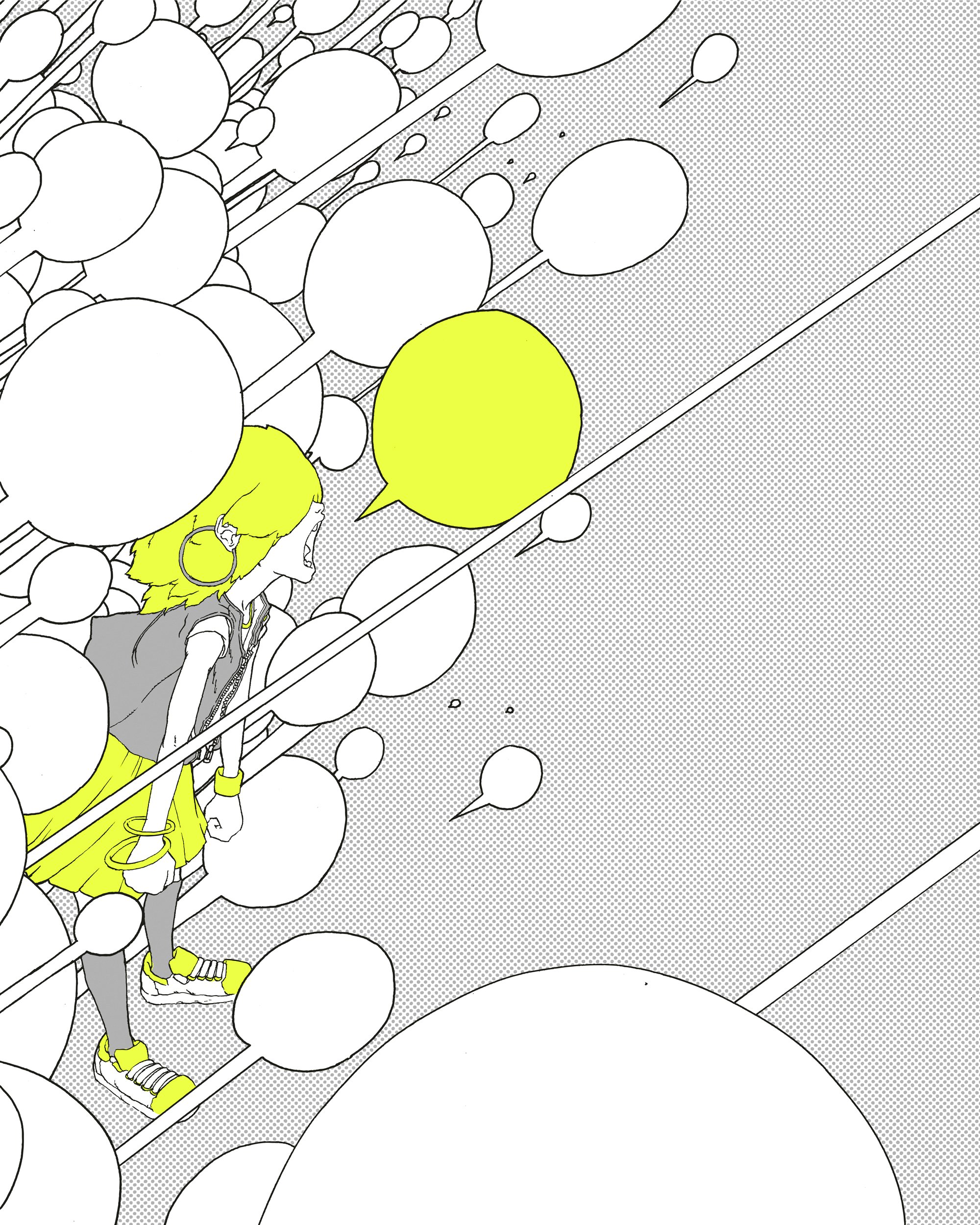
Discarded image I did while working on the visual identity for a music event in Rome.